CooperVision
Audit performed March 20, 2026 · Report version 2.0 · 21 CRO suggestions identified
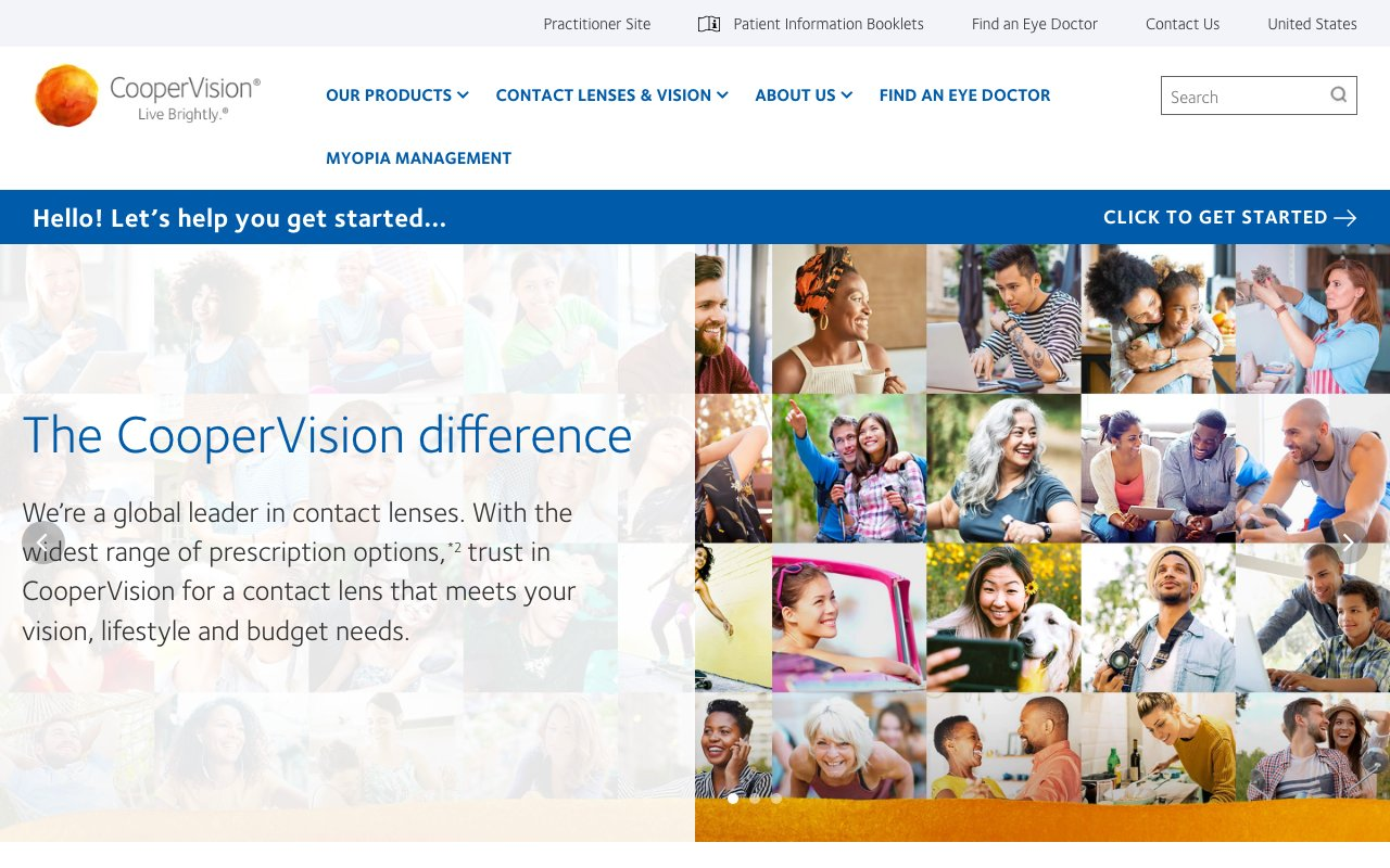
The homepage and main navigation provide extensive product links and informational pages but lack a clear, prominent primary call to action (CTA) such as 'Buy Now,' 'Order Free Trial,' or 'Find Your Lens.' This absence can confuse visitors about the next step, reducing conversion rates and negatively impacting pipeline growth. For a product-focused site like CooperVision, guiding users toward conversion actions is essential to capitalize on traffic and generate leads or sales.
The site title 'CooperVision | Live Brightly.| Eye Contacts' and navigation list many product families but lack clear, concise messaging that communicates unique benefits or reasons to choose CooperVision over competitors. Without a strong value proposition visible upfront, visitors may not understand why they should trust or prefer CooperVision lenses, reducing motivation to convert and impacting revenue potential.
The text content and navigation do not reference customer reviews, testimonials, expert endorsements, or certifications prominently. Social proof is a powerful conversion driver, especially for health-related products like contact lenses, where trust and safety concerns are paramount. The absence of visible trust signals can increase visitor hesitation and reduce conversion rates.
The navigation menu and text content show repeated links (e.g., multiple 'Careers,' 'Blog,' and product family links) and a very long list of product categories without clear hierarchy or grouping. This complexity can overwhelm users, making it difficult to find relevant information quickly, leading to frustration and higher bounce rates, which negatively affects engagement and conversions.
Although the site includes valuable tools like 'Find a lens quiz' and offers like 'Free Trial,' these are buried within long lists of links without emphasis or contextual explanation. Visitors may miss these conversion-driving features, resulting in lost opportunities to engage users and convert them into customers or leads.
Want to unlock the full CRO report?
Get access to all recommendations, benchmarks, and experiment ideas.
- All 21 prioritised CRO suggestions with experiment ideas
- Industry benchmarks for your category & traffic level
- Discoverability (SEO + GEO) full audit results
- A/B test hypotheses ready to implement
- Personalised session with a CRO specialist
⚠️ Important Note
This audit is based on an automated and heuristic-based analysis of publicly accessible pages. The evaluation follows industry best practices across conversion rate optimization (CRO), usability, analytics, and discoverability.
The findings presented here are directional and indicative in nature. They do not take into account internal data such as revenue performance, customer lifetime value, traffic quality, seasonality, or proprietary testing.
Recommendations should be interpreted as optimization opportunities rather than absolute assessments. Actual impact may vary depending on audience composition, acquisition channels, and business context. This report is not exhaustive and should be used as a starting point for further analysis and experimentation.