 CRO Audit
Ecom North
Audit performed April 26, 2026 · Report version 2.0 · 21 CRO suggestions identified
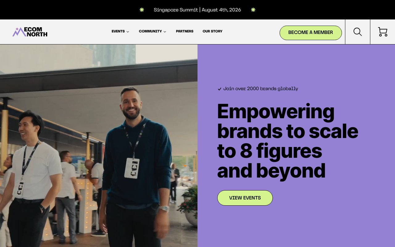
The website text repeatedly lists the same events multiple times, such as the Singapore Summit, US Summit, Toronto Summit, and Australia Summit, appearing over 20 times in a row. This repetition can confuse visitors, making it difficult to identify unique events and reducing the perceived professionalism of the site. It also dilutes the urgency and importance of each event, potentially lowering conversion rates for event registrations and ticket sales.
The homepage text mentions events and community benefits but lacks a prominent, clear call to action (CTA) that directs users to purchase tickets, become members, or engage deeper. The only CTAs are generic 'Learn More' links repeated for each event and a 'View Events' link, which may not sufficiently motivate visitors to convert. This absence of strong CTAs likely reduces conversion rates from casual visitors to paying attendees or members.
The site states it is 'an eCommerce collective built by founders, for founders' and mentions 'empowering brands to scale to 8 figures and beyond' but provides limited concrete benefits, testimonials, or success stories to substantiate these claims. While logos of partners and brands are shown, the text lacks detailed social proof or case studies that could build trust and credibility, which are critical for convincing high-value attendees to invest in events or memberships.
The text content shows a navigation structure with repeated links and categories such as Events, Community, Partners, and Our Story, but the repetition and lack of hierarchy make it difficult for users to find relevant information quickly. For example, multiple 'Learn More' links are repeated for the same events, and community resources are listed without clear differentiation. This can frustrate users and reduce time spent on site or exploration of offerings.
The site mentions 'Become a Member' links but provides minimal text explaining the benefits, pricing, or process of membership. This lack of discoverability and detail may prevent visitors from understanding the value or how to join, limiting membership conversions. The membership callouts are buried among event listings and partner logos, reducing their visibility.
Want to unlock the full CRO report?
Get access to all recommendations, benchmarks, and experiment ideas.
- All 21 prioritised CRO suggestions with experiment ideas
- Industry benchmarks for your category & traffic level
- Discoverability (SEO + GEO) full audit results
- A/B test hypotheses ready to implement
- Personalised session with a CRO specialist
⚠️ Important Note
This audit is based on an automated and heuristic-based analysis of publicly accessible pages. The evaluation follows industry best practices across conversion rate optimization (CRO), usability, analytics, and discoverability.
The findings presented here are directional and indicative in nature. They do not take into account internal data such as revenue performance, customer lifetime value, traffic quality, seasonality, or proprietary testing.
Recommendations should be interpreted as optimization opportunities rather than absolute assessments. Actual impact may vary depending on audience composition, acquisition channels, and business context. This report is not exhaustive and should be used as a starting point for further analysis and experimentation.