 CRO Audit
JobWay
Audit performed April 13, 2026 · Report version 2.0 · 21 CRO suggestions identified
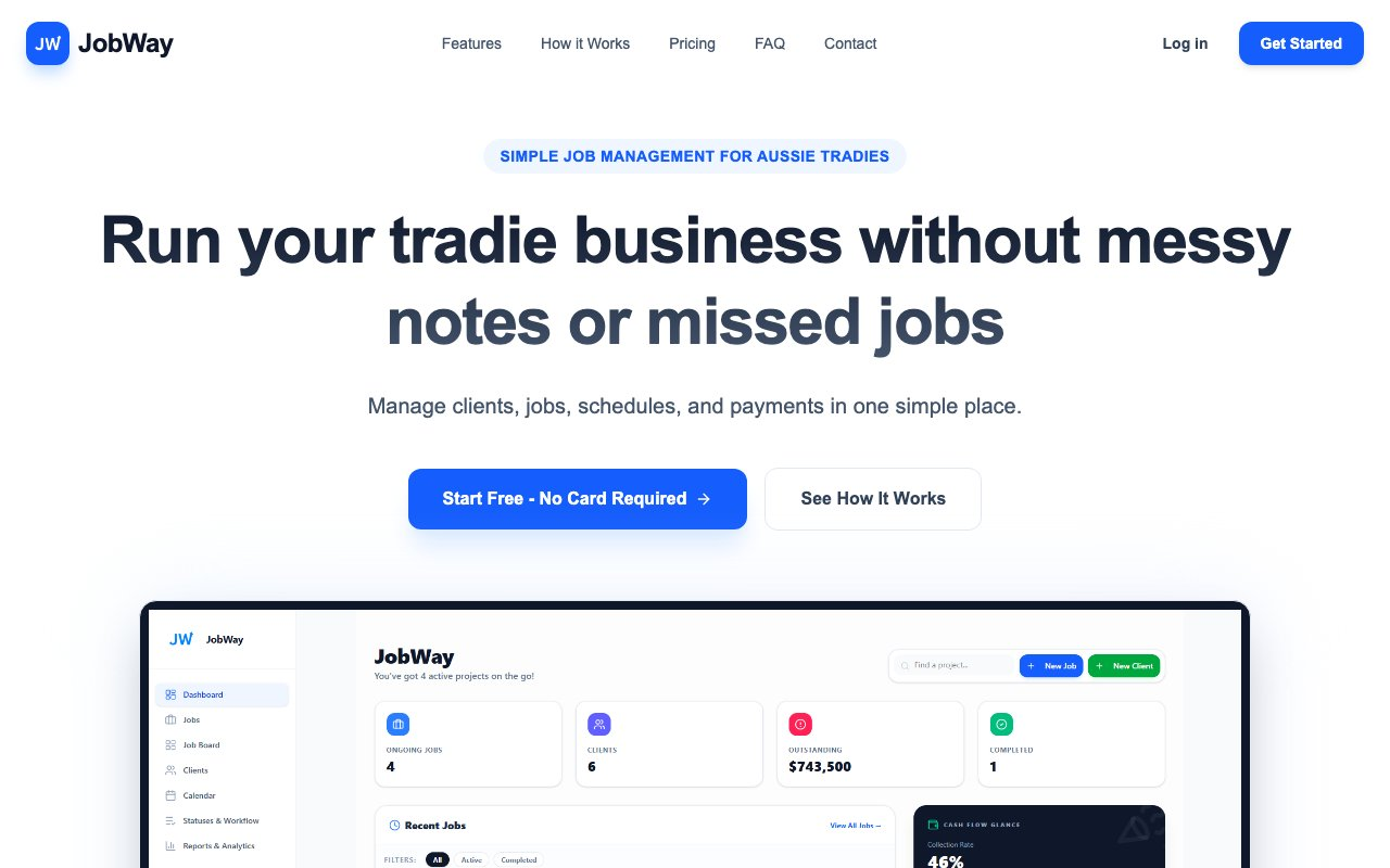
The headline 'Run your tradie business without messy notes or missed jobs' does not clearly articulate the unique value proposition. It lacks specificity on how JobWay directly benefits the target audience or differentiates from competitors. This unclear messaging can result in lower engagement from potential leads as they may not immediately grasp the advantages of using the platform, leading to a higher drop-off rate.
The website does not feature any client logos, testimonials, or case studies prominently in visible sections. Social proof is a key factor in building trust and authority, especially for non-category-dominant brands. Without visible testimonials or endorsements, potential leads may lack the confidence to proceed through the conversion funnel, perceiving higher risk without validated customer feedback.
The registration form presents six fields including passwords and company details, which can create significant friction. Especially for a free trial, requiring extensive information upfront raises the barrier to entry, potentially deterring leads from completing the registration process. The visual design should encourage quick, low-commitment sign-ups to maintain conversion rates.
The site lacks strong urgency cues or clear risk reversal messages to motivate prospects to act now. While the CTA mentions 'No Card Required', additional positioning around urgency or guarantees is missing. Prospects may delay registration without a compelling reason to act immediately, thus elongating the decision process and decreasing conversion efficiency.
The presence of two CTAs, 'Start Free' and 'See How It Works', in close proximity creates potential confusion and decision hesitance. Additionally, a lack of clear guidance on the homepage about what step users should take first can result in friction. This ambiguity can slow down user progression through the conversion funnel by creating uncertainty about the next logical action.
Want to unlock the full CRO report?
Get access to all recommendations, benchmarks, and experiment ideas.
- All 21 prioritised CRO suggestions with experiment ideas
- Industry benchmarks for your category & traffic level
- Discoverability (SEO + GEO) full audit results
- A/B test hypotheses ready to implement
- Personalised session with a CRO specialist
⚠️ Important Note
This audit is based on an automated and heuristic-based analysis of publicly accessible pages. The evaluation follows industry best practices across conversion rate optimization (CRO), usability, analytics, and discoverability.
The findings presented here are directional and indicative in nature. They do not take into account internal data such as revenue performance, customer lifetime value, traffic quality, seasonality, or proprietary testing.
Recommendations should be interpreted as optimization opportunities rather than absolute assessments. Actual impact may vary depending on audience composition, acquisition channels, and business context. This report is not exhaustive and should be used as a starting point for further analysis and experimentation.