JustMenacing
Audit performed April 9, 2026 · Report version 2.0 · 21 CRO suggestions identified
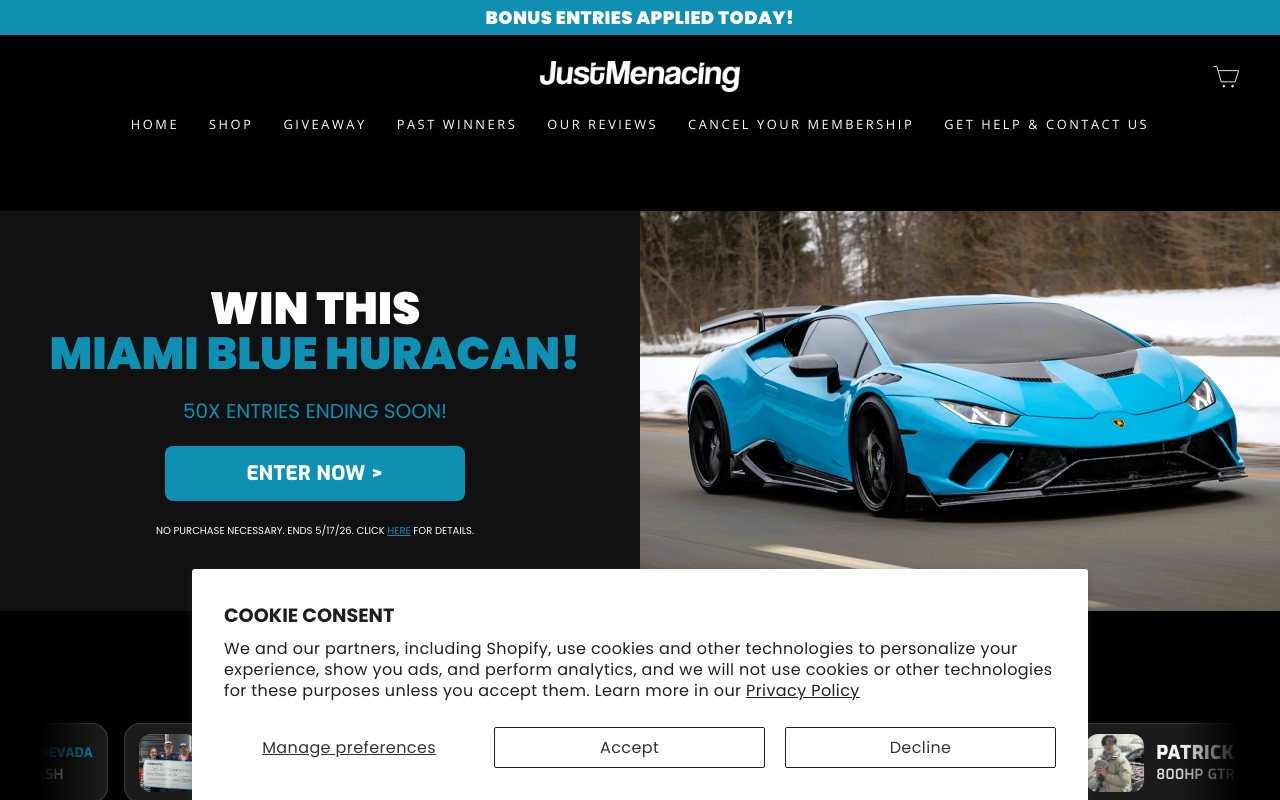
The website text does not clearly communicate what JustMenacing offers beyond a giveaway and some apparel products. The main headline is simply the brand name with a generic 'Welcome' and 'Earn rewards at checkout' phrase, but no strong unique selling proposition or explanation of brand values, product benefits, or customer appeal. This lack of clarity can confuse visitors, reducing their motivation to engage or purchase, directly impacting conversion rates and revenue.
Calls to action such as 'ENTER NOW >' and 'GET ENTERED NOW' are present but lack urgency, clarity, and visual emphasis in the text content. The main CTA for the giveaway is buried among product details and repeated winner lists, which can dilute focus. Additionally, the shopping CTAs are not clearly described in the text, which may confuse users about the next steps to take. Weak CTAs reduce click-through rates and conversions.
While product names and prices are listed (e.g., 'Born To Grip Built To Rip Tee $59.99'), there is no descriptive content explaining product features, materials, fit, or benefits. This lack of detail can prevent customers from making informed purchase decisions, increasing hesitation and cart abandonment. Clear product descriptions are essential to justify pricing and encourage conversions.
The site references 'Our Reviews' and 'Past Winners' pages, but within the main content, there is no visible integration of customer testimonials or social proof to build trust. The repeated listing of recent winners is helpful but lacks context or customer feedback on products or service quality. This limits engagement and reassurance for new visitors, potentially lowering conversion rates.
The navigation menu is extensive and somewhat repetitive, listing similar links multiple times (e.g., 'Past Winners' and 'Our Reviews' appear twice). The giveaway and shop sections are mixed with account management links, which may confuse users. Additionally, key information such as official rules and membership cancellation is buried in navigation rather than highlighted. This structure can hinder users from easily finding important content, reducing engagement and conversions.
Want to unlock the full CRO report?
Get access to all recommendations, benchmarks, and experiment ideas.
- All 21 prioritised CRO suggestions with experiment ideas
- Industry benchmarks for your category & traffic level
- Discoverability (SEO + GEO) full audit results
- A/B test hypotheses ready to implement
- Personalised session with a CRO specialist
⚠️ Important Note
This audit is based on an automated and heuristic-based analysis of publicly accessible pages. The evaluation follows industry best practices across conversion rate optimization (CRO), usability, analytics, and discoverability.
The findings presented here are directional and indicative in nature. They do not take into account internal data such as revenue performance, customer lifetime value, traffic quality, seasonality, or proprietary testing.
Recommendations should be interpreted as optimization opportunities rather than absolute assessments. Actual impact may vary depending on audience composition, acquisition channels, and business context. This report is not exhaustive and should be used as a starting point for further analysis and experimentation.