 CRO Audit
ShopMannisko
Audit performed April 26, 2026 · Report version 2.0 · 21 CRO suggestions identified
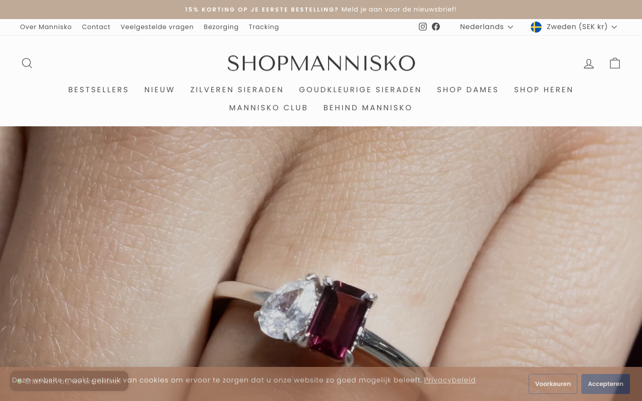
The website's main title states 'Waterbestendige Sieraden | Edelstenen | Voor iedereen – ShopMannisko,' which translates to 'Waterproof Jewelry | Gemstones | For everyone.' While this conveys product categories and a broad target audience, it does not clearly communicate what makes ShopMannisko unique or why customers should choose it over competitors. The absence of a compelling unique selling proposition (USP) can reduce visitor engagement and conversion rates because users may not quickly understand the brand's key benefits or value.
The text includes a newsletter signup offer '15% KORTING OP JE EERSTE BESTELLING? Meld je aan voor de nieuwsbrief!' (15% discount on your first order? Sign up for the newsletter!), which is a good incentive. However, there is no clear, prominent call to action (CTA) encouraging immediate purchase or guiding users through the shopping process. The shopping cart text shows 'Je winkelwagen is momenteel leeg' (Your cart is currently empty) and a generic 'Ga door naar afrekenen' (Proceed to checkout) without persuasive CTAs on product or category pages.
The website mentions '14 DAGEN RETOURNEREN' (14 days return policy) and free shipping over €50, which are positive trust signals. However, there is no mention of customer reviews, testimonials, ratings, or trust badges in the provided text. The lack of social proof can reduce buyer confidence, especially in the jewelry industry where trust and quality assurance are critical for conversion.
The menu structure is extensive, listing many categories and subcategories such as 'Zilveren Sieraden,' 'Goudkleurige Sieraden,' and multiple nested subcollections for necklaces, rings, bracelets, and earrings. While comprehensive, this depth and breadth of options may overwhelm users, making it difficult to find products quickly and increasing bounce rates or cart abandonment.
The website offers multiple language and currency options, listing many countries and currencies in a long list format. However, the text shows all options without clear user interface cues or explanations, which may confuse visitors about how to select the appropriate language or currency. This can lead to frustration and lost sales, especially for international customers.
Want to unlock the full CRO report?
Get access to all recommendations, benchmarks, and experiment ideas.
- All 21 prioritised CRO suggestions with experiment ideas
- Industry benchmarks for your category & traffic level
- Discoverability (SEO + GEO) full audit results
- A/B test hypotheses ready to implement
- Personalised session with a CRO specialist
⚠️ Important Note
This audit is based on an automated and heuristic-based analysis of publicly accessible pages. The evaluation follows industry best practices across conversion rate optimization (CRO), usability, analytics, and discoverability.
The findings presented here are directional and indicative in nature. They do not take into account internal data such as revenue performance, customer lifetime value, traffic quality, seasonality, or proprietary testing.
Recommendations should be interpreted as optimization opportunities rather than absolute assessments. Actual impact may vary depending on audience composition, acquisition channels, and business context. This report is not exhaustive and should be used as a starting point for further analysis and experimentation.