 CRO Audit
Stripe
Audit performed April 12, 2026 · Report version 2.0 · 21 CRO suggestions identified
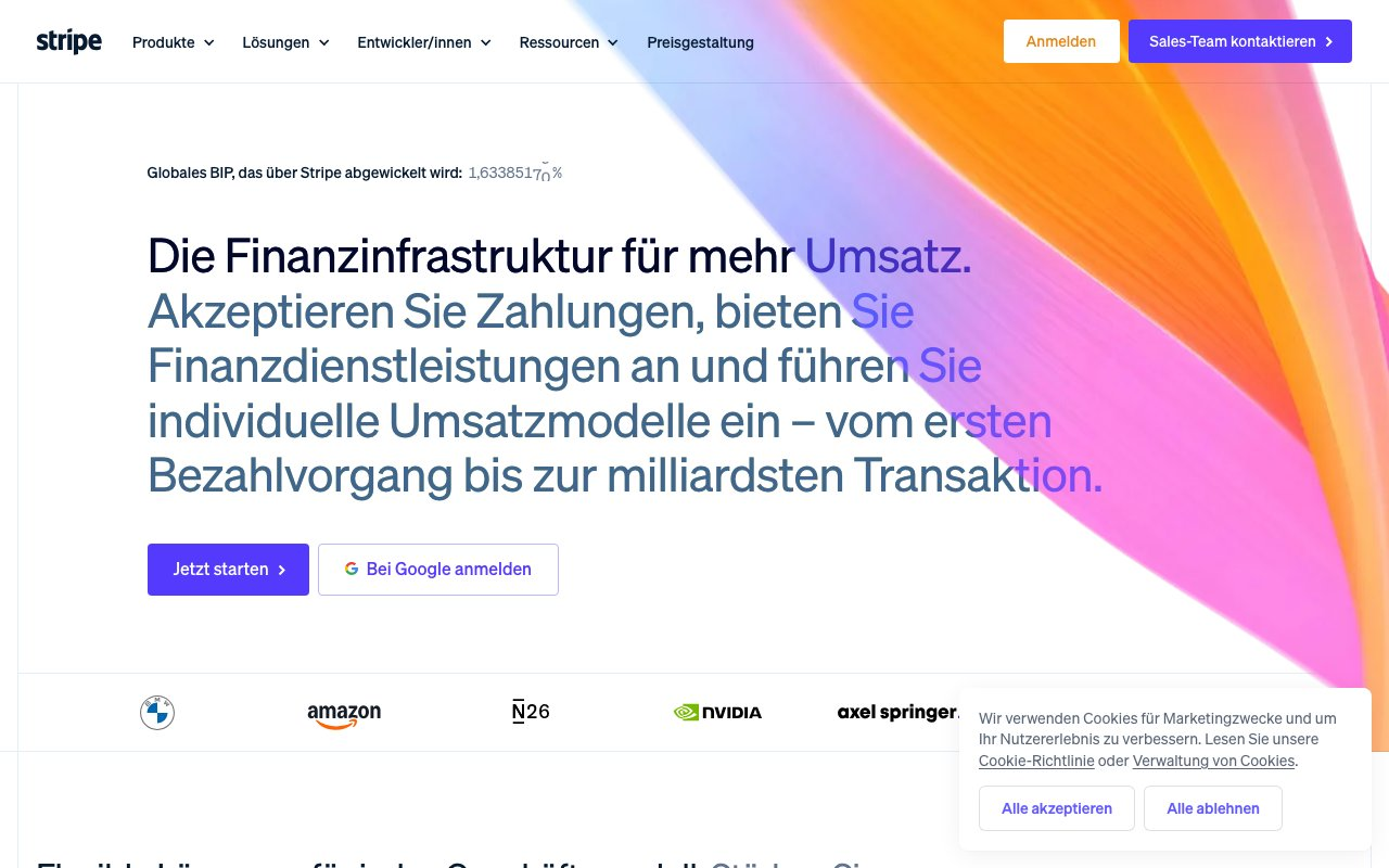
The website's headline and subheadline repeat the phrase 'Financial infrastructure to grow your revenue' but lack a clear, differentiated value proposition that immediately communicates Stripe's unique benefits. This repetition without elaboration may cause visitors to miss the compelling reasons to choose Stripe over competitors, potentially reducing conversion rates and pipeline growth. Clear articulation of how Stripe uniquely solves customer pain points or delivers ROI is essential to engage prospects quickly.
Calls to action such as 'Start now', 'Get started', and 'Contact sales' are present but scattered and lack strong contextual support or urgency. The CTAs are not consistently prominent or compelling, which can reduce click-through rates and lead capture effectiveness. Without clear, persuasive CTAs aligned with visitor intent, potential customers may hesitate or abandon the site, negatively impacting conversion.
While the site lists impressive metrics such as '$1.9T in payments volume' and '135+ currencies supported', these are presented without contextual explanation or easy-to-scan formatting. Additionally, customer logos and case studies are referenced but lack visible integration or storytelling in the text content. This reduces the effectiveness of trust signals that reassure prospects about Stripe's reliability and scale, potentially lowering conversion rates.
The content includes multiple repeated phrases, mixed languages, and dense blocks of text with overlapping information. This complexity and lack of clear hierarchy can overwhelm visitors and reduce engagement. Visitors may struggle to quickly understand Stripe's offerings and benefits, increasing bounce rates and reducing the likelihood of conversion.
Pricing is linked but not summarized or highlighted on the homepage, and product descriptions are brief and scattered. Visitors seeking quick pricing or detailed product information may find it difficult to locate or understand these critical details, potentially causing frustration and drop-off before conversion.
Want to unlock the full CRO report?
Get access to all recommendations, benchmarks, and experiment ideas.
- All 21 prioritised CRO suggestions with experiment ideas
- Industry benchmarks for your category & traffic level
- Discoverability (SEO + GEO) full audit results
- A/B test hypotheses ready to implement
- Personalised session with a CRO specialist
⚠️ Important Note
This audit is based on an automated and heuristic-based analysis of publicly accessible pages. The evaluation follows industry best practices across conversion rate optimization (CRO), usability, analytics, and discoverability.
The findings presented here are directional and indicative in nature. They do not take into account internal data such as revenue performance, customer lifetime value, traffic quality, seasonality, or proprietary testing.
Recommendations should be interpreted as optimization opportunities rather than absolute assessments. Actual impact may vary depending on audience composition, acquisition channels, and business context. This report is not exhaustive and should be used as a starting point for further analysis and experimentation.