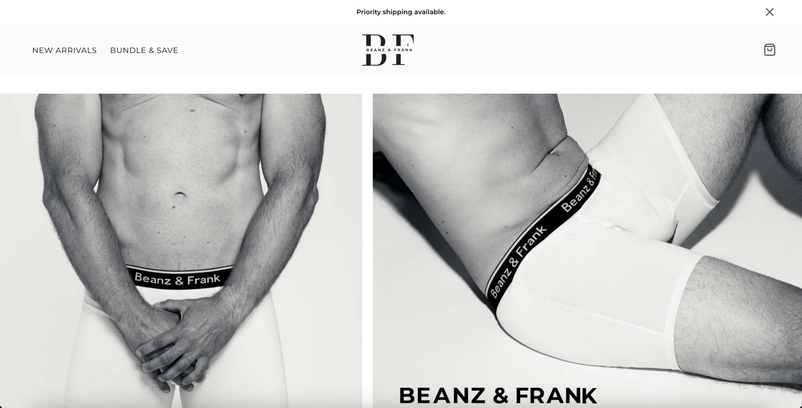
The homepage prioritizes large aesthetic imagery and brand mood before presenting a structured buying path. There is no early dominance of best sellers, starter bundles, or a clear “start here” directive within the first scroll. Product discovery feels passive rather than guided. The layout behaves like a lookbook instead of a revenue funnel. This increases cognitive effort for high-intent visitors who expect directional clarity. In mixed-traffic environments, that friction suppresses early purchase momentum.
“Bundle & Save” exists in navigation and cross-sells appear on product pages, but bundles are not framed as the default buying option. Single-unit purchase appears to be the primary flow. In a replenishable apparel category, multi-unit buying should be architecturally prioritized. The absence of strong bundle bias limits basket expansion during peak intent. AOV leverage is not embedded into the navigation logic. This structurally caps revenue per session.
The hero messaging emphasizes hype and brand energy without articulating a clear functional advantage. There is no visible technical breakdown of fabric composition, fit engineering, durability performance, or differentiation against competitors. In a commodity category, mechanism clarity is essential to justify price and create defensibility. Without it, visitors default to brand comparison and price sensitivity. This weakens perceived superiority. Emotional positioning alone cannot sustain conversion lift at scale.
Above-the-fold areas lack strong reinforcement of guarantees, shipping clarity, return ease, or durability assurances. Reviews are present but not structurally leveraged to reduce friction early in the evaluation process. Intimate apparel purchases trigger fit anxiety and hygiene hesitation. If these objections are not neutralized proactively, friction compounds. The current structure requires visitors to seek reassurance rather than being served it. This increases abandonment probability.
Product descriptions are concise but do not address key friction drivers: shrinkage, waistband longevity, ride-up prevention, breathability, seam durability, or wash resilience. Visual emphasis does not prominently showcase stitching, construction detail, or material texture. The persuasive layer is emotionally light and rationally thin. Buyers are left to infer performance claims. In apparel, lack of technical reinforcement lowers first-time buyer confidence. This directly reduces conversion rate.
Homepage and product copy are minimal and feature-light. There is limited expansion into problem-based queries such as “no ride up boxer briefs” or “breathable underwear for workouts.” Without use-case language and semantic layering, the site cannot capture high-intent organic search beyond branded terms. This constrains organic acquisition scalability. Paid channels become disproportionately relied upon. That increases CAC sensitivity.
The FAQ page returns a 404, removing a key mid- and bottom-funnel asset. FAQs capture transactional queries related to sizing, washing, returns, and durability. They also serve as friction-reduction reinforcement during product evaluation. Its absence harms both SEO and conversion reassurance. This is a structural revenue leak. It affects acquisition and on-site confidence simultaneously. The FAQ layer is not treated as a strategic acquisition and conversion asset, resulting in both semantic visibility gaps and unresolved buyer objections during evaluation.
The product environment lacks urgency cues, stock indicators, demand signals, or progressive micro-commitments. The CTA structure is clean but not behaviorally reinforcing. There are no visible scarcity or momentum drivers to accelerate decision-making. In low-consideration apparel, small urgency multipliers materially lift CR. A neutral interface increases browsing duration but reduces commitment velocity. This elevates abandonment rates.
- All 21 prioritised CRO suggestions with experiment ideas
- Industry benchmarks for your category & traffic level
- Discoverability (SEO + GEO) full audit results
- A/B test hypotheses ready to implement
- Personalised session with a CRO specialist
The findings presented here are directional and indicative in nature. They do not take into account internal data such as revenue performance, customer lifetime value, traffic quality, seasonality, or proprietary testing.
Recommendations should be interpreted as optimization opportunities rather than absolute assessments. Actual impact may vary depending on audience composition, acquisition channels, and business context. This report is not exhaustive and should be used as a starting point for further analysis and experimentation.