Chefio
https://www.chefio.co/
Conversion Rate Optimization audit summary
Last audit performed on Feb 04, 2026
Analyzed version 1.0
CRO index
Conversion & growth
42%
based on 67 total criteria
Analytics & tracking
45%
based on 43 total criteria
UX & engagement
30%
based on 34 total criteria
Discoverability (SEO + GEO)
Unavailable for non customers
We have 21 CRO suggestions for you
Unlock all with a personalized session with our team
Improvement suggestions
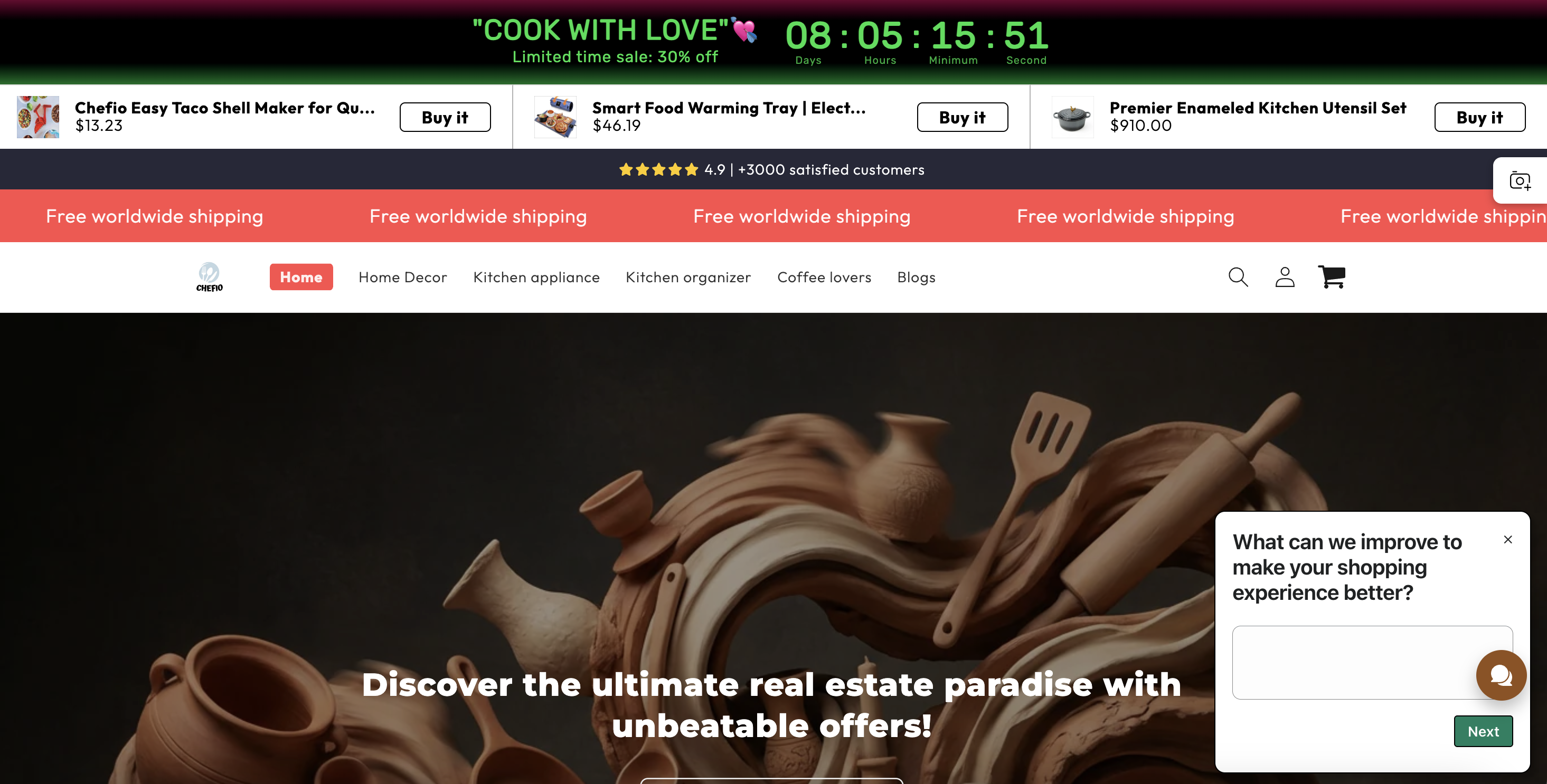
1. Low-quality and inconsistent product imagery
CriticalSeveral product images appear low-resolution, poorly cropped, or visually inconsistent across sections. Some look like supplier stock images, others feel stretched or overly compressed, and some lack context of real use. This creates immediate friction in a B2C retail context where visual evaluation is a primary decision driver.
For home and kitchen products, image quality directly anchors price perception and trust. Poor visuals lower perceived product quality and increase doubt about durability, materials, and legitimacy. Improving this means treating imagery as a conversion asset: clear, high-resolution visuals that show the product in use, at the right scale, and consistently across listings to support confident purchase decisions.
2. No clear CTA hierarchy creates decision paralysis
CriticalCTAs vary heavily in color, size, copy, and behavior. Red, black, and white buttons are used interchangeably for actions with the same intent, while some CTAs animate or pop and others do not. As a result, users cannot quickly distinguish between primary actions (buy, add to cart) and secondary ones (learn more, view options).
This increases cognitive load and slows decision-making, especially on scroll-heavy pages. Conversion improves when users are guided, not overwhelmed. Establishing a clear primary CTA style and a restrained secondary style will reduce friction and make the next step obvious at every point in the journey.
3. Excessive attention-grabbing elements
CriticalMultiple elements simultaneously demand attention above the fold: countdown timers, promo bars, carousels, product sliders, pop-ups, chat widgets, and image search overlays. These elements compete rather than reinforce a single narrative or action, resulting in a chaotic first impression.
Above-the-fold space should answer one question clearly: “What is this site and what should I do next?” Right now, the answer is fragmented. Reducing visual noise and prioritizing dominant products and action will improve comprehension, lower bounce risk, and create a calmer, more conversion-friendly entry point.
4. Displaying negative or lukewarm reviews
CriticalSome customer reviews surfaced on the homepage and product sections highlight mediocre quality or limitations of the products. While transparency is important, these reviews are shown without framing, filtering, or reassurance, and are placed in high-visibility areas.
In early-stage browsing, users look for reassurance, not balance. Exposing doubts before value is established increases perceived risk and hesitation. Reviews should reinforce confidence at this stage. The improvement here is not hiding feedback, but curating and positioning it strategically so social proof supports conversion rather than undermines it.
5. Navigation structure is unclear and poorly aligned with user intent
HighThe main navigation mixes product categories, lifestyle labels, and vague groupings without a clear logic. Categories like “Kitchen appliance,” “Kitchen organizer,” and “Coffee lovers” overlap conceptually, while others such as “Home Decor” introduce a different shopping mindset altogether. This makes it hard for users to predict what they’ll find before clicking.
For B2C retail, navigation should reduce thinking, not add to it. When users struggle to classify products mentally, they hesitate or abandon exploration altogether. Improving this means restructuring navigation around how users actually shop (use cases, product types, or problems solved) so visitors can immediately orient themselves and move deeper into the catalog.
6. No clear information scent between sections and products
HighSection headlines, imagery, and CTAs often feel disconnected from the products that follow. For example, aspirational statements (“Transform your kitchen today!”) or generic promises appear without clearly tying to specific product categories or benefits below them.
This breaks the information scent. Users scroll expecting continuity, but instead have to re-interpret context repeatedly. For conversion, every section should logically answer “why am I seeing this now?” Strengthening the link between section messaging and the products it introduces will keep users oriented and moving forward instead of scanning aimlessly.
7. Missing reassurance at key decision points
HighWhile guarantees and shipping promises exist, they are scattered and not consistently placed near moments of commitment (for example, near CTAs or price displays). Users often need to scroll or infer reassurance details rather than having them reinforced contextually.
At the moment of action, doubt is highest. Reinforcing trust signals exactly when users are asked to click or pay reduces hesitation and drop-off. Aligning reassurance with intent-heavy moments improves perceived safety and conversion likelihood.
8. Multiple overlapping popups interrupt the purchase flow
HighThe product page displays several intrusive elements at the same time: a review tooltip, a satisfaction survey popup, chat/help prompts, and floating UI elements. These overlap the main content and CTA area, forcing users to mentally and visually dismiss noise before they can even focus on the product.
On a PDP, the user intent is high and fragile. Interrupting that moment increases frustration and hesitation, especially on mobile. Reducing concurrent interruptions and reserving popups for post-action or exit moments would significantly improve focus, flow, and add-to-cart rate.
Want to unlock the full CRO report?
Get access to all recommendations, benchmarks, and experiment ideas.
Unlock full accessAdapt calls-to-action based on user readiness
CriticalAll visitors are presented with the same primary CTA regardless of engagement level.
Guide undecided users with progressive interactions
HighUsers showing exploration behavior are not guided toward soft commitment actions.
Reduce friction at high-intent conversion points
CriticalHigh-intent visitors face the same experience as early-stage users.
Important note
This audit is based on an automated and heuristic-based analysis of publicly accessible pages. The evaluation follows industry best practices across conversion rate optimization (CRO), usability, analytics, and discoverability.
The findings presented here are directional and indicative in nature. They do not take into account internal data such as revenue performance, customer lifetime value, traffic quality, seasonality, or proprietary tooling.
Recommendations should be interpreted as optimization opportunities rather than absolute assessments. Actual impact may vary depending on audience composition, acquisition channels, and business context.
This report is not exhaustive and should be used as a starting point for further analysis and experimentation.