
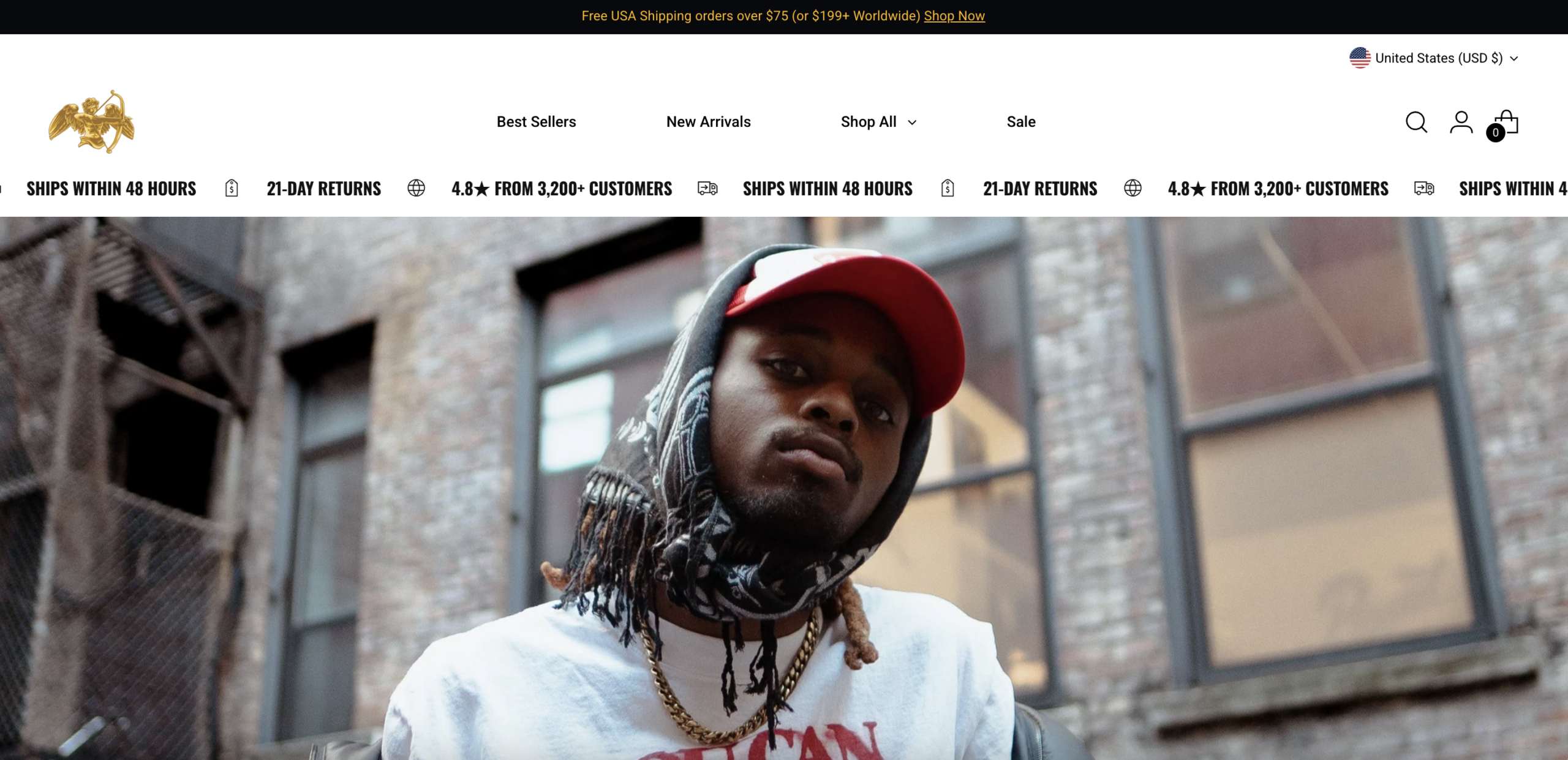
The hero is a full-bleed lifestyle photograph with no headline overlay, no CTA button, and no product identification visible above the fold. Visitors arriving from paid social or organic search have between five and eight seconds to confirm they are in the right place and understand what action to take next. Neither condition is met. The scrolling trust ticker below the image provides legitimacy signals, but these appear after the critical identity-formation window has already closed. A hero that communicates nothing actionable asks visitors to do interpretive work that most cold-traffic users will not perform — they will leave instead.
The phrase "built different" appears as the brand's primary positioning statement across the homepage, but there is no mechanism anywhere on the page explaining what the brand does differently compared to the hundreds of competing graphic tee labels. The claim is presented as self-evident. In a category saturated with identity-forward brands making identical assertions — authenticity, culture, rebellion, purpose — an unsubstantiated differentiation statement carries zero persuasion weight with cold traffic. The social proof bar (4.8 stars, 3,200+ customers) validates legitimacy but does nothing to differentiate the brand from any other well-reviewed apparel label.
Product pages display a sale price alongside a struck-through original price, but there is no percentage savings callout, no stock scarcity signal, no limited-edition framing, and no time-bound offer anchoring the discount. In streetwear specifically, scarcity and exclusivity are among the highest-leverage purchase accelerants available — the category runs on drops, restricted quantities, and social proof of demand. The current pricing structure presents a static number with no psychological tension around it. It removes the primary urgency mechanism that the brand's own visual identity is implicitly trying to invoke.
The navigation presents "Best Sellers," "New Arrivals," "Shop All," and "Sale" as four equal-weight destinations with no featured collection callout, no bestseller highlighted in the hero, and no directional text guiding first-time visitors toward an entry point. High-intent visitors arriving from discovery channels — paid social, influencer traffic, organic — who have not made a prior brand decision need commercial signposting to begin their evaluation. Without it, they default to self-navigation across an uncurated catalogue, which increases cognitive load and reduces time-to-add-to-cart.
The cross-sell section on product pages appears below a video embed, requiring significant scroll depth to reach. It presents related items in a static grid without outfit-completion framing, bundle pricing, or an "add both" mechanic. Cross-sells positioned after the add-to-cart zone consistently underperform those positioned before it in AOV contribution, because the buyer's decision momentum has already been spent. There is also no bundle incentive anywhere on the homepage or product pages that creates a financial reason to purchase multiple items in a single session.
Product pages present all key persuasion content — design rationale, materials and construction details, fit notes, size guidance, and returns policy — collapsed inside accordion tabs that require active clicks to open. First-time buyers evaluating a $45–$50 graphic tee need immediate access to material quality and fit information to justify the price point against cheaper alternatives available in two clicks elsewhere. Collapsed content forces deliberate effort to extract the information required to convert. Buyers who do not open the accordions leave with unresolved objections; the research literature is consistent that unexplored product content is among the leading drivers of apparel page abandonment.
The homepage features an Instagram UGC grid, which is one of the strongest available social proof formats in streetwear — community-worn imagery triggers identity validation and purchase intent simultaneously. However, the section functions as a visual content block only: no items are tagged, no looks are linked to product pages, and no "shop this look" CTA is present. Shoppers who find validation in a specific community image and want to replicate that fit have no frictionless path from the UGC to the product. The highest-intent social proof signal on the page converts to a dead end instead of to a transaction.
Homepage and product copy is visually brief and emotionally oriented, with minimal expansion into the descriptive language that powers organic search performance. High-intent, non-branded queries — "graphic tees with meaningful messages," "streetwear with spiritual themes," "urban faith-based apparel," "oversized vintage tees with storytelling" — are not addressed in visible body copy, category descriptions, or product narratives. The design language and story positioning of the brand map directly to specific long-tail search segments that go entirely uncaptured. The site appears dependent on paid social and branded direct traffic, concentrating acquisition risk in channels that do not compound over time the way organic rankings do.
- All 21 prioritised CRO suggestions with experiment ideas
- Industry benchmarks for your category & traffic level
- Discoverability (SEO + GEO) full audit results
- A/B test hypotheses ready to implement
- Personalised session with a CRO specialist
The findings presented here are directional and indicative in nature. They do not take into account internal data such as revenue performance, customer lifetime value, traffic quality, seasonality, or proprietary testing.
Recommendations should be interpreted as optimization opportunities rather than absolute assessments. Actual impact may vary depending on audience composition, acquisition channels, and business context. This report is not exhaustive and should be used as a starting point for further analysis and experimentation.