
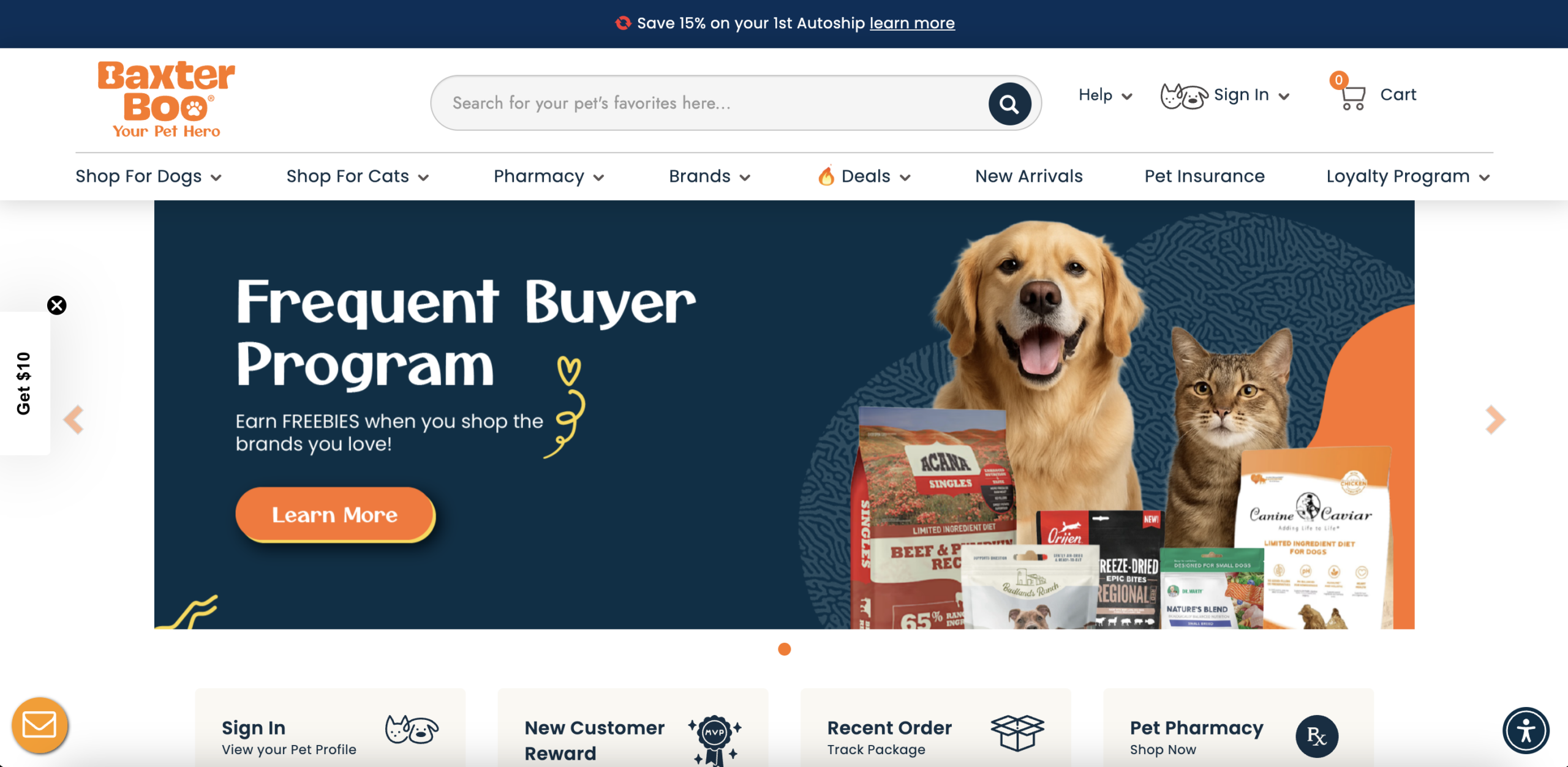
The first screen a visitor encounters promotes the brand's frequent buyer reward program, a retention mechanic that addresses customers who have already purchased. First-time visitors arriving from paid social or organic search are in a fundamentally different decision state: they need to understand why they should buy here at all, before any loyalty construct becomes relevant. The hero slides contain no positioning statement differentiating the brand from category dominants, no trust signal hierarchy, and no directional CTA that guides intent-based visitors toward a purchase path. Within the critical five-to-eight-second evaluation window, the site presents a program for its existing base to a visitor who has not yet made a single transaction.
The homepage contains no statement explaining why a pet owner should choose this retailer over category giants or direct-brand storefronts. The tagline "Your Pet Hero" is emotionally warm but functionally empty: it conveys no concrete advantage, no category-specific credential, and no mechanism that makes switching from an established competitor rational. In a market where pricing, delivery speed, and product range are largely commoditized by dominant players, differentiation must be structural and explicit. Without a clear reason-to-choose anchored above the fold, the site competes on the weakest possible basis, familiarity, which it cannot win as a challenger brand.
The subscription autoship offer, one of the highest-leverage revenue mechanics in recurring-purchase e-commerce categories like pet supplies, appears only as a thin banner above the navigation. It is the first element users are trained to ignore or close. Nowhere else on the homepage is the autoship program reinforced with specificity: how it works, what savings accumulate over a year, how flexible the delivery schedule is, or what the cancellation terms are. Subscription programs in pet retail operate on a compounding customer lifetime value model. Reducing the entry point for that programme to a dismissible text line suppresses subscription adoption and caps the revenue ceiling per customer acquired.
Category pages present a dense grid of products extending across many rows, with no visible attribute filters, life-stage selectors, dietary requirement flags, or any guided navigation layer that helps a visitor move from browse intent to a specific product match. Pet supply purchasing is high-consideration: breed, size, age, dietary restriction, and ingredient preference all drive the decision. Without a filtering architecture that allows buyers to narrow a large catalogue to their specific animal's needs, visitors face decision paralysis. Cognitive overload in unfiltered product grids consistently correlates with increased bounce rate and reduced add-to-cart action, particularly among first-time buyers.
The homepage contains more than ten distinct content sections: top categories, editorial feature blocks, new arrivals, a flea and tick strip, trending products, a loyalty section, coupon deals, a brand directory, a freeze-dried food segment, a secondary brand roster, a "why buy here" block, customer reviews, an FAQ, and an expert credentials section. Each section introduces new decision variables and visual treatments that compete for attention without a clear hierarchy guiding visitors toward a single next action. In e-commerce, homepage scrolling should function as a persuasion sequence that progressively qualifies and commits intent. What exists here functions as a catalogue magazine, not a sales engine.
Product pages devote a substantial portion of the visible content area to brand origin stories, founder narratives, mission statements, and ingredient philosophy sections, positioned immediately below the purchase module. While brand storytelling contributes to perceived premium positioning over time, it displaces the content that directly converts high-intent buyers: specific product attributes, feeding guidance, size-to-breed matching logic, ingredient breakdown, and objection-handling details. A visitor who has reached a product page has already expressed category intent. The remaining conversion barrier is product-specific confidence, not brand affinity, and the page structure prioritises the latter over the former.
Customer testimonials, "what our customers are saying" content, and expert credentials appear in the lower third of the homepage, well below the fold and after a sequence of category merchandising, brand directories, and promotional strips. Social proof is most effective when it surfaces at the precise moment a visitor's confidence wavers, typically within the first two to three scroll depths on a homepage for a brand they have not previously purchased from. Placing it at the bottom rewards visitors who have already committed enough attention to scroll the full page, and does nothing for the majority who do not. The FAQ section is similarly buried, meaning objections are raised and abandoned before any resolution is offered.
The primary navigation presents pet insurance and a pharmacy as co-equal menu items alongside product shopping categories. For a cold visitor arriving from a search query or a paid social ad, the presence of insurance and pharmaceutical services raises immediate categorisation questions: is this a retailer, a healthcare provider, or an insurance aggregator? This ambiguity increases cognitive load before any product or category page is reached and reduces the topical authority signal the site sends to search engines. From an organic search perspective, a domain that indexes across product retail, pharmaceutical sales, and insurance products struggles to build concentrated relevance in any single category, fragmenting the authority needed to compete on high-volume pet supply terms.
- All 21 prioritised CRO suggestions with experiment ideas
- Industry benchmarks for your category & traffic level
- Discoverability (SEO + GEO) full audit results
- A/B test hypotheses ready to implement
- Personalised session with a CRO specialist
The findings presented here are directional and indicative in nature. They do not take into account internal data such as revenue performance, customer lifetime value, traffic quality, seasonality, or proprietary testing.
Recommendations should be interpreted as optimization opportunities rather than absolute assessments. Actual impact may vary depending on audience composition, acquisition channels, and business context. This report is not exhaustive and should be used as a starting point for further analysis and experimentation.