
Bread Financial
https://www.breadfinancial.com/
Conversion Rate Optimization audit summary
Last audit performed on Feb 25, 2026
Analyzed version 1.0
CRO index
Conversion & growth
46%
based on 67 total criteria
Analytics & tracking
58%
based on 43 total criteria
UX & engagement
42%
based on 34 total criteria
Discoverability (SEO + GEO)
Unavailable for non customers
We have 21 CRO suggestions for you
Unlock all with a personalized session with our team
Improvement suggestions
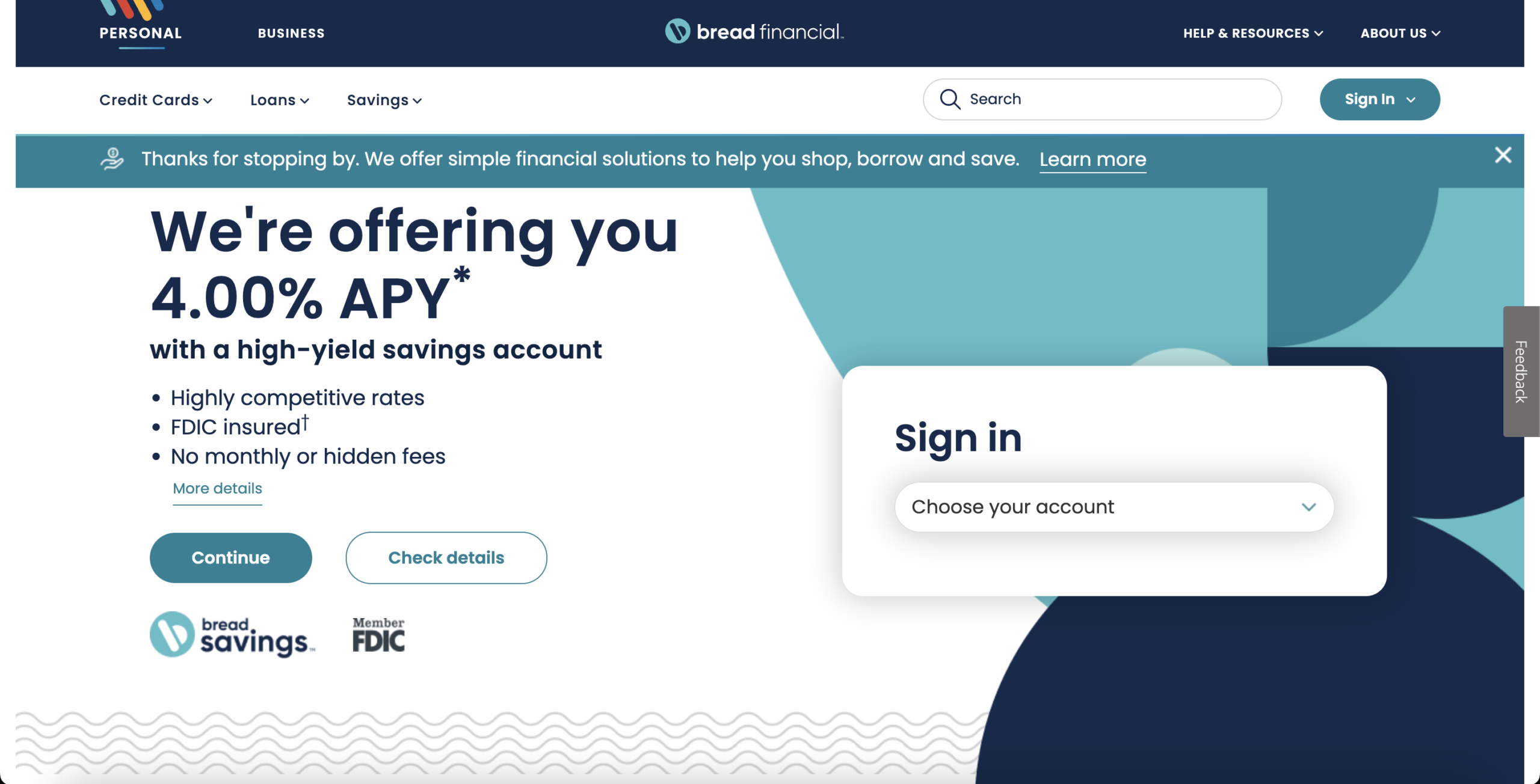
1. No Clear Primary Conversion Path for New Users
CriticalAcross the homepage, there are multiple CTAs: “Continue,” “Check details,” “Open an account,” “Learn more,” “Compare CDs,” “Explore our resources,” and more. There is no clearly dominant acquisition CTA aligned to a single product journey. Funnel psychology requires progressive narrowing. Here, the page expands options instead of guiding commitment.
This creates measurable pipeline leakage by diffusing momentum. Instead of driving users into a single application flow, traffic disperses into exploration. That increases bounce rate, reduces application completions, and inflates CAC due to non-linear journeys.
2. Product Portfolio Overexposure Without Segmentation
CriticalThe homepage promotes savings, credit cards, pay-over-time financing, financial education, and multiple branded credit programs (PlayStation, AAA, Academy, etc.). While portfolio breadth signals scale, it lacks segmentation by user need state. There is no visible “I want to save,” “I want a card,” or “I need financing” decision gate early in the journey.
This broad targeting increases over-attraction and under-qualification risk. Users unsure which product fits their need must self-navigate. Friction increases abandonment. Lead quality may also suffer if applications begin from exploratory rather than committed intent.
3. Limited Objection Handling at Point of Interest
CriticalSavings claims include “FDIC insured,” “No hidden fees,” and “Highly competitive rates,” but common objections (liquidity access, transfer speed, account minimums beyond $1,500, early withdrawal penalties) are not visibly addressed in the hero or immediate section. Credit card sections similarly emphasize rewards but lack transparent APR or qualification clarity in visible areas.
Unanswered objections increase hesitation. In financial services, trust acceleration is directly tied to objection density. The lack of pre-handling increases abandonment during consideration and elongates the decision cycle.
4. Absence of Customer Testimonials or Experiential Social Proof
CriticalAcross both the homepage and product pages, there are no visible customer testimonials, user quotes, ratings, reviews, or satisfaction metrics. Trust signals are institutional (FDIC insured, brand partnerships such as PlayStation, AAA, Academy), but there is no peer validation. In financial services, trust operates on two levels: regulatory credibility and experiential reassurance. The site demonstrates the former but not the latter. For cold traffic, especially rate-shopping or credit-shopping users, social proof from real customers reduces perceived risk and increases commitment confidence.
The absence of testimonials likely reduces application starts and increases hesitation during consideration. Without visible evidence of positive user experience, visitors must rely solely on brand positioning and product features. This increases comparison behavior, extends decision cycles, and may lower completed applications. Over time, this impacts conversion rate, increases paid acquisition waste, and reduces trust acceleration for first-time customers.
5. Limited SEO Depth for High-Intent Financial Queries
HighThe visible content prioritizes product presentation and navigation over search-intent depth. While there are strong commercial anchors like “4.00% APY,” “high-yield savings account,” and branded credit card names, there is limited visible explanatory content, comparison context, FAQs, or structured benefit breakdowns targeting long-tail financial queries (e.g., “best high yield savings account with no fees,” “AAA Visa credit card APR,” “minimum deposit for high yield savings”). The content appears conversion-oriented but not semantically rich enough to dominate competitive organic finance SERPs.
This likely restricts organic acquisition to branded or high-level product terms while underperforming for mid- and bottom-funnel informational-commercial hybrid searches. In a high-CAC industry like financial services, weak long-tail capture increases dependence on paid traffic, inflates acquisition costs, and reduces pipeline efficiency. Without deeper topical authority signals, the site risks losing intent-rich organic traffic to comparison sites and fintech competitors with more content depth.
6. Overloaded Product Grid Dilutes Decision Focus
HighThe homepage design presents multiple financial products in parallel blocks: savings accounts, CDs, branded credit cards, pay-over-time financing, education resources, and more. Visually, these are structured as equal-weight modules without a dominant primary pathway. This creates what is effectively a financial product catalog rather than a conversion-oriented journey. In decision psychology, when users are presented with multiple high-stakes options simultaneously without guided prioritization, choice paralysis increases and action probability decreases.
From a pipeline standpoint, this likely reduces account openings and credit applications because the interface promotes exploration over commitment. Instead of deepening interest in one offer, attention fragments across categories. That increases bounce rates, reduces application starts, and inflates acquisition costs, particularly for paid traffic that arrives with specific intent.
7. Low-Resolution Visual Assets Undermine Perceived Professionalism
HighProduct and interface imagery appear soft and low resolution, particularly in the credit card visuals and certain homepage modules. In financial services, visual sharpness signals operational precision and institutional reliability. Subconsciously, users equate clarity in presentation with clarity in operations. When visuals appear compressed or blurred, especially for financial products, it introduces subtle credibility friction.
This weakens trust formation at the exact stage where users are evaluating whether to deposit funds or apply for credit. Even minor reductions in perceived professionalism can reduce application initiation rates and increase comparison behavior. In competitive financial categories, trust fragility directly impacts conversion rate and paid traffic efficiency, as users default to brands that visually signal higher institutional stability.
8. Limited Educational Framing for First-Time Financial Decision Makers
HighWhile the homepage includes a “Financial education” section, the core product presentation assumes a level of prior knowledge. Terms like “APY,” “CDs,” “pay over time,” and multiple branded credit programs are introduced without visible contextual simplification or beginner-friendly explanation near the decision points. For first-time savers or credit applicants, financial terminology creates cognitive load. When understanding is incomplete, perceived risk increases.
This creates pipeline leakage among new-to-category users. Instead of progressing toward account opening or application, less financially confident visitors delay or abandon. Education content exists but is positioned as a separate resource rather than integrated into the product decision flow. That separation slows trust formation, reduces application starts from first-time users, and narrows the accessible market segment to more financially literate visitors only.
Want to unlock the full CRO report?
Get access to all recommendations, benchmarks, and experiment ideas.
Unlock full accessAdapt calls-to-action based on user readiness
CriticalAll visitors are presented with the same primary CTA regardless of engagement level.
Guide undecided users with progressive interactions
HighUsers showing exploration behavior are not guided toward soft commitment actions.
Reduce friction at high-intent conversion points
CriticalHigh-intent visitors face the same experience as early-stage users.
Important note
This audit is based on an automated and heuristic-based analysis of publicly accessible pages. The evaluation follows industry best practices across conversion rate optimization (CRO), usability, analytics, and discoverability.
The findings presented here are directional and indicative in nature. They do not take into account internal data such as revenue performance, customer lifetime value, traffic quality, seasonality, or proprietary tooling.
Recommendations should be interpreted as optimization opportunities rather than absolute assessments. Actual impact may vary depending on audience composition, acquisition channels, and business context.
This report is not exhaustive and should be used as a starting point for further analysis and experimentation.