
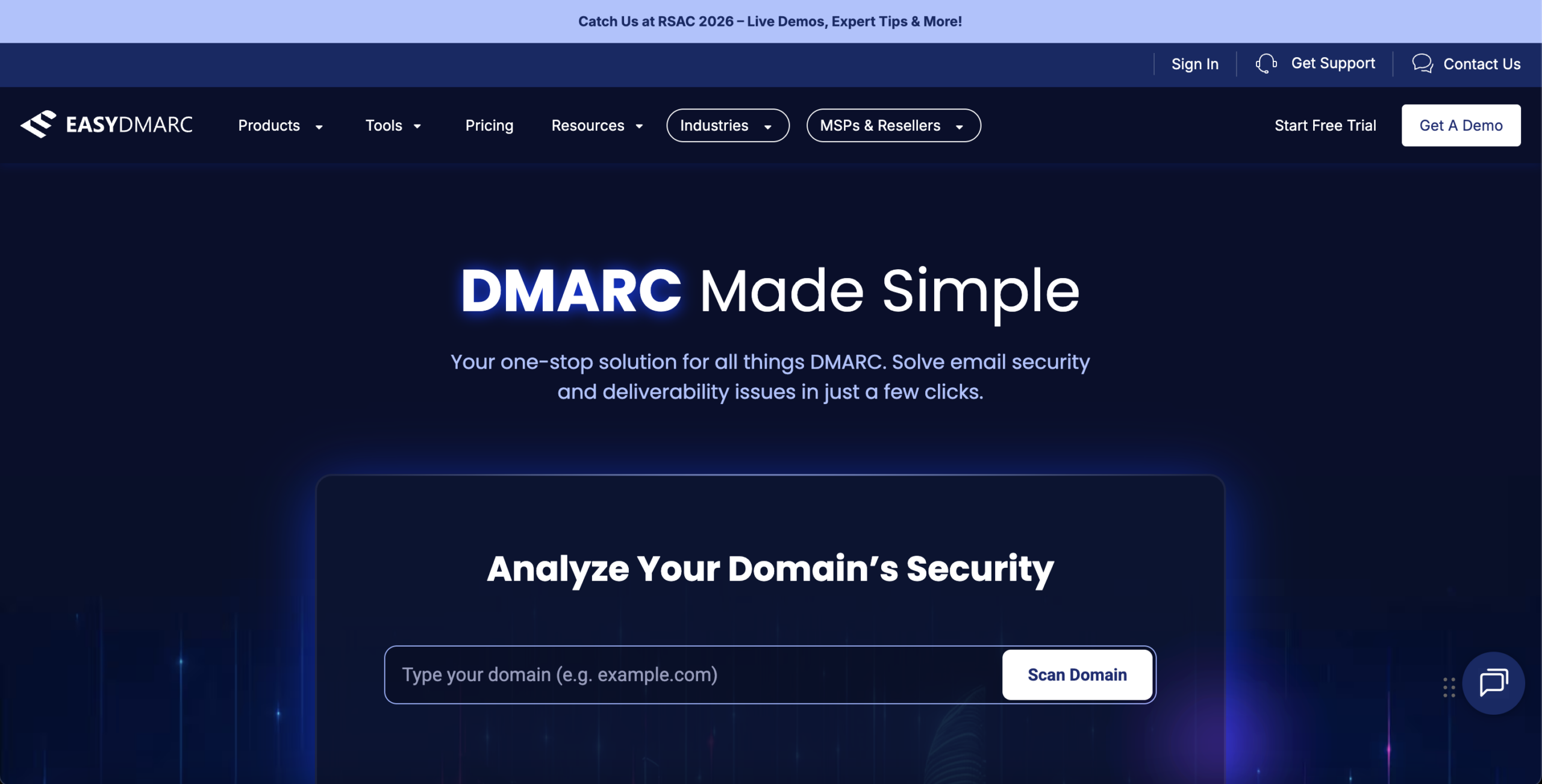
"DMARC Made Simple" positions the product around ease-of-use rather than the business consequence that actually motivates B2B buyers. Security and compliance decisions are driven by loss aversion — domain spoofing exposure, deliverability collapse, regulatory risk — not by the promise of simplicity. The subheadline compounds this by making a serious security problem sound trivial, inadvertently undermining urgency. High-intent visitors arriving from security-specific queries expect to see their threat reflected back at them, not reassured away.
Google and Yahoo's sender authentication mandates — one of the strongest externally-imposed urgency triggers available in this category — appear nowhere in the hero, primary CTAs, or lead gen page headline. A compliance requirement table exists mid-page but is framed as a feature explanation, not a business threat. Necessity-based conversion consistently outperforms interest-based conversion in compliance-driven SaaS categories. The site is currently running entirely on interest-based mechanics.
The demo request form requires seven fields — first name, last name, business email, phone number, country, employee count, and an open-text organizational description — before any value exchange occurs. There is no stated commitment promise (session length, deliverable, next step), no FAQ or objection-handling on the page, and no specificity about what the demo will reveal. In B2B conversion psychology, high-friction forms are only justified when preceded by a strong value articulation that makes the effort feel proportionate. That framing is absent.
"Start Free Trial" and "Get A Demo" are presented as visually near-equal options throughout the navigation. For a buyer who has not yet resolved whether they need a self-serve product or a guided enterprise sales experience, this forces a meta-decision that interrupts forward momentum. Additional CTAs appear at multiple scroll depths — domain scan widget, mid-page demo prompts — without a consistent intent hierarchy. Parallel CTAs of equal visual weight consistently reduce click-through to either option compared to a single primary CTA with a secondary ghost button.
The "Analyze Your Domain's Security" scan widget is the strongest self-qualification mechanism on the site — users who submit their domain have actively identified themselves as evaluators. However, there is no visible indication of what happens after submission: whether results trigger a sales sequence, what data is retained, or how findings connect to a demo or remediation path. If the scan result experience does not include risk severity framing and a direct next-action CTA, this high-intent signal is captured but not converted.
The homepage features G2 badges, media mentions, client logos, and statistics (380K+ domains, 27M+ attacks monitored), but visible testimonials are brief and non-specific. There are no case studies anchored to measurable outcomes — no "reduced spoofing incidents by X%," no "achieved DMARC enforcement in Y days," no "MSP scaled to W clients." In high-consideration B2B categories, outcome-specific proof is the most effective trust accelerant because it allows prospects to pattern-match their own situation to a validated result. Volume signals validate legitimacy; outcome stories drive decisions.
Below the demo form, the page presents an extensive "Meet Real People" directory of 25+ employee photos with titles. While humanizing the brand is a legitimate trust signal, this displaces the content that most directly converts motivated visitors: FAQ responses, objection pre-handling ("What happens to my data?", "How long does onboarding take?", "What if I'm partially configured already?"), and specific demo outcome promises. Buyers with unanswered concerns cannot self-resolve them and either abandon or submit with suppressed intent — reducing lead quality.
The EasySender solution page operates as a near-independent brand — distinct headline, its own "Get Started" CTA, separate pricing, and divergent visual framing — while sharing the EasyDMARC navigation shell. Beyond funnel fragmentation, this ambiguous brand architecture dilutes topical authority in organic search: crawlers and ranking algorithms struggle to assign clear subject-matter relevance when a domain hosts two competing product identities. Internal link equity is split, keyword targeting is diffuse, and the site cannot rank with full authority for either DMARC or email deliverability terms.
- All 21 prioritised CRO suggestions with experiment ideas
- Industry benchmarks for your category & traffic level
- Discoverability (SEO + GEO) full audit results
- A/B test hypotheses ready to implement
- Personalised session with a CRO specialist
The findings presented here are directional and indicative in nature. They do not take into account internal data such as revenue performance, customer lifetime value, traffic quality, seasonality, or proprietary testing.
Recommendations should be interpreted as optimization opportunities rather than absolute assessments. Actual impact may vary depending on audience composition, acquisition channels, and business context. This report is not exhaustive and should be used as a starting point for further analysis and experimentation.