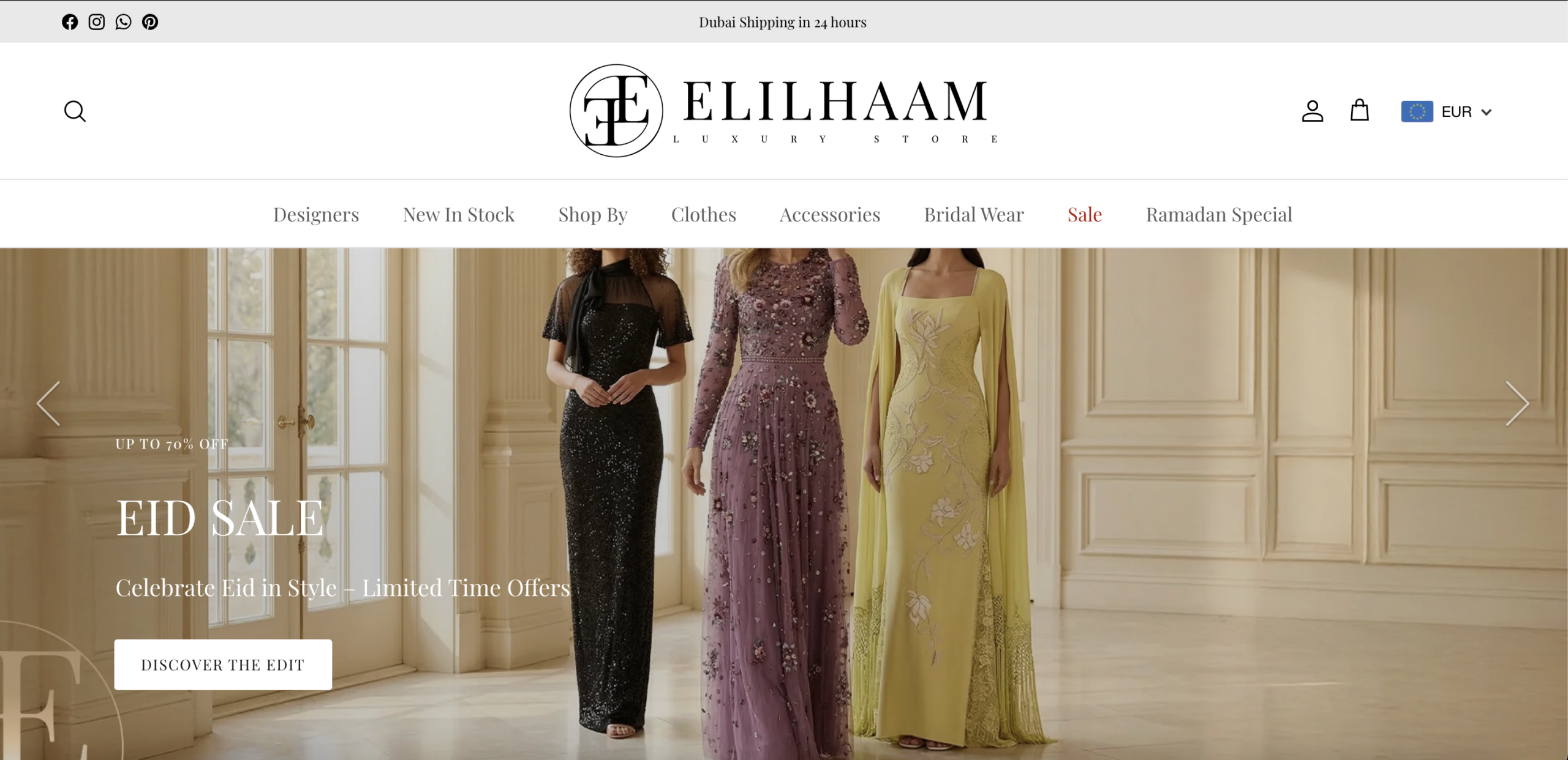
The homepage hero leads with a 70% off sale banner while the catalog simultaneously features made-to-order pieces priced above EUR 10,000. These two signals cannot coexist without material cost to perceived brand value. Discount mechanics condition buyers to anchor on reduced price, which directly suppresses willingness to pay for full-price luxury items encountered in the same session. The sale banner is the first visual impression, establishing the cognitive frame through which all subsequent product pages are evaluated — including the product pages where craftsmanship and designer exclusivity need to carry premium price acceptance without friction. A visitor conditioned by an aggressive discount headline will experience sticker resistance when encountering a five-figure garment with no intervening value justification.
The product page presents an 8–12 week delivery estimate and a no-returns policy in close proximity to the add-to-cart button, without any compensating trust architecture surrounding them. This combination represents the highest-friction purchase condition in luxury e-commerce: a permanent, irreversible financial commitment at a five-figure price point, for a product the buyer cannot physically inspect, that will arrive months after payment. The policy is disclosed but not reframed. There is no bespoke consultation language, no explicit fit accuracy guarantee, no alteration commitment, and no quality assurance promise visible within the purchase zone. From a buyer psychology standpoint, the page treats made-to-order as a logistical footnote rather than as the exclusive craftsmanship proposition it should be.
"Discover the Edit" is the primary conversion action anchoring the hero carousel. This language belongs to fashion publishing environments — editorial lookbooks, magazine features, brand campaigns — not to a transactional shopping surface. It provides no directional clarity: no indication of what category will open, what offer is accessible, or what value the visitor gains by clicking. High-intent buyers arriving with purchase readiness require a CTA that confirms the action is available and purposeful. The editorial framing adds brand aesthetic at the direct cost of purchase momentum. Visitors who arrive ready to buy but encounter no commercial directional signal are statistically more likely to passively browse or exit than to advance toward a product page.
On the product page, the description, delivery details, payment methods, and return policy are all collapsed behind accordion toggles and require an active click to access. At this price tier, the description is not supplementary content — it is the primary conversion asset. Fabric composition, construction technique, embellishment detail, designer provenance, and fit guidance are the justifications that allow a buyer to commit five figures to a garment they have never touched. Hiding this content requires buyers to actively seek reassurance. Buyers who scan passively — a significant majority — never receive the information they need to build conviction. The result is a persuasion gap precisely where purchase intent needs to be reinforced, not deferred.
Sizes are displayed in French sizing notation with a linked size guide, but no inline conversion table appears within the product page purchase zone. The announcement bar states Dubai shipping is available in 24 hours, the currency selector shows EUR, and the catalog includes international designer houses — all signals confirming the site actively serves buyers across multiple geographies and sizing conventions. French sizing is unfamiliar to buyers accustomed to UK, US, Italian, or Asian standards. At a price point where size certainty is the primary purchase prerequisite — compounded by a no-returns policy — the absence of an immediately accessible, inline conversion reference creates a friction point that directly triggers abandonment. Buyers who cannot resolve fit confidence without navigating away from the product page frequently do not return.
The option to message a personal stylist via WhatsApp appears as a small text link below the payment method options — a position that most buyers pass through after reaching their decision threshold, not before. For a luxury retailer selling made-to-order pieces with no return policy, human-assisted buying is not a convenience channel: it is the primary mechanism by which a five-figure purchase becomes safe to make. The WhatsApp touchpoint offers personalized sizing confirmation, styling guidance, delivery coordination, and relationship — precisely the signals that differentiate a curated boutique from an anonymous marketplace. Its subordinate placement communicates that it is an afterthought support link rather than a core brand promise, which is the inverse of its actual conversion value.
The "You May Also Like" section on the product page presents four alternative gowns — competing products at the same category level — rather than complementary accessories, evening footwear, clutches, or styling additions that would expand the order value of an already-committed buyer. In luxury fashion, a buyer who has reached the product page of a five-figure gown is psychologically primed for complementary investment: the mental accounting has already shifted into luxury mode, and the incremental cost of additions is perceived as proportionally small against the primary purchase. The current cross-sell logic presents replacement options — items that function as alternatives, not extensions — which risks redirecting momentum away from the primary product entirely rather than deepening the transaction.
The site carries exclusive and hard-to-find inventory from internationally recognized designer houses, surfaced on the product page via "More from [Designer]" navigation buttons. However, designer-specific category pages do not appear to be built or optimized for high-intent commercial search queries — such as "buy [designer name] gown online," "[designer] evening dress," or "[designer] bridal collection." These are among the highest-converting query types in luxury fashion e-commerce because they combine categorical intent with brand preference in a single signal: the visitor already knows what they want and is searching for where to buy it. The site holds the inventory to capture this audience but does not appear to be investing in the landing page architecture required to intercept it organically.
- All 21 prioritised CRO suggestions with experiment ideas
- Industry benchmarks for your category & traffic level
- Discoverability (SEO + GEO) full audit results
- A/B test hypotheses ready to implement
- Personalised session with a CRO specialist
The findings presented here are directional and indicative in nature. They do not take into account internal data such as revenue performance, customer lifetime value, traffic quality, seasonality, or proprietary testing.
Recommendations should be interpreted as optimization opportunities rather than absolute assessments. Actual impact may vary depending on audience composition, acquisition channels, and business context. This report is not exhaustive and should be used as a starting point for further analysis and experimentation.