
EverSettled
https://www.eversettled.com/
Conversion Rate Optimization audit summary
Last audit performed on Feb 11, 2026
Analyzed version 1.0
CRO index
Conversion & growth
30%
based on 67 total criteria
Analytics & tracking
55%
based on 43 total criteria
UX & engagement
56%
based on 34 total criteria
Discoverability (SEO + GEO)
Unavailable for non customers
We have 21 CRO suggestions for you
Unlock all with a personalized session with our team
Improvement suggestions
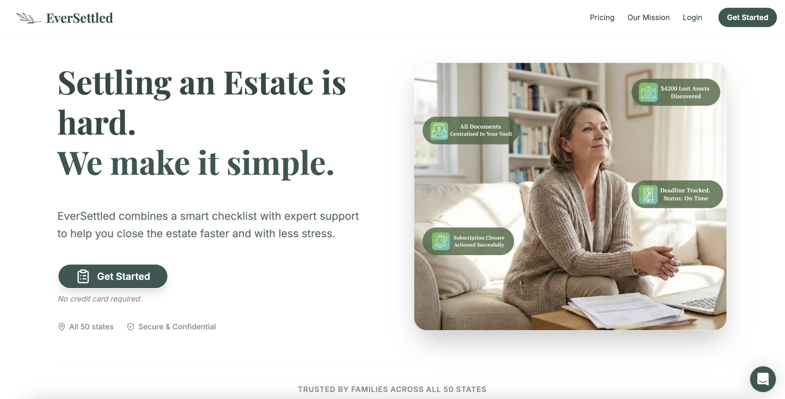
1. Intent mismatch: All CTAs route to /login
CriticalAll primary CTAs (“Get Started”, “Start Your Free Plan”, “Get Your Personalized Plan”, “Start Your 2-Week Free Trial”) ultimately route to a /login URL that presents “Create your free checklist.” This creates a severe intent mismatch. Users are not trying to “log in.” They are trying to start resolving a complex estate situation. The URL alone signals they may be in the wrong place.
This disconnect breaks psychological momentum at the most critical moment. When someone clicks “Start Your Free Plan” and lands on a generic login-style form, it introduces hesitation and doubt. That friction alone can dramatically increase abandonment, especially in a grief-sensitive category where clarity and reassurance are non-negotiable.
2. No clarity on what happens next
CriticalThe form does not explain what happens after account creation. There is no progression indicator, no “Step 1 of 3,” no explanation that users will answer questions to generate a personalized estate roadmap. The user is asked for personal information without understanding the immediate payoff.
This creates avoidable cognitive friction. At a moment where users need reassurance and structure, the experience feels open-ended. Any uncertainty at this stage significantly increases drop-off because the user imagines effort instead of seeing progress.
3. Inconsistent CTA language across funnel
CriticalHomepage CTAs include “Get Started,” “Start Your Free Plan,” “Get Your Personalized Plan,” and “Start Your 2-Week Free Trial.” The sign-up page shifts to “Create Free Account.” The hospice page uses “Become a Partner.” There is no consistent primary action language.
Inconsistency increases cognitive load. When the wording changes at each stage, users subconsciously question whether they are still pursuing the same offer. This fragmentation weakens the funnel and erodes conversion confidence.
4. Limited objection handling on homepage
CriticalThe homepage does not proactively address common concerns: contested estates, estates without a will, state-specific probate variations, or complexity concerns. The disclaimer “EverSettled is not a law firm and does not provide legal advice” appears in the footer but is not contextualized.
Without addressing these objections head-on, users are left to fill in gaps. In legal-adjacent services, unaddressed objections often translate into inaction. Silence is interpreted as uncertainty.
5. Thin content and limited topical authority
HighThe content is thin for a high-stakes category like estate settlement and probate. Core concepts are introduced but not developed in sufficient depth to demonstrate authority or fully address user intent. Key topics lack detailed explanations, supporting context, and comprehensive coverage.
In a category like estate settlement and probate, thin content signals limited authority. Google rewards depth in YMYL topics. When core pages lack comprehensive explanations of the “probate process,” “executor responsibilities,” timelines, or state-specific considerations, the site risks underperforming organically. Insufficient depth directly limits discoverability and perceived expertise.
6. No personalization or scenario-based entry points
HighThe product itself is positioned as a “smart checklist” that “adapts to your situation” yet the marketing layer does not adapt at all. There is no scenario-based entry, no branching questions, no “Which situation applies to you?” decision moment.
Without intent-based pathways, the experience remains generic. In high-emotion, high-stakes categories, generic equals friction. When visitors cannot immediately see themselves reflected in the experience, cognitive load increases and conversion likelihood drops.
Want to unlock the full CRO report?
Get access to all recommendations, benchmarks, and experiment ideas.
Unlock full accessAdapt calls-to-action based on user readiness
CriticalAll visitors are presented with the same primary CTA regardless of engagement level.
Guide undecided users with progressive interactions
HighUsers showing exploration behavior are not guided toward soft commitment actions.
Reduce friction at high-intent conversion points
CriticalHigh-intent visitors face the same experience as early-stage users.
Important note
This audit is based on an automated and heuristic-based analysis of publicly accessible pages. The evaluation follows industry best practices across conversion rate optimization (CRO), usability, analytics, and discoverability.
The findings presented here are directional and indicative in nature. They do not take into account internal data such as revenue performance, customer lifetime value, traffic quality, seasonality, or proprietary tooling.
Recommendations should be interpreted as optimization opportunities rather than absolute assessments. Actual impact may vary depending on audience composition, acquisition channels, and business context.
This report is not exhaustive and should be used as a starting point for further analysis and experimentation.