
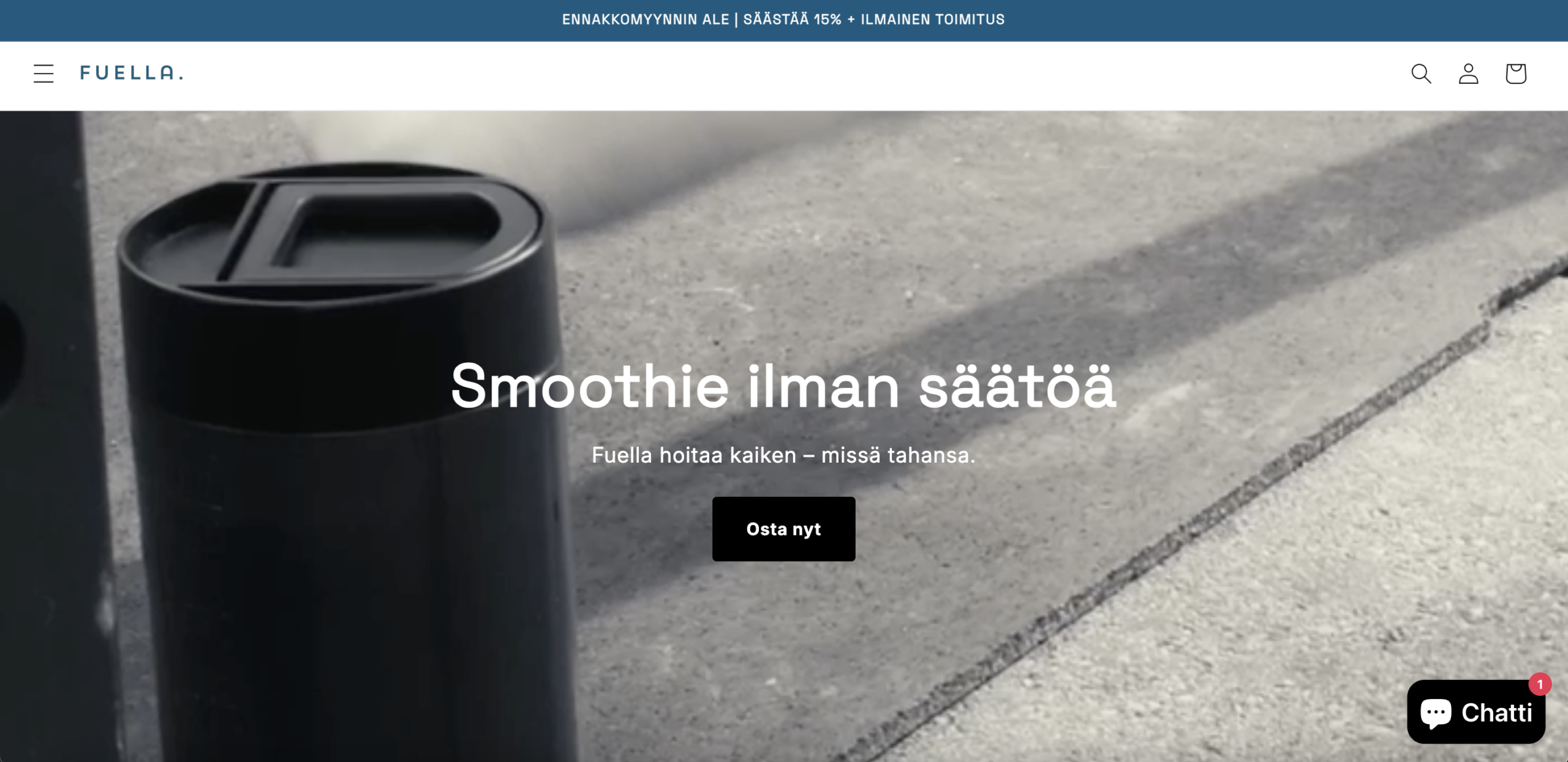
The hero section presents a heavily cropped, dark, and low-contrast image of the product, positioned far to the left of the frame and partially cut off, against a muted concrete background. Visitors arriving from paid social or cold search traffic have no prior brand context, and without clear product identification in the first visual pass, the brain defaults to confusion rather than continued evaluation. The headline is a benefit statement, not a category declaration, meaning first-time visitors cannot quickly confirm they are in the right place or understand what they are being invited to buy.
The primary CTA used throughout the site, in the hero, on the product page, and at scroll-depth reinforcement points, communicates immediate purchase on a product with a delivery date weeks in the future. In consumer psychology, "buy now" language implies immediate fulfilment. When a visitor clicks through and discovers they are committing money ahead of receiving anything, the broken expectation creates a trust rupture that is disproportionately damaging for a brand without established credibility. Pre-order environments require CTAs that acknowledge the commitment delay, framing the action as securing early access rather than completing a standard transaction.
The pre-order discount and free shipping offer, shown prominently in the announcement bar and repeated in a mid-page banner, carry no visible deadline or quantity cap. Urgency-based incentives only convert when they are time-bound or scarcity-anchored. Without an expiry, the offer functions as a permanent price point rather than a conversion accelerant, and visitors who would respond to time pressure have no reason to act today versus next week. On a pre-order product where the purchase commitment is already psychologically elevated, urgency mechanics are not supplementary, they are load-bearing conversion infrastructure.
The product page contains no customer reviews, ratings, user-generated content, or visible testimonials. For a standard in-stock product, thin social proof is a conversion liability. For a pre-order product, where the customer commits money before receiving or testing the item, the absence of third-party validation creates a trust vacuum that brand-authored messaging alone cannot fill. The trust signals visible on the page, a money-back guarantee and benefit checkmarks, are self-reported and carry a fraction of the persuasive weight that peer validation provides, particularly for cold traffic with no prior brand exposure.
The product page shows an original price crossed out with a pre-order price representing a reduction of more than 40%. For an established brand, aggressive pre-order pricing is credible and motivating. For a brand with no visible review history and no established market presence, a discount of this magnitude can activate price-quality heuristics, the cognitive shortcut where deeply discounted prices on unknown products raise doubts about the original price's legitimacy or the product's inherent value. No contextual explanation, such as "early supporter pricing" or "launch rate," is visible to reframe the discount as intentional rather than as a quality signal.
On the product page, critical information — product benefits, usage instructions, shipping timelines, and specifications — is hidden inside collapsible accordion sections positioned below the add-to-cart area. Visitors with unresolved objections must actively hunt for answers rather than having them surface at the moment of purchase consideration. Each unsatisfied objection at this stage reduces the probability of completing the order. For a pre-order product where the shipping timeline is itself a purchase variable, burying delivery information behind an interaction step is a structural conversion barrier, not a layout preference.
The core use-case imagery, showing the product being used outdoors, at the gym, and while commuting, appears well below the fold on both the homepage and the product page. Above the fold, the product is shown in isolation against abstract or muted backgrounds. The emotional case for purchase (freedom, convenience, active lifestyle fit) is not made until after the primary conversion zone has already passed. Visitors who do not scroll deeply miss the strongest motivational content; those who do scroll have already either committed or disengaged. The persuasion sequence is inverted, with rational isolation presented first and emotional resonance arriving later.
The entire site is in Finnish, which appropriately targets a domestic audience but eliminates organic reach from adjacent markets where comparable product categories carry significant search volume and where the portability positioning translates directly. Beyond language scope, there is no visible structured product data that would enable rich search results (star ratings, price, availability status) in domestic results pages. For a pre-order product in a competitive gadget category, the launch window is the highest-leverage organic acquisition period, and the current site architecture cannot capture it.
- All 21 prioritised CRO suggestions with experiment ideas
- Industry benchmarks for your category & traffic level
- Discoverability (SEO + GEO) full audit results
- A/B test hypotheses ready to implement
- Personalised session with a CRO specialist
The findings presented here are directional and indicative in nature. They do not take into account internal data such as revenue performance, customer lifetime value, traffic quality, seasonality, or proprietary testing.
Recommendations should be interpreted as optimization opportunities rather than absolute assessments. Actual impact may vary depending on audience composition, acquisition channels, and business context. This report is not exhaustive and should be used as a starting point for further analysis and experimentation.