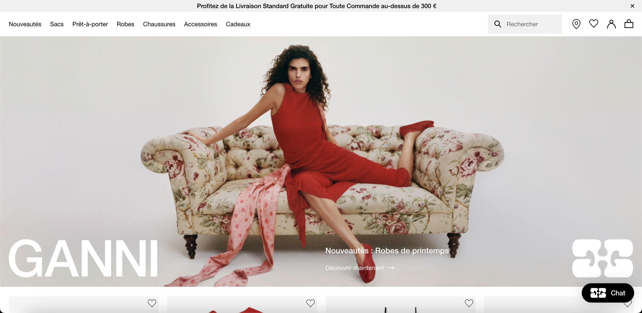
The hero occupies the full viewport with a high-production editorial image and a brand wordmark. The only commercial element visible is a collection category label and a small "Découvrir maintenant" CTA positioned in the lower-right quadrant. There is no price anchor, no tangible product benefit, no urgency signal, and no differentiation statement of any kind. For a brand that does not hold dominant recognition in the French market, this means every first-time visitor arriving from paid search or paid social makes their 5-second engagement decision without a single commercial argument in view. The hero is performing brand media work, not conversion work.
The announcement bar leads with "Profitez de la Livraison Standard Gratuite pour Toute Commande au-dessus de 300 €." At a price point where a single dress costs 225€, most single-item baskets fall below the threshold. The message is presented as a static policy statement with no cart-progress indicator, no "Add X€ to unlock free shipping" prompt, and no basket-building recommendation anchored to the gap. In behavioral economics, proximity-to-threshold messaging consistently drives incremental AOV. Its absence means the policy exists only to inform, not to convert, and buyers who notice it feel penalized rather than motivated.
Five large-format product images are stacked vertically on the left column. The purchase zone — price, size selector, add-to-cart button — is fixed in the upper-right and does not reappear as the visitor scrolls through the image gallery. Purchase intent in apparel peaks at the moment of visual satisfaction, not several hundred pixels above it. A visitor who scrolls through all five images to evaluate fit, drape, or detail has already demonstrated strong purchase intent, but the add-to-cart action is no longer in view. There is no sticky CTA, no floating purchase bar, and no repositioning of the conversion element at image intervals.
Details, fit and sizing information, and care instructions are all collapsed by default on the product page. For a 225€ dress purchased without a physical try-on, fabric composition, size behavior, and care requirements are not secondary content — they are the primary objection handlers. A buyer who cannot answer "Does this run small?", "What is this made of?", or "Will this shrink?" without an extra click is exposed to a decision gap that resolves through abandonment or delayed purchase rather than conversion. Collapsed content reduces visible cognitive load but increases perceived information risk in high-consideration categories.
The "Vous pourriez aussi aimer" section below the primary product displays handbags and accessories while the visitor is evaluating a dress. The cross-sell placement directly below a product page is the most commercially valuable position for AOV expansion because it captures a buyer who has already demonstrated category-level intent. Showing mismatched categories in that position interrupts outfit logic, fails to build a complete purchase story, and misses the most natural expansion path: complementary dresses, same-collection separates, or coordinating shoes. The result is low-intent impressions occupying high-intent real estate.
Review counts are visible on the product page but the social proof architecture delivers minimal conversion value: there are no review excerpts in the purchase zone, no headline average rating, no fit-specific metadata ("runs small," "true to size"), and no verified purchase differentiation. For a 225€ garment purchased without a physical try-on, fit-accuracy data from peer buyers is among the highest-converting trust signals available. Without it, a motivated buyer cannot validate their size choice through social proof — which is a primary abandonment trigger in fashion e-commerce, particularly for first-time buyers unfamiliar with the brand's cut and sizing.
GANNI's documented sustainability framework and distinct Scandinavian brand identity are not visible on the homepage hero, the product page, or in the announcement bar across the evaluated screenshots. At 225€ for a cotton dress, the purchase zone carries no justification infrastructure: no fabric sourcing signals, no production ethics indicators, no brand story element that contextualizes the price point against a value beyond garment aesthetics. In the contemporary fashion segment, buyers who self-select into a brand at this price bracket consistently respond to ethical positioning and identity signals — their absence removes a primary premium justification mechanism for visitors who arrive without pre-loaded brand affinity.
The homepage is composed almost entirely of images, short category labels, and product tiles. There is no editorial text, no keyword-enriched collection description, no semantic category narrative, and no long-form content visible at page level. For a brand competing on French-language commercial queries — "robe de printemps femme," "robe en coton imprimé," "mode scandinave" — a homepage with near-zero indexable text produces minimal organic ranking signals. This structural absence makes paid traffic disproportionately load-bearing for top-of-funnel acquisition, a dependency that inflates cost per acquisition and compounds every paid channel disruption.
- All 21 prioritised CRO suggestions with experiment ideas
- Industry benchmarks for your category & traffic level
- Discoverability (SEO + GEO) full audit results
- A/B test hypotheses ready to implement
- Personalised session with a CRO specialist
The findings presented here are directional and indicative in nature. They do not take into account internal data such as revenue performance, customer lifetime value, traffic quality, seasonality, or proprietary testing.
Recommendations should be interpreted as optimization opportunities rather than absolute assessments. Actual impact may vary depending on audience composition, acquisition channels, and business context. This report is not exhaustive and should be used as a starting point for further analysis and experimentation.