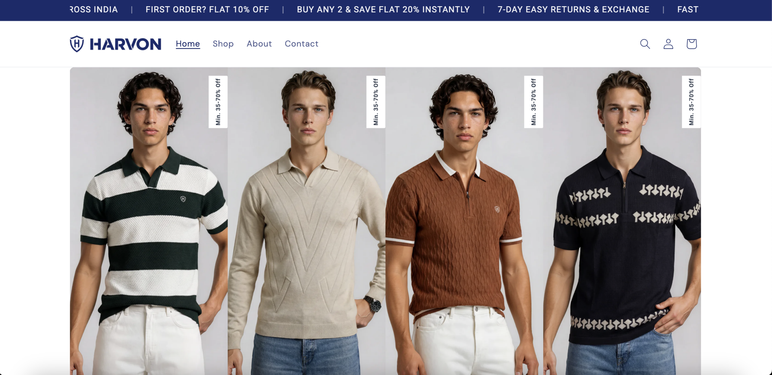
The hero section presents four product images with no headline, no value proposition, no CTA button, and no narrative direction. The only visible text is the promotional announcement bar above navigation and vertical discount strips on each image. For apparel brands with no global recognition, the hero must answer three questions within five seconds: what this is, who it is for, and what to do next. None of these are answered. Visitors arriving via paid social — where they engaged with a specific product ad — immediately lose narrative continuity when the landing experience offers no confirming headline, no reinforcing brand statement, and no path forward other than passive browsing.
The site runs three simultaneous discount mechanisms visible from the first scroll: a first-order flat discount, an instant multi-unit saving offer, and "Min. 35-70% Off" badges on every hero product image. At a price point of Rs. 1,199-1,299 per unit, these stacked mechanisms communicate that the marked price is substantially inflated by default — which trains buyers to perceive full-price purchasing as irrational. Repeat visitors will condition themselves to re-enter as new users, wait for promotions, or buy only in pairs to activate the bundle discount. This behavior pattern structurally suppresses average order value over time and prevents margin recovery even as the brand scales.
The announcement bar — the first piece of text a visitor reads on every page — leads with "Fast Shipping Across India" as a static, hardcoded message delivered to all visitors regardless of their location. For any visitor arriving from outside India, this is an immediate disqualifier: it signals that the brand does not serve them, before they have seen a single product or price. In conversion psychology, the first moment of perceived irrelevance is also the last — visitors who infer they are outside the intended market abandon without evaluating the offer further. If a portion of the site's paid or organic traffic originates internationally, this single line is suppressing that segment's conversion rate to near zero.
The homepage features a dedicated trust section articulating four claims: premium quality materials, fast and free shipping, easy returns and exchanges, and a perfect fit guarantee. Each of these is a baseline category expectation for any modern apparel brand, not a differentiating proposition. "Soft, breathable cotton that keeps its shape" describes a generic fabric property present across hundreds of comparable brands. "Real customer feedback" for sizing is mentioned without quantification, case example, or any specific proof element. A visitor evaluating this section alongside a competitor's equivalent section cannot identify a concrete reason to prefer this brand.
The product page contains no star rating, no review count, no customer photos, no testimonial, and no UGC reference of any kind. In apparel, where fabric quality, fit accuracy, and color fidelity are impossible to assess without physical handling, third-party validation is the primary objection-handling mechanism available at the point of purchase. The absence of social proof forces every buyer to rely exclusively on brand-originated claims — a substantially lower-trust signal for a brand without established category recognition. Visitors who are not yet committed will have no peer validation to resolve their hesitation.
The product page hero image shows the garment from the chest upward only, omitting the waist, hem, torso drape, and overall silhouette. Apparel purchase decisions are overwhelmingly visual — buyers assess how a product will look on a body proportionate to theirs, which requires seeing length, fit across the torso, and how the garment relates to the bottom half of the outfit. The homepage collection grid uses full-body shots that communicate this information clearly, but the product page — the most commercially critical page in the purchase flow — uses a crop that removes exactly the data points buyers most need at the commitment stage.
The product page presents the description as a collapsed accordion element requiring an active click to expand. At page load, only a key highlights table (fit, pattern, fabric, color) and wash care instructions are visible. The persuasive copy layer — why this specific product is worth buying, what the fabric texture feels like, what makes the design distinct — is invisible to every visitor who does not actively seek it out. For buyers in the consideration stage, who need the emotional and rational justification to move from interest to purchase, this information is the most critical page element — and it is hidden behind an interaction they receive no prompt to take.
The homepage hero contains no text content outside of promotional banners and product badges. The only substantive on-page text blocks are a collection heading, a four-point value list, two promotional banners, and an email capture label. For a brand targeting organic searches related to polo shirts, knitwear, or men's premium casualwear in India, this homepage has insufficient semantic content to rank for any meaningful category query. Search algorithms cannot infer topical authority from imagery alone, and the minimal keyword signals present do not establish the page as a relevant destination for the intent patterns that drive apparel discovery in competitive search markets.
- All 21 prioritised CRO suggestions with experiment ideas
- Industry benchmarks for your category & traffic level
- Discoverability (SEO + GEO) full audit results
- A/B test hypotheses ready to implement
- Personalised session with a CRO specialist
The findings presented here are directional and indicative in nature. They do not take into account internal data such as revenue performance, customer lifetime value, traffic quality, seasonality, or proprietary testing.
Recommendations should be interpreted as optimization opportunities rather than absolute assessments. Actual impact may vary depending on audience composition, acquisition channels, and business context. This report is not exhaustive and should be used as a starting point for further analysis and experimentation.