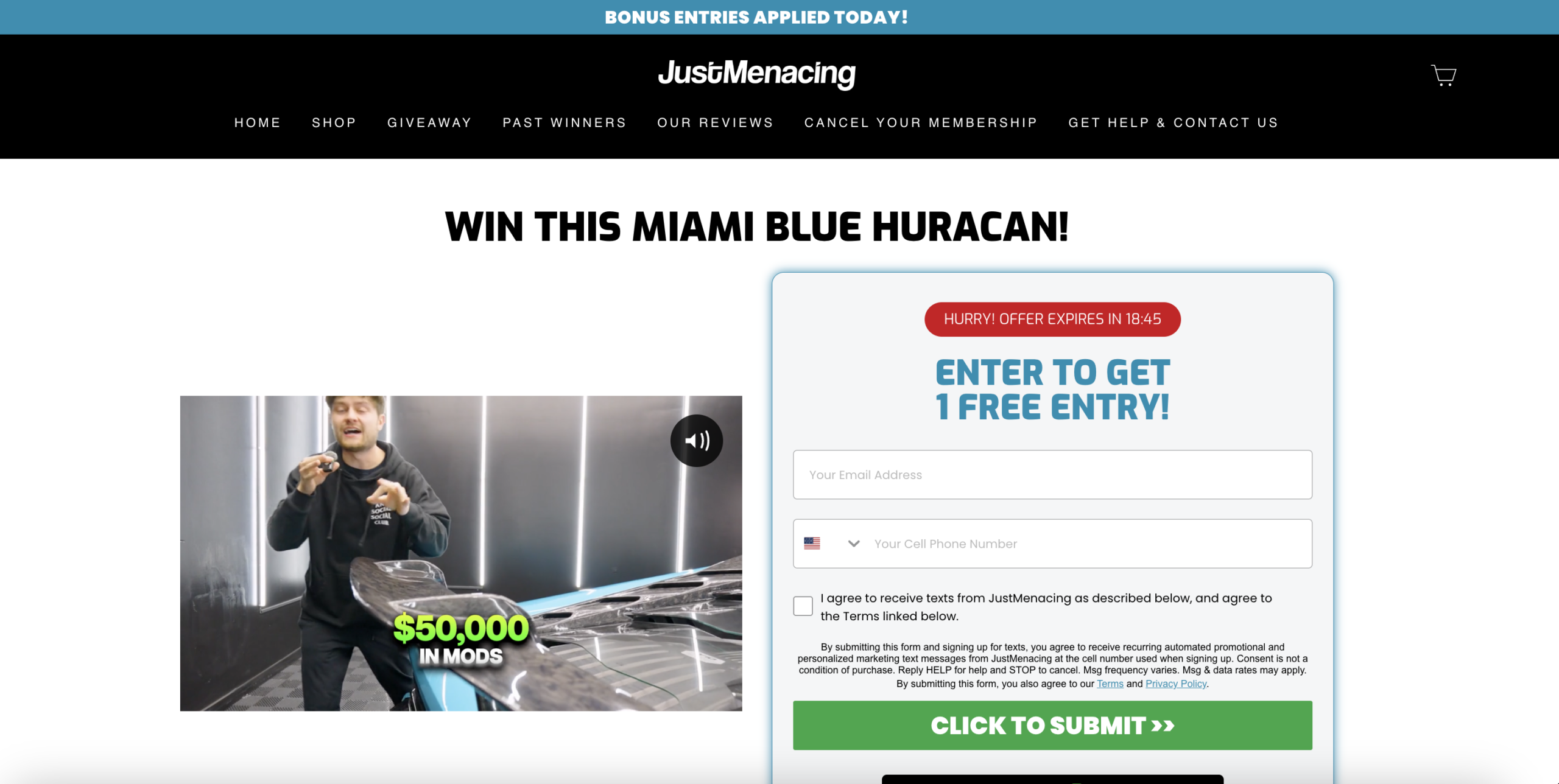
The hero section leads with a countdown timer as the dominant urgency signal above the entry form. In the giveaway and sweepstakes category, audiences carry a high baseline skepticism toward time-pressure mechanics: when a countdown applies to a free entry, which carries no inherent scarcity, the urgency premise is structurally implausible and visitors with any category familiarity recognize it as a pressure device rather than a genuine constraint. This recognition inverts the intended effect, shifting the visitor's mental frame from "I need to act now" to "this site is using tactics on me," which is one of the most corrosive trust signals in any conversion environment. Because the timer sits directly above the CTA, the first cognitive interaction a visitor has with the entry mechanism is a credibility question, not a motivation signal.
Between the phone field and the submission CTA, a dense block of legal consent text and an unchecked checkbox create a mandatory cognitive stop immediately before the action moment. The consent copy references automated marketing messages, frequency variation, carrier data rates, and linked terms in a single dense paragraph, requiring the visitor to shift from emotional buy-in to legal comprehension at precisely the point where behavioral momentum should be highest. In conversion psychology, any interruption between field completion and CTA click that introduces doubt, legal liability framing, or effort compounds abandonment probability multiplicatively. The checkbox is also unchecked by default, which is compliant but means every user must make an active choice at the moment of peak friction.
The primary above-the-fold CTA is "ENTER TO GET 1 FREE ENTRY," and the submission button reads "CLICK TO SUBMIT." Neither the hero section nor the form area references the existence of paid entry options, bonus entry tiers, or a membership model that amplifies winning probability. The visible prize inventory below the fold (Miami Blue Huracan, Custom McLaren, F250 Platinum, Twin Turbo Mustang, and others) demonstrates a multi-prize architecture that implies a commercial entry model, but this model is never surfaced during the highest-attention window. Visitors who arrive via social or paid channels, convert on the free entry, and then exit without encountering a paid entry prompt represent zero revenue generated per session despite full acquisition cost.
The global navigation renders "CANCEL YOUR MEMBERSHIP" as a top-level item alongside HOME, SHOP, GIVEAWAY, PAST WINNERS, OUR REVIEWS, and GET HELP. For a first-time visitor who has not yet entered or purchased anything, the presence of a cancellation option as a primary navigational element introduces a premature exit framing: it signals that membership has enough cancellation volume to warrant a dedicated navigation link, and that the brand anticipates its members will want to leave. This is categorically the opposite of the trust-building architecture required during the entry and first-purchase decision window. Purchase hesitation in subscription-adjacent models is primarily driven by fear of being locked in, and a visible cancellation link at the top of the page confirms that fear rather than resolving it.
The "Meet Our Previous Winners" section prominently features testimonials with visible dates from 2019 and 2020 as primary social proof anchors. In the giveaway and sweepstakes category, winner recency is the single most important legitimacy signal: a prospect evaluating whether to enter or pay for additional entries is primarily asking whether real people have recently won real prizes. A 5–6 year gap between the most visible winners and the current date raises the implicit question of whether the business is still operating at the same scale or integrity level, which is precisely the doubt that suppresses paid entry conversion. The "Recent Winners" bar at the top of the page partially mitigates this with current names, but the full section anchor is dominated by dated proof.
The full-page layout includes an extended specifications section covering exterior modifications, performance upgrades, wheels, interior, lighting, and audio components in text list format, alongside engine, horsepower, and torque callouts. While this content serves enthusiast credibility and communicates prize value depth, the information architecture treats specs as a destination rather than a bridge: the scroll path goes from the hero CTA to a video to a detailed spec list to a "GET ENTERED NOW" CTA, with no progressive micro-commitments along the way. For visitors who arrived already motivated to enter, this section adds friction by delaying the second conversion prompt. For visitors who are undecided, the raw spec data does not resolve the primary hesitation, which is whether the giveaway is real.
The "JustMenacing vs Others" section presents a comparison grid using green checkmarks and red crosses against unnamed "Other Brands," with three claims: longer giveaway periods that improve win probability, unique mod-focused giveaways not found elsewhere, and USDOT and CAN compliance through a third-party administrator. These claims address three distinct objections (odds, uniqueness, legitimacy) but provide no data to substantiate any of them. "Higher chance to win" is not quantified, "dozens of unique mods" is a category description rather than a differentiator, and third-party administration is asserted but not named. In a category where legitimacy skepticism is the primary conversion barrier, vague superiority claims function as brand noise rather than trust signals and may increase skepticism by appearing to oversell without evidence.
The audited entry page is a transactional conversion surface with no blog content, category text, or semantic depth that would allow it to attract organic traffic beyond branded search. Automotive giveaway and sweepstakes queries ("win a Lamborghini," "car giveaway entry," "free supercar sweepstakes") represent a high-volume, high-intent search category with strong commercial intent alignment. The entry page contains no optimized copy targeting these terms, no structured data markup for giveaway events, and no internal link architecture connecting content-rich pages to the entry surface. Every visitor who arrives via organic search finds the page only because they already know the brand name, meaning the site is capturing zero discovery-stage traffic from a category where intent is pre-qualified by the query itself.
- All 21 prioritised CRO suggestions with experiment ideas
- Industry benchmarks for your category & traffic level
- Discoverability (SEO + GEO) full audit results
- A/B test hypotheses ready to implement
- Personalised session with a CRO specialist
The findings presented here are directional and indicative in nature. They do not take into account internal data such as revenue performance, customer lifetime value, traffic quality, seasonality, or proprietary testing.
Recommendations should be interpreted as optimization opportunities rather than absolute assessments. Actual impact may vary depending on audience composition, acquisition channels, and business context. This report is not exhaustive and should be used as a starting point for further analysis and experimentation.