
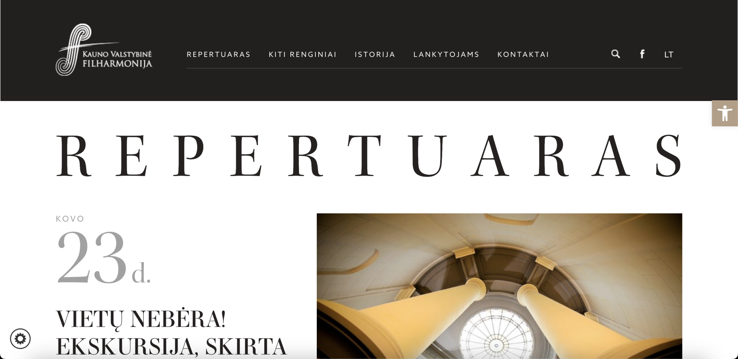
The most prominent event in the hero viewport carries a large, bold "VIETŲ NEBĖRA!" (No seats available) label. In e-commerce terms, this is the equivalent of a shop window displaying an out-of-stock product at full size with no alternative in view. Loss aversion is activated immediately: the first signal a visitor receives about this venue's events is that they cannot buy. Visitors operating under moderate intent do not reroute and continue exploring — they disengage. The hero is the highest-converting real estate on any transactional storefront, and it is currently being used to announce a closed transaction, while purchasable inventory sits below the fold receiving a fraction of the attention this slot commands.
The entire above-the-fold viewport is consumed by a large decorative typographic headline, a date display, and a sold-out event title, with no button, price, or purchase path of any kind. A visitor arriving with intent to buy a ticket cannot act on that intent without scrolling and navigating multiple steps further into the site. For a transactional e-commerce storefront, this is structurally equivalent to removing the add-to-cart mechanism from the product listing page. High-intent visitors who make engagement decisions within the first five seconds have no conversion signal to act on: the page reads as a content archive, not a revenue engine, and many will not scroll far enough to discover purchasable events below.
On the individual event detail page, the primary purchase element is rendered in a muted warm beige that provides negligible contrast against the surrounding layout — it competes with body text on equal visual footing and dominates no section of the page. More critically, ticket price is not displayed adjacent to or beneath the button. A visitor considering a purchase cannot evaluate cost without clicking through to an external ticketing system, introducing a commitment step under conditions of price uncertainty. In e-commerce conversion psychology, price transparency immediately before the CTA is one of the most reliable levers for reducing abandonment. Requiring visitors to discover price only after clicking out adds an unnecessary friction layer at the highest-intent moment in the entire purchase funnel.
The homepage moves directly from navigation into an event listing with no framing, no introductory headline, and no articulation of what attending a concert at this venue delivers as an experience. For visitors arriving from organic search, social channels, or cultural tourism discovery — all of whom lack prior brand familiarity — there is no persuasive layer between their arrival and a list of event names. E-commerce sites that rely exclusively on returning buyers stagnate; growth requires converting first-time visitors, who require orientation before they will transact. The site does not answer the purchase-critical questions a new visitor brings: What is the artistic quality of this ensemble? What does the venue experience feel like? Why is a ticket here worth a discretionary spend decision today?
At no point in the visible purchase journey — on the event listing, the event detail page, or elsewhere on the site — does the experience prompt a visitor to purchase multiple tickets, consider an upgraded seat category, explore a season subscription, or discover a companion event. In performing arts e-commerce, average order value is one of the two primary revenue levers alongside conversion rate. A visitor purchasing a single ticket for one event represents the minimum achievable transaction value. Bundle mechanics, curated programme clusters, and seasonal subscription offers can multiply per-visit revenue without increasing traffic acquisition costs — but none of these constructs exist in any form across the current site.
Event detail pages dedicate the majority of the above-fold viewport on desktop to extended programme notes, performer biographies, and historical context, before a visitor can locate the practical information needed to make a purchase decision: price, seat categories, duration, and doors-open time. In e-commerce product page logic, emotional framing builds desire at the top, but rational validation must appear immediately before the CTA to complete the conversion. Visitors who cannot efficiently locate price and availability without reading through dense literary copy abandon rather than search further, particularly on mobile where scroll patience is lower and exit rates from slow-loading text-heavy pages are consistently higher than desktop equivalents.
The site contains no audience reviews, experiential proof through past-performance photography, seat availability indicators, or real-time scarcity signals. In performing arts e-commerce, where the product is an experience that cannot be sampled before purchase, social proof is the primary mechanism for converting hesitant first-time buyers. There is no evidence anywhere on the site that others have attended, found the experience valuable, or would return — the signals that most reliably move an undecided visitor to commit. Institutional partner logos appear in the footer but communicate funding relationships, not audience satisfaction. The combination of zero reviews and zero scarcity signals means the site applies no psychological purchase pressure at any stage of the buyer journey.
All event listings, programme descriptions, and transactional pages are presented exclusively in Lithuanian. An English toggle exists in the navigation but the translated version lacks content parity: event detail pages revert to Lithuanian, leaving international visitors unable to evaluate the product they are being asked to purchase. For a venue in a city with active cultural tourism, Erasmus student populations, and European visitor traffic, this is a structural exclusion of a segment with genuine incremental ticket revenue potential. It also caps organic search performance: English-language transactional queries such as "classical music concert Kaunas" or "Lithuania philharmonic tickets" cannot be captured by pages that do not exist in those language versions.
- All 19 prioritised CRO suggestions with experiment ideas
- Industry benchmarks for your category & traffic level
- Discoverability (SEO + GEO) full audit results
- A/B test hypotheses ready to implement
- Personalised session with a CRO specialist
The findings presented here are directional and indicative in nature. They do not take into account internal data such as revenue performance, customer lifetime value, traffic quality, seasonality, or proprietary testing.
Recommendations should be interpreted as optimization opportunities rather than absolute assessments. Actual impact may vary depending on audience composition, acquisition channels, and business context. This report is not exhaustive and should be used as a starting point for further analysis and experimentation.