
The product page features a dedicated "Zero Risk. Total Confidence." section covering free worldwide shipping, a money-back guarantee, and related assurances — but this section sits deep in the page scroll, well below the add-to-cart button. At a price point above CA$300, purchase anxiety is at its highest in the immediate vicinity of the add-to-cart action, not after the visitor has already scrolled through technology explanations, results timelines, and testimonials. Buyers who would have converted if they had seen a guarantee badge adjacent to the price will frequently abandon the purchase zone without ever encountering the risk reversal content that could have resolved their hesitation. The guarantee exists; the placement prevents it from doing its conversion work.
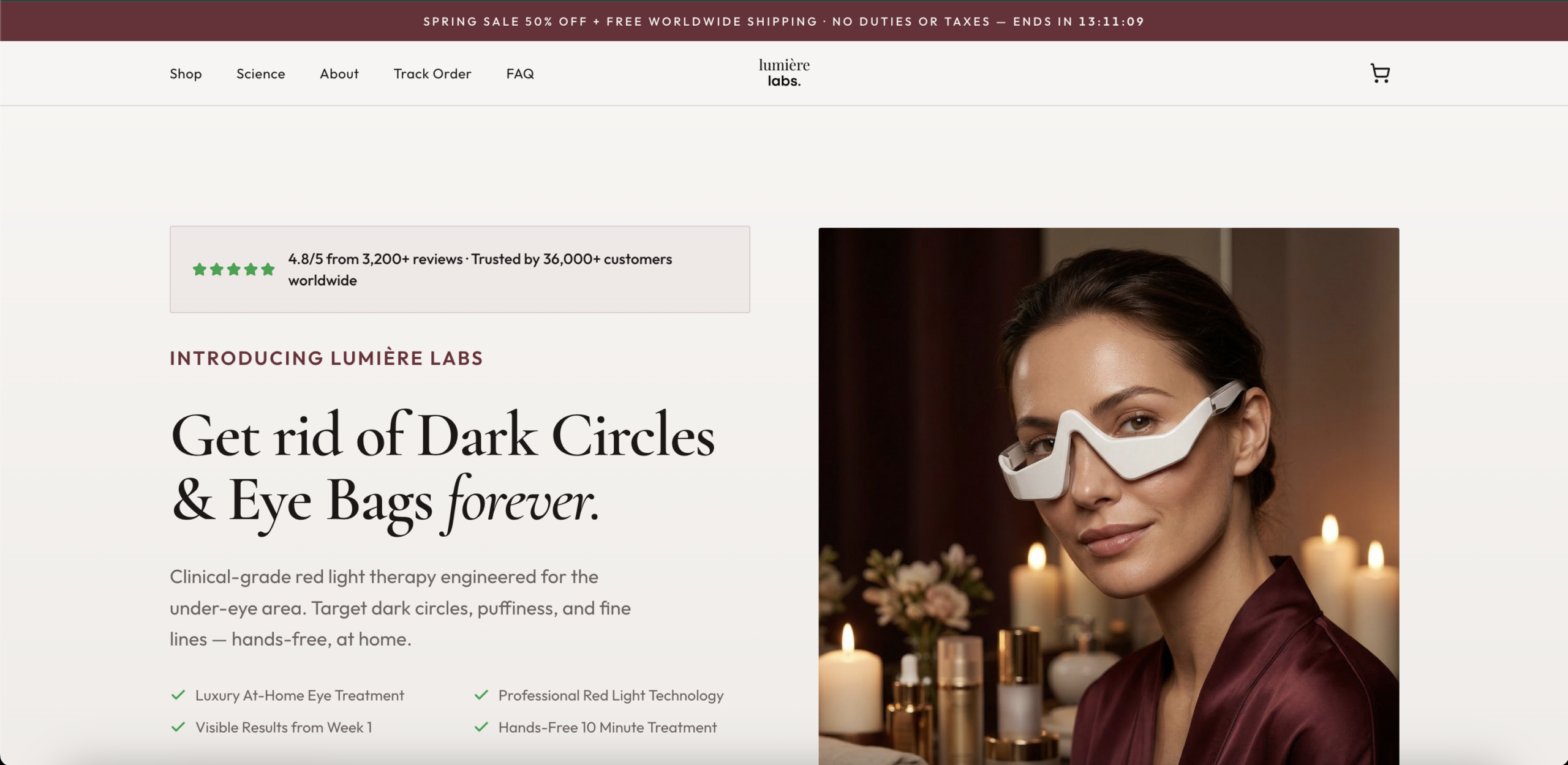
The hero headline promises permanent elimination of the stated cosmetic concerns, presented without an immediate clinical qualifier or results caveat. Beauty consumers — particularly those who have spent years purchasing topical products that failed to deliver — carry a high skepticism baseline for outcome claims. A permanence guarantee for a light therapy device at this price point requires immediate substantiation to survive scrutiny: a clinical citation, a "results may vary" anchor, or a "within X weeks of consistent use" framing. Without it, the most informed and highest-intent segment of the audience, the one most likely to actually convert, will default to disbelief and disengage before scrolling to the evidence sections that could have converted them.
The hero eyebrow label positions the brand as newly presenting itself to the visitor, while the adjacent trust bar simultaneously claims a base of tens of thousands of satisfied customers across more than three thousand verified reviews. These two signals are in direct conflict. A brand introducing itself does not have that volume of social proof, and a brand with that volume of social proof does not introduce itself. For a visitor conducting any level of due diligence, this inconsistency raises a flag: either the brand is fabricating its review count, or the intro line is a legacy placeholder that was never updated. Either reading damages trust at precisely the moment the page is trying to establish it.
The product page displays the price in Canadian dollars, while the announcement bar explicitly states that the offer includes worldwide shipping with no duties or taxes. The combination communicates global ambition at the marketing layer while delivering a regionally-configured experience at the commerce layer. For visitors outside Canada, the currency prefix introduces uncertainty: they must mentally estimate an exchange rate before assessing affordability. In consumer psychology, any ambiguity at the price display stage causes hesitation that disproportionately affects conversion more than the price itself. A visitor who would have purchased at the correctly displayed local price will frequently abandon rather than resolve the ambiguity.
The announcement bar deploys a live countdown timer alongside a significant promotional offer, both of which are among the highest-performing urgency mechanics in direct-to-consumer e-commerce. However, if neither the countdown timer nor the promotional framing is carried forward to the product page and cart, the psychological pressure created at the entry point dissipates entirely before the visitor reaches the transaction stage. Urgency mechanics only convert when they are present at the decision moment — the add-to-cart and checkout steps — not only at the awareness entry point. A visitor who arrived under time pressure will re-evaluate at a calmer register if the product page does not maintain that pressure.
The homepage is structured as a sequential brand narrative: the brand introduces itself, explains the problem, walks through a week-by-week results timeline, details the technology, and eventually surfaces purchase opportunities deep in the scroll. This architecture serves cold, low-intent organic audiences well but converts warm, high-intent paid traffic poorly. Visitors arriving from paid social ads, influencer referrals, or retargeting campaigns have already completed their brand education step in the ad unit itself; routing them through a brand awareness sequence on landing introduces friction and extends time-to-purchase-decision unnecessarily. The longest and most elaborately designed sections of the homepage appear before the first visible purchase CTA.
The hero trust bar presents a review count and rating without a visible Trustpilot, Judge.me, Yotpo, or Okendo badge — the platform-verified markers that signal to consumers that the number is independently audited and not self-reported. In the beauty and wellness device category, where fake review concerns are heightened following regulatory and press scrutiny, the absence of a named review platform significantly reduces the credibility of the claim. Research consistently shows that platform-verified social proof converts at a meaningfully higher rate than identical figures presented without platform attribution, because the platform name functions as an independent third-party guarantor of the count's legitimacy.
The primary product is merchandised and indexed under a branded name with no organic search equity or category recognition. Visitors searching for the solutions this device delivers — terms like "red light therapy for dark circles," "at-home eye bag treatment," or "under-eye light therapy device" — are high-intent buyers at a late decision stage. If the product page is indexed under a branded slug rather than a category-descriptive URL structure, and if the product page title tag and meta lead with the brand name rather than the primary category query, the site will consistently rank below competitors whose product naming is built around the search terms buyers actually use. In a nascent product category, ceding category keyword authority to competitors is a compounding penalty.
- All 21 prioritised CRO suggestions with experiment ideas
- Industry benchmarks for your category & traffic level
- Discoverability (SEO + GEO) full audit results
- A/B test hypotheses ready to implement
- Personalised session with a CRO specialist
The findings presented here are directional and indicative in nature. They do not take into account internal data such as revenue performance, customer lifetime value, traffic quality, seasonality, or proprietary testing.
Recommendations should be interpreted as optimization opportunities rather than absolute assessments. Actual impact may vary depending on audience composition, acquisition channels, and business context. This report is not exhaustive and should be used as a starting point for further analysis and experimentation.
The product page features a dedicated "Zero Risk. Total Confidence." section covering free worldwide shipping, a money-back guarantee, and related assurances — but this section sits deep in the page scroll, well below the add-to-cart button. At a price point above CA$300, purchase anxiety is at its highest in the immediate vicinity of the add-to-cart action, not after the visitor has already scrolled through technology explanations, results timelines, and testimonials. Buyers who would have converted if they had seen a guarantee badge adjacent to the price will frequently abandon the purchase zone without ever encountering the risk reversal content that could have resolved their hesitation. The guarantee exists; the placement prevents it from doing its conversion work.
The hero headline promises permanent elimination of the stated cosmetic concerns, presented without an immediate clinical qualifier or results caveat. Beauty consumers — particularly those who have spent years purchasing topical products that failed to deliver — carry a high skepticism baseline for outcome claims. A permanence guarantee for a light therapy device at this price point requires immediate substantiation to survive scrutiny: a clinical citation, a "results may vary" anchor, or a "within X weeks of consistent use" framing. Without it, the most informed and highest-intent segment of the audience, the one most likely to actually convert, will default to disbelief and disengage before scrolling to the evidence sections that could have converted them.
The hero eyebrow label positions the brand as newly presenting itself to the visitor, while the adjacent trust bar simultaneously claims a base of tens of thousands of satisfied customers across more than three thousand verified reviews. These two signals are in direct conflict. A brand introducing itself does not have that volume of social proof, and a brand with that volume of social proof does not introduce itself. For a visitor conducting any level of due diligence, this inconsistency raises a flag: either the brand is fabricating its review count, or the intro line is a legacy placeholder that was never updated. Either reading damages trust at precisely the moment the page is trying to establish it.
The product page displays the price in Canadian dollars, while the announcement bar explicitly states that the offer includes worldwide shipping with no duties or taxes. The combination communicates global ambition at the marketing layer while delivering a regionally-configured experience at the commerce layer. For visitors outside Canada, the currency prefix introduces uncertainty: they must mentally estimate an exchange rate before assessing affordability. In consumer psychology, any ambiguity at the price display stage causes hesitation that disproportionately affects conversion more than the price itself. A visitor who would have purchased at the correctly displayed local price will frequently abandon rather than resolve the ambiguity.
The announcement bar deploys a live countdown timer alongside a significant promotional offer, both of which are among the highest-performing urgency mechanics in direct-to-consumer e-commerce. However, if neither the countdown timer nor the promotional framing is carried forward to the product page and cart, the psychological pressure created at the entry point dissipates entirely before the visitor reaches the transaction stage. Urgency mechanics only convert when they are present at the decision moment — the add-to-cart and checkout steps — not only at the awareness entry point. A visitor who arrived under time pressure will re-evaluate at a calmer register if the product page does not maintain that pressure.
The homepage is structured as a sequential brand narrative: the brand introduces itself, explains the problem, walks through a week-by-week results timeline, details the technology, and eventually surfaces purchase opportunities deep in the scroll. This architecture serves cold, low-intent organic audiences well but converts warm, high-intent paid traffic poorly. Visitors arriving from paid social ads, influencer referrals, or retargeting campaigns have already completed their brand education step in the ad unit itself; routing them through a brand awareness sequence on landing introduces friction and extends time-to-purchase-decision unnecessarily. The longest and most elaborately designed sections of the homepage appear before the first visible purchase CTA.
The hero trust bar presents a review count and rating without a visible Trustpilot, Judge.me, Yotpo, or Okendo badge — the platform-verified markers that signal to consumers that the number is independently audited and not self-reported. In the beauty and wellness device category, where fake review concerns are heightened following regulatory and press scrutiny, the absence of a named review platform significantly reduces the credibility of the claim. Research consistently shows that platform-verified social proof converts at a meaningfully higher rate than identical figures presented without platform attribution, because the platform name functions as an independent third-party guarantor of the count's legitimacy.
The primary product is merchandised and indexed under a branded name with no organic search equity or category recognition. Visitors searching for the solutions this device delivers — terms like "red light therapy for dark circles," "at-home eye bag treatment," or "under-eye light therapy device" — are high-intent buyers at a late decision stage. If the product page is indexed under a branded slug rather than a category-descriptive URL structure, and if the product page title tag and meta lead with the brand name rather than the primary category query, the site will consistently rank below competitors whose product naming is built around the search terms buyers actually use. In a nascent product category, ceding category keyword authority to competitors is a compounding penalty.
- All 21 prioritised CRO suggestions with experiment ideas
- Industry benchmarks for your category & traffic level
- Discoverability (SEO + GEO) full audit results
- A/B test hypotheses ready to implement
- Personalised session with a CRO specialist
The findings presented here are directional and indicative in nature. They do not take into account internal data such as revenue performance, customer lifetime value, traffic quality, seasonality, or proprietary testing.
Recommendations should be interpreted as optimization opportunities rather than absolute assessments. Actual impact may vary depending on audience composition, acquisition channels, and business context. This report is not exhaustive and should be used as a starting point for further analysis and experimentation.