Sky Therapies
https://skytherapies.ca/
Conversion Rate Optimization audit summary
Last audit performed on Feb 12, 2026
Analyzed version 1.0
CRO index
Conversion & growth
35%
based on 67 total criteria
Analytics & tracking
58%
based on 43 total criteria
UX & engagement
43%
based on 34 total criteria
Discoverability (SEO + GEO)
Unavailable for non customers
We have 21 CRO suggestions for you
Unlock all with a personalized session with our team
Improvement suggestions
1. Booking page confusion: no clear starting point
CriticalThe booking page opens with “Hello. Are you a current client? Sign in” followed by “Book an Appointment” and a left sidebar showing “Our Team,” “Free 20 Minutes Phone Consultation with Our Intake Coordinator,” “Free Initial 20 Minute Phone Consultation,” “Individual Therapy Online,” and “Couples Therapy Online.” Immediately, the user is forced to choose between multiple nearly identical consultation options and different booking paths: “Book by Session” or “Book by Practitioner.” There is no visual hierarchy, no “Start Here” guidance, and no explanation of which consultation is appropriate for a new client. It feels operational, not guided.
For a first-time therapy client already in a vulnerable state, this is overwhelming. Instead of feeling supported, the user is confronted with internal clinic structure: intake coordinator vs therapist consultation, 50 vs 75 vs 90 minutes, by session vs by practitioner. The cognitive load is high at the exact moment conversion should feel easy. When someone cannot instantly understand where to click, hesitation increases. In mental health services, hesitation equals drop-off.
2. No CTA hierarchy: “Learn More” competes with “Book Free Consultation” everywhere
CriticalThroughout the page, “Learn More” buttons use the same purple color, shape, and visual weight as the primary CTA “Book Free Consultation.” The same issue repeats across sections: in specialties, approaches, and service blocks, secondary exploration actions look identical to the main booking action. There is no visual hierarchy separating browsing from booking.
Users are not guided toward the intended conversion path. Instead of creating a clear progression toward “Book Free Consultation,” the interface presents parallel actions competing for attention. This lack of hierarchy fragments momentum across the entire page, increasing the likelihood that users browse passively rather than commit to booking.
3. Acronym-driven messaging with no explanation creates conversion friction
CriticalIn the “Our Approaches” section, several cards are labeled almost exclusively with initials: EMDR, DBR, CBT, DBT. There is no expansion of the acronym, no one-line explanation, and no benefit statement. The user is presented with technical shorthand and a generic “Find Out More” button. From a CRO perspective, this creates an immediate comprehension gap.
Here, users are forced to translate terminology before they can evaluate relevance. Most therapy clients are not searching for “DBR” — they are searching for relief from trauma, anxiety, or chronic pain. When the interface leads with acronyms instead of outcomes, it shifts the cognitive burden onto the user. That added mental effort increases hesitation and weakens forward momentum toward booking.
4. Generic path to conversion before education
CriticalAll primary momentum across the site pushes toward “Book Free Consultation” or booking a session — before the user fully understands the process, what therapy will look like, or whether this is the right fit for them. There is a “How Does It Work?” section on the homepage, but it is visually separated, light in detail, and easy to scroll past. It does not strongly anchor the journey in a clear 1-2-3 format before directing users to book.
Users are asked to commit before fully understanding what happens next. In high-trust industries, clarity about process is one of the strongest friction reducers. Right now, the process feels implied rather than confidently explained.
5. Local SEO is under-optimized
HighThe footer lists many cities: “Toronto, North York, Markham, Ottawa, Vaughan, Guelph, Brampton…” This is a common tactic, but without dedicated, optimized local pages for each location, this acts more like a mention than a ranking driver.
This is what Google rewards:
- Dedicated local landing pages
- Local schema
- Location-specific testimonials
- Embedded Google Map
- Local citations
To rank in multiple Ontario cities, this website needs structured local content, not just a list.
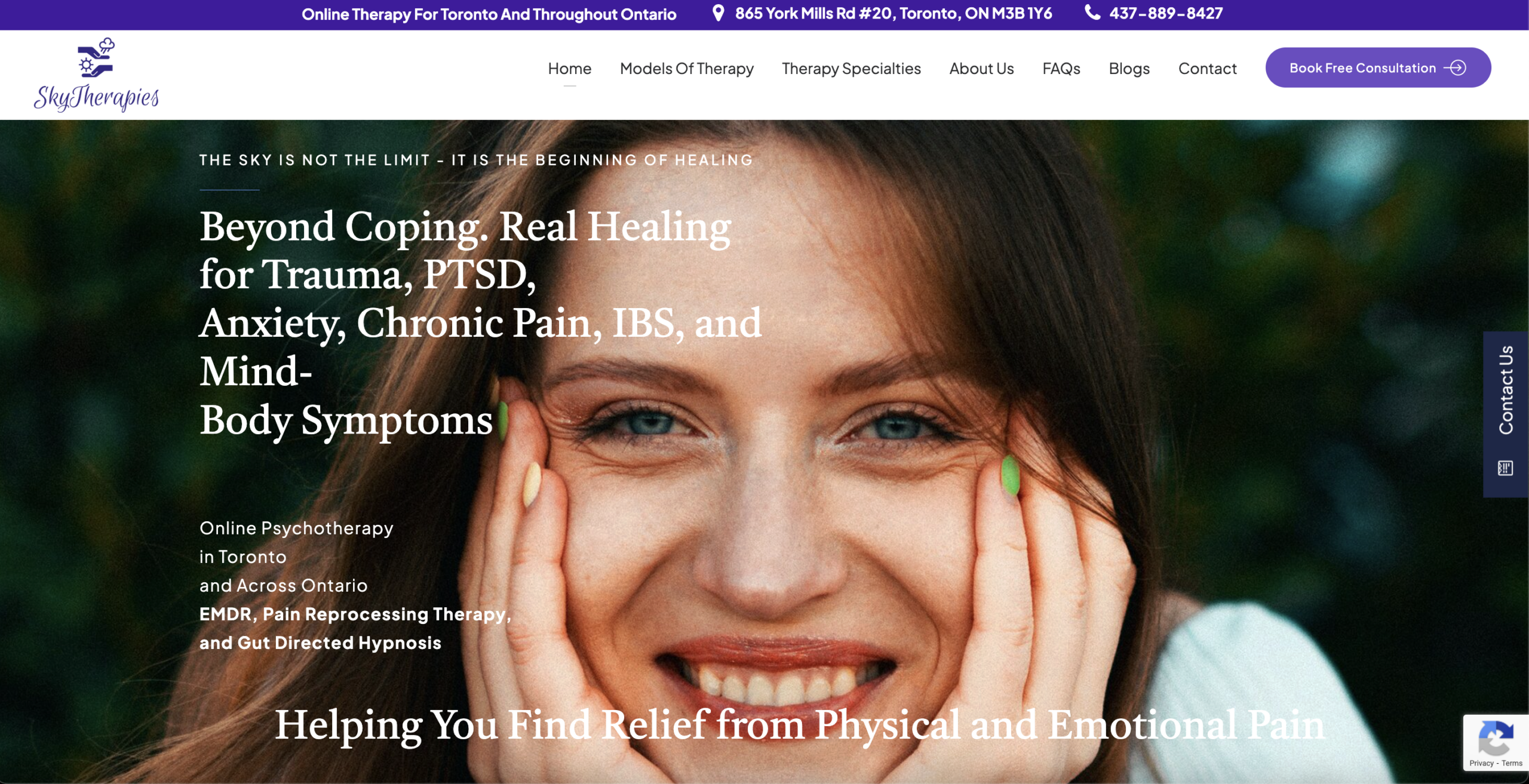
6. Hero readability issue: text competes with the image
HighThe headline “Beyond Coping. Real Healing for Trauma, PTSD, Anxiety, Chronic Pain, IBS, and Mind-Body Symptoms” is placed directly over a high-detail facial image with strong highlights and contrast. Because there is no solid overlay or controlled background, parts of the white text sit on lighter areas of the image, reducing contrast and making sections harder to read. The smaller supporting copy (“Online Psychotherapy in Toronto and Across Ontario…”) is even more affected.
Above the fold, readability should be effortless. Here, users must visually work to process the core message. That small friction at the first impression stage increases bounce risk. When the value proposition is not instantly clear, engagement drops before the user even starts scrolling.
Want to unlock the full CRO report?
Get access to all recommendations, benchmarks, and experiment ideas.
Unlock full accessAdapt calls-to-action based on user readiness
CriticalAll visitors are presented with the same primary CTA regardless of engagement level.
Guide undecided users with progressive interactions
HighUsers showing exploration behavior are not guided toward soft commitment actions.
Reduce friction at high-intent conversion points
CriticalHigh-intent visitors face the same experience as early-stage users.
Important note
This audit is based on an automated and heuristic-based analysis of publicly accessible pages. The evaluation follows industry best practices across conversion rate optimization (CRO), usability, analytics, and discoverability.
The findings presented here are directional and indicative in nature. They do not take into account internal data such as revenue performance, customer lifetime value, traffic quality, seasonality, or proprietary tooling.
Recommendations should be interpreted as optimization opportunities rather than absolute assessments. Actual impact may vary depending on audience composition, acquisition channels, and business context.
This report is not exhaustive and should be used as a starting point for further analysis and experimentation.