The Abyss of Persefone
https://abyssofpersefone.com/
Conversion Rate Optimization audit summary
Last audit performed on Feb 12, 2026
Analyzed version 1.0
CRO index
Conversion & growth
40%
based on 67 total criteria
Analytics & tracking
63%
based on 43 total criteria
UX & engagement
47%
based on 34 total criteria
Discoverability (SEO + GEO)
Unavailable for non customers
We have 21 CRO suggestions for you
Unlock all with a personalized session with our team
Improvement suggestions
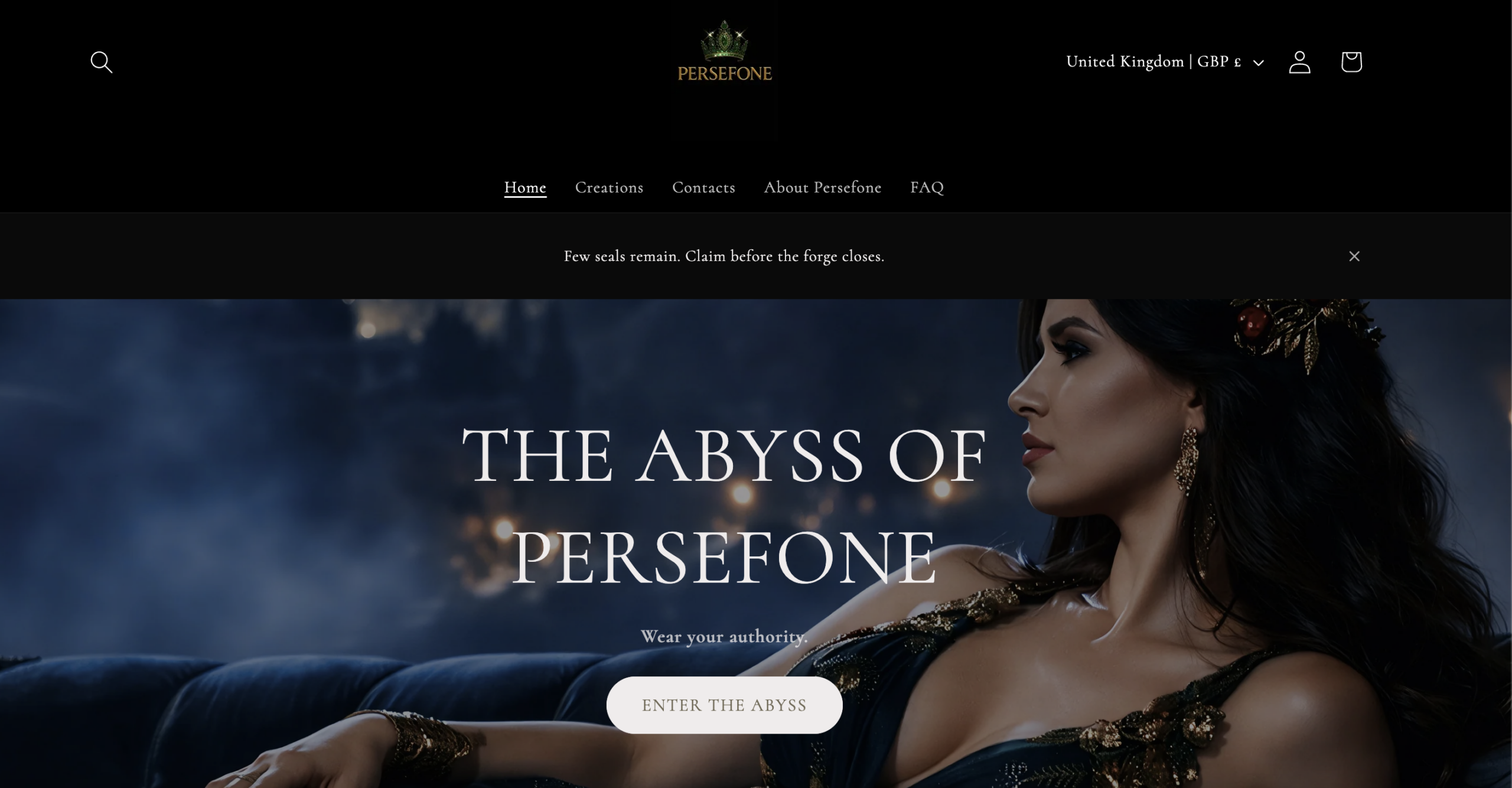
1. Navigation confusion: structured by collections, not buying intent
CriticalThe homepage and navigation prioritize brand-driven collections (“The Lust Collection,” “The Rebellion Collection,” “The Dominance Collection”). There is no visible segmentation by product type such as rings, necklaces, earrings, or bracelets. The primary navigation uses “Creations” instead of clear commerce language like “Shop” or “All Jewelry.”
From a conversion standpoint, this assumes high brand familiarity or purely vibe-shopping. Most ecommerce visitors browse by product category, not by narrative collection. Unless the visitor already understands the brand universe, they must interpret what each collection contains before shopping. That added cognitive step reduces browsing efficiency and increases friction for first-time buyers.
2. Accessibility risk: low contrast and readability vulnerabilities
CriticalThe site relies heavily on white text over dark, high-contrast imagery, small poetic subtext, and subtle, low-contrast button elements. While visually refined, this design approach introduces measurable readability risks, particularly where text overlaps detailed backgrounds or where font size is reduced for stylistic effect.
From a usability standpoint, this can significantly impair legibility for users with visual impairments, users browsing on lower-quality or glare-prone screens, and mobile users in bright environments. When contrast ratios fall below accessibility standards (WCAG), readability drops and interaction accuracy declines, directly impacting engagement and conversion rates.
3. Overreliance on imagery for communication
Critical
Large sections of the website are image-driven with minimal textual reinforcement. While visually strong, the communication relies heavily on mood imagery and short poetic lines rather than structured, descriptive copy.
From an SEO perspective, this limits semantic depth. Search engines require crawlable text to understand product category, materials, and commercial relevance. Without sufficient keyword-rich context, the website functions more as a visual brand statement than a discoverable ecommerce.
From a UX standpoint, users who skim for product cues such as type, material, or value proposition receive few scannable anchors. Luxury storytelling is effective, but high-performing ecommerce experiences balance atmosphere with structured clarity to support faster decision-making.
4. Reviews are hidden behind interaction
CriticalReviews are present in the header (“Reviews”), but they are not surfaced prominently within the homepage or product content. Users must proactively click to access them.
This introduces unnecessary friction in trust validation. Social proof works best when it is integrated directly into the browsing journey, ideally based on the visitor's intent. Requiring users to actively search for validation reduces its psychological impact and weakens conversion reinforcement.
5. Product page misses a structured “Key details” block
CriticalThe product description relies heavily on poetic storytelling (“Indigo depths meet precious metal…”) but lacks a structured, scannable specification section. There is no immediate bullet-point summary of essential product information such as exact stone type, weight, adjustability, hypoallergenic properties, or plating thickness.
From a conversion standpoint, this creates friction for analytical buyers who need fast confirmation before committing. Jewelry purchases require clarity around material, durability, and dimensions. Adding a concise “Key details” block directly under the price would reduce hesitation, strengthen perceived craftsmanship, and support both conversion and SEO without compromising the brand aesthetic.
6. No visible craftsmanship explanation
HighThe homepage focuses heavily on identity and mythology: “Objects of authorship.”, “Function over ornament.”, “Every Persefone piece exists to alter perception.” However, there is no visible explanation of materials used, production method, handmade vs manufactured, origin (Made in Italy is not clearly stated), quality standards, etc.
For luxury or premium jewelry, craftsmanship storytelling is a major conversion driver. Without tangible product substance, the brand risks feeling aesthetic rather than authoritative.
7. Email capture lacks incentive clarity
HighThe opt-in section reads: “Access The Abyss of Persefone – Private access. No broadcasts”. This positioning creates intrigue but does not define the value exchange. It is unclear what access provides:
- Early drops?
- Limited pieces?
- Discounts?
- Editorial content?
- Exclusive events?
Want to unlock the full CRO report?
Get access to all recommendations, benchmarks, and experiment ideas.
Unlock full accessAdapt calls-to-action based on user readiness
CriticalAll visitors are presented with the same primary CTA regardless of engagement level.
Guide undecided users with progressive interactions
HighUsers showing exploration behavior are not guided toward soft commitment actions.
Reduce friction at high-intent conversion points
CriticalHigh-intent visitors face the same experience as early-stage users.
Important note
This audit is based on an automated and heuristic-based analysis of publicly accessible pages. The evaluation follows industry best practices across conversion rate optimization (CRO), usability, analytics, and discoverability.
The findings presented here are directional and indicative in nature. They do not take into account internal data such as revenue performance, customer lifetime value, traffic quality, seasonality, or proprietary tooling.
Recommendations should be interpreted as optimization opportunities rather than absolute assessments. Actual impact may vary depending on audience composition, acquisition channels, and business context.
This report is not exhaustive and should be used as a starting point for further analysis and experimentation.