
The Spero Clinic
https://www.thesperoclinic.com/
Conversion Rate Optimization audit summary
Last audit performed on Feb 06, 2026
Analyzed version 1.0
CRO index
Conversion & growth
42%
based on 67 total criteria
Analytics & tracking
45%
based on 43 total criteria
UX & engagement
30%
based on 34 total criteria
Discoverability (SEO + GEO)
Unavailable for non customers
We have 21 CRO suggestions for you
Unlock all with a personalized session with our team
Improvement suggestions
1. No clear self-qualification framework (“is this for me?”)
CriticalThe page never clearly defines who the program is designed for. Conditions are listed (CRPS, EDS, POTS, AMPS), but there is no explicit guidance on patient profiles, severity levels, treatment history, or readiness criteria. As a result, visitors cannot quickly map their own situation to the program. Users are left asking:
- Am I too early or too late?
- Is my case severe enough?
- Does this replace my current treatment or complement it?
In high-stakes medical decisions, lack of self-qualification creates hesitation and abandonment. Conversion improves when users can confidently say “yes, this sounds like me” or “no, this isn’t right for my case” within the first scrolls.
2. No clear path to conversion throughout the website
Critical
While the site’s stated primary action is “Book a free consultation,” the actual conversion path is fragmented and inconsistent across the page. Users are exposed to multiple calls to action with different labels, visual treatments, and intents, making it difficult to understand what the main next step is supposed to be.
Throughout the journey, visitors are repeatedly prompted to take divergent actions such as booking a consultation, starting their journey, watching videos, reading testimonials, calling or texting the clinic, or exploring additional content. These actions are presented with similar visual weight and without a clear hierarchy, causing primary and secondary goals to compete rather than reinforce one another.
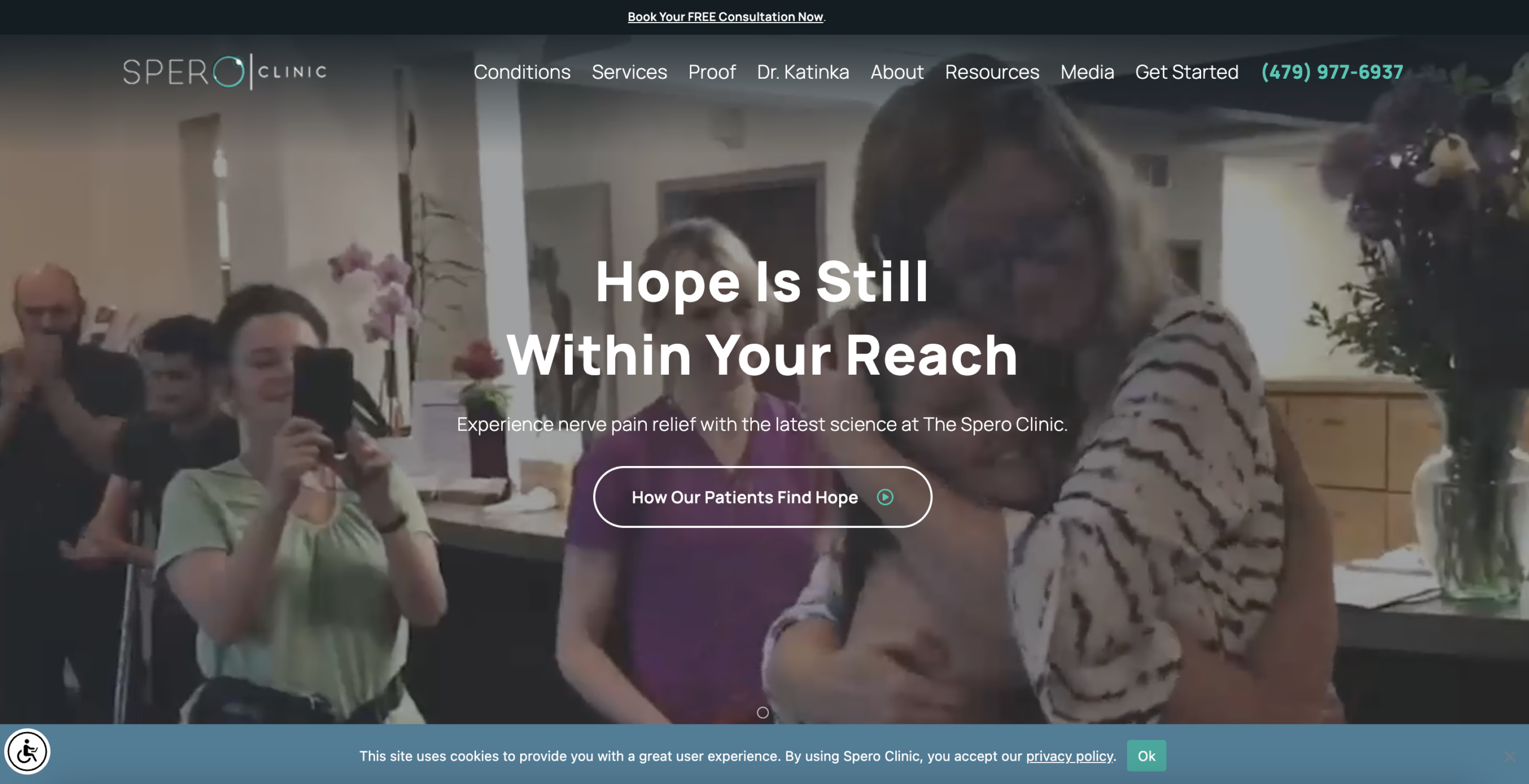
3. Low-quality and inconsistent imagery and video assets
Critical
The site relies heavily on visual and video content to communicate trust, care, and transformation, yet the overall quality and consistency of these assets undermine that goal. Several background videos and images appear blurred, over-compressed, poorly cropped, or visually dated, particularly in the hero section and testimonial areas.
The hero background video, while emotionally framed, lacks clarity and focus, making it difficult to understand what is happening on screen. Instead of reinforcing credibility and care, it introduces visual noise at the most critical moment of first impression. Similarly, testimonial visuals and supporting imagery do not consistently convey a controlled, clinical, and high-standard environment.
Conversion would improve by treating imagery and video as conversion assets rather than decorative elements. High-quality, well-lit, sharply focused visuals that clearly show the facility, clinicians, and patient interactions would strengthen perceived legitimacy, reinforce pricing confidence, and reduce subconscious doubt during the decision-making process.
4. Multiple audiences are addressed simultaneously
CriticalThe page appears to speak simultaneously to multiple audiences with very different needs and decision criteria:
- Newly diagnosed patients seeking early guidance and reassurance
- Long-term, severe cases who have exhausted multiple treatment options
- International medical travelers evaluating logistical feasibility and commitment
- Caregivers and family members involved in research and decision-making
Because each of these audiences evaluates risk, urgency, and success differently, a single, unified message fails to resonate fully with any one group. The result is diluted positioning, reduced clarity, and increased difficulty for visitors to quickly self-identify as a good fit for the program.
Segmented messaging that explicitly acknowledges these different profiles would improve relevance, reduce cognitive friction, and increase confidence in taking the next step.
5. Navigation is not intuitive and offers no guidance
HighThe navigation assumes a level of medical clarity that many visitors do not have. Users are expected to know their exact condition or to immediately understand which service applies to their situation, even though many arrive with symptoms, uncertainty, or a long history of misdiagnosis. For patients in pain, the decision journey often do not start with “I know my condition” or “I know which treatment I need.” It starts with questions such as what is happening to me, is this related to my symptoms, or can this clinic help someone like me. The current navigation does not support this reality.
By presenting conditions, services, proof, and resources as parallel and equally weighted options, the site forces users to self-navigate without guidance. This increases cognitive load, slows exploration, and risks losing users who are already overwhelmed or unsure where to begin. Navigation would be more effective if it actively guided users based on uncertainty rather than expertise. Entry points such as “I don’t know my diagnosis,” “I’ve tried other treatments,” or “I’m exploring options” would help users orient themselves and move forward with greater confidence.
6. Higher need of human reassurance from the medical lead
HighWhile Dr. Katinka has a dedicated section on the site, her presence is primarily informational rather than reassuring. Users can read about credentials and background, but there is limited opportunity to experience her as a human guide in what is a highly emotional and high-stakes decision.
Human reassurance would be stronger if Dr. Katinka were more visibly present within the journey itself. A short welcome video or direct message acknowledging patient uncertainty, explaining her approach, and setting expectations could significantly reduce anxiety and increase trust. This would help users feel seen and supported before taking the next step, rather than evaluating the clinic at an emotional distance.
7. Reassurance is not delivered at moments of highest doubt
HighTrust signals exist across the site, but they are not consistently placed where users are asked to make decisions. Key moments such as consultation prompts and treatment explanations often appear without immediate reassurance around safety, expectations, or next steps.
Reassurance would be more effective if it were tightly coupled with intent-heavy interactions. Clear expectations around consultation outcomes, commitment level, and patient experience placed directly next to CTAs would reduce hesitation and increase conversion confidence.
8. Testimonial navigation adds unnecessary visual noise
High
The testimonial section relies on explicit navigation controls, such as a “Next” button, to move between individual reviews. This interaction adds an extra visual element that competes with the testimonial content itself and slightly increases cognitive load.
This section would benefit from a more dynamic and subtle presentation, such as an auto-advancing or swipeable carousel. A smoother transition between testimonials would maintain user attention, reduce interface noise, and allow social proof to function as a passive reinforcement rather than an explicit interaction point.
Want to unlock the full CRO report?
Get access to all recommendations, benchmarks, and experiment ideas.
Unlock full accessAdapt calls-to-action based on user readiness
CriticalAll visitors are presented with the same primary CTA regardless of engagement level.
Guide undecided users with progressive interactions
HighUsers showing exploration behavior are not guided toward soft commitment actions.
Reduce friction at high-intent conversion points
CriticalHigh-intent visitors face the same experience as early-stage users.
Important note
This audit is based on an automated and heuristic-based analysis of publicly accessible pages. The evaluation follows industry best practices across conversion rate optimization (CRO), usability, analytics, and discoverability.
The findings presented here are directional and indicative in nature. They do not take into account internal data such as revenue performance, customer lifetime value, traffic quality, seasonality, or proprietary tooling.
Recommendations should be interpreted as optimization opportunities rather than absolute assessments. Actual impact may vary depending on audience composition, acquisition channels, and business context.
This report is not exhaustive and should be used as a starting point for further analysis and experimentation.