
The Swank Company
https://www.shopswankco.com/
Conversion Rate Optimization audit summary
Last audit performed on Feb 03, 2026
Analyzed version 1.0
CRO index
Conversion & growth
49%
based on 67 total criteria
Analytics & tracking
61%
based on 43 total criteria
UX & engagement
23%
based on 34 total criteria
Discoverability (SEO + GEO)
Unavailable for non customers
We have 21 CRO suggestions for you
Unlock all with a personalized session with our team
Improvement suggestions
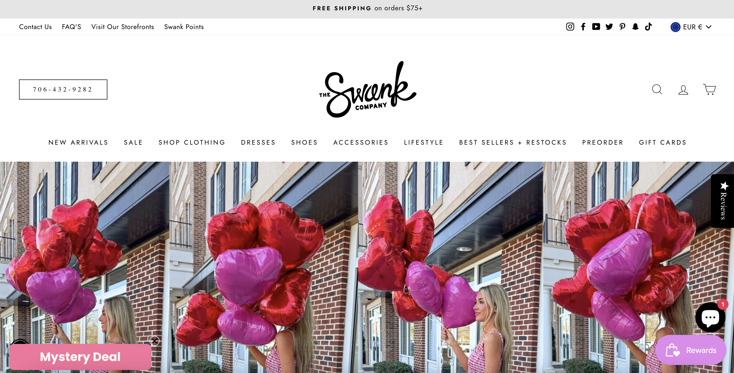
1. Confusing and redundant navigation structure
CriticalThe navigation makes it unnecessarily difficult to find products. Categories are duplicated across different paths (for example, “Dresses” exists as a top-level menu item and again inside broader “Shop clothing” sections), forcing users to guess where products actually live. This creates friction, especially for first-time visitors, who must explore multiple menus to confirm they’re not missing anything.
This kind of redundancy increases cognitive load and slows down decision-making. Streamlining categories, removing overlaps, and establishing a single, clear taxonomy would make browsing more intuitive, reduce frustration, and help users reach relevant products faster without feeling lost.
2. No clear hierarchy of modules and widgets on the homepage
CriticalThe homepage displays multiple actions at the same time: browsing collections, joining the loyalty program, claiming a mystery deal, opening chat, or reading reviews. All of these compete visually, with no clear indication of what users should do first.
Without a clear hierarchy, users default to passive scrolling or leave altogether. Establishing a primary action for first-time visitors and progressively introducing secondary actions based on engagement would create a more intentional and less chaotic experience.
3. Customer review widget is empty
CriticalEven if users actively seek out reviews and open the reviews panel, the content is empty. This creates an immediate negative trust signal.
An empty or underpopulated reviews section is more damaging than having no reviews at all. Ensuring reviews are consistently populated, up to date, and visible would significantly strengthen credibility and reduce friction at the moment of decision.
4. Design favors aesthetics over usability
CriticalThe site prioritizes visual presentation, but this comes at the expense of usability. Important elements such as navigation clarity, decision cues, and trust signals are visually understated or hidden.
Balancing aesthetics with functional clarity would preserve the brand’s look while making the experience easier to use and convert.
5. Customer reviews are hidden behind manual interaction
HighCustomer reviews are not visible by default and require users to actively click on a side “Reviews” tab to access them. This placement makes reviews easy to miss, especially on mobile, where side elements are often ignored or obscured.
Because reviews are hidden, social proof is not integrated into the natural browsing or buying flow. Making reviews visible inline on key pages would allow reassurance to happen passively, without requiring extra effort from the user.
6. Promotions are shown without regard to user intent
HighPromotional elements such as “Mystery Deal” are shown universally, regardless of whether users are price-sensitive, browsing casually, or close to purchasing. This can distract high-intent users and cheapen the experience for others.
Promotions should be triggered based on behavior, not shown by default. Aligning offers with signs of hesitation or exit intent would make promotions feel more relevant and effective.
7. No adaptation for returning visitors
HighReturning users are shown the same experience as first-time visitors, even though their needs and intent are different. There is no recognition of prior engagement or familiarity.
Adapting the experience for returning users would allow faster access to relevant products and reduce unnecessary friction in repeat visits.
8. SEO content is generic and underutilized
HighThe homepage and category-level copy relies heavily on generic phrases like “affordable women’s clothing” and “latest trends,” which are highly competitive and add little differentiation. While this content exists, it does not clearly target specific search intents or long-tail queries that could attract qualified traffic.
Strengthening SEO content with more specific, intent-driven language (for example, occasion-based, style-based, or use-case-focused copy) would improve organic visibility while also making the content more useful for users.
Want to unlock the full CRO report?
Get access to all recommendations, benchmarks, and experiment ideas.
Unlock full accessAdapt calls-to-action based on user readiness
CriticalAll visitors are presented with the same primary CTA regardless of engagement level.
Guide undecided users with progressive interactions
HighUsers showing exploration behavior are not guided toward soft commitment actions.
Reduce friction at high-intent conversion points
CriticalHigh-intent visitors face the same experience as early-stage users.
Important note
This audit is based on an automated and heuristic-based analysis of publicly accessible pages. The evaluation follows industry best practices across conversion rate optimization (CRO), usability, analytics, and discoverability.
The findings presented here are directional and indicative in nature. They do not take into account internal data such as revenue performance, customer lifetime value, traffic quality, seasonality, or proprietary tooling.
Recommendations should be interpreted as optimization opportunities rather than absolute assessments. Actual impact may vary depending on audience composition, acquisition channels, and business context.
This report is not exhaustive and should be used as a starting point for further analysis and experimentation.