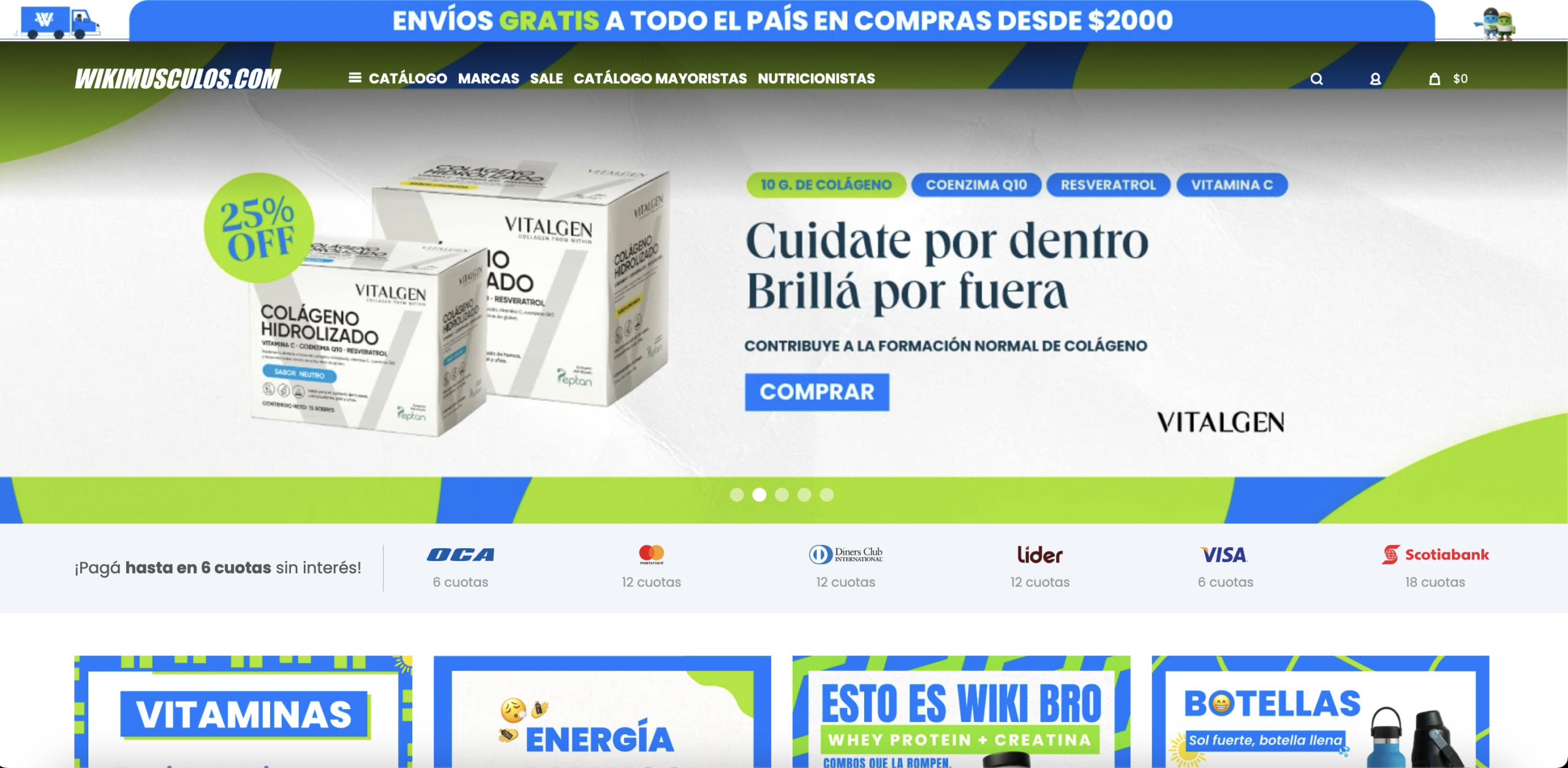
The hero section cycles through individual brand campaigns — each with a different headline, product image, and tone — leaving the store itself without a persistent, visible value proposition. Visitors who land from paid social or organic search arrive during the 5-second evaluation window with no stable answer to the question "why buy here rather than a competitor." A rotating carousel ensures that question is never answered: successive slides present different products, different messages, and different visual languages. First-party research consistently shows that carousels reduce engagement with any individual slide, and beyond the UX mechanics, the structural problem is strategic: the store is ceding its own above-the-fold real estate to supplier brand content without extracting store-level benefit from it.
Sports nutrition and supplement purchases are high-consideration decisions where buyers face significant perceived risk: efficacy uncertainty, ingredient skepticism, and adverse-effect concern. In this environment, customer reviews function as proxy clinical validation — they reduce risk perception and provide the real-world outcome evidence that product descriptions alone cannot supply. No review system is visible on any product page across the audit screenshots: no star ratings, no review count, no user testimonials. Without this layer, first-time buyers must make purchase decisions based solely on manufacturer copy and brand reputation, both of which are structurally insufficient to overcome the trust deficit that characterizes cold traffic to an unfamiliar regional retailer.
Across the homepage, category pages, and product pages, there are no stock level indicators, no limited-time offer timers, no low-inventory warnings, and no social proof signals such as recent purchases or active viewers. In a competitive commodity category where multiple platforms carry the same branded SKUs, urgency and scarcity are among the few purchase-acceleration levers that a retailer controls directly. Their complete absence means every visitor who hesitates can defer the decision indefinitely, return to a competitor, or find the same product on a marketplace with faster delivery. The flat discount badge visible in the hero (a static percentage) does not create urgency because it carries no time anchor and no consequence for delay.
The homepage correctly surfaces installment payment options — listing six financial institutions with installment terms up to 18 cuotas — directly below the hero, which is strong commercial architecture. However, on individual product pages the installment information is entirely absent. The payment-method logos visible in the product page footer are too small and positioned too far from the purchase zone to serve as a decision accelerant. For higher-ticket items, installment availability is a direct price-perception modifier: a product that appears expensive as a single payment becomes dramatically more accessible when broken into monthly amounts. Presenting the lump-sum price in isolation without the installment equivalent forces the buyer to mentally perform an unfavorable calculation rather than anchoring to the lowest perceived cost.
The product listing pages present 94 items with only five filter controls: category, brand, price, specials, and vegan. There is no editorial merchandising layer: no benefit-based sorting ("best for energy," "most popular for recovery"), no featured or staff-picked products, no outcome-based sub-collections, and no contextual copy to help visitors narrow intent. Supplement shoppers frequently arrive with goal-driven rather than brand-driven intent — they want to lose weight, build muscle, or improve sleep — and the current category architecture requires them to already know which product serves that goal before the site can help them find it. A catalogue-first layout optimizes for breadth navigation, not conversion, which systematically increases time-to-decision and abandonment among visitors who don't already know what they want to buy.
On the product pages reviewed, descriptions show visible formatting issues: sentences that cut off mid-clause before a line break, inconsistent paragraph spacing, and disjointed structural transitions between the general ingredient explanation and the brand-specific dosage information. While the informational intent is present — explaining mineral functions, synergy rationale, and dosage — the execution creates a perception of incomplete content. In a category where purchase confidence depends on perceived expertise and authority, copy that appears broken or unfinished signals editorial carelessness. For health and supplement products specifically, buyers use description quality as a proxy for product and retailer credibility: if the listing looks unfinished, the brand feels untrustworthy.
The related products carousel visible below product descriptions presents four to six items from the same ingredient category: all magnesium variants from different brands, at different dosages and price points. While this reflects logical inventory proximity, it functions as a substitution prompt rather than an addition prompt. A shopper evaluating a magnesium product who sees four cheaper magnesium alternatives is likely to switch down in price, not add a complementary product. Cross-sell modules drive AOV when they surface genuinely complementary categories, stack-based recommendations ("commonly bought with"), or outcome-based bundles. Displaying category-identical items at lower prices is a commercial own-goal that reduces rather than expands basket value.
The homepage surfaces a blog section with articles covering nutrition topics relevant to the store's catalogue, including content on high-calorie meal density, sports injury recovery nutrients, sleep quality, and lecithin benefits. This editorial investment signals a genuine intent to capture informational search traffic. However, there is no visible internal link architecture connecting these articles to the product or category pages that a reader would naturally convert through. An article on recovery nutrients that ends without linking to relevant supplement categories, and a category page that surfaces no educational content to support undecided buyers, represent a two-sided missed opportunity: organic informational traffic arrives but is not guided toward commercial intent, and commercial pages fail to reduce buyer hesitation with the supporting content already sitting on the same domain.
- All 21 prioritised CRO suggestions with experiment ideas
- Industry benchmarks for your category & traffic level
- Discoverability (SEO + GEO) full audit results
- A/B test hypotheses ready to implement
- Personalised session with a CRO specialist
The findings presented here are directional and indicative in nature. They do not take into account internal data such as revenue performance, customer lifetime value, traffic quality, seasonality, or proprietary testing.
Recommendations should be interpreted as optimization opportunities rather than absolute assessments. Actual impact may vary depending on audience composition, acquisition channels, and business context. This report is not exhaustive and should be used as a starting point for further analysis and experimentation.