
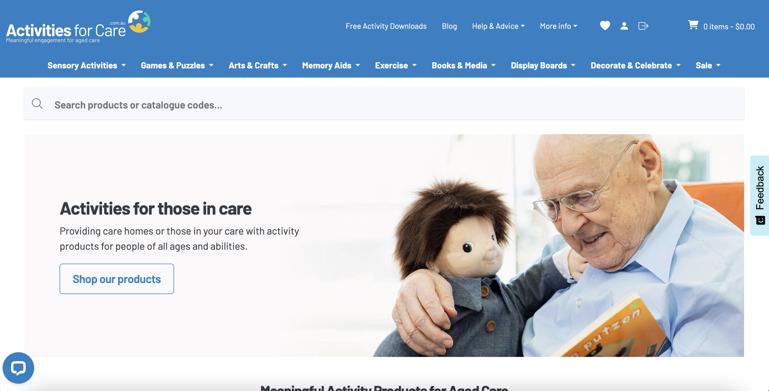
The primary navigation presents a large number of top-level categories: Sensory Activities, Games & Puzzles, Arts & Crafts, Memory Aids, Exercise, Books & Media, Display Boards, Decorate & Celebrate, Sale. In addition, there is a secondary menu (Free Downloads, Blog, Help & Advice, More Info), a large search bar, account icons, wishlist, and cart. The volume of simultaneous choices creates cognitive overload at the first moment of site engagement.
The menu is organized by product types rather than user intent or use cases. While this structure may make sense internally, it does not reflect how care professionals typically think. Buyers are often problem-oriented: "I need dementia activities," "I need low-mobility group activities," or "I need something for sensory stimulation." The current architecture forces users to map their needs onto a product taxonomy they may not know.
The homepage does not prominently feature testimonials, professional endorsements, customer logos, review ratings, or proof of scale indicators. There is no immediate evidence that other care homes, professionals, or families trust and actively use these products. In a sector such as aged care, where purchases affect vulnerable individuals and may involve institutional budgets, trust is not optional. It is foundational to conversion.
Although this is an e-commerce website, the homepage does not immediately communicate that products are available for purchase. The layout emphasizes category blocks, informational sections, and editorial content, but it rarely showcases actual product cards with visible pricing, ratings, or "Add to cart" functionality. As a result, the commercial nature of the site is visually underrepresented.
The website appears to cater primarily to aged care environments, yet there is no prominent pathway for care homes or institutional buyers to request a consultation, discuss bulk orders, or obtain tailored recommendations. The contact page is only accessible through the footer, making it effectively invisible for high-intent B2B visitors. If a significant share of revenue comes from care homes ordering in volume, this represents a structural conversion gap.
The product page content is minimal and largely functional. Beyond the product title, price, short one-line description, and basic technical specifications, there is very limited keyword-rich or context-driven copy. Sections such as "Description," "Activity Ideas," and "Technical Specifications" are collapsed and contain very short content. For a niche with substantial organic search opportunity, this represents a significant missed acquisition channel.
The site appears to publish infrequently, with visible gaps between articles and limited content volume. In a niche such as aged care activities, there is substantial opportunity to capture organic traffic through educational, problem-based, and long-tail search queries. However, the current publishing cadence and content depth do not suggest an active inbound strategy designed to attract and convert search traffic at scale.
The site displays a "How would you rate your experience?" feedback overlay before users have meaningfully interacted with the site. This appears to introduce unnecessary friction at the primary goal of the page: product discovery and purchase. In e-commerce, every above-the-fold element should support revenue-driving actions. This widget competes for attention without contributing to trust, navigation clarity, or conversion momentum.
- All 21 prioritised CRO suggestions with experiment ideas
- Industry benchmarks for your category & traffic level
- Discoverability (SEO + GEO) full audit results
- A/B test hypotheses ready to implement
- Personalised session with a CRO specialist
The findings presented here are directional and indicative in nature. They do not take into account internal data such as revenue performance, customer lifetime value, traffic quality, seasonality, or proprietary testing.
Recommendations should be interpreted as optimization opportunities rather than absolute assessments. Actual impact may vary depending on audience composition, acquisition channels, and business context. This report is not exhaustive and should be used as a starting point for further analysis and experimentation.