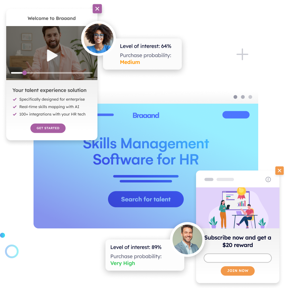
In a world where every click counts and every scroll matters, website optimization and conversion rate optimization (CRO) have become essential strategies for growth.
But where do you begin? To answer this question, we’ve gone straight to the source: top marketing experts from Pathmonk Presents. We’ve had the privilege of interviewing top professionals on our podcast, each with their own unique insights into what really drives conversions and optimizes user experiences.
Here, you’ll find practical, field-tested strategies to maximize conversions and take your website’s performance to the next level. Join us as we unpack top conversion rate optimization best practices shared by 16 marketing experts, guiding you on the path to optimization success.
Table of Contents
1. Amber Spencer from Damon Motorcycles: “Make sure the landing pages align with your ads”
“The landing page is super important, depending on where they’ve come from. If you’re running paid media, make sure that when the person comes to the landing page, the message they’ve seen on the ad aligns with what’s on the page.
Another big thing is ensuring that your website is really fast. Before images go up, make sure they’re super optimized. Videos should be super optimized too. The load time should be low when they initially load the page to make sure visitors don’t bounce away before they even get a chance to look at the information.”
2. Emma Nowakoski from Modifly: “Have one clear call to action”
“Keeping it simple in terms of design, layout, and messaging is key. Having one clear call to action—whether it’s a form fill or contact us—is something we always recommend. On the technical side, meta keywords and SEO should be kept simple to prevent slowing down the site. A fast load time and a clear customer journey are essential. Targeted landing pages and answering potential questions directly on the page can also drive conversions.”
3. Zachary Rego from Triple Whale: “Include personalized on-site experiences”
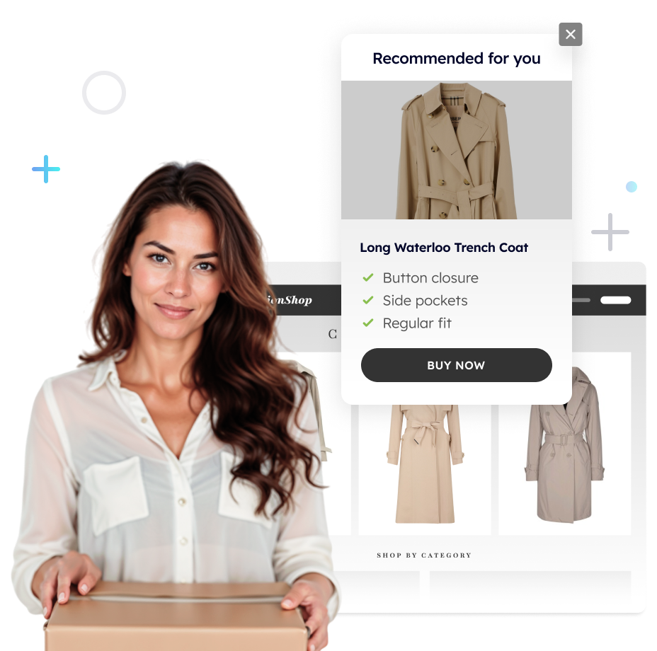
“We create personalized on-site experiences with pop-ups and content to convert visitors through free tools and resources. That approach has been really successful for generating top-funnel leads, which our sales team nurtures into demos.”
Increase e-commerce sales with personalized experiences
- Show the right products at the right moment
- Reduce cart abandonment with intent-based nudges
- Turn anonymous visitors into confident buyers
4. Laurel Barrette from NFS Technology: “Make your forms easy to complete”
“One back-to-basics thing is making your forms easy to complete. Don’t ask for too much information up front—just the essentials. Also, make sure your content is searchable and easy to find. Content needs to be both attractive and actionable, not just for SEO. Ensure it’s genuinely useful for the client—like buyer enablement tools that they can actually use.”
5. Jakub Putyło from Inspeerity: “Connect your website to a CRM”
“Definitely connect your website to a CRM. It helps us manage leads with features like lead scoring, newsletters, and nurturing. We also use other tools to identify which companies are visiting our website, which helps us track interest.”
6. Stephen van der Heijden from OfferZen: “Allow users to interact quickly with the product”
“One thing we’ve learned is the importance of having clear windows on your storefront, meaning people need to see and use the product as soon as possible. Getting users to start interacting with the product quickly is key. In our case, that’s browsing software developers, so reducing the time and effort it takes for users to find value is crucial for conversion.”
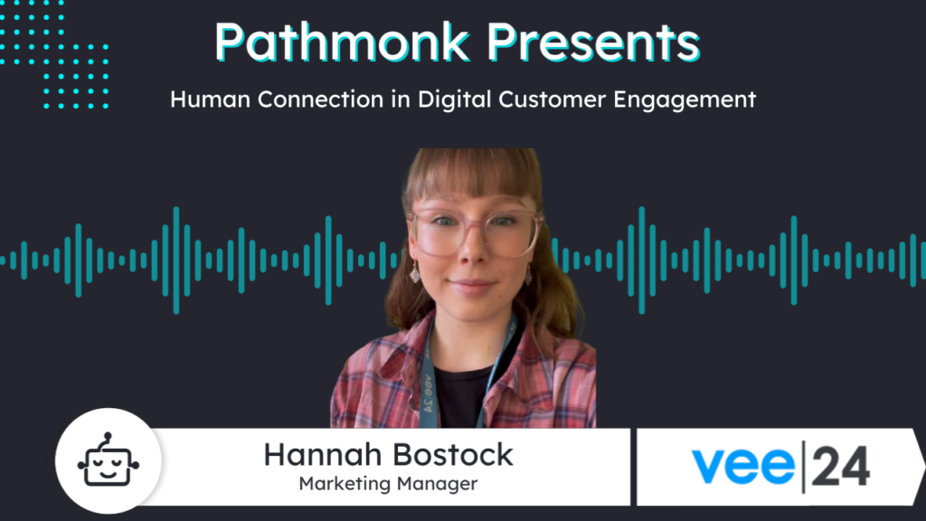
7. Hanna Bostock from Vee24: “Don’t rely solely on contact forms”
“My biggest tip is to not rely solely on contact forms. You cut off a lot of potential leads by only offering a contact form. If a competitor offers multiple ways to communicate and you don’t, you risk losing business. Offering multiple channels is key.”
8. Matthew Burns from Wizard of Ads: “Eliminate as much clutter as possible”
“Eliminate as much clutter as possible. You want to get right to the point. A great website answers three questions quickly: Am I in the right place? Can you solve the problem I’m having? What is the process or what do I have to do next? If you can do those three things quickly, you’ll have better conversions and retention.”
9. Nadine Kreutz from Generic De: “You need one key message”
“You need a good mix—SEO strategy, SEA, and so on. But the key is being crystal clear about what you do and what you offer. You need one key message and repeat it across different channels so your customers truly understand what you’re offering and how you can solve their problems.”
10. Ana Guerra from Focus BC: “Keep it simple and repeat your core message”
“My advice would be to keep it simple and repeat your core message several times. People explore websites differently—some read everything, while others skim or just visit one landing page. So, repeating the main message in different ways is key. Also, make it easy for people to contact you—include contact forms or options on different pages, not just the homepage.”
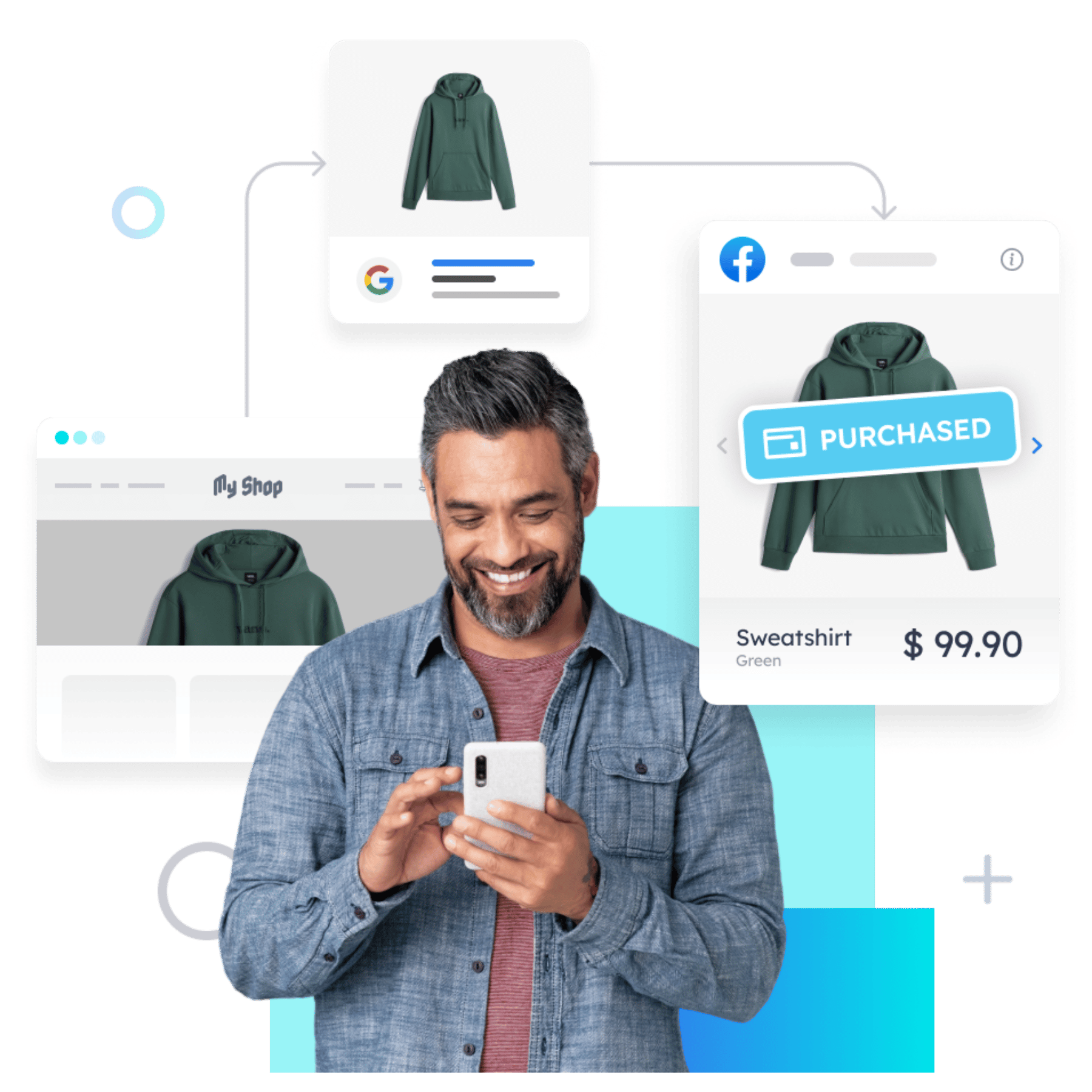
2.5× better ad results with intent-based retargeting
- Retarget users based on real-time intent, not cookies
- Increase ROAS without relying on third-party tracking
- Stay compliant with privacy-first advertising standards
11. Peter Pongracz from Virto Solar: “The most important thing is product-market fit”
“You want to track where your traffic is coming from and keep an eye on the perfect buyer personas and countries. There’s no silver bullet, but for us, the product is good enough to drive growth. Of course, you need to support it with marketing activities, but the most important thing is product-market fit.”
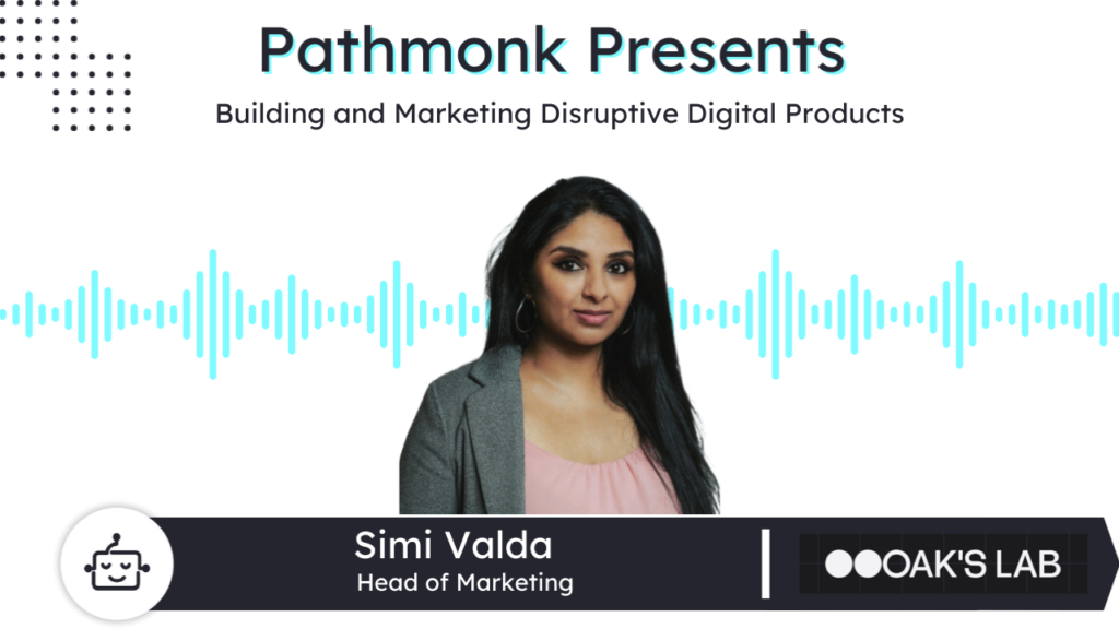
12. Simi Valda from Oaks Lab: “Make it easy for people to contact you”
“Make sure that the way you explain your business is clear and articulate. It’s not just your client that should understand it—anyone who comes to your website should understand who you are, what you do, and how you provide value within a few seconds. Second is design and branding. Design and brand can bring alive who you are.
Also, you need to make it easy for people to contact you—have forms or contact points where they can reach out. Make it as easy as possible for the prospect. It’s really about doing the simple things well.”
13. Amy Wilkinson from Wallet Connect: “Constantly be testing and analyzing data”
“Constantly be testing and analyzing data. Never make assumptions that the copy you’ve decided on is great just because you’ve done a bit of SEO long-tail research. You can have the greatest ideas, but sometimes, when you’re analyzing data and testing, you discover that the unexpected option performs the best.
You find some great low-hanging fruit there. So test, analyze your data, and don’t underestimate the power of possibly being wrong and finding some great opportunities through that.”
14. Kristjan Hauksson from The Engine Nordic: “Understand who’s visiting your website”
“The foundation is understanding who’s visiting your website. If you’re a B2B company with a limited pool of potential clients, it’s not about getting a lot of traffic—it’s about getting the right traffic and being able to identify and qualify those visitors.
Use a system that helps you assess where your leads are in the buying cycle. You can implement things like information-qualified leads (IQLs) and marketing-qualified leads (MQLs) to identify leads and qualify them properly when they come in.”
15. Farah van Caloen from Rohirrim: “Having the form on the top of the page”
“One thing that worked really well for me is having the form on the top right-hand corner of the page rather than at the bottom, or having a button that leads to the form. It’s one of those things where there’s always a push and pull with the design team because, let’s be honest, it’s not the nicest design to have the form right in front of you, but it converts better.
Another thing is having a video in the header banner that summarizes what the page or product is about. Even if people don’t watch the whole video, we see more conversions and form fills just by having it. Content should focus on the users’ pain points—people want products that make their lives better. Also, lots of white space, product images, and icons help keep people on the page longer.”
16. Rafael Morgan from Crazy Games: “Fix issues while understanding user behavior”
“One thing we do is use our internal analytics tools to monitor and fix issues while understanding user behavior. Data is crucial—we look at retention, onboarding, and user acquisition. Everything is based on data.”
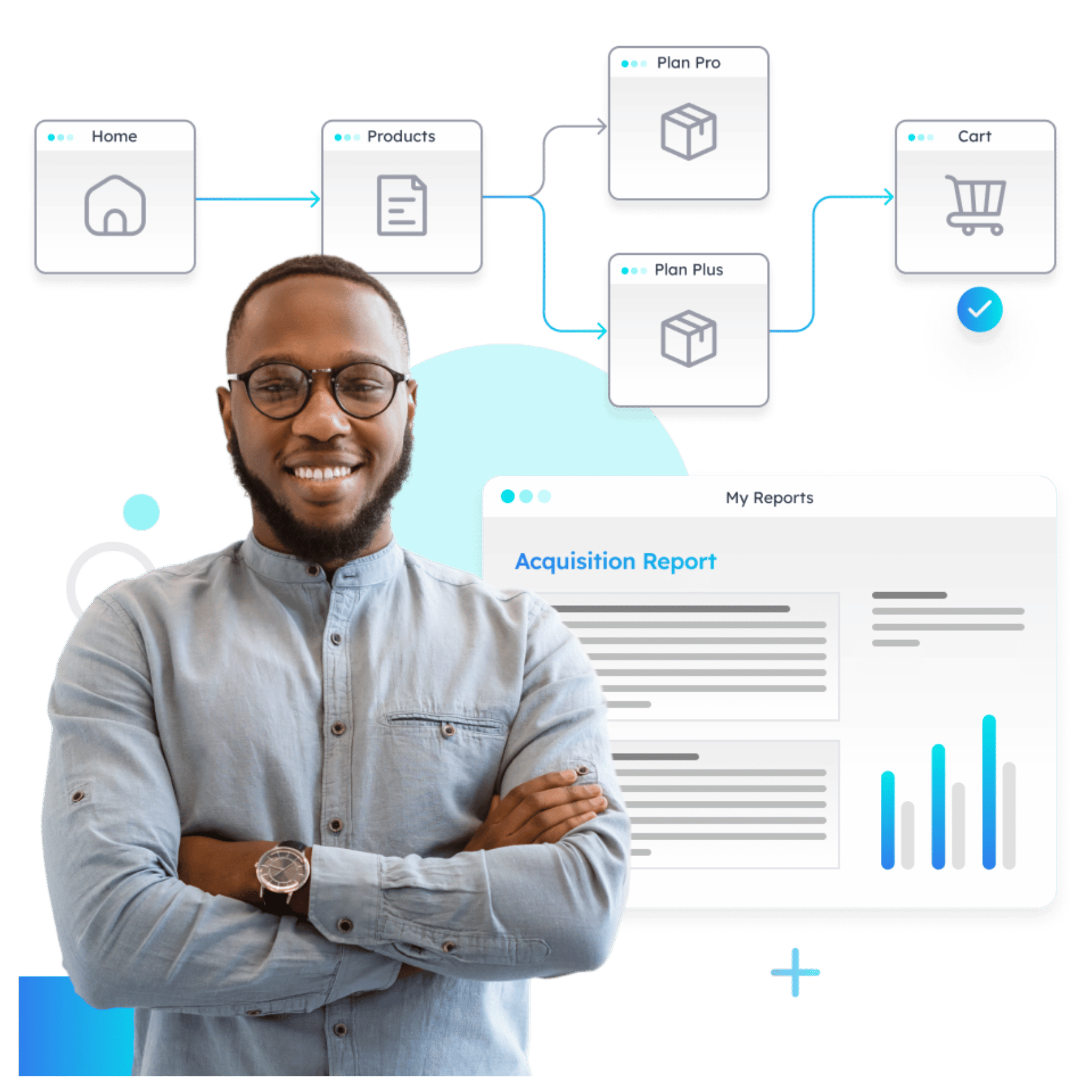
Understand how your prospects behave (in real time)
- Visualize how visitors move across your website
- Identify drop-offs and friction points instantly
- Turn journey data into actionable insights with AI
What Are The Top Conversion Rate Optimization Best Practices?
According to our Pathmonk Presents guests, these are the top CRO best practices to guarantee a website that offers unforgettable user experience and drives conversions:
- Ensure landing page messaging aligns with ads, and optimize page load times to keep visitors engaged.
- Use simple design with one clear call to action and remove any unnecessary clutter.
- Personalize on-site experiences with tailored pop-ups and content to engage visitors based on their behavior.
- Keep forms short and easy to fill out, and place them in visible locations to maximize form completions.
- Offer multiple contact options beyond just a form to make it easier for potential leads to reach you.
- Continuously test and analyze site elements, allowing data to guide improvements rather than relying on assumptions.
Pathmonk: Empowering Marketers to Improve Conversions with AI
So, what’s the real secret behind high-converting websites? As our experts have explored, it’s not just about driving traffic—it’s about turning that traffic into actual leads and customers.
That’s where Pathmonk steps in, transforming the way marketers approach CRO. Pathmonk uses AI to craft real-time, personalized experiences that match each visitor’s unique intent. The result? An impressive boost in conversions—up to 8x in some cases, with average gains of around 50%. Imagine taking those 100 sales and easily turning them into 150, all without lifting a finger.
Want to see how Pathmonk can work for you?
- Check out our interactive, personalized demo—no sales calls involved!
- Or book a product tour with our team if you’re curious to see what we can do.
For those who know what they want and are ready to boost conversions, setting up an account is quick and straightforward. Pathmonk is here to empower marketers to make every visitor count, with the AI-driven power to turn visitors into real business growth.
Increase +180% conversions from your website with AI
Get more conversions from your existing traffic by delivering personalized experiences in real time.
- Adapt your website to each visitor’s intent automatically
- Increase conversions without redesigns or dev work
- Turn anonymous traffic into revenue at scale
