
Over 98% of your website visitors might scroll, explore, maybe even consider converting… but something stops them. A doubt. A distraction. A competitor’s tab 💀
Exit intent tactics exist to catch those users right before they disappear. But here’s the problem: most brands still rely on clunky popups and generic offers that ignore what users actually want.
If you’re serious about conversion rate optimization, exit intent isn’t about slapping a “10% off” banner on the way out. It’s about recognizing intent signals — and responding with the right interaction, at the right moment.
In this article, we’ll break down the most effective CRO strategy to turn abandoning visitors into conversions — and how to do it with AI-driven, personalized experiences that go way beyond popups.
In this article we talk about...
What is exit intent?
Exit intent is a behavioral signal that detects when a user is about to leave your site — usually by tracking rapid mouse movement toward the browser bar or close button. But it’s not limited to that.
In reality, exit intent can show up in many forms:
- A user scrolls to the bottom of the page without clicking.
- They hesitate after reading key product info.
- They visit high-intent pages but don’t convert.
- They switch tabs or reduce engagement.
In short: exit intent means they’re done — but they haven’t left yet.
And that tiny window? That’s your chance to act.
Done right, exit strategies can re-engage users with the right message or value add. Done poorly, they interrupt and frustrate.
That’s why traditional popups fall short. They don’t recognize the why. They just react to the when.
Why do my visitors leave?
Visitors leave for one of two reasons:
- They got what they needed.
- They didn’t.
Since you’re reading this, we’re probably talking about the second one.
Here are the most common reasons users abandon your site without converting:
- Lack of urgency: There’s no reason to act now.
- Unclear value: They don’t fully understand why you’re better.
- Too much friction: Long forms, slow load times, or a clunky UX.
- Wrong timing: They’re not ready to buy — just exploring.
Distrust or doubt: They’re unsure if your product or service will actually deliver.
Sometimes it’s not even about your site. Life happens. The phone rings. The boss walks by. They lose focus.
The key takeaway? Exit behavior is rarely random. It’s driven by intent — or a drop in it.
If you can detect why they’re leaving, you can respond with something more effective than a generic “Wait! Get 10% off!” popup. You can meet them where they are in their decision process — and guide them forward.
Free template: CRO testing framework
Organize, prioritize, and execute conversion rate optimization tests with a clear, repeatable framework.
Free download
Don’t sabotage your own exit strategy
Before we talk about how to do exit intent well, let’s be clear on what not to do, because most exit popups fail for a reason. They interrupt, overwhelm, and sometimes they even confuse.
If you’re triggering a message right before someone leaves, you get one shot. Don’t waste it.
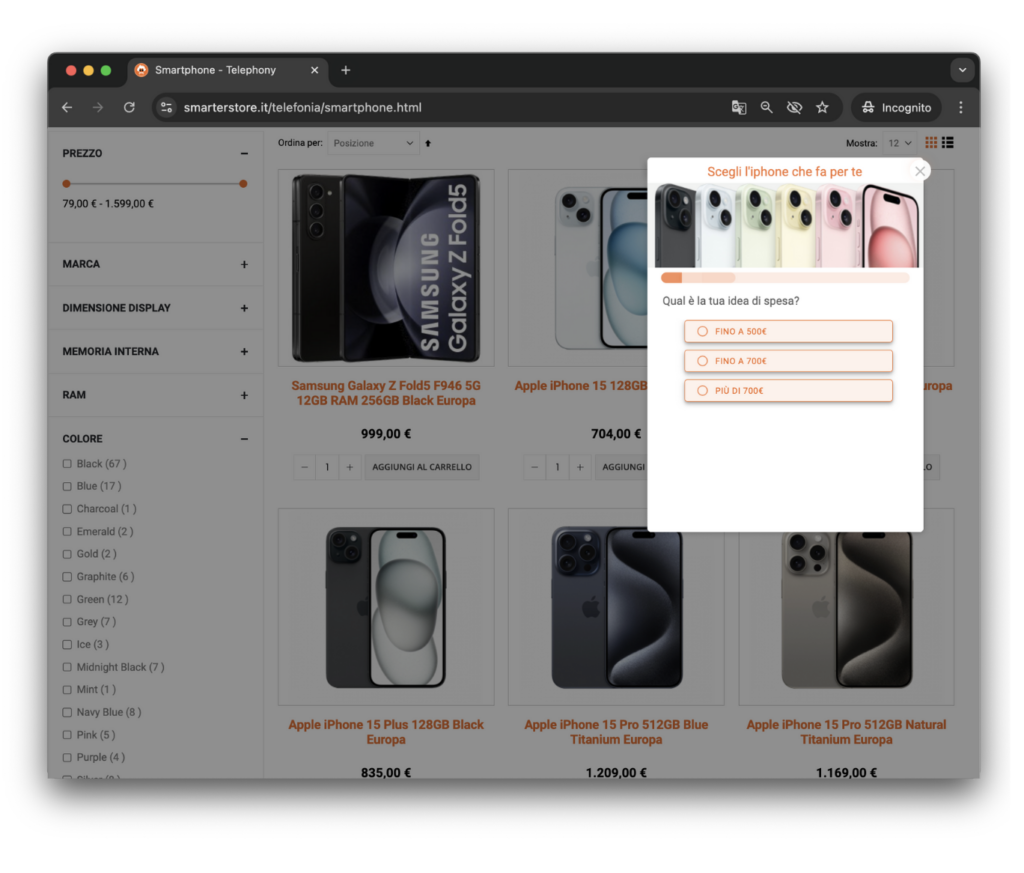
1. Don’t cram multiple goals into one popup
Exit intent isn’t the place to multitask. You’re not pitching your entire funnel, you’re giving users one last, focused reason to stay.
The worst offenders? Popups that try to:
- Capture an email and promote a product
- Offer a discount and invite to a webinar
- Feature multiple CTAs like “Learn More,” “Subscribe,” “See What’s New,” “Maybe Later,” and “Cancel”
Confused visitors don’t convert. A good exit strategy has one job: get one action.
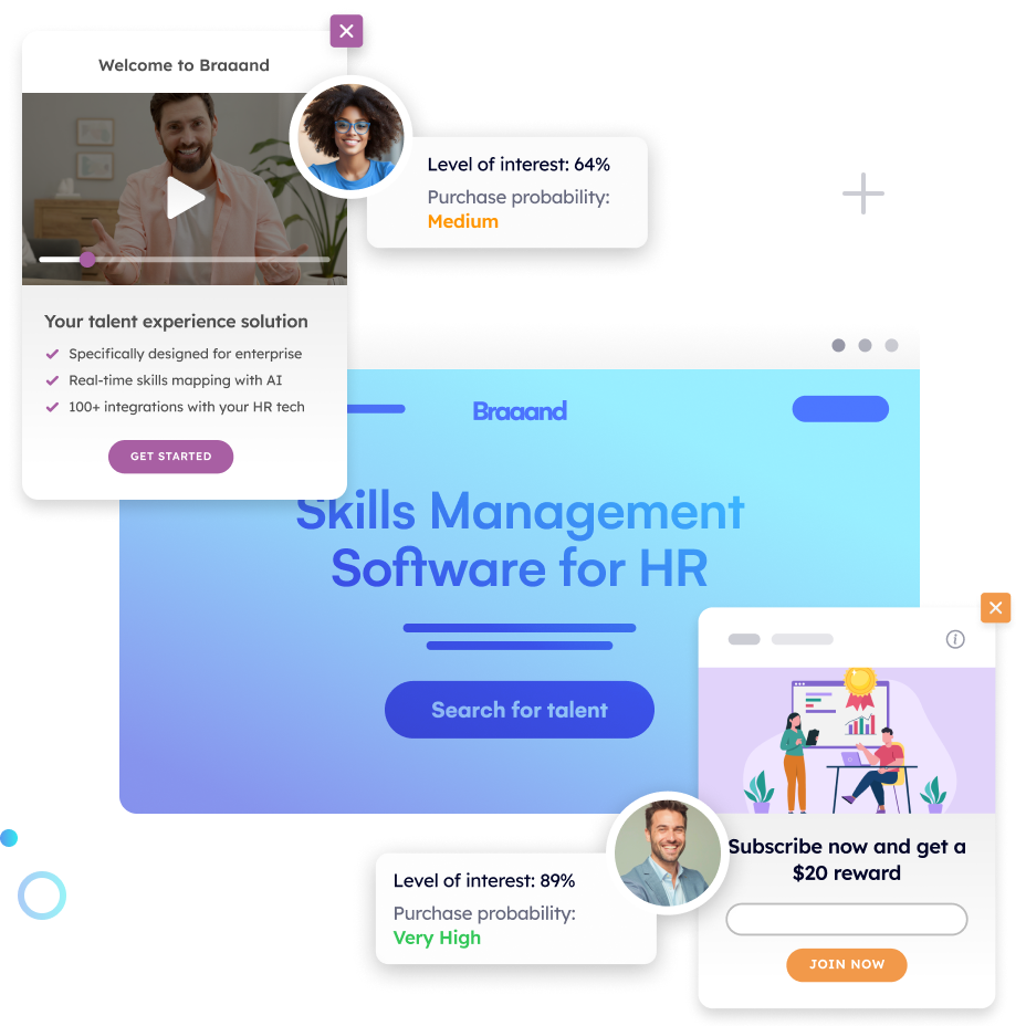
At Pathmonk, we don’t use popups that ask users to make a decision buffet-style. Our AI detects their intent, then delivers one simple interaction based on their behavior — no clutter, no mixed signals.
2. Stop giving people decision fatigue
The more choices you give, the more likely someone is to choose none.
It’s a classic paradox in conversion psychology: more options = lower action. On exit, it’s even worse. The user is already disengaging — don’t hand them a cognitive to-do list.
Instead, be direct:
- “Yes, sign me up” → ✅
- “Send me the guide” → ✅
- “Okay” / “Cancel” / “No thanks” → ❌
At this stage, clarity wins. Make it obvious what happens next. Remove friction. Guide the decision, don’t complicate it.
3. Don’t design like it’s 2010
Some exit popups look like someone stuffed a homepage into a modal. Scrollbars, anchor links, multi-step flows… it’s a mess.
If your popup needs scrolling — it’s not a popup. It’s a page.
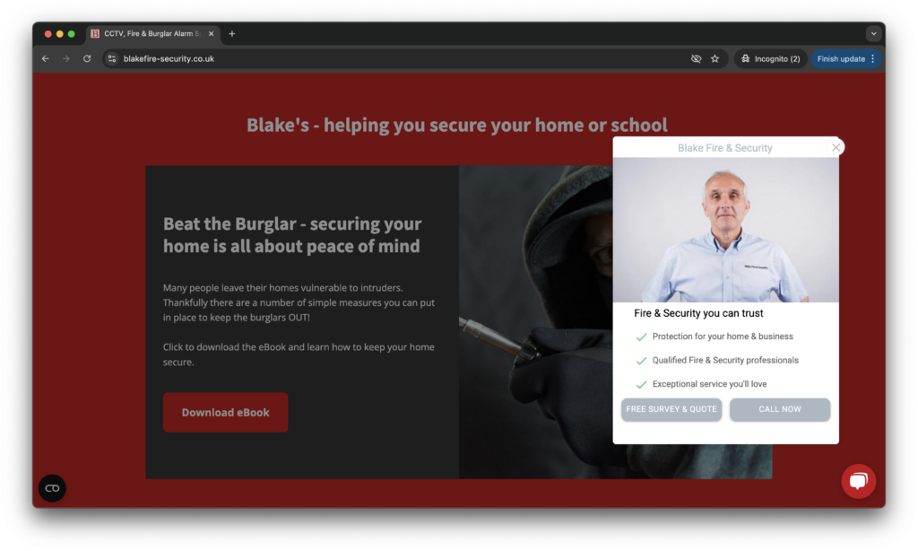
Here’s a better approach: keep the interaction lightweight, relevant, and seamless. That’s what Pathmonk does: no overlays, no blockers. Just a micro-experience tailored to what the visitor actually needs in that moment.
Generate better leads to grow your sales
Discover new strategies to unlocking a flood of high-quality leads from your website.
How to convert visitors before they leave: the Pathmonk way
Exit intent shouldn’t be about guessing, it should be about knowing.
Pathmonk tracks and analyzes each visitor’s behavior in real time (scrolls, clicks, hovers, time on page, hesitation, repetition…) to predict when someone is likely to leave. Before they do, we trigger a micro-experience tailored to their journey. Not a popup. Not a gimmick. Just the right interaction at the right time.
Here’s how brands are using Pathmonk to turn exits into conversions:
1. Recover lost conversions with high-intent triggers
When a user shows signs of hesitation or drop-off (like lingering on pricing or bouncing between product pages), Pathmonk can automatically trigger a tailored experience — like a value reinforcement, a relevant case study, or a limited-time offer.
💡 Example: A user hovers over the exit bar after viewing multiple pricing tiers → We show a dynamic prompt: “Compare plans in 30 seconds” or “See how [customer] made their decision.”
2. Rescue distracted visitors with smart redirects
Not everyone who leaves is uninterested — many are just overwhelmed or confused. Pathmonk recognizes those signals and offers helpful nudges.
💡 Example: A user scrolls fast through content but doesn’t click → Trigger a soft suggestion: “Need help choosing? Try our product finder.”
This gives them a clear next step without forcing commitment — just keeping the conversation going.
3. Re-engage passive browsers with personalized content
When visitors aren’t ready to buy, content is your best tool. Pathmonk identifies passive behavior and offers a relevant article, guide, or success story based on the pages viewed and time spent.
💡 Example: A user reads two blog posts but avoids CTAs → Offer a guide related to their topic. No form of spam, just a contextual suggestion.
4. Give reassurance at the point of doubt
Most visitors don’t convert because they still have doubts. Is this product right for me? Is it worth it? Can I trust this brand?
Pathmonk detects friction points — like re-reading the same section or jumping between tabs — and delivers reassurance moments.
💡 Example: A user repeatedly checks product features → Trigger a trust message: “Rated 4.9 by marketers like you” or “See customer results in your industry.”
5. Use urgency where it makes sense —and only then
Artificial urgency is dead. But real urgency, based on context, works.
Pathmonk tracks return visits and engagement loops to know when a visitor is close, and uses urgency only when it’s aligned with their intent.
💡 Example: A user visits the same product page 3 times in 2 days → Show “Only 2 seats left this month” or “Trial spots filling fast.”
6. Keep the experience seamless: no annoying popups
Traditional exit intent popups disrupt the flow. They darken the screen, block content, and force the visitor into a binary decision: convert now or close the box. That kind of pressure isn’t persuasion, it’s interruption.
Pathmonk takes a completely different approach: instead of jarring overlays, our interactions are lightweight, embedded elements that feel like part of your site —not something slapped on top of it.
No visual clutter. No “X” to hunt for. No bounce-inducing friction.
What visitors experience is more like a smart assistant than a popup:
- A subtle prompt that appears inline when intent to leave is detected
- A dynamic message that slides into view naturally, without hijacking the layout
- A value-add interaction that feels timely, relevant, and helpful — not forced
This keeps users in flow, reduces frustration, and increases engagement.
Because when the experience feels seamless, people are far more likely to stick around.
Increase +180% conversions from your website with AI
Get more conversions from your existing traffic by delivering personalized experiences in real time.
- Adapt your website to each visitor’s intent automatically
- Increase conversions without redesigns or dev work
- Turn anonymous traffic into revenue at scale
What’s the difference between Pathmonk and traditional popup tools?
Tools like OptinMonster, Sumo, and other popup builders have one thing in common: they rely on basic, rule-based triggers. If a visitor moves their mouse toward the top of the screen, they get a popup with a discount. If they spend 30 seconds on the site, they’re asked to subscribe. Scroll 80% down the page? Cue the modal.
These tools operate on a simple cause-effect model. But the problem is—they don’t care why the visitor is doing what they’re doing. Everyone gets the same message, regardless of context or intent.
That’s where Pathmonk is different.
Instead of relying on fixed rules, Pathmonk uses AI-powered behavioral analysis to understand what each visitor is trying to achieve — and how likely they are to convert. It tracks signals like scroll depth, hesitation, repeat visits, page switching, and time spent across different sections. Then, based on real-time behavior, it delivers a micro-interaction tailored to that specific moment in the journey.
Unlike popup tools that interrupt, Pathmonk guides.
Unlike static modals, Pathmonk adapts.
So while tools like OptinMonster might shout “WAIT! 10% OFF!” the moment someone gestures toward the close button, Pathmonk quietly delivers what that person actually needs — whether it’s reassurance, a helpful redirect, or a relevant content suggestion.
Should I still use popups at all?
If you’re using Pathmonk, the answer is simple: no, you don’t need popups anymore.
Popups were originally designed as a workaround: a way to grab attention before a user leaves. And yes, in some cases, they work. But they’re based on a flawed premise: that everyone should see the same message, just because they hit a certain trigger (like scrolling 80% down a page or hovering toward the browser bar).
Even the most “advanced” popup tools on the market still rely on static rules and segmentation. You spend time creating variations, testing placements, adjusting copy, and managing overlays — all for something that still interrupts the user journey and often gets dismissed out of habit.
With Pathmonk, you don’t need any of that.
Instead of forcing one message on everyone, Pathmonk reacts to each visitor’s behavior in real time. It doesn’t rely on assumptions — it learns. It doesn’t interrupt — it integrates.
Here’s how Pathmonk replaces the role of popups, and does it better:
- No more manual segmentation: You don’t have to guess who should see what. Pathmonk identifies user intent and context dynamically, and serves the right interaction accordingly.
- No more guessing timing: Instead of relying on timers or scroll percentages, Pathmonk analyzes scroll behavior, hesitations, return frequency, and more, triggering interactions only when the data suggests someone is likely to leave or needs a nudge.
- No more design clutter: Popups can mess with your site’s UX, especially on mobile. Pathmonk’s micro-interactions are lightweight, fast-loading, and feel like a natural part of the site.
No more tradeoff between UX and conversion: With popups, there’s always a risk: will this annoy users? Will it hurt the experience? With Pathmonk, there’s no tradeoff. You get personalized conversion boosts without compromising UX.
And let’s be real: users are tired of popups. They’re used to clicking the “X” without reading. They’ve been trained to ignore them. So why keep using a tactic that most people bypass automatically?
If you’re serious about improving conversions and creating a better user experience, it’s time to move beyond popups. Pathmonk doesn’t just replace them: it renders them unnecessary. What you get instead is a smarter, more adaptive way to catch and convert visitors based on what they actually need, not what you hope will make them stay.