You don’t get many second chances on the web.
If a site takes too long to load, is hard to navigate, or interrupts users with pop-ups, they leave. Fast.
The truth is: most websites lose conversions not because of bad products, but because of bad experiences. Frustration builds friction, and friction kills results.
In this article, we’ll break down the most common reasons why users get frustrated — and what you can do to fix each one. Whether you’re running a lead gen site or an ecommerce store, this is your checklist for spotting the hidden problems that could be costing you real money.
In this article we talk about...
6 signs your website users are frustrated
Most businesses don’t realize their website is causing friction until they look at the data. User frustration isn’t always obvious, but it leaves a clear trail behind in your analytics, session recordings, and conversion metrics.
Here are some of the most telling signs that something’s not working for your visitors:
1. High bounce rate
If a large portion of your traffic lands on a page and leaves immediately without clicking anything, that’s a red flag. It often means the page didn’t load fast enough, wasn’t relevant, or simply didn’t feel trustworthy at first glance.
👉 Related reading: How to reduce bounce rates with Pathmonk
2. Low time on site
Even if users don’t bounce instantly, they might still leave quickly. If average session duration is low, it likely means users aren’t finding what they need — or they’re confused by the structure and give up.
3. Drop-offs in key funnels
Whether it’s an abandoned cart, an unfinished lead form, or users exiting just before the CTA, these are all signals of micro-frustrations. Something caused friction just before the finish line.
👉 Related reading: How to convert visitors in the decision stage with Pathmonk
4. Rage clicks and dead clicks
If you’re using session recording tools like Hotjar or Microsoft Clarity, look for “rage clicks” — when users rapidly click the same spot out of frustration. It usually means something isn’t clickable, doesn’t respond, or behaves unexpectedly.
5. Frequent support requests for simple things
If users are reaching out to ask how to book a demo, where to find pricing, or how your product works, that’s your UX failing, not theirs.
6. Poor conversion rates despite solid traffic
You’re getting visits, maybe even from qualified channels like search or paid, but conversions are flat. That’s a classic sign that the user journey is broken somewhere along the way.
👉 Related reading: How to automatically increase any website conversion rate with Pathmonk
Frustration builds silently, and most of it happens before a user ever fills out a form or talks to your team. That’s why identifying and removing these points of friction is critical if you want to improve performance.
Turn website traffic into sales-ready leads
- Identify high-intent visitors automatically
- Qualify leads before they reach your sales team
- Convert traffic without adding friction or forms
Why your website users are frustrated
1. Slow loading times
People expect websites to load instantly. When a page drags for more than a couple of seconds, it signals poor quality or unreliability — even before the content appears. Users don’t wait. They click away.
What feels like a short delay to you feels like forever to them, especially on mobile or when they’re multitasking.
The impact on conversions
Speed is directly tied to bounce rate and revenue. A few key stats:
- A 1-second delay in page load time can reduce conversions by up to 7%
- Pages that load in 1 second convert 3x higher than those that load in 5
- Google considers site speed a ranking factor, so it also affects your visibility
In short, a slow site = fewer visitors, fewer conversions, lower SEO performance.
How to fix slow loading times
- Compress and optimize images: Large images are often the main culprit. Use tools like TinyPNG or WebP format to reduce file size without losing quality.
- Use lazy loading: Only load images and assets when they appear in the viewport — not all at once.
- Minify CSS, JS, and HTML: Clean up unnecessary code and reduce file sizes. Tools like Minify or online compressors help.
- Use a CDN (Content Delivery Network): Serve your site through edge servers around the world to reduce latency.
- Audit your site speed regularly: Use tools like Google PageSpeed Insights, GTmetrix, or Lighthouse to test performance and prioritize improvements.
2. Confusing navigation
When visitors land on your site, they’re usually trying to accomplish something specific: find pricing, book a demo, learn about your product, or read customer reviews. If your navigation structure makes that hard to do, you’ve already lost them.
Confusing menus, vague labels, buried pages, or an overload of choices all increase cognitive load. The user has to think too much. And online, thinking = friction.
If users feel disoriented — unsure of where to click, what path to follow, or where they are in the journey — frustration kicks in fast.
The impact on conversions
Poor navigation directly affects your bottom line. Here’s how:
- Users drop off before reaching high-intent pages like pricing, product details, or conversion forms.
- Your most important content stays hidden, buried under vague or overloaded menus.
- Even if users are interested, they may leave out of sheer annoyance if they can’t find what they’re looking for quickly.
It also hurts SEO: search engines rely on your site structure to crawl and index pages properly. If your navigation is a mess, you’re likely losing visibility too.
How to improve your website’s navigation
- Use Pathmonk to guide users to conversions seamlessly: Use Pathmonk to guide users to conversions seamlessly. Instead of relying only on your static menu, Pathmonk detects what each visitor is trying to achieve and delivers smart, contextual nudges that lead them toward conversion. Whether it’s surfacing the right CTA, showing supporting content, or prompting a micro-form, Pathmonk fills the gaps your navigation can’t.
- Stick to clear, user-focused menu labels: Use terms your audience understands — not internal jargon. “Solutions,” “Pricing,” and “Resources” often perform better than clever but unclear alternatives.
- Limit top-level choices: Avoid overwhelming users with 10+ menu items. Group content logically under intuitive categories.
- Highlight high-intent paths: If your goal is lead generation, make sure key actions like “Book a demo” or “Start free trial” are prominent and accessible from anywhere.
- Test your navigation regularly: Use behavioral tracking or user testing to see how visitors interact with your menus, and where they get stuck.
3. Too many pop-ups or interruptions
You’ve probably experienced this yourself: you land on a site, and before you even scroll, you’re hit with a cookie banner, then a newsletter popup, followed by a chatbot in the corner, and maybe even an exit-intent modal as you try to leave.
It’s overwhelming, disruptive, and screams “we care more about your email than your experience.”
Pop-ups and overlays that appear at the wrong time — or too many at once — break the user’s flow. They interrupt the natural browsing experience and make it harder to focus on what the visitor actually came for.
The impact on conversions
While pop-ups can increase short-term signups, overusing them damages trust and usability. Here’s how they hurt in the long run:
- Users bounce before they even engage with your core content
- Visitors associate your brand with spammy, pushy tactics
- Important messages get ignored because they’re competing with too many other distractions
- Mobile users struggle the most — overlapping pop-ups can make the site nearly unusable
In essence, pop-up overload turns curiosity into frustration — and that means lost conversions.
How to avoid interruptions
- Prioritize user intent over timing: Don’t throw every popup at the user within the first 10 seconds, or the same generic exit-intent banner. Think about when the user actually needs a nudge, not just when you want to show it.
- Limit the number of concurrent pop-ups: Cookie banner, chatbot, and newsletter modal all at once? No. Choose the most critical one and delay or suppress the rest. Or, if you want it automatically done for you, Pathmonk will show the best micro-experience to each user, maximizing their chances of conversion.
- Use subtle, native-looking prompts: Sticky side bars, like Pathmonk’s menu, often perform better and feel less intrusive than full-screen modals.
Use Pathmonk to trigger the right experience at the right moment: Instead of relying on generic pop-ups, Pathmonk analyzes user behavior in real time and surfaces only the most relevant interaction — like a CTA, video, or micro-form — precisely when it’s most likely to convert. No clutter, no guesswork, just smooth progression through the journey.
Free template: CRO audit checklist
- Identify conversion drop-offs across your funnel
- Spot friction points hurting performance
- Prioritize fixes with the biggest impact
4. Poor mobile experience
Mobile traffic now accounts for more than half of web visits globally, and yet, many websites still treat mobile as an afterthought. What works on desktop often falls apart on a smaller screen.
Misaligned buttons, broken layouts, cut-off text, hard-to-tap elements, and content that just doesn’t render properly are instant turn-offs. Users have little patience for pinching, zooming, or trying to guess where to click. If the experience is frustrating on mobile, most visitors won’t even bother switching to desktop — they’ll just leave.
The impact on conversions
A poor mobile experience doesn’t just hurt usability, it has a direct impact on results:
- Mobile bounce rates skyrocket when layouts break or content becomes unreadable
- Conversion rates drop significantly if CTAs or forms are hard to interact with
- Google penalizes non-mobile-friendly sites in search rankings, which reduces organic traffic
- Visitors may question the credibility of your brand if your mobile site feels clunky or outdated
Given how many users first discover your brand on mobile, this first impression matters more than ever.
How to improve your mobile experience
- Adopt a mobile-first mindset: Don’t just shrink your desktop site — design for mobile from the start. Prioritize speed, simplicity, and thumb-friendly interactions.
- Test across devices and screen sizes: What looks fine on an iPhone 14 may break on a smaller Android. Use responsive testing tools (like BrowserStack or Chrome DevTools) to catch layout issues early.
- Simplify navigation and interactions: Use hamburger menus, collapsible sections, and fewer on-screen elements to avoid overwhelming the user. Ensure buttons are large enough to tap comfortably.
- Make sure CTAs and forms are accessible: Place key actions within easy reach (no scrolling forever), and ensure forms are optimized for mobile typing — with autofill, proper keyboard types, and minimal fields.
5. Unclear value proposition
When someone lands on your website, they’re asking one silent question: “What is this, and why should I care?”
If your site doesn’t answer that within the first few seconds, you’ve lost them. Visitors aren’t willing to scroll, explore, or dig around just to figure out what you do, they’ll move on to a competitor that makes it clearer.
A vague headline, generic messaging, or cluttered layout can instantly create confusion. And confusion leads to friction. Friction leads to drop-off.
The impact on conversions
An unclear value proposition results in:
- High bounce rates on landing pages, especially from paid traffic
- Poor engagement across the site (low time on page, low scroll depth)
- Missed opportunities to differentiate your offer
- Fewer conversions because users never realize the value you provide
It doesn’t matter how good your product or service is, if the visitor doesn’t “get it” immediately, it’s game over.
How to help prospects understand your value proposition
- Refine your headline to speak directly to your audience’s pain point or desired outcome: Don’t lead with features — lead with value. Your headline should explain what you do and why it matters.
- Use subheadings to support your message: Reinforce your value prop with a concise explanation or benefit statement that’s scannable.
- Show social proof or trust elements early: Logos, testimonials, or stats help add credibility and context fast.
- Keep the design clean and focused above the fold: Remove distractions that compete with your core message. A cluttered layout dilutes impact.
- Use Pathmonk to adapt the messaging based on user behavior: If your audience comes from different sources or has different intents, one static value prop won’t cut it. Pathmonk dynamically adjusts content and CTAs in real time to show the most relevant message to each visitor — so you never lose a lead just because they didn’t “get it” fast enough.
6. Autoplaying videos or sound
Few things trigger an immediate “close tab” reaction like surprise audio. Imagine you’re quietly browsing during a meeting or on your commute, and suddenly a video starts blasting music or someone’s voice.
Autoplaying sound is not just disruptive, it’s intrusive. It takes control away from the user, and that always backfires.
Even autoplaying videos without sound can be irritating if they compete for attention or slow down the page load.
The impact on conversions
Autoplaying media may seem like a good way to grab attention, but it usually does the opposite:
- Users leave the site before engaging at all
- Visitors disable media or ignore content entirely out of annoyance
- Pages load slower due to unnecessary video assets
- It erodes trust and signals that the site isn’t respecting user experience
Tactical tips to fix autoplaying multimedia assets
- Never autoplay sound: If you want to use video, always keep it muted by default. Let the user choose when to play audio.
- Use click-to-play or scroll-triggered videos: This gives users control and ensures they’re actually interested before the media starts.
- Compress and optimize videos for fast loading: Large video files can drag down performance, especially on mobile.
- Use Pathmonk to trigger videos contextually, based on user behavior: Instead of throwing a video at every visitor, Pathmonk detects when a user is engaged and ready, then displays product videos, case studies, or testimonials at exactly the right moment. That way, video becomes a conversion tool, not a frustration.
7. Inconsistent or ugly design
First impressions matter, and on the web, they’re formed in milliseconds. Even if users can’t pinpoint what’s wrong, a clunky, outdated, or inconsistent design triggers a gut-level reaction: this site doesn’t feel trustworthy.
Disjointed visuals, mismatched fonts, low-quality images, awkward spacing, or unclear visual hierarchy make the experience feel cheap or amateur. And when that happens, users are less likely to stay, engage, or buy.
It’s not just about aesthetics, it’s about perceived credibility.
The impact on conversions
Design is one of the strongest trust signals on your site. A poor design leads to:
- Higher bounce rates due to visual discomfort
- Lower engagement with key content or CTAs
- Reduced willingness to submit forms or make purchases
- Lost opportunities to build brand recognition and authority
Especially for SaaS and service businesses, the website is the product experience — if it looks off, users assume the same about everything else.
How to improve your website’s design
- Stick to a consistent visual style: Use a defined color palette, font system, and spacing rules. Consistency builds familiarity and trust.
- Use white space wisely: Crowded layouts feel chaotic. Give content room to breathe.
- Design for scannability: Break up text with headings, bullets, and visuals. Users rarely read, they skim.
- Invest in good imagery: Ditch pixelated stock photos. Use original graphics or high-quality visuals aligned with your brand.
8. Forms that are too long or don’t work
Filling out a form is often the final step before a conversion, and also the moment many users drop off.
Why? Because the form feels like work. If you’re asking for too many fields, repeating info, or throwing errors with no explanation, users get frustrated fast. Especially on mobile, long or clunky forms are a guaranteed turn-off.
Worse, if the form breaks or doesn’t confirm submission properly, users may leave without knowing whether their action worked.
The impact on conversions
Forms are one of the biggest friction points in the user journey. If they’re not optimized, expect:
- Abandoned sign-ups or checkouts
- Lower lead volume and quality
- Lost revenue from users who were ready to convert but gave up
- Frustrated users who never come back
How to create seamless forms
- Use Pathmonk to trigger forms when intent is highest: Instead of showing a generic form to everyone, Pathmonk detects user readiness and shows short, dynamic forms only when the visitor is likely to engage — improving both quantity and quality of leads.
- Only ask for essential info: Every extra field increases drop-off. If you don’t need it, don’t ask for it.
- Use smart field types: Dropdowns, autofill, and mobile-friendly keyboards make a big difference.
- Provide clear error messages and validation: Don’t just highlight a field in red — explain what’s wrong and how to fix it.
- Offer progress indicators for longer forms: If the form must be long, break it into steps and show users how far they’ve come.
9. Irrelevant or generic content
People come to your website looking for answers. If what they find is too broad, too vague, or clearly not written for them, they’ll lose interest.
Generic content wastes time. It forces users to sift through fluff to find what they actually need, and most won’t bother. Whether it’s blog posts, product descriptions, or landing pages, if the message doesn’t match their intent, they’re gone.
The impact on conversions
Irrelevant content leads to:
- Low engagement (scroll depth, time on page, click-through)
- Poor SEO performance (Google favors useful, intent-matching content)
- Lower conversion rates, even if you’re driving the right traffic
- Users leaving with the impression that “this isn’t for me”
The mismatch between what users expect and what they see is one of the fastest ways to lose trust.
How to make your content feel personal
- Use Pathmonk to personalize website experiences dynamically: Pathmonk identifies user intent and adjusts the website experience in real time, showing the most relevant messages, offers, or case studies based on source, behavior, and stage. That way, every visitor gets content that actually speaks to them.
- Segment your content by audience or use case: Don’t try to speak to everyone at once. Create pages or sections tailored to specific personas or industries.
- Match content to intent: Top-of-funnel users need education, mid-funnel want comparisons, and bottom-funnel want proof. Give each segment what they’re looking for.
- Use real examples, not generic phrases: Cut the “we offer solutions for all your needs” copy. Say what you do, for whom, and how it helps.
- Continuously review your content performance: If certain pages have high drop-off, rewrite or restructure them based on user behavior.
How Pathmonk helps eliminate website friction
By now, it’s clear: frustration leads to friction, and friction costs you users, conversions, and revenue.
But fixing that friction isn’t just about changing button colors or redesigning your entire site. It’s about responding to what users actually want in real time.
That’s exactly what Pathmonk does.
🧠 Real-time intent detection
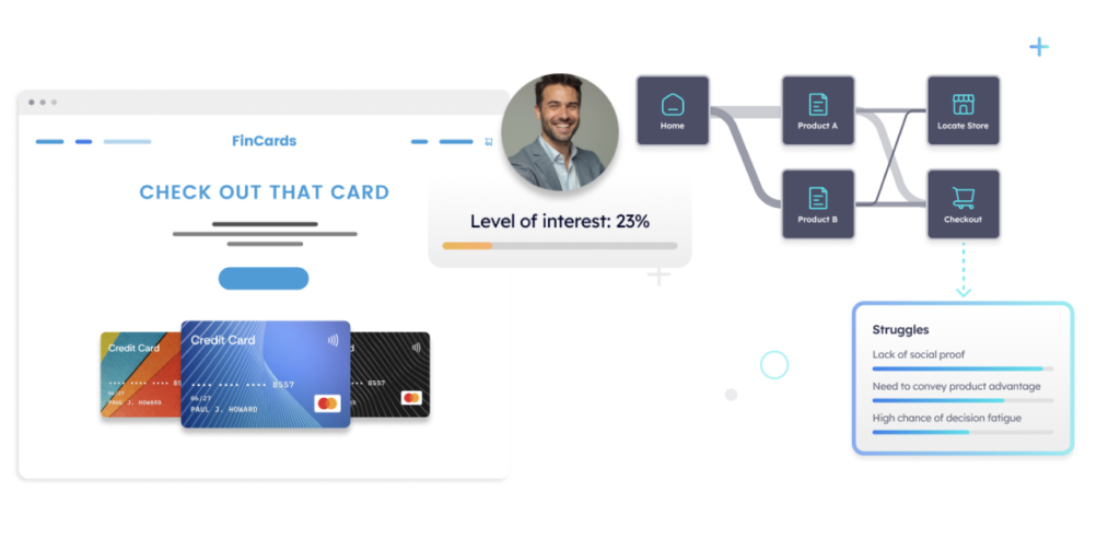
Pathmonk analyzes every visitor’s behavior as they move through your site — clicks, scrolls, time on page, traffic source — and determines what they’re trying to achieve. No guessing. No assumptions.
⚡ Adaptive micro-experiences
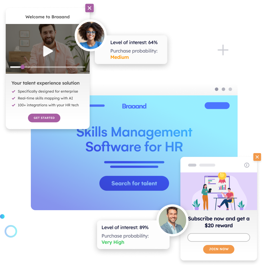
Instead of using static journeys or flooding users with pop-ups, Pathmonk reacts intelligently with seamless, in-page interactions that guide visitors toward conversion without interrupting them.
- A relevant CTA appears right when interest peaks
- A short form shows up only when intent is high
- A case study or testimonial is surfaced the moment trust needs to be built
- A product video is triggered once users engage with a key feature
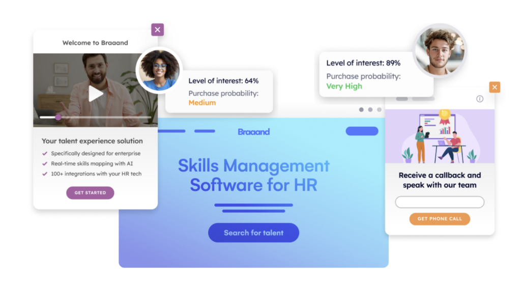
All tailored. All automatic. All friction-free.
💡 From frustration to flow
Pathmonk doesn’t change your site’s design, it layers intelligence on top of it. So you don’t need to rebuild anything. You just make what you already have work smarter.
🛠️ Set it up once, let the AI do the rest
No developers. No coding. You define your goals, activate the AI, and let Pathmonk handle the personalization. While other tools give you data, Pathmonk gives you results: more leads, more demos, more revenue.
Ready to eliminate the hidden friction points killing your conversions?
Increase +180% conversions from your website with AI
Get more conversions from your existing traffic by delivering personalized experiences in real time.
- Adapt your website to each visitor’s intent automatically
- Increase conversions without redesigns or dev work
- Turn anonymous traffic into revenue at scale
FAQs about website user frustrations
Why do users leave even if my product is good?
Because a good product can’t save a bad experience.
You might have the best solution in your industry, but if your website is slow, hard to navigate, or cluttered with distractions, users won’t stick around long enough to find that out. First impressions online are instant, and they’re based on how smooth the experience feels.
If visitors can’t understand what you offer, get to the right page quickly, or complete a basic action without frustration, they’ll bounce. UX issues don’t just hurt your brand, they kill conversions before they even start.
Do pop-ups always frustrate users?
Not always — but most sites overdo it. A single, well-timed pop-up can be effective. But stacking a cookie banner, newsletter signup, chatbot, and exit-intent modal within the first 15 seconds? That’s a guaranteed bounce.
The key is intent. If a pop-up appears when a user is engaged and it offers real value (like a discount, a demo, or helpful content), it can work. If it appears just because someone opened the page, it interrupts the experience and drives people away. That’s why Less noise, more relevance.
Can personalization help reduce frustration?
Yes, when it’s based on behavior, not assumptions.
Personalization done right smooths out the user journey. It helps visitors skip irrelevant content, surface what matters to them, and move through the site without unnecessary steps. It’s like turning a maze into a guided path.
Tools like Pathmonk personalize experiences in real time based on how users interact with the site — no need for cookies or login data. That means you can adapt your site to every visitor’s intent without crossing any privacy lines.
Do I need to redesign my website to fix frustration issues?
No, in fact, redesigning might not be the best move.
Most frustration comes from UX gaps: slow speed, poor content hierarchy, long forms, or bad mobile experiences. These don’t always require a full rebuild. Small, focused changes often make a bigger impact.
And if you want to go a step further without touching your core design, you can layer intelligent experiences on top. That’s what Pathmonk does — it identifies what each user is trying to do and guides them with relevant interactions, all without you changing your site structure or hiring a dev team.

