Your customers may have 99 problems… but does your brand solve any of them? 😬
Here’s the thing: at the awareness stage, people aren’t ready to buy—they’re busy figuring out what their actual problem is. They’re googling and skimming pages to get answers. The last thing they want is a sales pitch.
If you want to keep them around, you need to show up with value—real value, not fluff. With Pathmonk’s AI-driven personalization, you can give your visitors exactly what they’re looking for: useful content, answers, and a reason to stick with your brand.
Let’s break down how you can make the most of it, shall we?
Table of Contents
Step by step: engaging early-stage visitors with Pathmonk
1. Install and set up Pathmonk
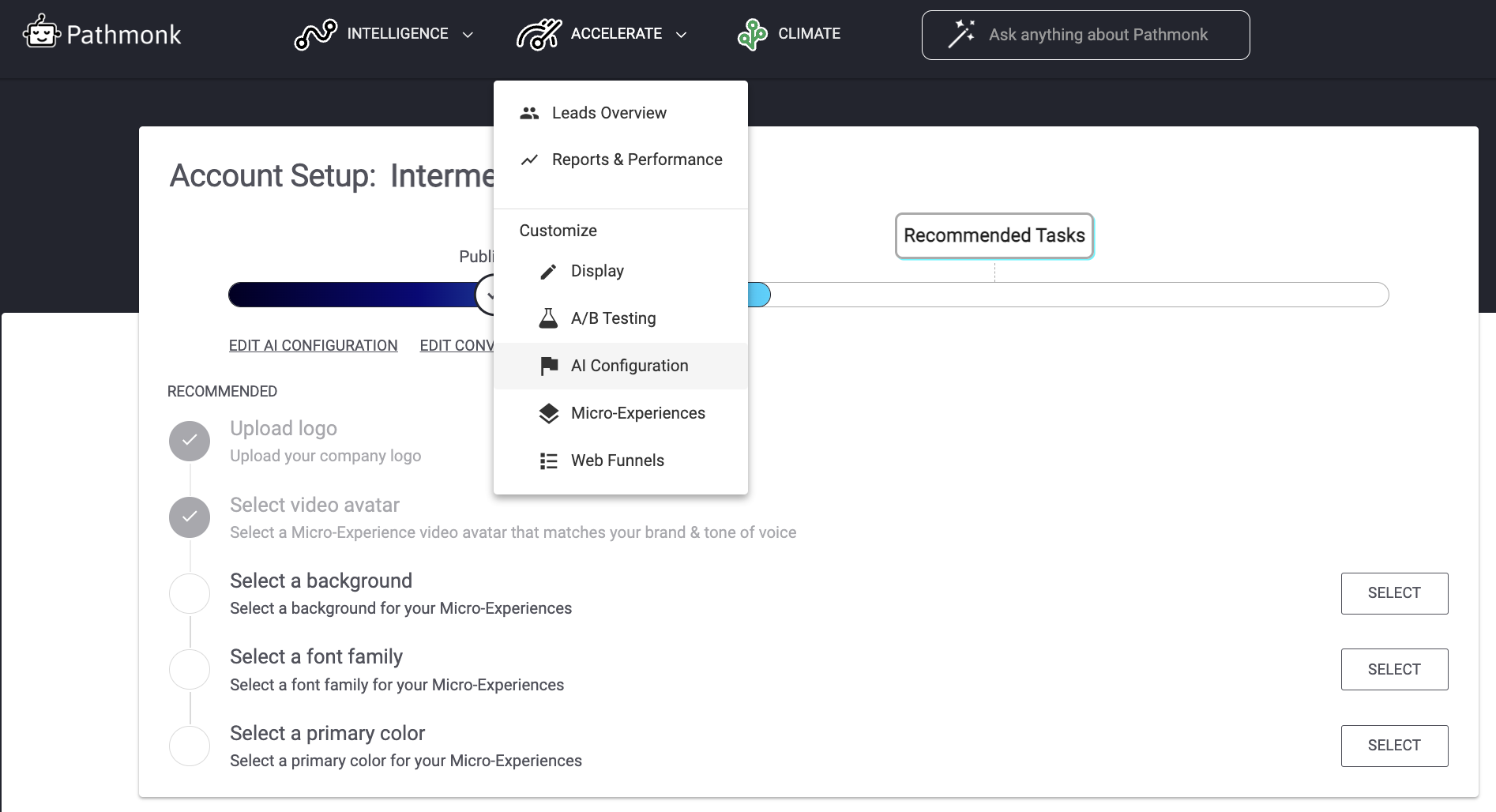
Pathmonk optimizes your entire customer journey, not just the awareness stage. Once you’ve logged in, the first step is defining your website’s main goal. In your dashboard, under the Accelerate menu, choose AI configuration.
Ask yourself: What action do you want visitors to take? Is it completing a purchase? Booking a call with your sales team? Signing up for a free trial? Clarifying this goal ensures the AI knows what to prioritize.
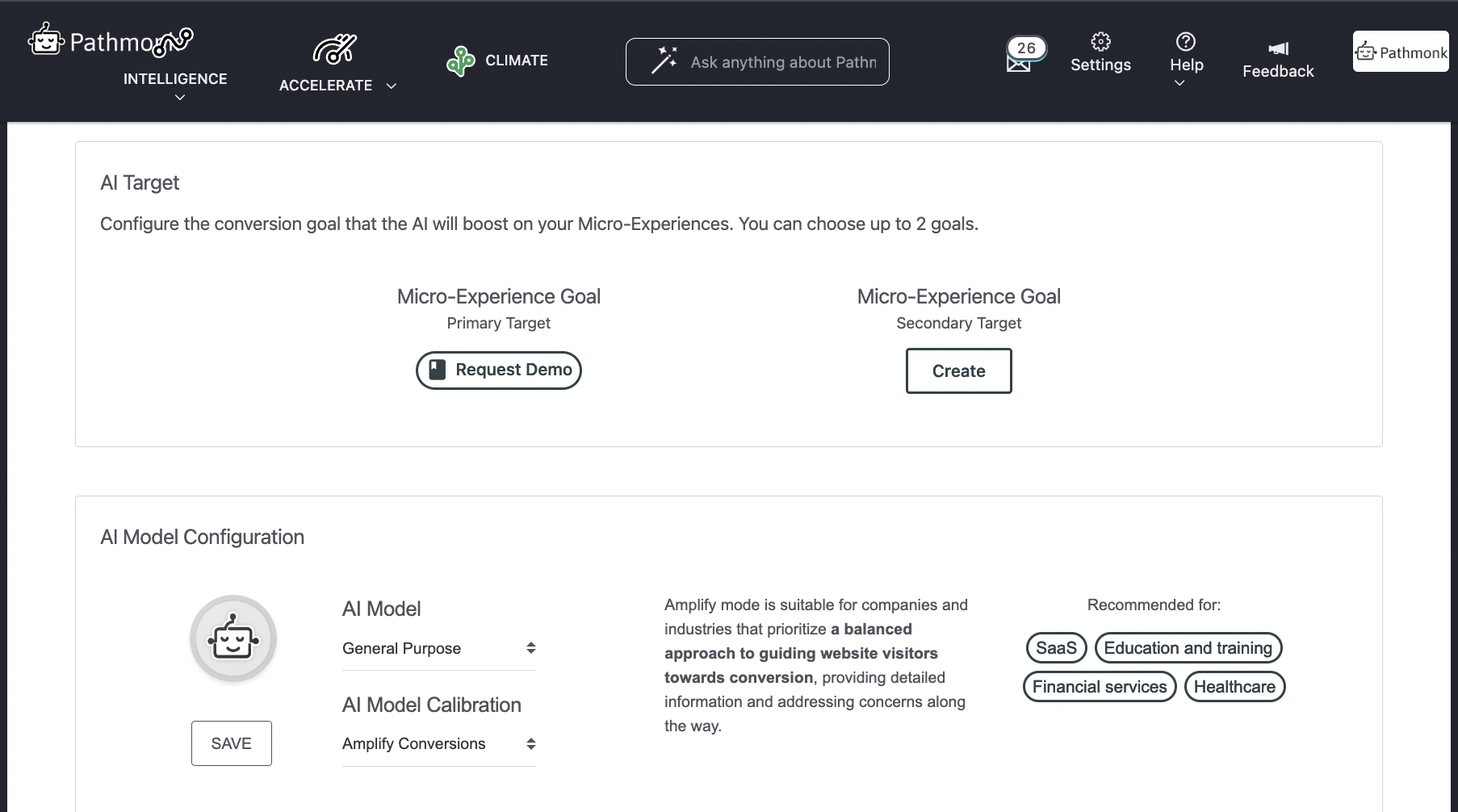
Next, choose the AI mode that fits your needs. This includes selecting the optimization speed and aligning with your growth model:
- E-commerce: Focus on personalized shopping experiences to drive sales.
- PLG (Product-Led Growth): Guide visitors toward exploring free trials or product features.
- SLG (Sales-Led Growth): Encourage actions like scheduling demos or calls.
These steps ensure that Pathmonk is perfectly tailored to your strategy from the start.
2. Let our AI create experiences for awareness-stage visitors
Once everything is set up, Pathmonk’s AI takes over, creating engaging and personalized microexperiences to capture attention and guide early-stage visitors. Some examples include:
- Educational videos: Explain concepts, showcase your expertise, or highlight your solutions in an easy-to-digest format.
- Interactive web funnels: Help visitors discover their challenges while connecting them to tailored content. For instance, a quiz can help potential buyers pinpoint the best solution for their needs.
- FAQs: Address common questions in a concise, engaging way to remove friction and build trust.
- Newsletter sign-ups: Create low-commitment opportunities for visitors to stay in touch and receive ongoing value.
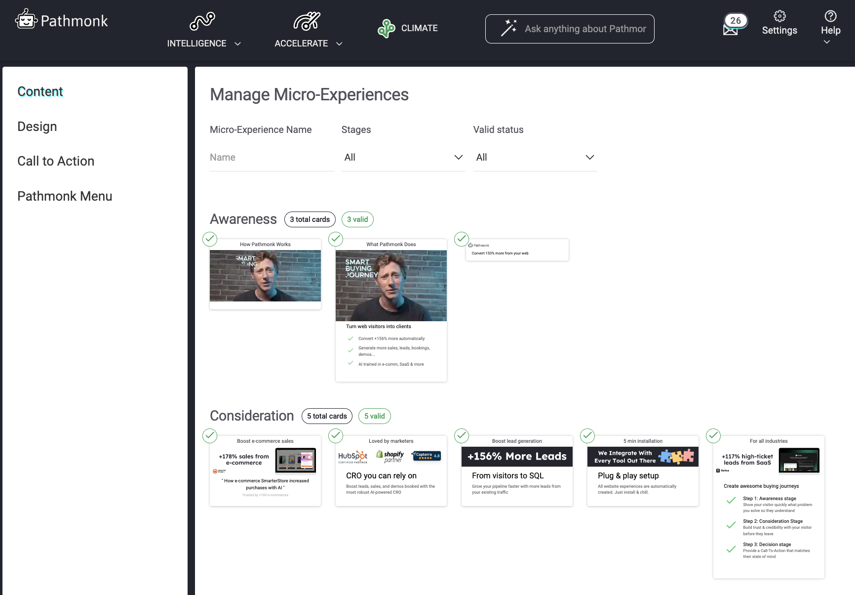
Each of these experiences is designed to meet visitors where they are, offering value without being pushy.
3. Need a tweak? Full onboarding support
Pathmonk doesn’t leave you hanging after the setup. Whether you need to refine your microexperiences, adjust your content, or add a custom touch, full onboarding support is available to guide you. You’ll also have the flexibility to tweak your settings and personalize your interactions as your goals evolve.
Increase +180% conversions from your website with AI
Get more conversions from your existing traffic by delivering personalized experiences in real time.
- Adapt your website to each visitor’s intent automatically
- Increase conversions without redesigns or dev work
- Turn anonymous traffic into revenue at scale
What is the awareness stage?
The awareness stage is where the customer journey begins. At this point, visitors have realized they have a problem or need but are far from deciding on a solution. They’re exploring, learning, and gathering information—not shopping or making commitments. This stage is all about discovery, and the best way to engage is by being genuinely helpful.
For businesses, the awareness stage isn’t about selling. It’s about building credibility and trust. Imagine someone who has just started researching a topic like “ways to improve productivity” or “how to live sustainably.” They aren’t looking for a product pitch—they’re looking for valuable, educational content that answers their questions. If you can provide that, you’re already a step ahead.
Think of it like meeting someone at a party who mentions they’re curious about cooking. You wouldn’t jump into selling them your cookbook—you’d probably share a few beginner-friendly tips or your favorite recipe to get them started. That’s the mindset to adopt here: be helpful first.
Visitors in the awareness stage are usually research-focused. They’re typing broad, question-based searches into Google or exploring educational content on blogs, videos, and social media. They’re drawn to articles, guides, and infographics that provide insights or solve small problems.
At this stage, visitors also tend to have short attention spans. They’re skimming and bouncing between resources, looking for the best match for their needs. If your content doesn’t feel relevant or engaging, they’ll quickly move on. That’s why clear, concise, and targeted material is key. Avoid bombarding them with promotional language or cluttering your site with irrelevant distractions—focus on providing exactly what they came for.
So, TLDR about the awareness stage:
- It’s all about learning: Visitors want to understand the problem first. They’re looking for educational content—articles, guides, videos—not demos or product comparisons.
- Trust is earned here: If you can deliver value without being pushy, you’ll build credibility and stay top of mind when they move to the next stage.
- Pushy = out: Hard sells and aggressive CTAs don’t work. What does? Helping them feel smarter about their problem.
Why most brands fail to engage visitors at the awareness stage
Engaging visitors in the awareness stage sounds simple—just provide helpful information, right? But many businesses fall into common traps that push potential customers away before they’ve even had a chance to connect.
Let’s take a closer look at what goes wrong and how you could avoid these pitfalls.
1. Generic content
One of the biggest mistakes is creating content that’s too broad or generic. Imagine landing on a blog post titled “Why Marketing Matters” when you’re searching for specific advice like “How to increase engagement on social media.” It’s frustrating and feels like a waste of time. Visitors are looking for content that directly speaks to their challenges or interests. If your content doesn’t address specific pain points, it won’t hold their attention.
Instead, focus on tailoring your content to match what your audience is searching for. For example, if your audience includes small business owners, write about “How to Market Your Business on a Budget” rather than general marketing tips. The more specific and relevant your content, the more likely visitors will stick around.
2. Overly promotional messaging
No one likes being sold to, especially not in the awareness stage. Visitors at this point aren’t ready to buy—they’re still exploring. Overloading them with product pitches, pricing details, or aggressive CTAs can be a huge turnoff. Imagine going into a bookstore to browse and being immediately cornered by a salesperson trying to sell you a specific book. You’d probably leave.
This doesn’t mean you can’t introduce your brand—it’s about subtlety. Offer value first, like a helpful guide or a blog post that answers their questions. Let them explore without feeling pressured, and they’ll naturally become curious about what you offer.
3. Lack of personalization
Just like having generic content, a one-size-fits-all approach rarely works in the awareness stage. Visitors want to feel like the content or experience is designed for them. If your website shows the same blog recommendations, CTAs, or pop-ups to every visitor, it’s a missed opportunity to connect on a deeper level.
For example, someone reading an article about “Tips for Reducing Stress at Work” might respond well to a suggestion for a related guide like “10 Ways to Manage Team Burnout.” Personalization makes visitors feel understood and keeps them engaged. Without it, your site risks feeling impersonal or irrelevant.
4. No clear next step
Even in the awareness stage, visitors need guidance (or maybe here more than ever?). A common mistake is leaving them hanging, unsure of what to do next.
Maybe they’ve read your blog or watched your video, but now what? If there’s no clear path forward, like a link to related content or an option to subscribe for updates, they’ll likely bounce and forget about you.
Always provide a next step, but keep it low-pressure, no strings attached. For example:
- Suggest a related blog post to read next.
- Offer a free download, like a checklist or an ebook.
- Invite them to subscribe to your newsletter for more helpful tips.
These small nudges help visitors feel like their journey with you is just beginning rather than hitting a dead end.
How Pathmonk engages visitors in the awareness stage
Right, remember: engaging visitors during the awareness stage is all about understanding their needs, meeting them where they are, and guiding them toward the next step without feeling pushy.
Pathmonk is designed to analyze your visitor’s behavior with the help of AI and create personalized, seamless interactions that keep visitors engaged, helping them transition smoothly through their journey. Here’s how it works:
1. Behavioral analysis: understanding behavior in real-time
One of the most powerful ways Pathmonk supports engagement is through its advanced behavioral analysis. As visitors explore your website, Pathmonk’s AI tracks and interprets their actions in real time to understand their intent. It doesn’t rely on cookies or invasive tracking—instead, it focuses on genuine user behavior.
For example:
- A visitor clicks on one or two blog posts but doesn’t delve too deeply into the content. Pathmonk identifies this as casual browsing and adjusts its approach to gently encourage further exploration.
- If a visitor quickly checks out a couple of pages, such as your homepage and a blog post, it suggests they’re in the initial stages of learning. Pathmonk might prioritize showing them top-level educational content to keep them engaged.
- Someone spending only 30–60 seconds on a page may still be assessing whether your site is worth their time. Pathmonk can respond with subtle prompts, like a suggestion for a quick-read article or a concise guide download.
This real-time analysis ensures every interaction is relevant and valuable, making visitors feel understood without overwhelming them with irrelevant content.
2. Automatically personalized experiences
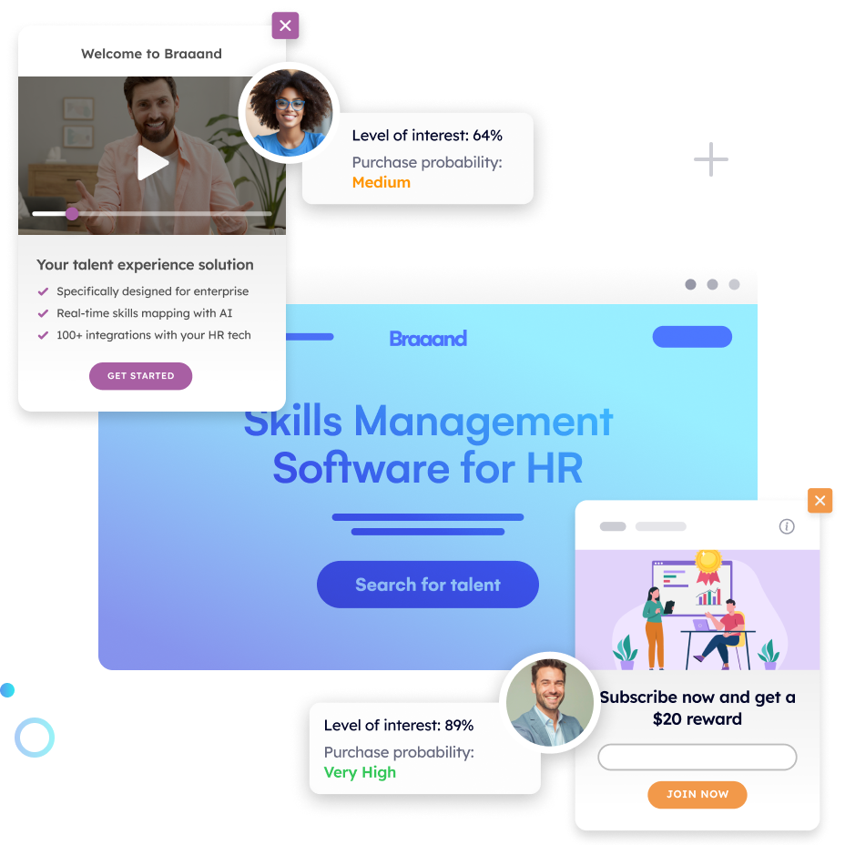
Pathmonk takes engagement a step further with its ability to create personalized experiences. These are small but impactful interactions that adapt to each visitor’s behavior and needs. Unlike static pop-ups or generic CTAs, Pathmonk’s microexperiences are tailored in real time to the visitor’s context.
Here’s how they work:
- A first-time visitor exploring your blog might see a subtle prompt offering a free guide related to the article they’re reading, like “Download Our Small Business Startup Checklist.”
- Someone showing interest in a specific topic could be guided to a curated list of blog posts or resources tailored to their research, presented in a dynamic navigation menu.
- A visitor who scrolls through a page but hasn’t clicked anything might see a non-intrusive pop-up asking if they’d like to join your newsletter for more insights.
The key is that these experiences feel helpful, not intrusive. They guide visitors without interrupting their flow, ensuring a positive experience that keeps them engaged.
3. Guiding visitors toward the next step
Pathmonk creates a smooth, natural flow that aligns with the visitor’s needs. It doesn’t overwhelm with choices or try to sell too early. Instead, it provides clear and actionable paths that feel logical and intuitive. Whether it’s directing visitors to learn more about a topic or encouraging them to explore additional resources, the goal is to keep the interaction helpful and relevant.
What sets Pathmonk apart is its focus on nurturing the relationship rather than pushing for a quick win. Visitors in the awareness stage often leave websites because they feel lost or unsure of what to do next. Pathmonk prevents this by ensuring the journey feels intentional, guiding visitors step by step in a way that keeps them engaged and interested.
It’s not about rushing prospects—it’s about building the foundation for long-term trust and deeper interaction.
What are the benefits of using Pathmonk to optimize your customer journey?
There are many CRO tools out there, but Pathmonk stands out because it doesn’t just focus on conversions—it optimizes the entire customer journey. Here’s why our customers have switched from platforms like Mutiny or Dynamic Yield to Pathmonk:
1. Real-time optimization
Pathmonk reacts to visitor behavior instantly, ensuring every interaction aligns with their intent. There’s no waiting for manual updates or pre-set triggers—your website stays dynamic, adapting in real time to meet visitors where they are.
2. Fully automated—no manual work required
Forget about spending hours setting up campaigns or tweaking experiences. Pathmonk handles everything for you, from analyzing behavior to creating personalized interactions. It’s a plug-and-play solution that lets you focus on strategy while the platform does the heavy lifting.
3. Non-intrusive and user-friendly
Visitors in the awareness stage don’t want to feel pressured or bombarded. Pathmonk ensures a seamless experience with subtle, helpful interactions that build trust instead of pushing for a sale. It’s about guiding, not interrupting.
4. Cookieless technology for privacy compliance
With increasing privacy concerns, Pathmonk uses cookieless tracking to deliver precise insights without compromising visitor trust. It’s fully compliant with data privacy regulations, making it a future-proof solution for businesses looking to build credibility.
5. Effortless integrations
Pathmonk integrates with all the tools you already rely on—CRMs, email platforms, and more. Whether you need to sync leads, track performance, or improve retargeting, Pathmonk fits seamlessly into your workflow without disrupting what’s already working.
How Tivic Health increased 31% sales optimizing the awareness stage
Tivic Health faced significant challenges in driving conversions for their flagship product, ClearUP Sinus Relief—a high-ticket bioelectronic device designed to alleviate sinus pain. While the product held immense potential, the company encountered three critical issues at the awareness stage:
- Prospects didn’t understand the product: Visitors often failed to grasp ClearUP’s unique value or how it worked, which made it difficult to build interest and stand out in a crowded market.
- Visitors lacked guidance through the website: Many visitors were browsing the site but weren’t progressing toward the next step in the buying process. The lack of clear direction left them disengaged.
- A lack of trust prevented purchases: As a high-ticket, innovative product, ClearUP required more reassurance than the website provided. Visitors needed to feel confident in the product’s claims before committing to a purchase.
To address these challenges, Tivic Health’s marketing agency, Media Contour, partnered with Pathmonk to improve the customer journey.
To solve these challenges, our AI focused on educating, guiding, and building trust with visitors:
- Personalized education: Pathmonk delivered targeted microexperiences like educational videos, FAQs, and guides to explain ClearUP’s value and address common questions.
- Trust signals: Testimonials, certifications, and FDA compliance details were shown at key moments to reassure hesitant visitors.
- Intent-driven guidance: Interactive quizzes and subtle CTAs helped visitors explore ClearUP naturally, without feeling pressured.
By tailoring the experience to each visitor’s needs, Pathmonk ensured prospects understood the product, felt confident in its benefits, and were smoothly guided toward making a purchase.
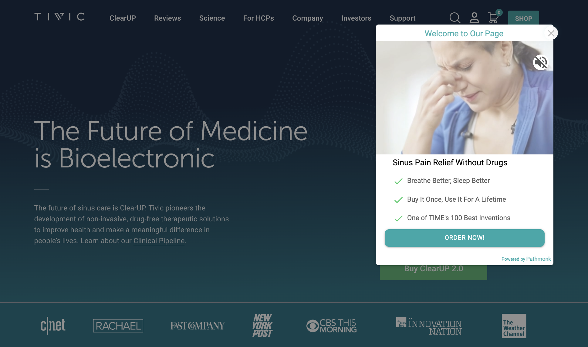
The results speak by themselves:
- 31% increase in purchases: Visitors gained a clearer understanding of ClearUP’s value and felt more confident in their decision to buy.
- 33% increase in cart additions: Personalized guidance helped prospects take action, increasing interest in the product.
- 30% engagement with microexperiences: Visitors actively interacted with educational and trust-building content, creating a smoother path to conversion.
How to add Pathmonk to your marketing strategy
Step 1: Set up your Pathmonk account
Setting up your Pathmonk account is straightforward and hassle-free. Here’s how to get started:
- Preview with our interactive demo: If you prefer to see how Pathmonk will work on your website before making a commitment, take advantage of our personalized interactive demo. This allows you to explore the features and benefits at your own pace.
- Schedule a demo call: For those who prefer a more personalized touch, you can schedule a call with our team for a tailored product demo. We’re here to answer any questions and help you understand how Pathmonk can specifically benefit your business.
To get started, simply visit our Pricing page and select the plan that fits your needs. We charge based on the pageviews your website receives, ensuring you only pay for what you need.
Step 2: Implement your cookieless snippet
After purchase, you will receive a unique Pathmonk snippet. This is a simple copy-and-paste action, which can be done through your platform’s backend or with Google Tag Manager installation instructions.
Step 3: Automatically create website experiences:
Pathmonk will utilize your existing website content to automatically generate personalized microexperiences for your visitors.
These microexperiences are tailored to engage users and guide them towards conversion, leveraging Pathmonk’s AI to optimize the customer journey seamlessly.

