GLOSSARY
Call-to-action (CTA)
A prompt designed to encourage users to take a specific action, such as clicking a button, filling out a form, or making a purchase.
Essential for driving engagement and conversions.
A Call to Action (CTA) is a key element in digital marketing, web design, and conversion optimization. It’s the bridge between user interest and business results — the moment when you invite someone to take the next step, whether that’s signing up, downloading, booking, or buying. CTAs appear in buttons, links, banners, popups, or even in text — but their effectiveness depends on wording, design, timing, and relevance.
More than just a button, a CTA represents your value exchange. A strong CTA makes the action feel clear, rewarding, and low-friction. A weak CTA causes confusion, hesitation, or abandonment. That’s why refining CTAs is one of the most impactful CRO tactics.
Why is a Call to Action important?
CTAs are the triggers that turn passive visitors into active leads or customers. Without a clear and compelling CTA, even the best offer can be ignored. They’re essential to guide users through the customer journey, from awareness to consideration to conversion.
An effective CTA can significantly boost engagement rates, reduce drop-offs, and increase conversion rates. It aligns user intent with business goals. Whether it’s “Get My Free Trial” or “Download the Report,” the right CTA can increase clarity, reduce friction, and motivate action — all within a single line.
Turn website traffic into sales-ready leads
- Identify high-intent visitors automatically
- Qualify leads before they reach your sales team
- Convert traffic without adding friction or forms

How to create a strong CTA
Crafting a CTA requires both clarity and persuasion. Here’s what to consider:
- Use action-driven language: Start with a strong verb — like “Get,” “Start,” “Book,” “Claim,” or “Download.” Passive or generic words like “Submit” don’t create urgency or value.
- Communicate the benefit: Tell users what they’ll get. “Get your free quote” is stronger than “Click here.” Benefits make the action feel worthwhile.
- Match intent and stage: Don’t ask for a big commitment if the user is still early in the journey. Use softer CTAs like “Learn More” or “Watch Demo” for top-of-funnel visitors, and high-intent CTAs like “Start Free Trial” or “Schedule a Call” for bottom-of-funnel users.
- Design for visibility: Use contrasting colors, whitespace, and button styling to make CTAs stand out. They should be scannable, clickable, and clearly differentiated from other text or design elements.
- Place CTAs strategically: Include them where the user is most likely to be ready to act — not just at the top or bottom of the page, but also after key sections or value explanations. Multiple CTAs throughout the page can capture intent at different stages.
How Pathmonk boosts CTA performance
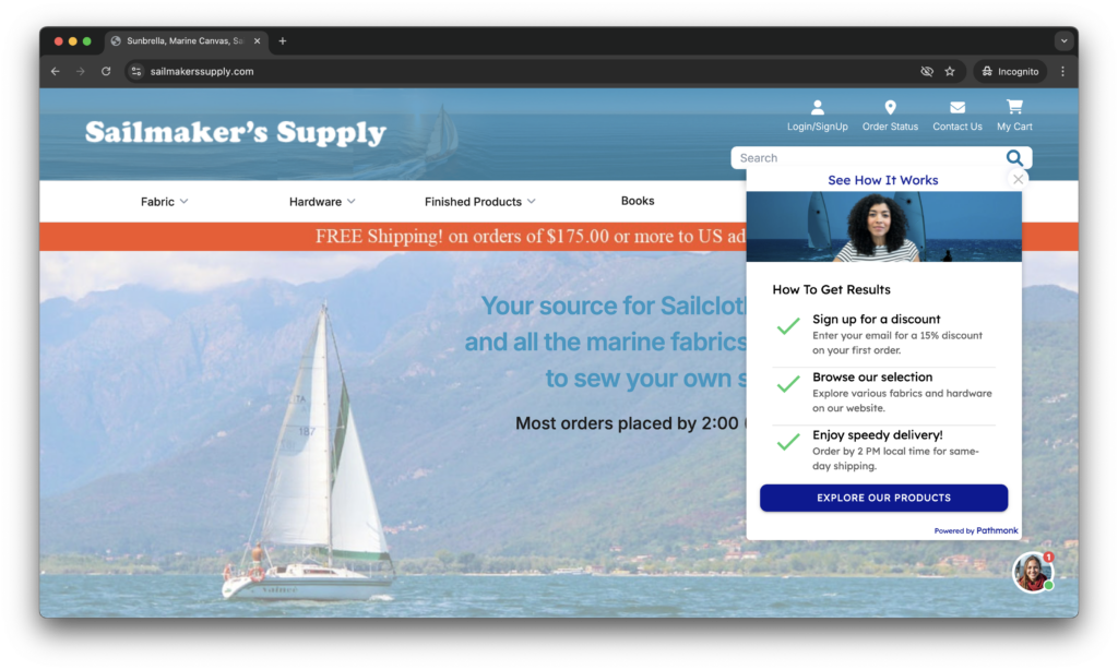
With Pathmonk, CTAs don’t change, but the experience leading to them does. Instead of showing the same static content to every visitor, Pathmonk adapts the journey surrounding the CTA based on user behavior, intent, and journey stage.
This means:
- First-time visitors might see a brief explainer video to build trust before the CTA appears
- Returning users may be shown a testimonial from a similar industry to reinforce credibility
- High-intent users could be guided through a quick questionnaire to qualify their needs before clicking “Book a demo”
The CTA remains consistent (e.g., “Book a demo”), but what leads to that moment is personalized. Pathmonk uses AI to determine which type of experience — video, testimonial, quiz, interactive asset — is most likely to increase engagement and conversion. This adaptive layer drives more users toward your CTA by aligning the journey with what each visitor needs to feel confident.
You get higher conversion rates without needing to manually create audience segments, run separate campaigns, or code multiple variants. All activity is tracked in a centralized dashboard so marketers can optimize performance continuously based on real behavioral data.
Increase +180% conversions from your website with AI
Get more conversions from your existing traffic by delivering personalized experiences in real time.
- Adapt your website to each visitor’s intent automatically
- Increase conversions without redesigns or dev work
- Turn anonymous traffic into revenue at scale

Related articles about conversion rate
- CTA (Call-to-Action): What it is and How to Use it
- The Role of UX in Conversion Rate Optimization
- The Science of High-Converting Landing Pages
- Which Attributes Describe a Good Landing Page Experience?
FAQs on CTAs
1. What makes a CTA effective?
An effective CTA is one that clearly communicates what action the user should take and what benefit they’ll receive from doing so. It should use strong, action-oriented verbs like “Get,” “Start,” “Claim,” or “Download”, words that reduce ambiguity and make the value of clicking obvious. The copy should be specific and benefit-driven, avoiding vague terms like “Submit” or “Click Here.” It also needs to match the user’s context and readiness; for example, a softer CTA like “Learn More” is better suited for early-stage visitors than something like “Buy Now.”
Design plays an equally critical role. A CTA must stand out visually through contrasting colors, a well-defined button shape, and adequate spacing so users can easily identify and interact with it. Equally important is placement: a well-crafted CTA buried under a wall of text or hidden in a cluttered layout won’t perform. It should appear at moments of peak user motivation — such as after a value proposition or testimonial — so that it aligns with natural decision points in the user journey.
2. How many CTAs should a page have?
The number of CTAs on a page depends on the length of the content and the complexity of the user journey, but most high-converting pages include more than one. Typically, there’s a primary CTA that reflects the main business goal (e.g., “Start Free Trial”) and one or more secondary CTAs offering alternative paths (e.g., “See How It Works” or “Download Brochure”). These secondary CTAs help capture users at different levels of awareness or intent, preventing loss of engagement if someone isn’t ready for the primary action yet.
However, more CTAs doesn’t mean more conversions unless they’re strategically placed. A good practice is to position CTAs at key engagement points: near the top for early visibility, mid-page after trust-building elements like testimonials or videos, and again at the end. The layout should visually prioritize the primary CTA while treating others as supporting options. The goal is to guide the user, not overwhelm them — which means clarity, not clutter, must lead the way.
3. Should CTAs be different for mobile and desktop?
It depends. The way users browse on mobile is vastly different from desktop, which means your CTAs must adapt if needed. On mobile, screens are smaller, scrolling is vertical, and attention spans are even shorter. CTAs should be large enough to tap easily, placed in thumb-friendly areas, and spaced well to avoid accidental clicks. A fixed bottom bar CTA works particularly well on mobile — it keeps the call to action visible without interrupting the reading experience.
Additionally, mobile CTAs should consider the loading speed and simplicity of the interaction. If a mobile user clicks “Book a Demo” and gets taken to a form with 10 fields, you’re likely to lose them. You may want to simplify the flow, offer single-click actions, or preload information where possible. Always A/B test mobile-specific layouts and CTA placements independently from desktop, as user behavior differs significantly across devices.
4. What color should my CTA button be?
There’s no universally “best” color for CTA buttons, the key is to stand out against the background and surrounding elements. The chosen color should create strong contrast with the page layout so the button catches the user’s attention without clashing with your brand. For example, if your site is mostly blue and white, a bright orange or green CTA may draw the eye. The color should also communicate a sense of action and trust — avoid overly dark or muted shades that fade into the background.
That said, color psychology can play a supporting role. Red can evoke urgency, green signals ease and positivity, and blue conveys trust and stability. But context always trumps theory — test what resonates with your audience. It’s also important to be consistent across your site. Users learn to associate certain colors with actions, so mixing styles on different pages can reduce clarity and lower performance.
5. What if users don’t click my CTA?
If your CTA isn’t getting clicks, it’s a signal that something isn’t resonating with your audience. The issue could lie in the copy (too generic or too aggressive), the design (not visually distinct), or the placement (appearing before the user is ready). Start by analyzing behavior with heatmaps or session recordings: are users seeing the CTA but not clicking, or are they missing it entirely? A low interaction rate might mean it’s time to rethink not just the button, but the experience that leads up to it.
Additionally, consider the psychological friction. Are you asking too much too soon? Could a softer CTA or an intermediary step increase comfort? For example, instead of “Buy Now,” try “See Plans” or “Get Started.” Small tweaks like adding a trust element near the CTA (e.g., “No credit card required”) or experimenting with exit-intent popups can help re-engage users who hesitate. And always test — one well-targeted variation can unlock a major boost in conversions.
6. What’s the difference between a CTA and a headline?
A headline introduces your message and frames the value; a CTA tells the user what to do with that information. The headline is often the first thing a user reads and should capture attention, build interest, or establish credibility. It’s the hook — the emotional or logical appeal that sets the stage. For example, “Save time with our all-in-one platform” is a headline that creates interest.
The CTA comes in immediately after — it turns that interest into action. It should answer the question, “What should I do next?” A CTA like “Start Free Trial” or “Get Instant Access” gives direction. The most effective pages ensure these two elements work together: the headline builds the case, and the CTA closes it. If either is weak or misaligned, conversion rates suffer.