Believe it or not, there isn’t much standing between you and your website conversions doubling or tripling from what you’re seeing today. Many marketers are in the same position with a need and desire to increase website conversions, it’s a common challenge today. If your conversion rate is stuck at 2% or lower, you’re not there yet. Are you putting up barriers to conversion without even realising it (hint: 80% don’t fill out forms on mobile).
It’s important to critically look at the user flow, personalization & the user journey! It’s impossible to argue against the fact that the Internet is the most revolutionary commerce tool that we’ve seen in our lifetime. So once you have valuable visitors on your site – make sure to capture both them and their subscription by giving them a great user journey! Here’s how:
1. Take a Personal Approach
Showing relevant and personalized content tailored to where your visitors are in their journey as a customer is a great way to support them in finding the right product. It’s a way to give every visitor to your website a bespoke experience in real-time based on their individual preferences and actions.
If you present visitors (and worse, returning visitors) with generic content and the same generic buttons, you’re going to keep them at the same stage of awareness and negatively affect the user flow. You will prevent them moving forward in their user journey toward a decision and ultimately, a subscription!
On that note, it’s very important that your website comes across not as a robotic company looking for your sale before pushing you to the side to make room for the next customer – but instead to come across as warm, welcoming and friendly.
However, at Pathmonk we do things the right way – we’ve learned to be a pro-active supporter throughout the user flow in order to gain that all-powerful conversion. We communicate to visitors in a supportive manner and do our best to make them comfortable during their user journey by taking a personal approach all while providing them with the information that they want and need to know.
If visitors don’t want to speak we don’t push any further, we’re all about comfort so we simply point them in the right direction and leave it at that if they so wish.
This unique approach allows visitors to have all the information they need readily available, to process it and make a decision – it saves time! Our system is ultimately efficient, time-saving and beneficial for the visitor – 3 crucial commodities for potential buyers in today’s world.
Consider the following: A user visits several times the same product page – Pathmonk will provide a smart card to that user with the most common questions about that product and the answers.
2. Put yourself in the Shoes of Your Visitors
Have you sat back to consider the end user of your website, their subscription and the reasons why they are signing up for a product or the reasons why they just leave? It’s very important that the user flow of your website appears obvious and natural without visitors searching for buttons or information they need. Your visitors should have everything necessary readily available in order to make a decision on whether a course is right for them or if it will be offered when they want to take it.
Making sure a visitor has all of the relevant information to make a decision just at the right moment in their user journey is crucial and results in less people leaving without providing their contact details. It is in your best interest to make it as simple as possible to let users get all the relevant information they need about the courses immediately, right now when they need it. This prevents your visitors from leaving your website and finding the right course elsewhere from one of your competitors!
Don’t force visitors to fill out lengthy forms throughout the user flow before they can get detailed information about your product (actually 81% don’t fill out forms anyhow, so you will be left with only a few of your hard earned visitors leaving their contact details). This seems obvious, but so many websites are still using this as a way to grow their database and conversions.
You might be thinking now: “How will we get our visitors contact information, we really need it to set up a call with them to explain the product in detail”.
We hear you, that’s why Pathmonk helps you to collect customer contact information in a seamless way without disturbing their user journey.
3. Use Customer Insights and Data (actually, you know what – we will do that for you)
Many businesses rely on agencies and third parties to set up their website and create a good user flow and you are not alone with this, many businesses do it that way. By now you know your website inside out, how it works and where things are, but for those who visit your website for the first time it can be difficult to navigate in their user journey and find the most suitable course!
We noticed that many businesses face one of the two scenarios:
- Many academies do not have any website data: We understand that your team has many other things to do other than focusing on website metrics – that’s why Pathmonk sends you all the information you need: website visitors or the interest level for each of your products.
- Many academies would love to optimize the user experience based on data: The next step is to give every visitor to your website a personalized experience in real-time based on their individual preferences and actions so that you can earn their subscription. Pathmonk makes that easy for you – in fact, we can do that for you!
With all of this data that we provide you with, you have the weapons you need to chase down your leads, provide a great user flow and secure their conversion! Use this newly-attained data to your advantage because if you don’t use everything you have at your disposal then you might as well be throwing money away. On that note, ensure that you take the time to reach out to your leads using this data and to see what your visitors really want throughout their user journey, then you can use that information to follow-up and guide them in a friendly, warm manner towards the right course for them.
4. Create an Alluring Email Collection
Yes that’s right; with the 3 previous steps in action, the final step that will ultimately guarantee more conversions for you is a sharp and appealing email collection. Say you click onto a website and in less than 1 second a huge subscribe box appears blocking your entire screen and the website, following you wherever you scroll. It’s holding you hostage for your contact information, demanding your email address and there’s no way to escape without giving in to its demands – so what do you do? Leave.
When your visitors are happy with the user flow experience which they’ve had on your website they’ll be ready to leave their email and subscribe, so you owe it to yourself to secure their loyalty by offering an attractively subtle subscribe box that isn’t too obnoxious or too reclusive and appears just at the right moment. One particular aspect to include here is a list of benefits within the subscribe box that your visitors will receive when they subscribe – a list that seals the deal, inspires positive thoughts and gives your visitors a reason to subscribe that they cannot afford to pass up! Lastly, use neutral colours that evoke positive emotions of calm, peace, tranquility.
You may think that all of this effort for a simple subscription box is unnecessary, however that box is the last obstacle to overcome of the user journey, the determining factor of whether or not you convert a visitor into a customer. If they aren’t drawn in by that box, if any distraction occurs on their computer, in their mind, reality or if their brain subconsciously finds something that they don’t like (which is what the brain does) then their user flow will be disrupted and they’ll be lost along with their subscription.
A recent study analysing thousands of websites with a combined $3 billion in annual advertising spending discovered that some websites are converting at rates two or three times higher than the average! A good conversion rate is a lot higher than you may think – conventional wisdom says that a solid conversion rate is somewhere around 2% to 5%. Mmmh think again… About 1/4 of all accounts have less than 1% conversion rates. The median is 2.35% but the top 10% of websites have conversion rates of 11.45%. This is across different markets – contact us for details. This isn’t an anomaly; this is perfectly attainable.
Like it was mentioned before: There isn’t much standing between you and conversion rates double or triple what you’re seeing today. A great place to start is to critically look at the user flow, personalization & the user journey!
When you begin to do that you’ll finally be on the right path towards achieving higher conversion rates.
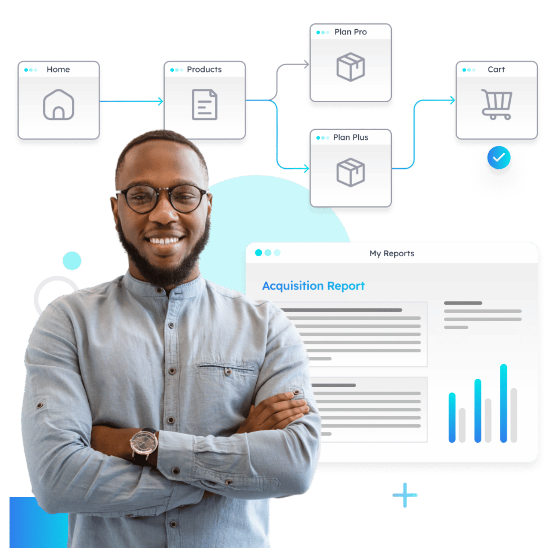
Understand how your prospects behave (in real time)
- Visualize how visitors move across your website
- Identify drop-offs and friction points instantly
- Turn journey data into actionable insights with AI

