The highest-impact CRO changes are rarely the ones that follow the playbook. Across practitioner forums, A/B testing communities, and published case study data, the wins that generate 30–300% conversion lifts most often come from removing elements that were assumed to build trust, restructuring pages to reduce rather than expand optionality, and matching messaging to buyer intent state rather than demographic segment. The pattern holds across e-commerce, SaaS, and B2B services.
The mechanism behind these wins is consistent: most CRO programs optimize against their own mental models of the customer, not against behavioral evidence. When teams finally test assumptions they never thought to question (that the hero image is helping, that more social proof is better, that a shorter form is always preferable) they discover significant conversion drag that has been invisible because it was never in scope.
Table of Contents
A 2023 analysis of 28,304 A/B tests run on the Optimizely platform found that 80% of experiments produced no statistically significant result, and of the 20% that did, a disproportionate share of the largest uplifts came from changes that contradicted the hypothesis. Teams that expected a redesign to win saw the original perform better. Teams that added a trust badge saw conversions drop. Teams that removed the product demo video saw demo requests increase.
These results are not anomalies. They are a structural property of mature CRO programs: the straightforward wins get captured early, and the remaining gains are embedded in assumptions teams have not tested because they are too obvious to question.
This creates what you could call the Friction Inversion Effect: a pattern where the highest-leverage changes come from inverting assumptions about what creates friction versus what creates clarity. The form field you added to qualify leads is confusing 60% of buyers who were already qualified. The testimonials section is triggering skepticism, not trust. The hero image is displacing the headline that would have converted visitors in the awareness stage who do not yet know they have a problem.
This article documents the categories of unexpected wins that practitioners consistently report, explains the mechanisms behind each, and provides a diagnostic framework for identifying where your own unconventional wins are likely hiding.
Get your website’s conversion score in minutes
- Instant CRO performance score
- Friction and intent issues detected automatically
- Free report with clear next steps
The friction inversion effect: why unexpected wins cluster in specific places
Before cataloging specific wins, it is worth understanding why they occur in predictable categories rather than randomly across the page.
Most CRO programs are built on a model of the visitor that is implicitly rational, linear, and homogeneous. The visitor arrives, reads, considers, decides. In this model, more information reduces uncertainty, more social proof builds confidence, and a shorter path reduces friction. Each of these premises is partially true for some visitors under some conditions. None of them is universally true.
Real visitor populations are segmented by intent state: the combination of where they are in the buying journey and what question they are trying to answer when they arrive. A visitor in the awareness stage is trying to understand whether they have the problem your product solves. A visitor in the decision stage already knows they have the problem and is evaluating your credibility against alternatives. Optimizing for one intent state actively degrades conversion for the other.
This is the root cause of the Friction Inversion Effect. When teams add a feature because it would help a consideration-stage buyer, they frequently do so in a position that disrupts an awareness-stage buyer who has not yet formed a purchase intent. The net effect is negative because the awareness-stage segment is typically larger.
The unexpected wins described below all share this common structure: they resolve a collision between what the page was optimized to communicate and what a specific visitor segment actually needed.
intent stage
| Page element |
Awareness
|
Consideration
|
Decision
|
|---|---|---|---|
|
Hero image
|
Hurts
Cold traffic sees lifestyle not fit
|
Neutral
Provides context but rarely decisive
|
Hurts
Delays confirmation-seeking buyers
|
|
Trust badges
|
Helps
Reduces anxiety on cold-traffic pages
|
Helps
Supports credibility during evaluation
|
Hurts
Visual noise near a CTA ready to be clicked
|
|
Long-form copy
|
Helps
Educates visitors discovering the problem
|
Helps
Essential for high-ACV due diligence
|
Neutral
Buyer is past reading; wants a path forward
|
|
Multiple CTAs
|
Helps
Options match varied entry intent
|
Neutral
One action is enough with clear hierarchy
|
Hurts
Decision paralysis delays the final click
|
|
Qualification form
|
Hurts
Too much friction before problem is felt
|
Helps
Filters and guides serious evaluators
|
Helps
Speeds handoff by pre-qualifying intent
|
|
Navigation bar
|
Helps
Lets explorers browse to the right content
|
Neutral
Rarely used by buyers already on-task
|
Hurts
Exits buyers from the conversion path
|

Removal wins: deleting elements that were assumed to be helping
1. Trust badges and security seals
The most consistently reported unexpected win in practitioner communities is removing trust badges (SSL seals, money-back guarantee icons, security certifications) from purchase flows and landing pages.
The hypothesis behind adding them is sound: badges signal credibility and reduce purchase anxiety. The actual effect depends heavily on placement and visitor intent. When badges appear near the primary CTA on a page where credibility has already been established through copy and design, they introduce visual noise that delays click behavior. A 2022 study by Baymard Institute found that 58% of shoppers cited concerns about site legitimacy during checkout, but the concern was triggered by poor design, not by the absence of badges. Badges on a poorly designed page signal that the page knows it looks untrustworthy.
The Friction Inversion here: badges help on pages that do not otherwise communicate credibility. On pages that do, they redirect attention from the conversion action.
Testing protocol: Remove all trust badges from above the fold on your highest-traffic landing page for 14 days. If CVR rises, test selective reintroduction in the footer or checkout flow only.
2. The hero image
Removing the hero image (or replacing it with text) is one of the most reported wins on SaaS landing pages, particularly for B2B products with a complex value proposition.
Hero images cost load time, consume scroll-depth-zero real estate, and frequently communicate nothing specific. A generic stock photo of a smiling professional contributes less information than the headline it displaces. Multiple practitioners in the ConversionMentors community documented 10–25% uplift from replacing a visual-heavy above-the-fold section with a headline-forward, copy-dense layout.
The mechanism: visitors who arrive from high-intent paid search queries already know the product category. They need confirmation of fit, not a visual impression of a lifestyle. The hero image adds cognitive processing time before they reach the information that would allow them to decide.
3. The navigation bar
Removing global navigation from landing pages is documented widely, but teams rarely apply it to core product pages or pillar content. Several practitioners report significant CVR improvements from removing navigation from pages that receive high-intent paid traffic, even when those pages are nominally “informational” pages rather than dedicated landing pages.
The cost: users who arrive at the wrong page for their question cannot navigate. This tradeoff is worth measuring, but the default assumption that navigation always helps is incorrect.
Adding friction that should have hurt
Qualification steps in lead gen forms
This is the counterintuitive win that generates the most debate: adding a multi-step qualification flow where a short form previously existed, and seeing both conversion rate and lead quality improve simultaneously.
The mechanism is well-established in behavioral economics. The commitment escalation effect means that a visitor who completes step one of a form is more likely to complete step two than they would be to complete a single equivalent long form. Breaking a 6-field form into three 2-field screens frequently increases completion rates by 20–40%.
More important for B2B teams: the qualification steps filter out visitors who are not ready to engage, which reduces sales team time spent on cold leads and improves downstream close rates. Simplifying the funnel is not always the right answer: the question is whether your form’s length is causing drop-off among qualified buyers, or filtering out unqualified ones.
The failure mode: qualification flows hurt when the questions are perceived as interrogative rather than helpful. “What is your annual budget?” fields reduce completion rates. “Which of these problems are you trying to solve?” fields do not.
The deliberate pause: adding loading screens
A practitioner at a legal services firm documented a 17% increase in form completions after adding a 3-second “analyzing your case” loading screen between form submission and the confirmation page. The screen had no functional purpose: it was cosmetic. The effect was real.
The mechanism is perceived value. An instant response signals automation and reduces confidence that the submission was meaningful. A brief, purposeful delay signals that something is being processed. This effect is most pronounced in categories where trust is the primary purchase driver: healthcare, financial services, legal.
Longer copy on high-ACV product pages
The “shorter is better” heuristic dominates most CRO programs, and it is correct for low-consideration purchases. For products with an ACV above $5,000, the research consistently shows that longer, more detailed copy outperforms shorter copy, because the buyer needs to complete due diligence before they are psychologically capable of converting.
A 2021 analysis by CXL Institute of 50 B2B SaaS landing pages found no significant correlation between copy length and CVR for products under $2,000 ACV, but a positive correlation between copy length and CVR for products above $5,000 ACV. The mechanism: high-ACV buyers need to justify the purchase internally and to their organization. They are looking for material to support a decision they are already inclined to make. Short pages leave them without the evidence they need to move forward.
Copy and context surprises
Negative framing outperforming positive framing
Several practitioners report that rewriting CTAs and headlines in loss-aversion terms produced significant lifts over equivalent gain-framing copy. “Stop losing leads to faster competitors” outperforming “Grow your pipeline with AI” is the pattern.
The mechanism is well-documented: Kahneman and Tversky’s loss aversion research established that the psychological weight of a potential loss is approximately twice that of an equivalent gain. For products that address an active pain, loss framing activates the pain rather than the aspiration. The caveat: loss framing performs poorly for products that address aspirational needs or where the audience does not yet recognize they have the problem being solved. In those cases, it feels threatening rather than resonant.
Specificity over clarity in headlines
Generic headlines that explain what the product does (“AI-powered conversion optimization”) consistently underperform specific headlines that state a concrete outcome (“Most of our customers double demo requests within 90 days”).
The specificity paradox: practitioners often test specific headlines and then generalize winning copy because they worry the specific claim is too narrow. This is the wrong move. The specificity is the mechanism. It signals confidence, sets expectations, and anchors the value proposition in a number the buyer can evaluate.
Social proof works the same way: a testimonial that says “Pathmonk changed our business” contributes nothing. A testimonial that says “We went from 1.2% to 3.8% CVR in six weeks without touching the site” is evaluable and credible.
Removing the “no thanks” option
Standard practice in popup optimization is to include a polite “no thanks” dismissal link beneath the CTA. Several practitioners report that removing the dismissal link (requiring users to click outside the modal to close it) increased email capture rates significantly without increasing bounce rate.
The mechanism is reduced priming: the dismissal text (“No thanks, I don’t want more sales”) explicitly surfaces the negative decision and anchors the visitor to the opt-out frame. When the only text on the popup is the affirmative CTA, the choice architecture tilts toward action. This effect degrades rapidly with aggressive frequency capping failures: if the popup returns repeatedly, the absence of a clear dismissal creates frustration that damages broader metrics.
Structural and flow surprises
Consolidating multiple CTAs to a single one
Pages that offer “Book a Demo,” “Start Free Trial,” “Watch a Video,” and “Download the Guide” simultaneously frequently convert worse than pages that offer a single CTA. The practitioner wins come from forcing prioritization: pick the one action you most want the visitor to take, remove the others, and let the design communicate that this is the path.
Conversion research from Unbounce’s 2022 landing page analysis found that single-CTA pages converted at 13.5% on average versus 11.9% for pages with multiple CTAs: a modest absolute difference that compounds significantly across high-traffic pages.
The cost: by removing secondary CTAs, you lose visitors who were not ready for your primary action but would have engaged with a lower-commitment option. The question is whether those secondary engagements ever converted downstream, and what percentage of primary-CTA completions they were cannibalizing through decision paralysis.
Reducing page load speed by removing non-essential JS
Page speed is a canonical CRO lever, but most teams optimize it by compressing images and enabling caching rather than auditing third-party script load. Practitioners consistently report that removing tag manager tags for inactive tools, deactivating chatbots on high-intent landing pages, and eliminating decorative animations produces larger CVR gains than equivalent efforts spent on image compression.
The reason: a 500ms delay caused by a visible element (an animation, a live chat widget loading) interrupts the cognitive flow of a buyer who has just arrived at the page. A 500ms delay in the background while a large image loads does not interrupt anything the visitor is consciously experiencing.
The best CRO tools are the ones you are actively using. Tools you have accumulated but no longer maintain are net negative contributors.
How Pathmonk resolves the guesswork behind unexpected wins
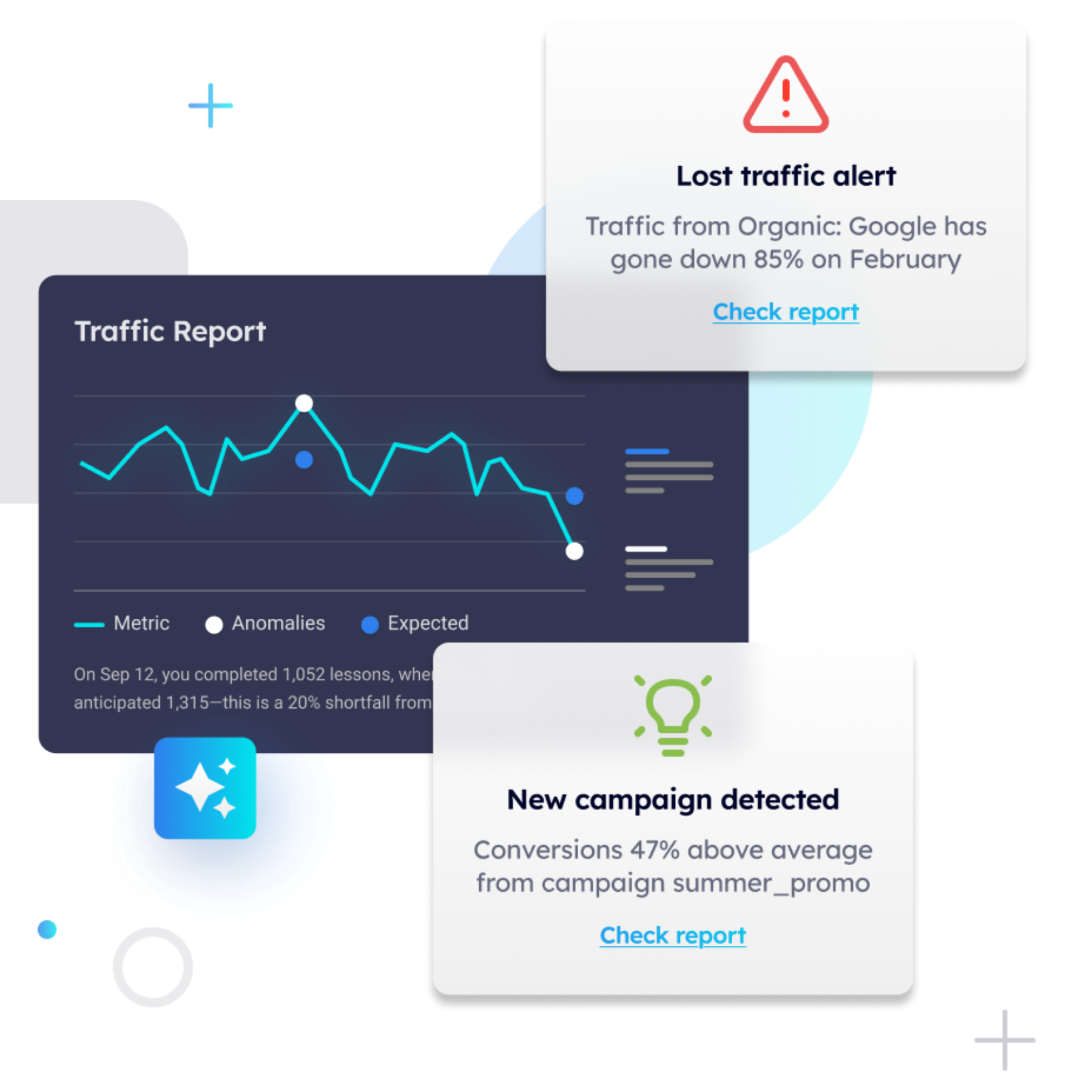
The reason unexpected CRO wins feel surprising is that most optimization programs operate without behavioral intent data. They know what visitors do (pages viewed, scroll depth, clicks) but not why, which translates into which stage of the buying journey a visitor is in when they hit a specific page.
Pathmonk’s AI classifies every visitor into one of three stages (awareness, consideration, or decision) in real time, using behavioral signals including navigation patterns, engagement velocity, content interaction, and session history. This classification happens through a cookieless fingerprinting method that does not require consent banners or cookie consent frameworks.
The operational implication is significant: instead of serving the same page to all visitors and hoping the copy addresses their intent state, Pathmonk triggers stage-matched microexperiences that speak directly to where the visitor is in their decision process. An awareness-stage visitor on a pricing page receives content that reframes the value proposition. A decision-stage visitor on the homepage receives a prompt to book a demo or start a trial.
This directly addresses the root cause of the Friction Inversion Effect. When you know that 40% of your landing page visitors are in the awareness stage and 30% are at decision, you stop trying to write a single headline that serves both and start serving differentiated experiences based on demonstrated behavioral intent. The buying journey stage detection removes the need to guess which version of your visitor you are speaking to.
The self-optimization layer runs a continuous 50/50 A/B test between the Pathmonk-personalized experience and the unmodified control, maintaining a permanent 5% holdout group to ensure the baseline conversion rate is always being measured. Understanding the statistics behind the test matters here: Pathmonk requires 95% statistical confidence before declaring a winner and scaling the personalized variant to the remaining traffic, which prevents teams from acting on noise.
The practical result mirrors what practitioners find when they run unexpected-win experiments manually, except it runs continuously across all traffic without requiring anyone to form a hypothesis. Teams using Pathmonk frequently discover that their highest-conversion microexperience is one they did not predict: a content offer for a visitor they assumed was ready to buy, or a direct demo CTA for a visitor they assumed was still in research mode. The AI surfaces the wins; the team’s job shifts to understanding why.

How Obzervr increased conversions by 280% with AI-driven buyer journey personalization
Obzervr is a B2B SaaS company providing field service management software to asset-intensive industries including mining, utilities, and oil and gas. Their buyer profile (technical operations managers evaluating enterprise software with long procurement cycles) is one of the most difficult segments to convert from web traffic.
The challenge Obzervr faced is one that any B2B SaaS team with a complex product will recognize: their website was built to explain the product, not to match the visitor’s intent state. Decision-ready buyers arriving from paid campaigns were hitting the same educational content that awareness-stage visitors needed — a problem explored in depth when examining what to do with visitors who are not ready to convert.
After implementing Pathmonk, the platform’s AI classified visitors by buying journey stage and served differentiated microexperiences: consideration-stage visitors received content that addressed common evaluation objections, while decision-stage visitors were surfaced with direct conversion prompts matched to their demonstrated intent. No changes were made to the underlying website.
The conversion rate uplift was 280% compared to the unmodified control group. The mechanism was not a single clever test or a copywriting breakthrough. It was the systematic elimination of stage-intent mismatch across all visitor segments simultaneously.
The result demonstrates the core insight behind the Friction Inversion Effect at scale: the biggest conversion drag on most websites is not a broken element or a weak CTA. It is the collision between a fixed message and a heterogeneous visitor population with fundamentally different information needs.
Increase +180% conversions from your website with AI
Get more conversions from your existing traffic by delivering personalized experiences in real time.
- Adapt your website to each visitor’s intent automatically
- Increase conversions without redesigns or dev work
- Turn anonymous traffic into revenue at scale

FAQ on CRO experimentation
Why do the most impactful CRO changes tend to be removals rather than additions?
Because most pages have accumulated elements over time without systematic measurement of each one’s net contribution. Every additional element competes for attention and can suppress the click-through rate of surrounding elements. Removal tests reveal the counterfactual for each component. Addition tests rarely do, because the baseline is usually already bloated.
Does the Friction Inversion Effect apply equally to e-commerce and B2B SaaS?
The specific wins differ by context. In e-commerce, removal wins concentrate around checkout friction, trust badge placement, and product page image density. In B2B SaaS, they concentrate around CTA consolidation, copy length, and intent-stage mismatch. The underlying mechanism (that pages were optimized against a mental model rather than behavioral evidence) applies to both.
How do you prioritize which assumptions to test first?
Start with the assumption that has been in place the longest without a test. Elements added during site launches or major redesigns are never tested because they are considered the baseline. Running a proper CRO test on your oldest, most assumed-correct elements typically yields the largest gains.
Is there a risk that removing trust signals hurts conversion for some user segments?
Yes. Trust badges reduce purchase anxiety for visitors who arrive with no prior brand exposure and no contextual trust signals from the surrounding design. The test should measure CVR by acquisition source: direct and branded search visitors typically show no benefit from badges; paid display and cold social traffic may show uplift. Remove across all sources only after segmented analysis confirms the same direction of effect.
How do you measure whether a longer form is qualifying better or just losing completions?
Track the downstream conversion rate (lead-to-opportunity, opportunity-to-close) for both form variants, not just form completion rate. A form that captures 40% fewer submissions but generates 2x the close rate has higher business value. This requires CRM integration and a 30–90 day measurement window rather than the 2-week cycles most CRO programs use.
Why do unexpected CRO wins often fail to replicate when applied to other pages?
Because the win was produced by resolving a specific collision between page content and visitor intent state: a collision that may not exist on the other page. The tactic (removing the hero image) is not directly transferable. The diagnostic framework is. Ask whether each element serves the dominant intent state of visitors on that specific page.
Can the Friction Inversion Effect be measured before running a test?
Partially. Heatmap data showing high engagement with elements that do not lead to conversion is evidence of attention displacement. Session recordings of exits from high-intent pages without interaction on the primary CTA suggest a page is failing on intent alignment. Neither replaces a controlled test, but both help prioritize which assumptions are worth challenging.
What is the relationship between conversion rate benchmarks and the Friction Inversion Effect?
Benchmarks tell you whether your current rate is above or below the industry median; they say nothing about where your specific improvement opportunity is. A page at 3% CVR in an industry that benchmarks at 2% is not necessarily optimized: it may be leaving a further 3% on the table through untested assumptions. The benchmark is a relative health indicator, not an optimization ceiling.
Key takeaways
- The largest CRO gains in mature programs come from testing assumptions that have been held constant since the site was built, not from incremental improvements to elements already in scope.
- The Friction Inversion Effect describes the pattern where elements added to increase trust, provide options, or reduce friction produce the opposite outcome for visitor segments whose intent state does not match the element’s purpose.
- Removal wins cluster around trust badges (when design already communicates credibility), hero images (on high-intent acquisition pages), navigation (on landing pages), and multiple CTAs (where decision paralysis exceeds the value of optionality).
- Adding friction produces unexpected wins in qualification flows (commitment escalation), long-copy pages (high-ACV products), and deliberate micro-delays (categories where perceived processing signals value).
- Specificity in copy outperforms clarity in almost every B2B context where the audience is evaluating fit rather than discovering a category.
- Intent-stage mismatch (serving the same message to awareness, consideration, and decision-stage visitors simultaneously) is the most common and most under-diagnosed conversion drag on B2B websites.
- AI-driven personalization platforms like Pathmonk address intent-stage mismatch systematically, without requiring teams to form hypotheses about visitor segments they have not instrumented.
- Every unexpected CRO win is unexpected once. The underlying mechanism (stage-intent collision) is predictable if you have behavioral data about who is arriving at each page and what they actually need.
any mature CRO program