
Research shows it takes only about 50 milliseconds (0.05 seconds) for visitors to form an opinion about your landing page, determining whether they’ll stay or leave. That’s why a clear, compelling copy and visually appealing design are crucial.
Your landing page represents the moment that decides whether visitors stay or go. Yet, too often, static landing pages miss the mark, offering style with no substance.
They may look polished, but they’re forgettable, with no compelling reason for visitors to stay or engage.
Audiences now expect a dynamic, engaging experience that makes them feel involved. When visitors land on a static page, they’re just scrolling through, with nothing to explore or click — it’s a one-sided interaction. So, how do you keep them engaged?
The answer lies in interactivity: inviting visitors to participate and take action, transforming passive scrolls into meaningful engagement.
In this guide, we’ll explore why static pages struggle to convert and let you in on a secret most high-converting websites don’t want you to know 🤫 By the end, you’ll have everything you need to create award winning landing pages with interactivity that turn visits into conversions.
Table of Contents
Why Your Landing Pages Are Not Converting
Even the sleekest landing pages can fail if they don’t engage visitors effectively. Here’s why static landing pages often struggle to convert:
- Lack of personalization: A static page delivers the same content to every visitor, making it feel like a one-size-fits-all solution. Without personalized touches, your page risks being just another stop on a visitor’s journey instead of the destination.
- Limited interaction: Static rarely invites visitors to explore or engage with it. Without different elements, there’s no real invitation to interact. This creates a one-sided experience where visitors passively scroll rather than actively engage.
- No sense of urgency: Static pages often lack the cues that motivate visitors to act now. With no adaptable calls-to-action or timely incentives, there’s little reason for visitors to convert immediately.
- Missed opportunities for engagement: A static page is like a closed door — there’s nowhere for visitors to go. Interactive elements, however, give visitors the chance to explore, respond, and dive into your content.
Main Elements of Landing Pages with Interactivity
An interactive landing page is designed to do more than look appealing; it captures attention, invites exploration, and creates a pathway to conversion. Here are the fundamental elements that make interactive landing pages so effective, setting them apart from static designs.
1. Engaging visuals and animations
First impressions matter, and nothing captures attention faster than dynamic visuals. Interactive landing pages incorporate animations, eye-catching visuals, and smooth transitions to hold users’ interest from the start.
Subtle animations, like a fade-in effect as users scroll or a hovering image that reacts to the cursor, encourage users to keep exploring and discovering what’s next on the page.
2. Personalized user journeys
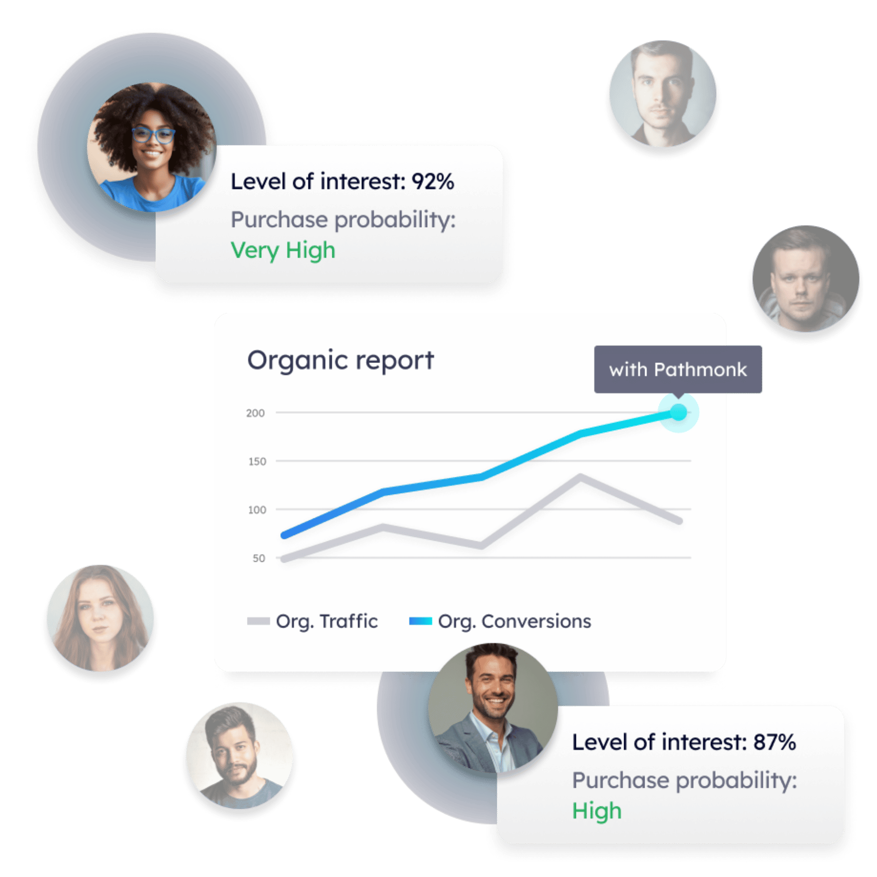
One-size-fits-all no longer cuts it in digital engagement. Interactive landing pages are structured around personalized user journeys, where content and CTAs adapt to individual preferences and behavior.
By guiding users through a path tailored to their interests, personalized journeys make visitors feel understood and more connected to the brand. This personalized approach ensures that each interaction brings them closer to taking action.
3. Immediate engagement opportunities
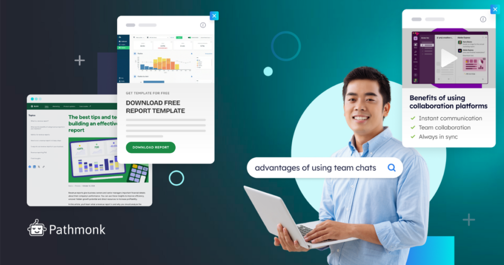
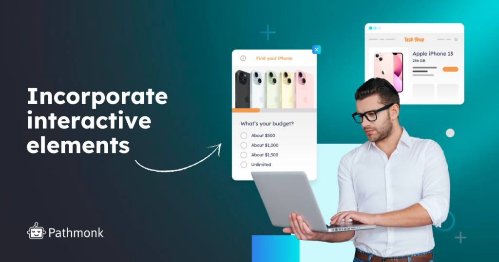
Unlike static pages, interactive landing pages engage visitors instantly, drawing them in with elements like polls, quizzes, or quick surveys that invite participation. These tools not only make the experience feel relevant but also create a two-way interaction that holds attention longer.
Engaging visitors right from the start turns them from passive viewers into active participants, boosting both interest and retention.
4. Clear and compelling calls to action (CTAs)
Every landing page needs CTAs, but on interactive pages, these are designed to be dynamic and responsive. Interactive CTAs can change based on a visitor’s actions or the content they’ve engaged with, creating an experience that feels custom-made.
These CTAs do more than prompt action — they use language and visuals that resonate with each user, encouraging them to move forward naturally.
5. Layered content with interactive depth
Interactive landing pages provide content depth that goes beyond simple text or images. This could be clickable graphics, videos that respond to user interaction, or expandable sections that reveal more information when clicked.
Layered content keeps users engaged longer by allowing them to explore topics or features in greater detail at their own pace. This interactive depth invites users to dig deeper without feeling overloaded by information.
6. Real-time feedback and responses
Instant feedback is a powerful motivator on an interactive page. Whether it’s through a live chatbot, a survey result, or a product recommendation based on quiz responses, real-time feedback keeps visitors engaged by providing immediate value. This feature bridges the gap between browsing and decision-making, helping users feel confident in taking the next step.
Below we’ll explore how to apply these elements when creating your landing pages with interactivity.
Free on-page SEO template
- Optimize pages with a clear, repeatable SEO structure
- Improve rankings without relying on guesswork
- Turn organic traffic into conversions
How to Create Landing Pages with Interactivity
Building an interactive landing page that converts involves more than just adding flashy features. It’s about strategically embedding elements that connect with visitors and guide them toward taking action. Here’s a comprehensive guide to creating landing pages that drive engagement and conversion.
1. Map out user journeys and set goals
Before you start adding interactive features, outline the journey you want your visitors to take. This requires clarity on:
- Primary objective: What’s the main action you want users to complete? (E.g., sign-up, purchase, download)
- Path to conversion: How will users naturally progress through your page? Think of the most logical flow, from top to bottom.
- Key touchpoints: Identify critical moments where interactive elements can add value (e.g., a quiz at the beginning, a pop-up CTA after scrolling halfway). Below are some examples of how to plan your goals and interactive elements:
User Goal | Suggested Interactive Element | Location on Page |
Sign-Up | Personalized Quiz | Top or mid-page |
Download | Dynamic Pop-up CTA | Near top or just before footer |
Product Purchase | Cost Calculator | Near product showcase or CTA |
Expert tip: Test different interactive elements at various touchpoints. Sometimes, even a subtle change in placement (like moving a CTA up by one section) can have a significant impact on conversions.
2. Incorporate interactive elements like quizzes, calculators, and polls
Interactive tools engage users by inviting them to participate actively. Here’s a breakdown of the most effective tools and how to use them:
- Quizzes
- Helps match users with relevant products or content.
- Provides a sense of discovery and personal relevance.
- Example: “Which product suits your needs best?” quiz.
- Calculators
- Perfect for illustrating potential ROI or savings, helping users justify a purchase.
- Example: “How much could you save with our product?”
- Polls
- Short, single-question polls gather feedback and opinions, making visitors feel heard.
- Example: “What feature is most important to you?”
Expert tip: Use branching logic in quizzes and calculators to make the experience feel even more personalized. For example, after a user selects an answer, direct them to a question or recommendation tailored to their response. This keeps engagement high and builds trust.
3. Implement dynamic calls-to-action (CTAs)
Dynamic CTAs respond to user behavior, offering prompts at the ideal time. To make them effective:
- Behavior-based CTAs
- Trigger CTAs based on actions like scrolling, hovering, or spending a specific amount of time on the page.
- Example: A CTA button appears after the user scrolls to the product details section.
- Personalized CTAs
- Adapt CTA text or offer based on the visitor’s previous interactions or preferences.
- Example: If a user has shown interest in a particular product, show a CTA like, “Ready to see it in action? Click here.”
- Countdown CTAs
- Adding urgency with limited-time offers or countdown timers to prompt immediate action.
- Example: “Sign up within the next 10 minutes to get 20% off.”
Expert tip: Experiment with micro-copy on your CTAs to make them feel more personal. For example, instead of “Sign Up Now,” try “Unlock My Discount.” Subtle tweaks can make a CTA feel more relevant to your visitor.
Increase e-commerce sales with personalized experiences
- Show the right products at the right moment
- Reduce cart abandonment with intent-based nudges
- Turn anonymous visitors into confident buyers
4. Use visual engagement tools like sliders and image galleries
Visual engagement tools, such as sliders and galleries, invite users to interact with your content in a way that feels immersive. Here’s how to make the most of them:
- Image sliders
- Showcase multiple product angles, customer testimonials, or use cases.
- Keep slides minimal with bold text overlays for a quick and easy read.
- Image galleries
- Offer a click-through experience to explore various features or details of a product or service.
- Great for step-by-step tutorials or showcasing a portfolio.
- Before/after sliders
- Allows users to interactively compare features or outcomes, ideal for service-based businesses.
Expert tip: For mobile users, ensure your sliders and galleries are swipe-friendly and responsive. User behavior differs on mobile, so intuitive navigation is critical to avoid drop-offs.
5. Personalize with AI-powered content recommendations
AI-based recommendations make visitors feel understood, creating unique personalized experiences. Here’s how you can apply AI to boost personalization:
- Content suggestions
- Suggest blog articles, case studies, or products based on user behavior, like previously viewed items or clicks.
- Example: A visitor who views SEO services might be shown related content, like case studies on successful SEO projects.
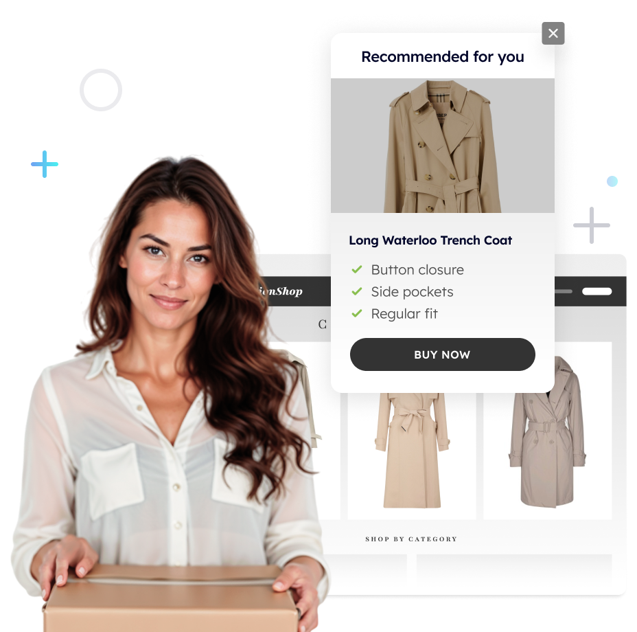
- Product recommendations
- Display products based on browsing history, cart items, or items frequently bought together.
- Example: After viewing a premium software package, show an add-on bundle with “Customers also bought…”
- Tailored pop-ups
- Use AI to display pop-ups with customized offers or discounts based on visitor behavior.
- Example: Offering a discount after several page views to retain visitors likely ready to convert.
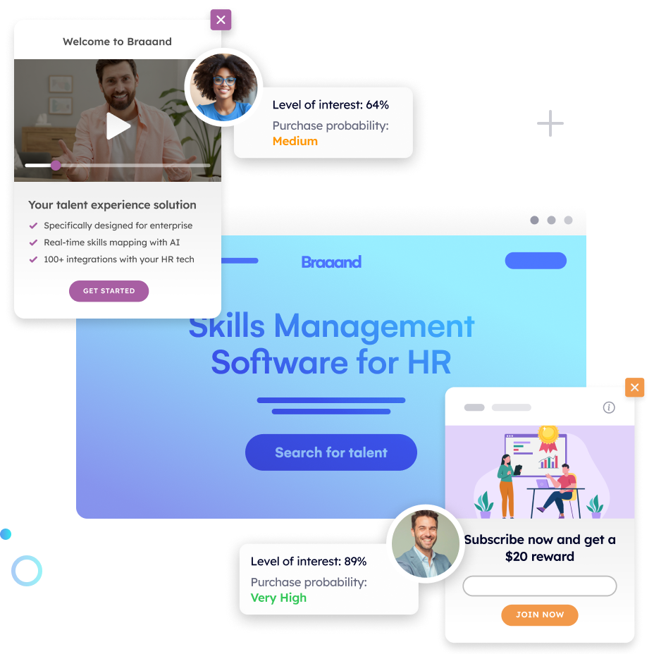
Expert Tip: With Pathmonk, you can easily transform your static landing pages into interactive masterpieces that will improve your conversion rates – expect a 50% growth on average 😉 By applying advanced AI for data analytics, our solution tailors the user journey in real-time, ensuring that each visitor sees the content most likely to convert them.
Increase +180% conversions from your website with AI
Get more conversions from your existing traffic by delivering personalized experiences in real time.
- Adapt your website to each visitor’s intent automatically
- Increase conversions without redesigns or dev work
- Turn anonymous traffic into revenue at scale
Practical Cases of Interactive Landing Pages with Pathmonk
Marketing agency: boosting contact form submissions by 100%
Fusion ROI, a digital marketing agency specializing in conversion-focused services, faced a challenge that’s all too common in their industry: turning visitors into leads. Although they excelled at driving traffic, many visitors arrived at their site without taking that critical next step. Fusion ROI needed a way to capture visitor attention and drive conversions, specifically through their contact form.
With Pathmonk interactivity, Fusion ROI transformed their landing pages by implementing behavior-based prompts and personalized CTAs that engaged visitors at the right moment. These elements invited users to interact, offering tailored suggestions and guiding visitors toward the contact form.
As a result, Fusion ROI achieved a remarkable 100% increase in contact form submissions. This improvement underscores the importance of real-time interactivity in reducing bounce rates and capturing high-quality leads.

E-commerce: enhancing conversion rates in 178%
Smarterstore, a prominent e-commerce platform, sought to increase conversions among visitors who browsed without making a purchase. While Smarterstore’s website already had a solid foundation in product presentation, they needed a way to encourage visitors to engage more deeply with their offerings and move them toward checkout.
With Pathmonk they offered dynamic CTAs and personalized shopping prompts that responded to each visitor’s browsing behavior. These features were strategically placed across product pages, creating opportunities for visitors to explore products in detail and receive tailored recommendations.
By keeping visitors engaged through customized suggestions, Smarterstore achieved a 178% increase in conversions, highlighting how tailored interactivity can streamline the online shopping experience and effectively guide visitors through the purchase funnel.
Learning Technology: Lifting High-Ticket Leads by 117%
Thrive Learning, a provider of professional training and development services, faced the challenge of attracting qualified leads for their high-ticket offerings. Their site needed to engage professionals interested in their courses and motivate them to request more information or sign up. However, without interactive engagement, visitors were likely to browse without converting.
With Pathmonk, Thrive Learning was able to implement interactive elements like customized lead capture forms and targeted CTAs based on visitor behavior. These tools created a more tailored experience that spoke directly to potential clients’ needs and interests.
As a result, Thrive Learning saw an impressive 117% increase in high-ticket leads, demonstrating the power of interactive content to convert browsing interest into qualified inquiries.

You too can easily achieve these outstanding results! Enough boring landing pages, create interactive, conversion-boosting machines with Pathmonk. Give it a try today:
- Try out this interactive demo (without any sales calls!);
- Know more about the product by booking a product tour with our team.

