The Buyer’s Journey is a three-step process buyers undertake to become aware of, consider, and decide to purchase your product or service. By adapting the website experience for each visitor, based on their stage in this process, businesses can optimize the website experience and improve business metrics such as conversions or revenue.
In this article, we will discuss the Awareness stage. After buyers realize they have a problem or pain point, they are eager to discover solutions. They are becoming aware about a product or service by visiting and engaging with a website. During the awareness stage prospective buyers reflect their awareness by a meaningful website visit, that is, when the user has read, interacted, etc. with the content of the website.
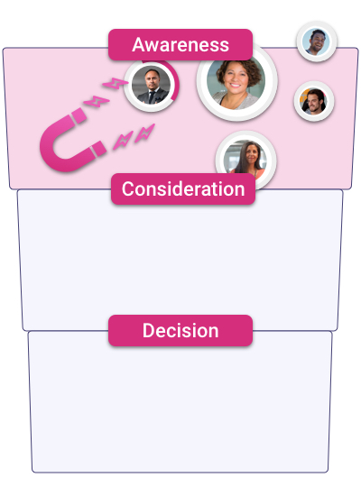
Why is the Awareness Stage Important?
When a potential buyer arrives on your platform, usually it is because you can provide a solution to their problems or pain points. Showcasing a clean and simple interface, powerful messaging and a website with a remarkable loading time are key factors in capturing your visitor’s attention during the awareness stage. The first website presentation is a critical component and it should be compliant with the 7-second website rule. This well-known convention specifies that you have a limited amount of time to capture the visitor’s attention. Essentially, you need to immediately answer the following questions to support the awareness stage of your prospective buyer:
- Who are you?
- What do you do?
- Is this product/service the one I need?
- What’s the next step?
Education
In order to better support a buyer in the awareness stage and through their buying journey as a whole you need to know your weak points. You can integrate tools that analyze your website’s usage. It is undoubtedly valuable to know who, how, when, and why the clients are using your platform. Make sure to track each channel and each stage of the buying journey so that you know where in the journey visitors withdraw.
Avoiding Saturation
One step at a time. Requesting contact information for a personal conversation or purchase from the visitor at the awareness stage is never the solution. By using these types of call-to-actions the visitor will not consider this as a fair exchange, with no incentive offered first.
Additionally, interrupting user navigation with unrequested demo requests, or too aggressive sales copy will create an uncomfortable experience during the awareness stage.
Providing an Intuitive Interface
The cleaner the better. Reaching truly intuitive websites is not an easy task. Website design is full of conventions and best practices. A great start is to not breakcore design principles in order to make life easier for your visitors. All visitors can quickly identify that the “magnifying” icon represents search and most will know that selecting the “hamburger” symbol will open a menu. By making use of some basic UX patterns, the visitors won’t miss any destination you want them to see.
Turn website traffic into sales-ready leads
- Identify high-intent visitors automatically
- Qualify leads before they reach your sales team
- Convert traffic without adding friction or forms
Tips to Improve the Awareness Stage:
Keep the Context of the Destination the Visitor has Come from
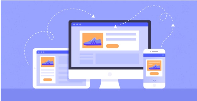
During the awareness stage, we have to work hard to retain the interest of our prospects. A user wants to see information that relates to the product or service on your website right after interacting with an advertisement. For example, if a user clicks on a specific advertisement, what they expect to see is this specific product and more information about it, not the main page of the brand. Otherwise, the customer can easily lose interest by getting lost finding their desired product.
Show Evergreen Content
Evergreen content (or non-seasonal content) is published information that is not time-dependent. No matter when you access it, it won’t be deprecated or obsolete. Therefore your visitors won’t be landing on obviously outdated content which may immediately result in less engagement; a critical element to supporting a prospect in the awareness stage.
Creating timeless content does not restrict the post-publication from not having up-to-date information, but rather from combining these current needs with reliable information for today and well into the future. Avoid using short-term labels:
- “2 days ago …”
- “Earlier this year …”
- “This week …”
- Specific dates
See an example of evergreen versus time-dependent content:
- Wrong: To deal with the cold weather coming next week, you can get one of our fleeces.
- Success: Purchase one of our fleeces to deal with the cold wherever you are.
Present Educational & Practical Information
Be effective with the information you show in order to be trustworthy and leave an impression. During the awareness stage, we want to create a frictionless experience; the user should not have to do a lot of work in order to know what your product or service is about. Dollar Shave Club is a perfect example of a minimalist interface that effectively conveys essential information while flawlessly representing the business.
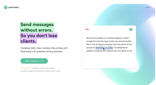
At this point, it is key to clearly state the benefit and the implication that the benefit provides. It is essential that your visitors can relate to the problem. Grammarly is showing this clearly below.
- Benefit: Message without typos
- Implication: So you don’t lose clients
Let’s consider another example: the Airbnb portal.
You can easily identify that the main CTA (call-to-action) resides in the toolbar; to search for rooms. There are not many buttons that catch your eye.
Guide Visitor Attention Intentionally
Having traffic is important. However, consider if that traffic is going to potentially purchase your product. When selecting an ad campaign, try to be specific on what type of client you want to obtain.
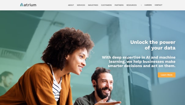
Introduce Your Offering with Video
Attention spans appear to be decreasing over the years and an ever-growing opportunity to keep page visitors engaged is with introduction videos. The digital world continues to expand but it is equally important that we inject the human element to maintain and develop a connection.
With an introduction video, you can quickly and succinctly highlight your product or service with the added value of showcasing your commitment to the brand and business. As we hope to not lose your focus through these articles we can admit that short videos between 30 to 60 seconds can often say much more than text, offering a captivating first impression. With a rich story, clear messaging, and dynamic and innovative elements you can be closer than ever to leading those visitors further down the funnel from the awareness stage.
Things to Avoid
- Overwhelming the visitor with purchase or subscription requests
- Overloaded interfaces
- Excessive sales language
- Unorganized navigation
- Assuming they understand what you do
- Conflicting call-to-actions
How Does Pathmonk Help You?
In the Awareness stage, Pathmonk works to reduce bounce rate, engage more visitors and increase time on-page so that you can retain more visitors on your site. Optionally, filter the traffic regions you want to optimize the conversions for.
Pathmonk uses micro experiences that focus on visuals to keep the visitor on the page. Micro-moments are concrete, understandable, and accumulative. These moments integrate and escalate to the final buying decision and lift conversions. An example: An introduction video that briefly communicates, in a human & relatable way, what your service is all about.
Check out part 3 of the series, where we share lessons learned about the “Consideration stage” and hands-on insights about which content supports visitors in this stage.
Check out part 4 of this series, where we look into the “Decision Stage” with extensive details and highlight processes to improve your final conversions.
Understand how your prospects behave (in real time)
- Visualize how visitors move across your website
- Identify drop-offs and friction points instantly
- Turn journey data into actionable insights with AI
