
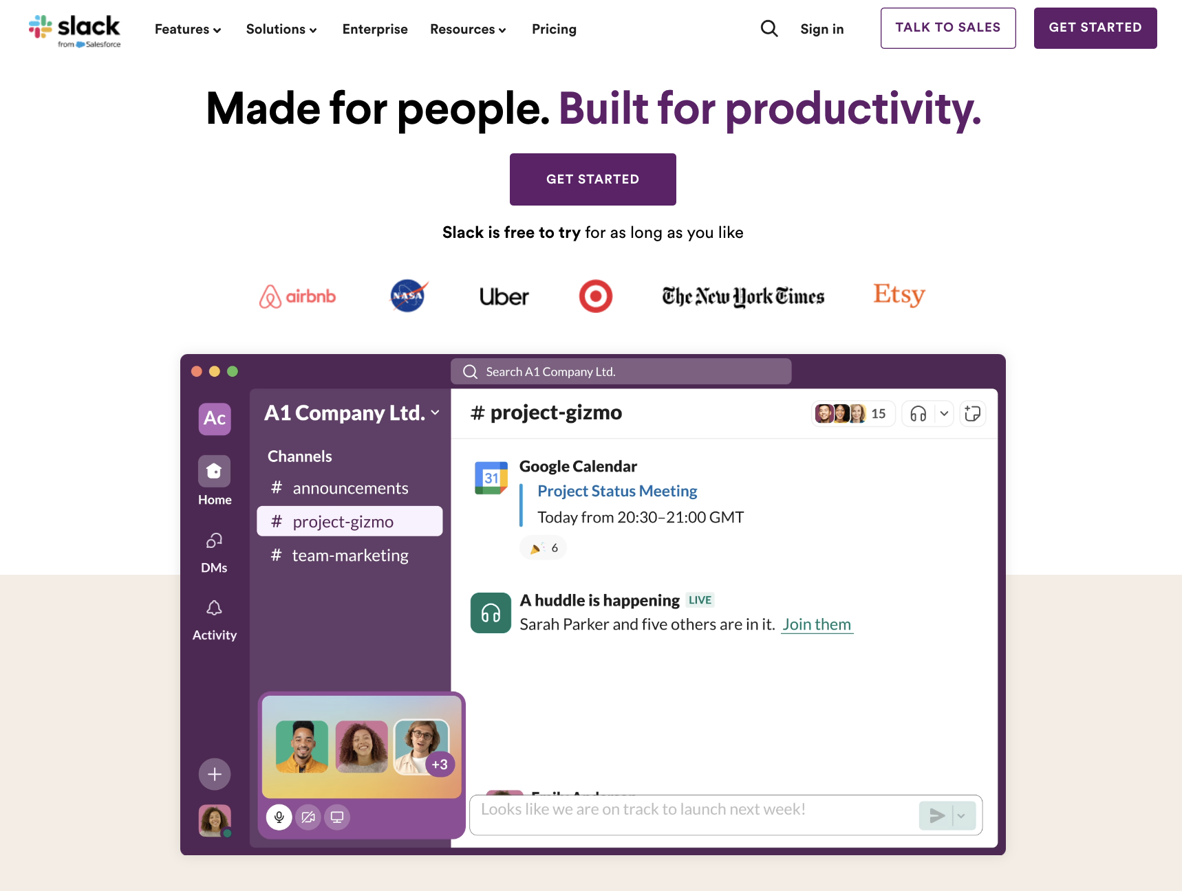
Slack – Communication and Collaboration
Slack is a collaboration and communication platform designed for teams. It provides a centralized space for messaging, file sharing, and integrating various tools and services. Users can create channels for different topics, projects, or teams, allowing for organized and focused conversations.
Slack supports direct messaging, voice and video calls, and integrates with numerous third-party applications, enhancing workflow and productivity. It’s widely used by businesses and organizations to facilitate real-time communication and collaboration among team members.
What we love about it:
- Clear and compelling value proposition: the headline “Made for people. Built for productivity.” effectively communicates the platform’s primary benefits.
- Strong social proof: logos of well-known companies like Airbnb, Uber, and the New York Times build credibility and trust.
- Visual and engaging content: the use of screenshots and illustrations helps users quickly understand how Slack works and its key features.
- Flexible CTAs: options to “Sign up with email address” or “Sign up with Google” make it easy for users to get started.
What could be improved:
- CTA prominence: while the CTAs are clear, making the “Try for free” button more prominent by using a contrasting color could draw more attention.
- More detailed feature explanations: adding brief descriptions or tooltips to the screenshots could provide deeper insights into the specific functionalities.
- Testimonial diversity: including a wider range of testimonials from different industries and company sizes could make the page more relatable to diverse potential customers.
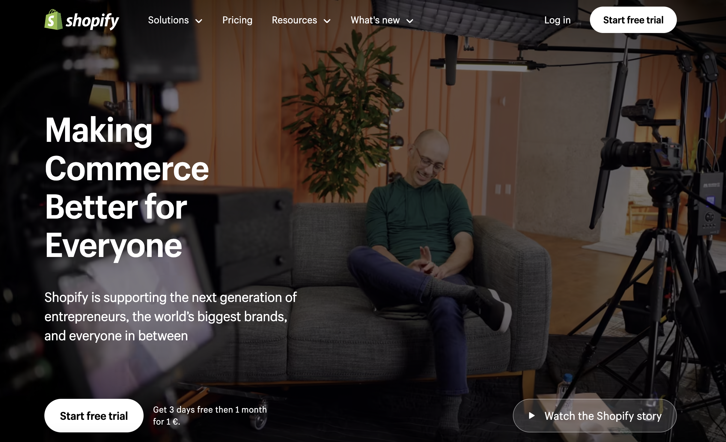
Shopify – E-commerce
Shopify is an e-commerce platform that allows individuals and businesses to create, manage, and grow online stores. It provides tools for setting up a website, customizing the design, managing products, processing payments, and handling shipping.
Shopify also offers features like marketing and SEO tools, analytics, and integration with various third-party apps to enhance the functionality of online stores. It’s widely used by entrepreneurs and companies of all sizes to sell products and services online (and we’re Shopify Certified Personalization Partners!)
What we love about it:
- Visual storytelling: The use of high-quality images and videos to showcase the platform’s features and success stories helps engage users and convey the brand message.
- Credibility through statistics: Highlighting impressive statistics such as the number of businesses using Shopify and total sales volume builds trust and demonstrates the platform’s impact.
- Comprehensive feature overview: Detailed descriptions of the platform’s features, including selling channels, back-office management, and customer engagement tools, provide a clear understanding of its capabilities.
What could be improved:
- Content spacing: Improving the spacing between sections and elements could enhance readability and prevent the page from feeling cluttered.
- Simplified navigation: Streamlining the navigation menu to highlight the most important sections and reducing the number of options could make it easier for users to find relevant information.
- Interactive elements: Adding more interactive elements, such as hover effects, sliders, or interactive demos, could engage users more effectively and provide a more dynamic browsing experience.
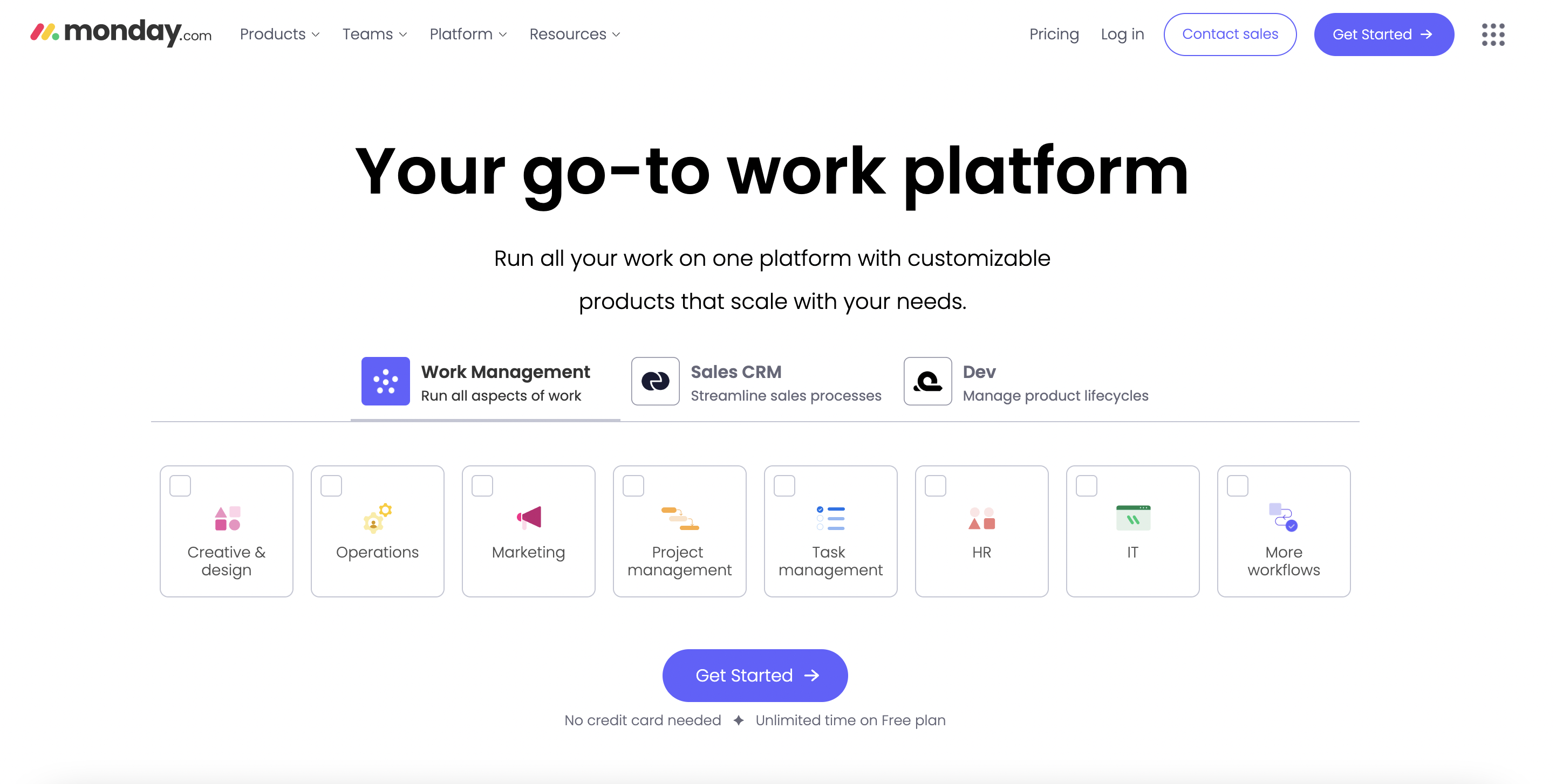
Monday.com – Work Operating System
Monday.com is a work operating system that enables teams to build, run, and scale their workflows on a flexible platform. It offers a range of tools for project management, task tracking, collaboration, and process automation.
Users can customize workflows, integrate with other apps, and visualize their progress through various views like boards, timelines, and calendars. Monday.com is designed to improve team productivity and transparency across projects.
What we love about it:
- Use of real-world scenarios: showcasing specific use cases and practical applications of the platform helps potential users visualize how it can be integrated into their workflows.
- Layered feature presentation: the step-by-step breakdown of features, starting from high-level benefits to detailed functionalities, provides a comprehensive understanding without overwhelming the user.
- Customer logos and testimonials: displaying logos of well-known companies and customer testimonials builds trust and credibility.
What could be improved:
- Simplified navigation: reducing the number of options in the navigation menu could make it easier for users to find the most relevant information quickly.
- Content spacing: improving the spacing between sections and elements could enhance readability and prevent the page from feeling cluttered.
- More concise messaging: streamlining some of the text-heavy sections could make the content more digestible and keep the reader’s attention focused.
- Dynamic user engagement: integrating interactive elements like live chats, pop-up tips, or guided tours could enhance user engagement and provide instant support.
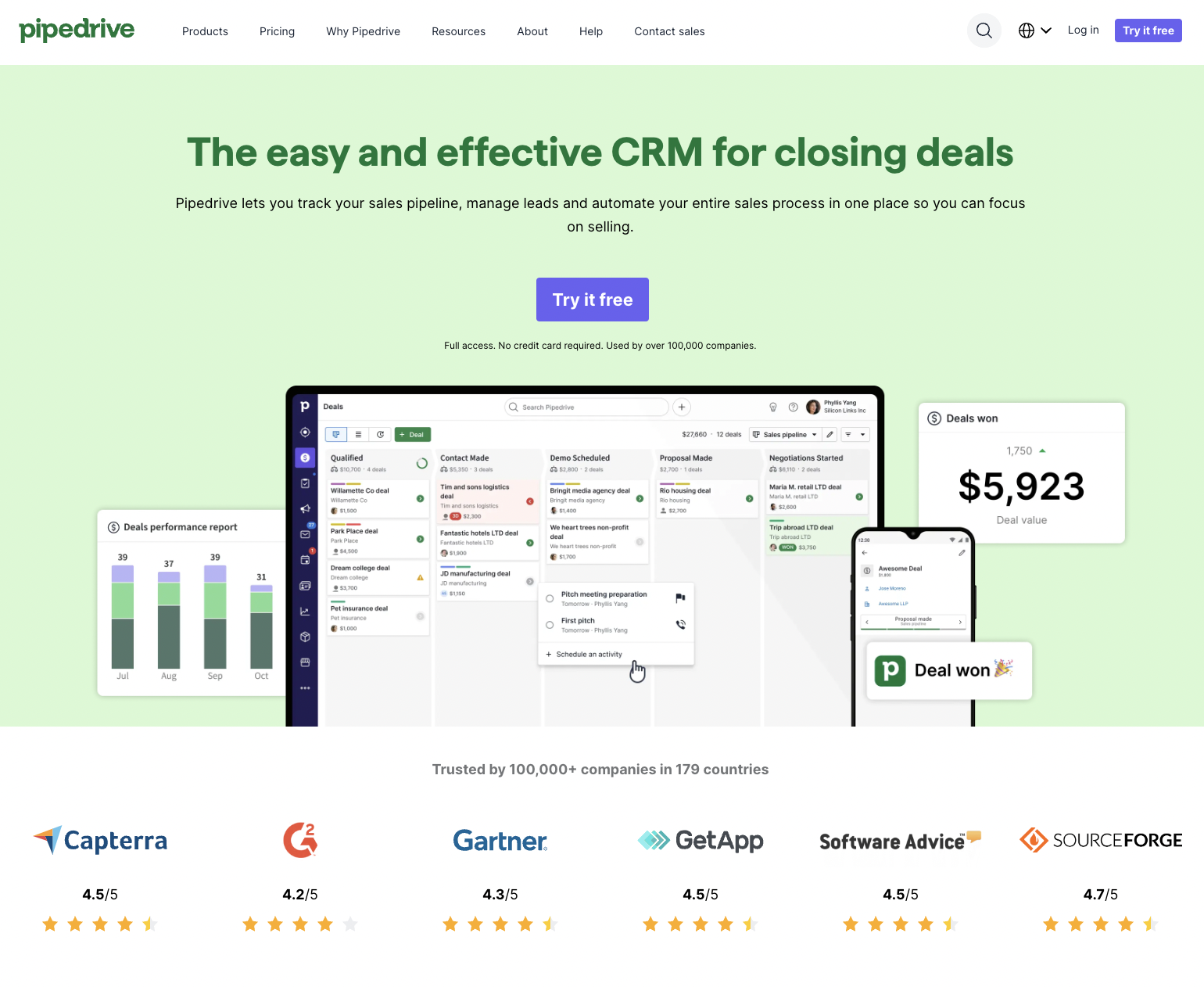
Pipedrive – Sales CRM
Pipedrive is a customer relationship management software designed to help businesses manage their sales processes. It offers tools to track sales pipelines, manage leads, automate sales tasks, and improve overall sales efficiency.
Known for its user-friendly interface and focus on sales automation, Pipedrive is used by companies to streamline their sales operations, enhance productivity, and close deals more effectively.
What we love about it:
- Detailed and engaging content: the page provides a comprehensive overview of the CRM’s features, benefits, and user testimonials, which helps potential customers understand its value.
- Clear and prominent CTA: the “Try it free” button is clearly visible and strategically placed, encouraging users to take immediate action.
- Social proof and credibility: showcasing ratings from reputable sources (Capterra, G2, Gartner) and displaying user testimonials builds trust and credibility.
- Integrations and marketplace: highlighting integrations with popular tools (Slack, Zoom, Google Drive) shows the CRM’s versatility and compatibility with existing workflows.
What could be improved:
- Visual hierarchy and spacing: the page could benefit from better spacing and visual breaks to avoid overwhelming the user with too much information at once.
- Simplifying content: some sections, particularly those with dense text, could be streamlined for quicker reading and better clarity.
- Highlighting key features: using more icons or visuals to highlight key features could make the information more digestible and engaging.
- Additional CTAs: incorporating more ctas throughout the page, especially after major sections, could improve user engagement and conversion rates.
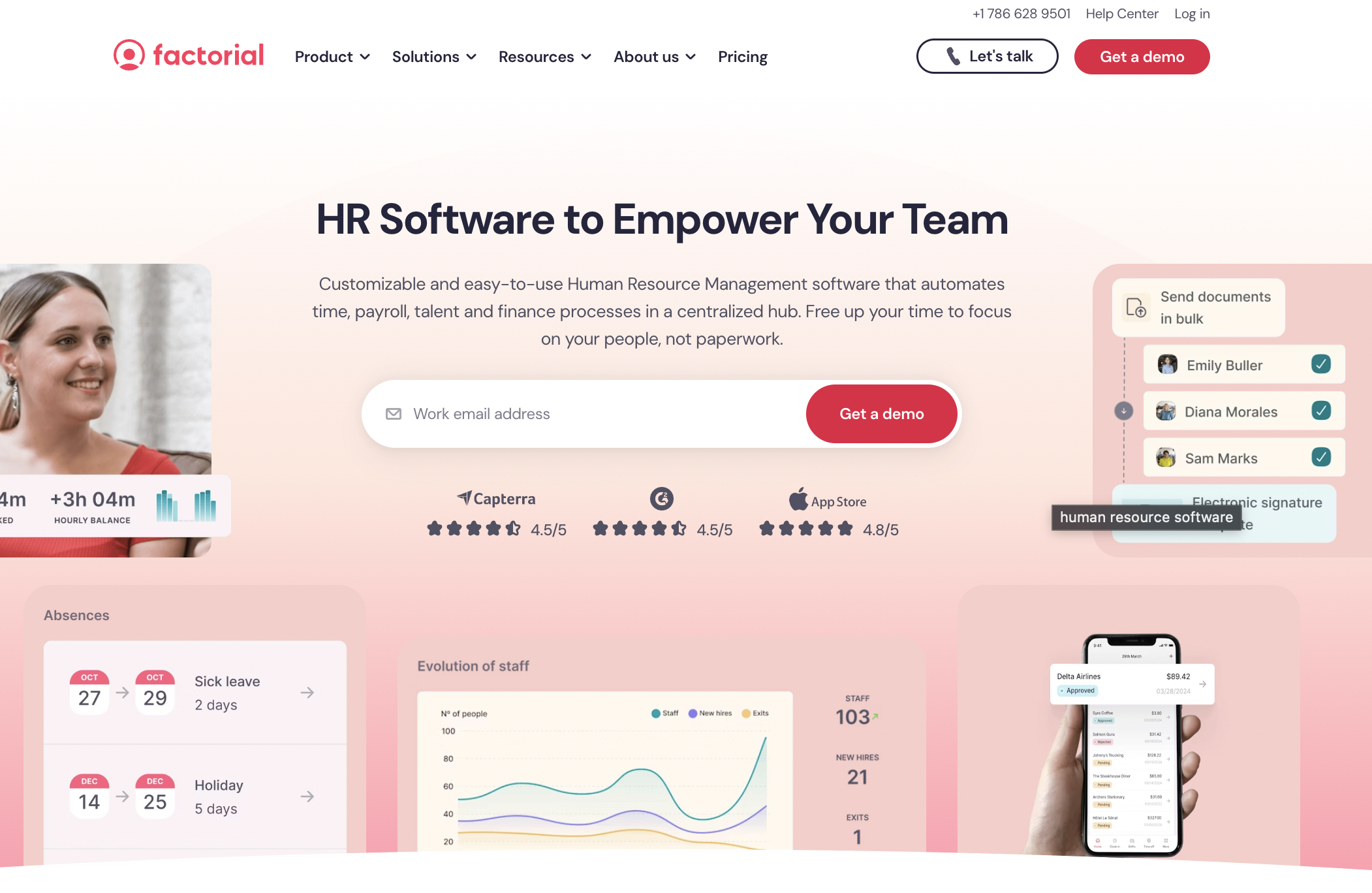
Factorial – Human Resources
Factorial is a human resources software platform designed to streamline and automate HR processes for businesses. It offers tools for managing employee data, time tracking, payroll, performance reviews, and recruitment.
Factorial aims to improve efficiency and reduce administrative workload by providing an all-in-one solution for HR management, helping companies focus more on their people and less on paperwork.
What we love about it:
- User-centric design: The inclusion of user testimonials and video highlights personal experiences with the software, creating a relatable and trustworthy impression.
- Integration showcase: Prominently displaying integrations with other popular tools like Slack, LinkedIn, and Google Workspace helps illustrate the platform’s versatility and compatibility.
- Awards and recognitions: Showcasing industry awards and recognitions immediately conveys credibility and excellence in the HR software space.
- Clear pricing information: Providing straightforward access to pricing details helps potential customers quickly understand the cost structure and makes the decision-making process easier.
What could be improved:
- CTA differentiation: Varying the design and placement of call-to-action buttons throughout the page could help maintain user interest and improve conversion rates.
- Simplified navigation: Restructuring the navigation menu to make it more concise and intuitive could enhance the user experience, making it easier to find relevant information.
- Interactive elements: Adding interactive elements like hover effects, collapsible sections, or interactive demos could engage users more effectively and provide a deeper understanding of the software’s features.
- Enhanced mobile optimization: Ensuring that all elements of the page are fully optimized for mobile devices could improve accessibility and user experience for on-the-go users.
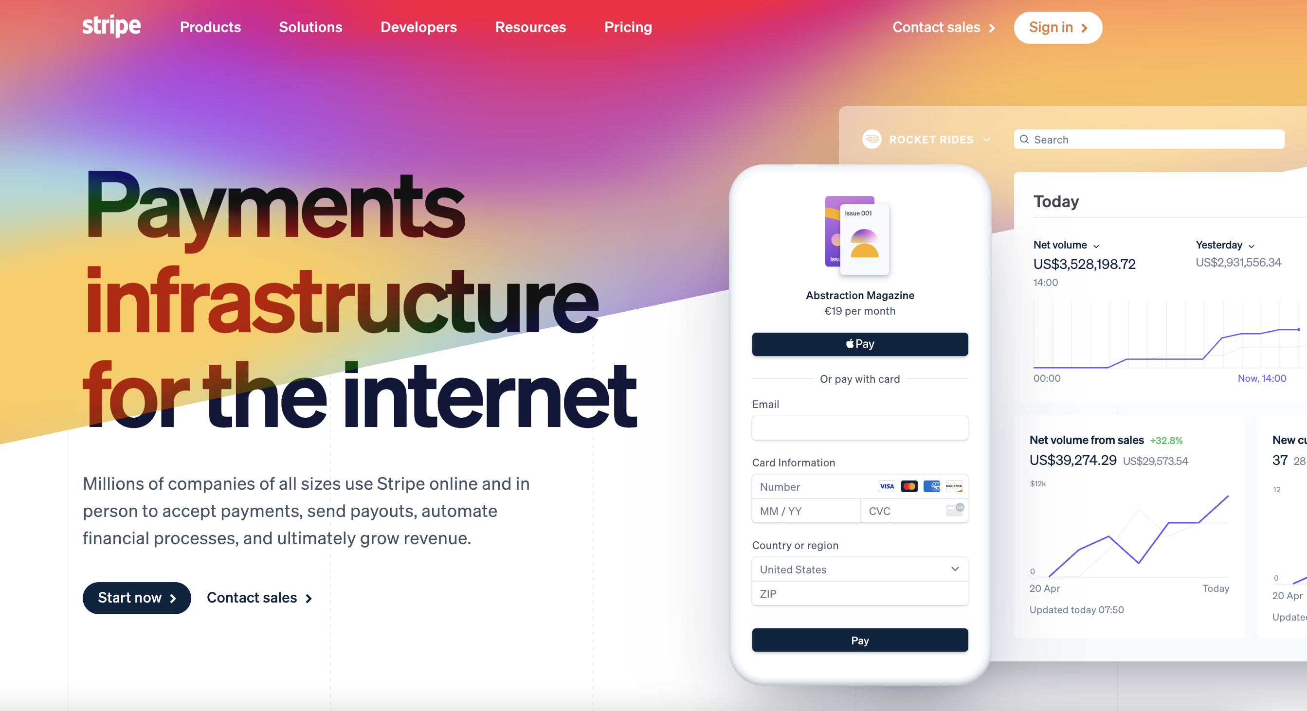
Stripe – Payment Processing
Stripe is a technology company that provides a suite of payment processing software and APIs for online businesses. It enables businesses to accept payments, manage subscriptions, and handle financial transactions securely over the Internet.
Stripe supports a wide range of payment methods and currencies, offering solutions for both small startups and large enterprises. Its services include tools for fraud prevention, invoicing, and financial reporting, making it a comprehensive platform for managing online payments and financial operations.
What we love about it:
- Focused messaging: the headline “Payments infrastructure for the internet” and subheadline clearly articulate what Stripe does and its value proposition in a concise manner.
- Product illustrations: detailed illustrations and screenshots of the product interface help users visualize how Stripe can be integrated into their own systems.
- Diverse use cases: the page effectively showcases different use cases and solutions, from startups to large enterprises, demonstrating versatility.
- Developer-friendly features: highlighting the ease of integration with APIs and low/no-code options emphasizes Stripe’s appeal to both technical and non-technical users.
What could be improved:
- Navigation hints: adding subtle visual cues or indicators to guide users through the page and highlight key sections could enhance the user experience.
- Support options visibility: making customer support options more prominent could reassure potential customers about the availability of help and resources.
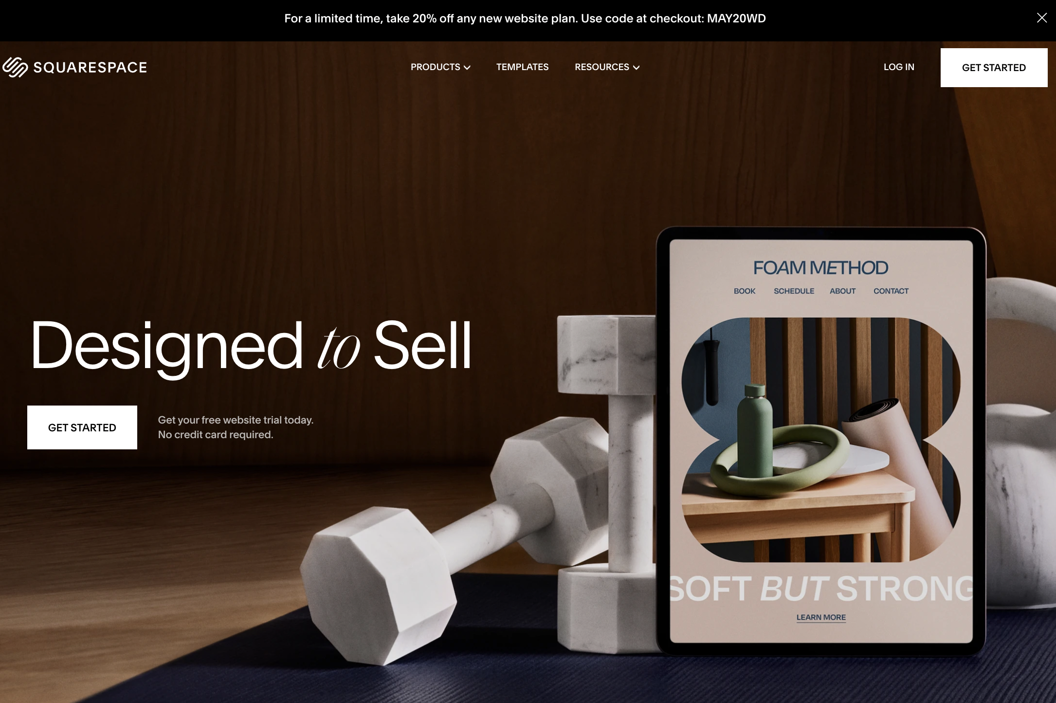
Squarespace – Website Builder
Squarespace is an all-in-one website building and hosting platform that allows users to create and manage websites without needing technical expertise. It offers customizable templates, drag-and-drop design tools, and integrated features for blogging, e-commerce, and portfolio presentation.
Squarespace provides everything needed to build a professional online presence, including domain registration, hosting, SEO tools, and customer support. It’s popular among individuals, small businesses, and creative professionals for its ease of use and aesthetically pleasing design options.
What we love about it:
- Visually striking design: the use of high-quality images and sleek design elements makes the page visually appealing and engaging.
- Template variety showcase: prominently displaying various website templates helps users quickly see the customization options available for different needs.
- Clear CTA: the “Start your free website trial today” button is prominently placed, encouraging users to take immediate action.
- Focus on business growth: the sections on marketing tools and solutions for brand growth emphasize the platform’s value in helping businesses expand and succeed online.
What could be improved:
- Text contrast: improving the contrast between text and background in some sections could enhance readability and ensure the content is easily accessible.
- More detailed feature explanations: providing brief descriptions or tooltips for each template and feature could help users understand the benefits and functionality more clearly.
- Interactive demos: adding interactive elements such as live previews or demo videos could give users a more immersive experience and better understanding of how the platform works.
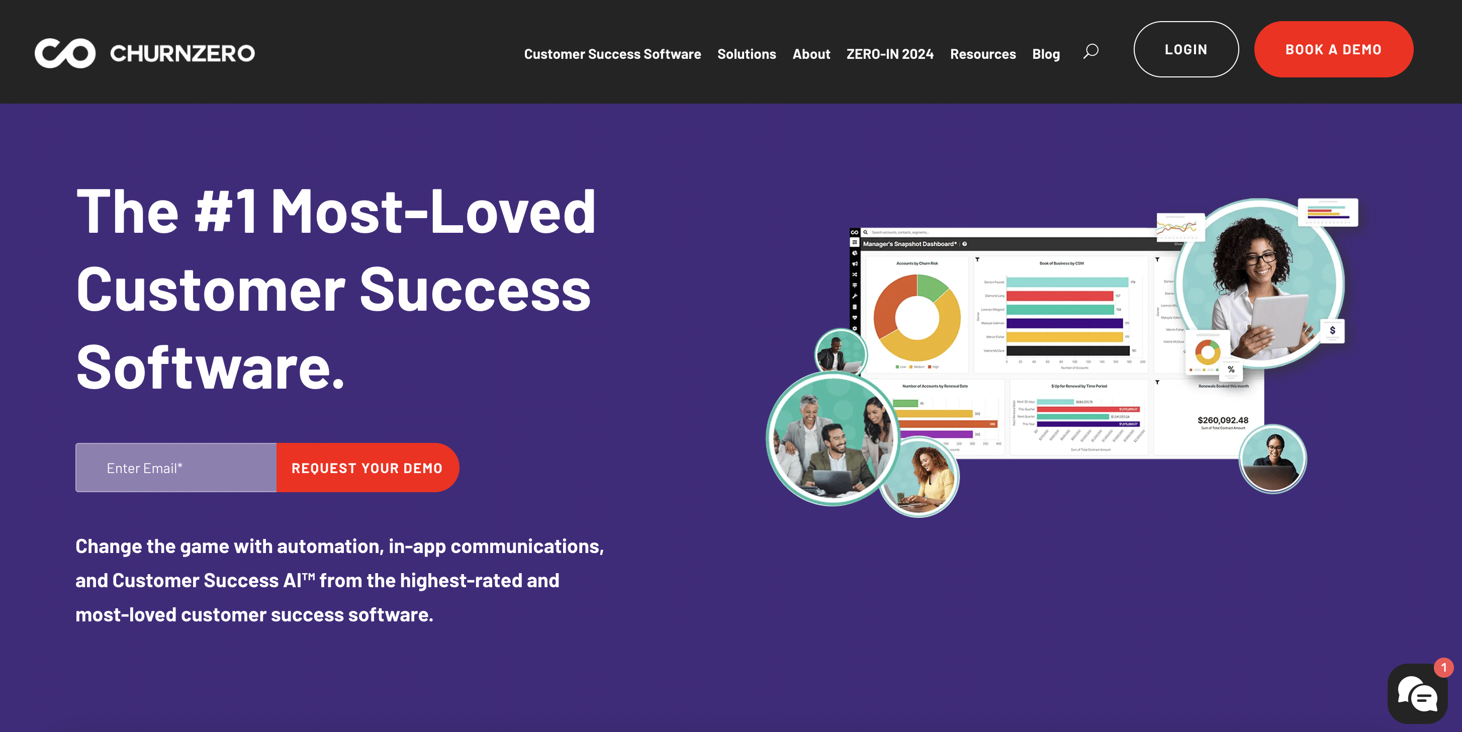
ChurnZero – Customer Success
ChurnZero is a customer success software platform designed to help subscription-based businesses reduce customer churn and increase retention. It provides tools for tracking customer engagement, analyzing user behavior, and automating customer success workflows.
With features like in-app messaging, health scoring, and personalized customer journeys, ChurnZero enables companies to proactively manage customer relationships, identify at-risk customers, and drive user adoption and satisfaction.
What we love about it:
- Strong branding and identity: the consistent use of the purple color scheme and modern design elements reinforces ChurnZero’s brand identity.
- Focused user journey: the clear progression from feature highlights to integrations and then to customer success stories guides users logically through the page.
- Live demo as lead magnet: the prominent “get a live demo” section with a video and CTA provides a tangible next step for interested users.
- Resource accessibility: the resources section, featuring studies and reports, offers valuable content that can help build trust and educate potential customers.
What could be improved:
- Engagement variety: adding interactive case studies or success stories that users can explore would make the content more engaging.
- Integration details: providing brief descriptions or hover-over information for each integration logo could help users understand the benefits of each integration.
- User testimonials: integrating short video testimonials from a diverse range of customers could add a personal touch and enhance credibility.
- Performance metrics: including real-world performance metrics, such as customer retention rates or ROI figures, could provide concrete evidence of the platform’s effectiveness.
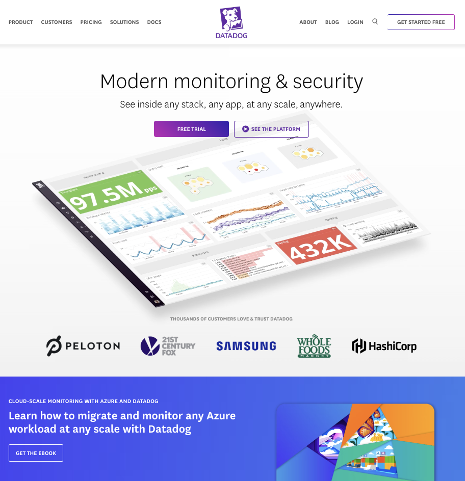
Datadog – Cloud Monitoring
Datadog is a monitoring and analytics platform for cloud applications. It provides comprehensive visibility into infrastructure, applications, and logs by collecting and analyzing data from various sources in real-time.
Datadog helps IT and DevOps teams track the performance of their systems, identify and resolve issues, and improve overall operational efficiency. Its features include dashboards, alerts, integrations with other tools, and AI-driven insights, making it a powerful tool for managing and optimizing cloud-based environments.
What we love about it:
- Clear structure and hierarchy: the page follows a logical structure, starting with a strong headline and CTA, followed by client logos, feature highlights, and additional resources. this helps guide the user through the content in a cohesive manner.
- Visual design and appeal: the use of vibrant colors and high-quality images makes the page visually appealing and engaging. Additionally, the illustrations and graphs not only add visual interest but effectively showcase the product’s capabilities in monitoring and data visualization.
- Credible endorsements: featuring logos of well-known companies like Peloton, Samsung, and Whole Foods builds trust and credibility.
- Easy access to resources: the prominent placement of resources like reports and ebooks makes it easy for users to find valuable information.
What could be improved:
- Navigation simplicity: simplifying the navigation menu could enhance user experience by making it easier to find key information quickly.
- Testimonial inclusion: adding customer testimonials or case studies could provide additional social proof and highlight real-world benefits.
- Content spacing: improving the spacing between sections could enhance readability and prevent the page from feeling cluttered.
- Personalization: the content currently feels too generic, trying to address both potential clients and potential employees at the same time. Separating these audiences with dedicated on-page experiences could make the messaging more targeted and effective.
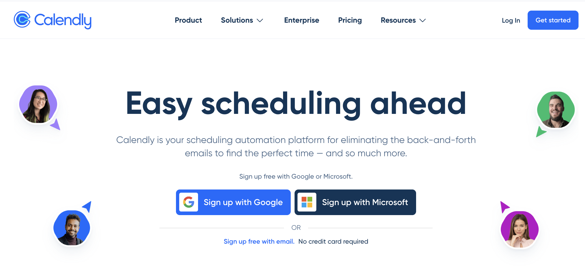
Calendly – Scheduling
Calendly is an online scheduling tool that simplifies the process of arranging meetings and appointments. It allows users to set their availability preferences, share their scheduling links, and let invitees choose from the available time slots.
Calendly integrates with various calendar systems, such as Google Calendar, Outlook, and Apple Calendar, to automatically sync events and prevent double-booking. It is widely used by professionals and businesses to streamline appointment setting, improve productivity, and enhance the scheduling experience for both hosts and invitees.
What we love about it:
- User-centric approach: The headline “Simplified scheduling for more than 20 million users worldwide” effectively communicates the value proposition, appealing directly to potential users.
- Multiple sign-up options: Providing options to sign up with Google, Microsoft, or email caters to different user preferences and makes the onboarding process easy and flexible.
- Clear benefit statements: Sections like “Drive more retention” and “Speed up your response times” clearly articulate the benefits of using Calendly, making the advantages obvious to the reader.
- Visual hierarchy: The use of bold headings, subheadings, and bullet points helps in breaking down the information, making it easy to scan and understand quickly.
- Integration highlights: Showcasing integrations with popular tools like Salesforce, Zoom, and Slack emphasizes Calendly’s compatibility and enhances its appeal to businesses already using these tools.
What could be improved:
- Content targeting: The messaging currently targets a broad audience including sales, marketing, customer success, and IT teams. Creating more tailored content for each segment could make the messaging more relevant and impactful.
- Case studies and success stories: Adding detailed case studies or success stories with measurable outcomes could provide more tangible proof of Calendly’s effectiveness.
- Interactive elements: Incorporating interactive elements such as live demos, hover effects, or clickable feature walkthroughs could make the page more engaging and informative.
- Visual consistency: Ensuring a consistent color scheme and design elements throughout the page could enhance visual cohesion and professional appearance.
- Footer organization: Organizing the footer with quick links to essential resources like customer support, pricing, and case studies could improve navigation and accessibility for users looking for specific information.
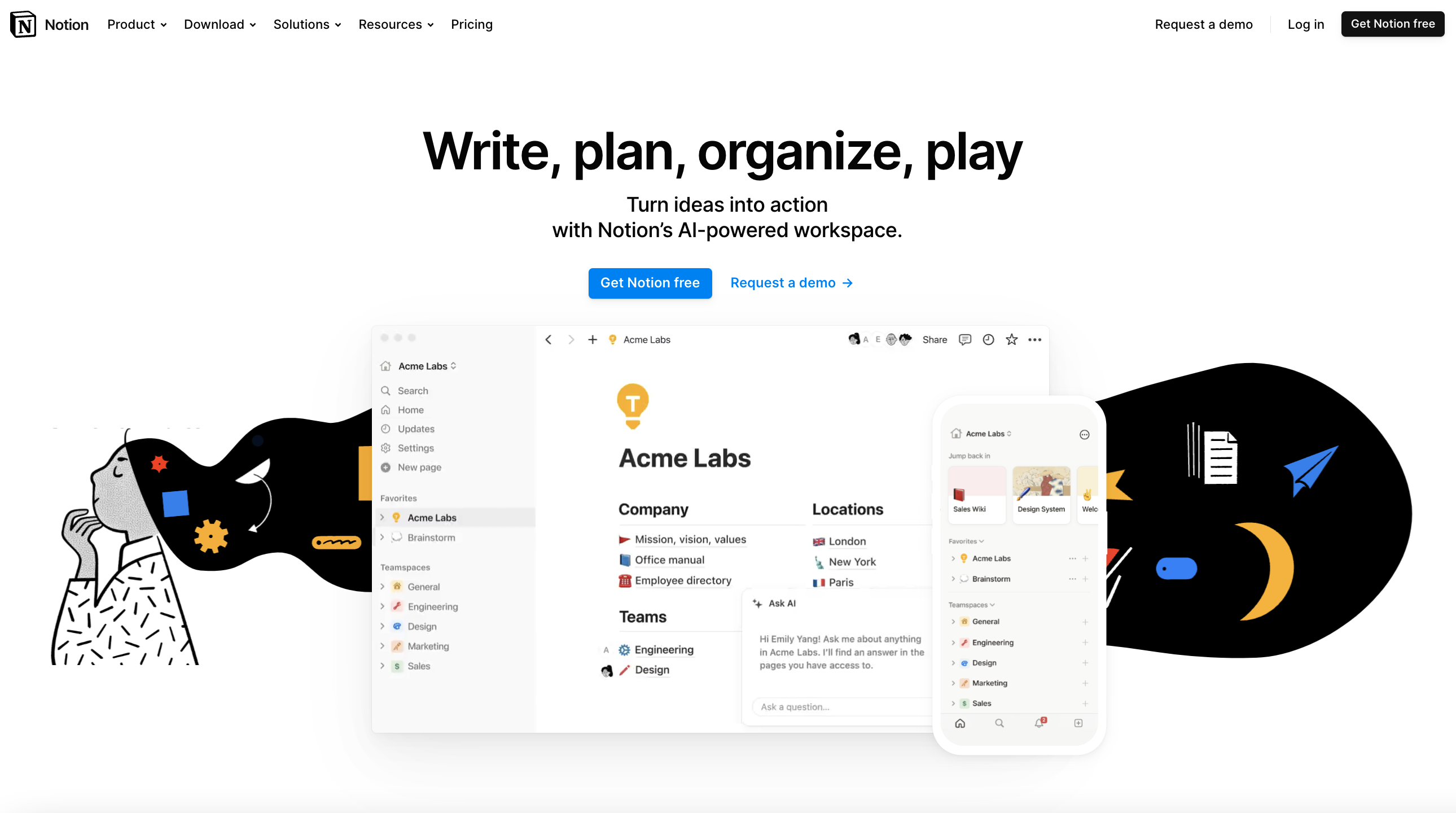
Notion – All-in-One Workspace
Notion is an all-in-one workspace software that combines note-taking, task management, project planning, and collaboration tools. It allows users to create, organize, and share various types of content in customizable pages and databases.
Notion supports real-time collaboration, making it ideal for teams and individuals to manage projects, track tasks, store documents, and brainstorm ideas. Its flexible and modular structure lets users tailor their workspace to fit their specific needs, enhancing productivity and organization.
What we love about it:
- Clear and compelling headline: the headline “write, plan, organize, play” immediately conveys the multifunctional nature of Notion, attracting a wide range of users.
- Engaging visuals: the use of high-quality screenshots and playful illustrations makes the page visually appealing and helps demonstrate the product’s features.
- Social proof: featuring logos of well-known companies and stating “millions run on Notion every day” builds trust and credibility.
- Comprehensive feature overview: the detailed sections on different functionalities (e.g., “powerful building blocks” and “consolidate tools. Cut costs.”) provide a thorough understanding of the platform’s capabilities.
- Global community focus: emphasizing the global user base and creativity (“join a global movement. Unleash your creativity.”) fosters a sense of community and belonging.
What could be improved:
- Personalization: the content could be more tailored to different user segments (e.g., individuals vs. teams, different industries) to make the messaging more relevant and impactful.
- Navigation clarity: simplifying the navigation menu and adding anchor links to specific sections could enhance the user experience by making it easier to find relevant information quickly.
- Reduce cognitive load: the page has a lot of information, which might be overwhelming. breaking down the content into more digestible chunks and using more white space could improve readability and user experience.
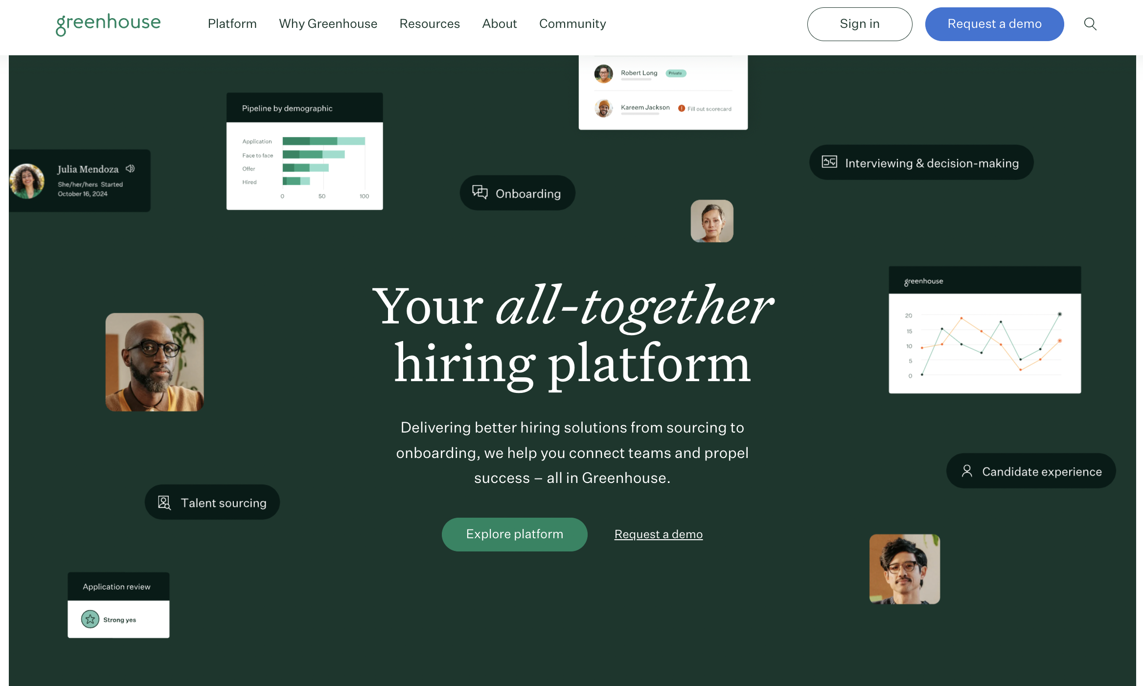
Greenhouse – Recruiting
Greenhouse is a recruitment software platform designed to streamline and optimize the hiring process for businesses. It provides tools for job posting, candidate tracking, interview scheduling, and collaborative hiring.
Greenhouse enables companies to build structured and efficient recruitment workflows, improve candidate experiences, and make data-driven hiring decisions. Its features include applicant tracking, automated task management, and integration with other HR tools, making it a comprehensive solution for managing the entire hiring lifecycle.
What we love about it:
- Social proof: featuring logos of well-known companies like HubSpot, HelloFresh, and Trivago builds credibility and trust in the product.
- Clean and professional design: the overall design is sleek and modern, which gives a professional look and feels trustworthy.
- Concise messaging: the text is clear and to the point, effectively communicating the benefits of using Greenhouse without overwhelming the user with too much information.
- Comprehensive footer: the footer provides extensive navigation options, including links to solutions, resources, and company information, enhancing usability and accessibility.
What could be improved:
- Personalization: the messaging is quite generic and could benefit from more personalized content tailored to specific user segments (e.g., startups vs. enterprises).
- CTA visibility: the CTAs could be more visually distinct by using contrasting colors or larger buttons to draw more attention.
- Text contrast: some text sections could benefit from higher contrast against the background to improve readability, especially in lower-light environments or for users with visual impairments.
- Performance indicators: adding statistics or performance indicators, such as customer success metrics or ROI figures, could provide more concrete evidence of the platform’s value.
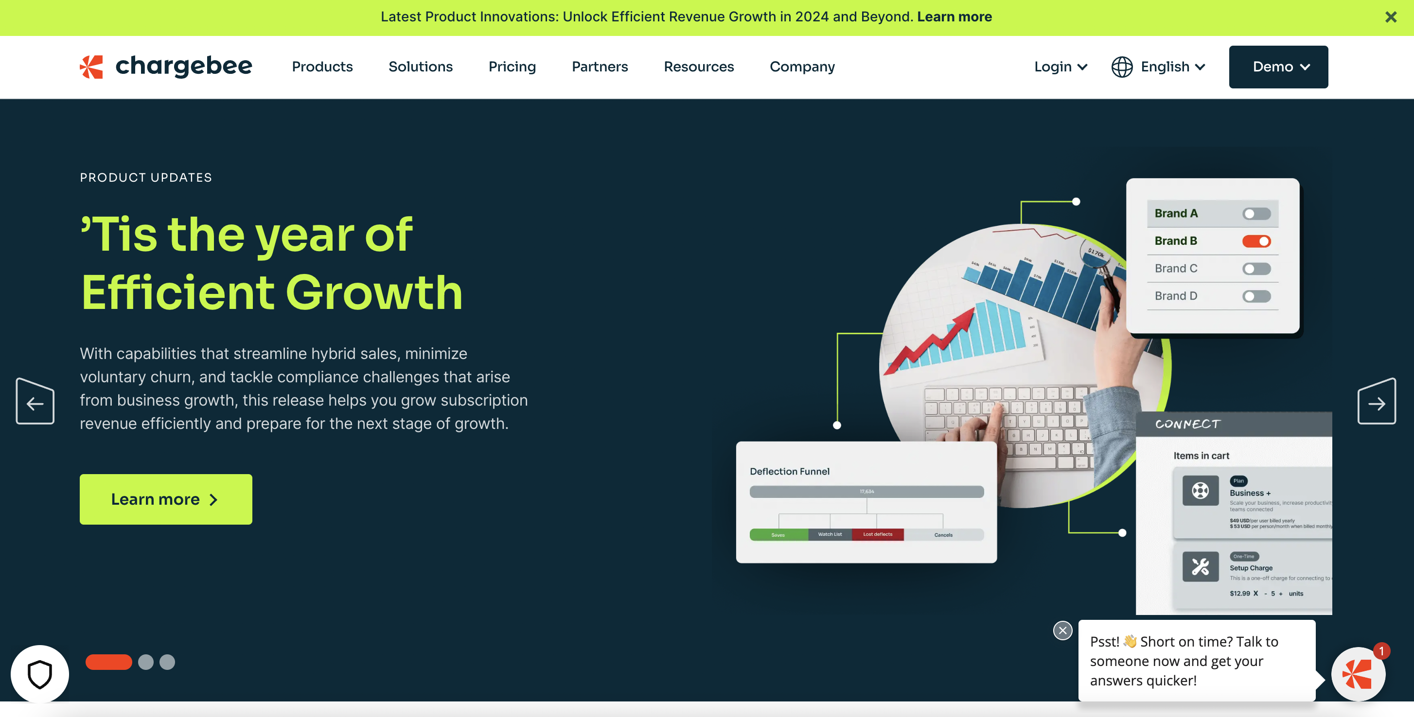
Chargebee – Subscription Billing
Chargebee is a subscription billing and revenue management platform designed for SaaS businesses and subscription-based services. It automates billing, invoicing, payments, and revenue operations, helping companies manage their recurring billing cycles efficiently.
Chargebee supports multiple pricing models, global payment methods, and compliance with tax regulations. Its features include subscription management, revenue recognition, dunning management, and analytics, making it a comprehensive solution for optimizing subscription revenue and financial processes.
What we love about it:
- Focused value proposition: the headline “’Tis the year of efficient growth” immediately sets the theme and focus on growth, which is appealing to potential clients looking to scale their businesses.
- Use of case studies: the inclusion of a detailed case study with specific savings figures (“saves $150k a year in operating costs”) provides concrete evidence of Chargebee’s value.
- Global reach and community: highlighting global statistics (e.g., “6456+ customers” and “209 countries and territories”) emphasizes Chargebee’s extensive reach and community impact.
What could be improved:
- Content density: the page has a lot of information, which can be overwhelming. Simplifying some sections or breaking content into more digestible chunks could improve readability.
- Personalization: the content could better address specific user segments (e.g., small businesses vs. large enterprises) with tailored messaging and examples.
- User journey mapping: designing the page with a clear user journey in mind, guiding potential customers through a logical flow from introduction to conversion, can improve user experience and conversion rates.
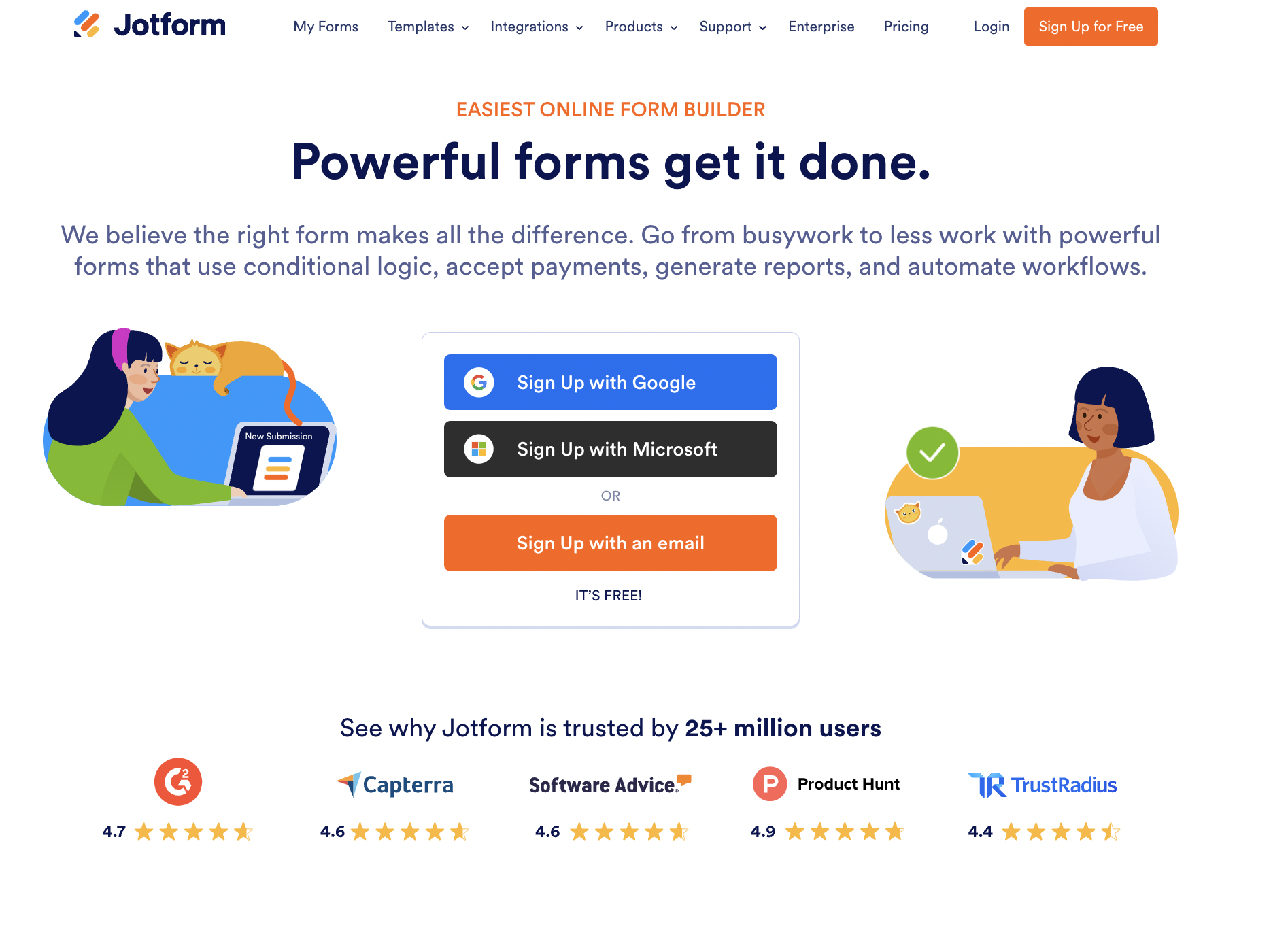
JotForm – Form Builder
JotForm is an online form builder that allows users to create and customize forms for various purposes, such as surveys, registrations, order forms, and feedback collection. It offers a drag-and-drop interface, making it easy to design forms without any coding knowledge.
JotForm provides a wide range of templates, integrations with other apps, and features like payment processing, conditional logic, and data analytics. It’s used by individuals, businesses, and organizations to streamline data collection and enhance productivity.
What we love about it:
- Trust indicators: the page features ratings from well-known platforms like Capterra and Product Hunt, along with user statistics (“trusted by 25+ million users”), which build credibility and trust.
- Easy sign-up options: offering multiple sign-up methods (Google, Microsoft, email) makes the registration process flexible and user-friendly.
- Highlighting key features: the sections on building forms, integrating with business apps, and collecting payments clearly outline the main functionalities, helping users quickly grasp the platform’s capabilities.
- Engaging visuals: the use of modern illustrations and a clean layout makes the page visually appealing and helps in maintaining user interest.
What could be improved:
- Content depth: providing more detailed descriptions or examples of how specific features work could help users better understand the platform’s capabilities and applications.
- Personalization: tailoring the messaging to different user segments (e.g., small businesses, educators, non-profits) could make the content more relevant and engaging for diverse audiences.
- Testimonial variety: including a broader range of customer testimonials from various industries and use cases could add more social proof and relatability.
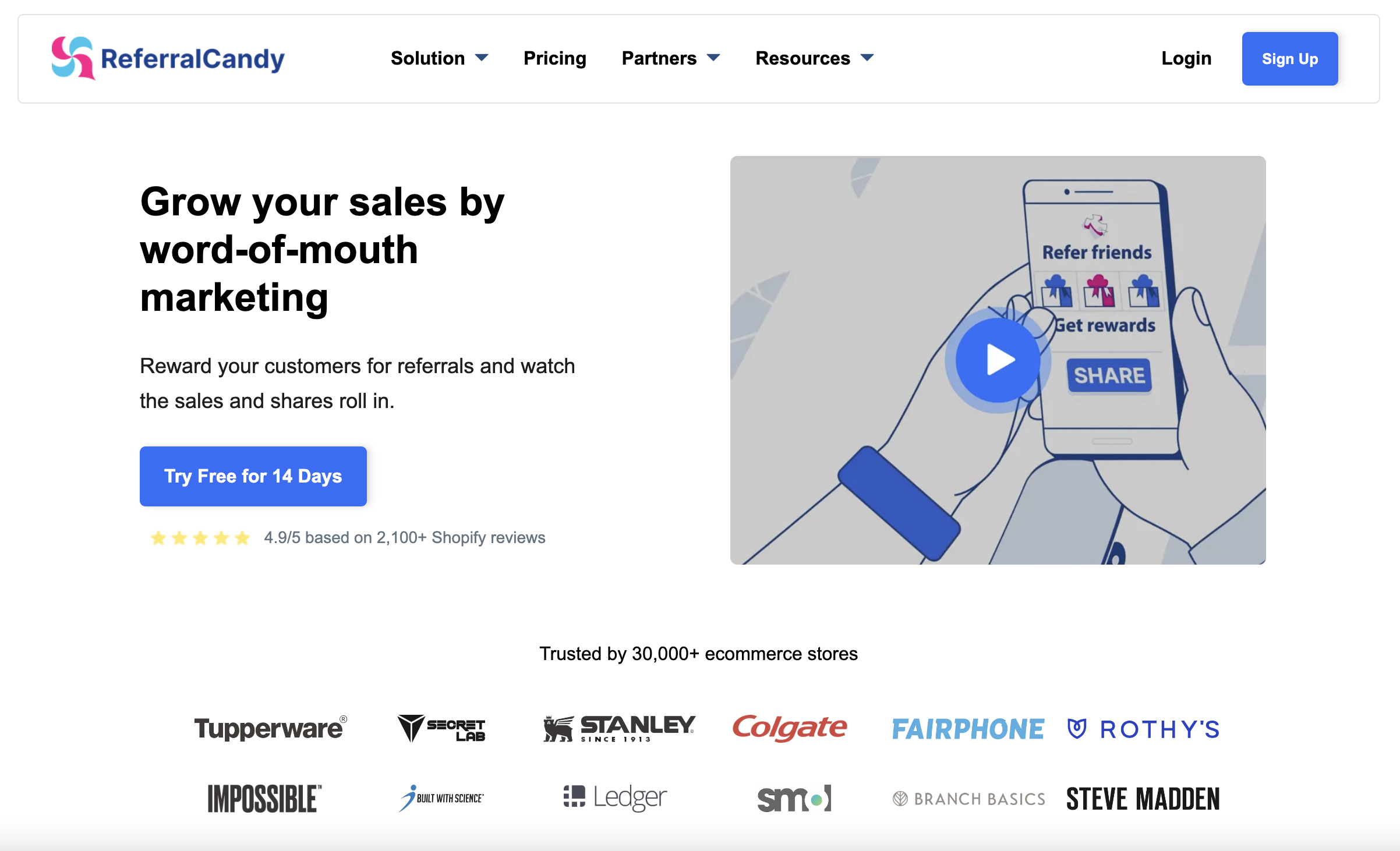
ReferralCandy – Referral Marketing
ReferralCandy is a referral marketing platform designed to help e-commerce businesses increase sales through customer referrals. It enables businesses to create and manage referral programs where customers can refer friends and family in exchange for rewards.
ReferralCandy automates the process of tracking referrals, distributing rewards, and analyzing the performance of referral campaigns. Its features include customizable referral templates, integration with e-commerce platforms, and real-time analytics, making it easy for businesses to leverage word-of-mouth marketing to grow their customer base.
What we love about it:
- Clear value proposition: The headline “Grow your sales by word-of-mouth marketing” immediately communicates the primary benefit. Subheadline and call-to-action (CTA) “Try Free for 14 Days” are prominent and inviting.
- Visual appeal: Clean and modern design with ample white space makes the content easy to read. Visuals and illustrations complement the text and help convey the message effectively.
- Feature highlight: Clearly outlined features like “Automated invitation,” “Custom rewards,” “Feature on your website,” and others make it easy to understand the benefits. Each feature has a brief description and an accompanying visual, enhancing comprehension.
What could be improved:
- Social proof: Adding more diverse testimonials, including those from smaller brands or businesses, can make the tool seem accessible to a broader audience. Video testimonials or case studies can provide more in-depth social proof.
- Performance metrics: The section showing performance metrics is useful but could benefit from more dynamic visuals like animated graphs or real-time stats.
- FAQ section: Adding a frequently asked questions section could preemptively address common concerns and questions, aiding in the decision-making process, while also helping SEO.
Lattice – Performance Management
Lattice is a performance management and employee engagement platform designed to help companies develop and retain their talent. It offers tools for goal setting, performance reviews, continuous feedback, and employee recognition.
Lattice also provides features for engagement surveys, career development planning, and analytics to gain insights into employee performance and satisfaction. The platform aims to improve organizational culture, enhance employee development, and align individual performance with company goals.
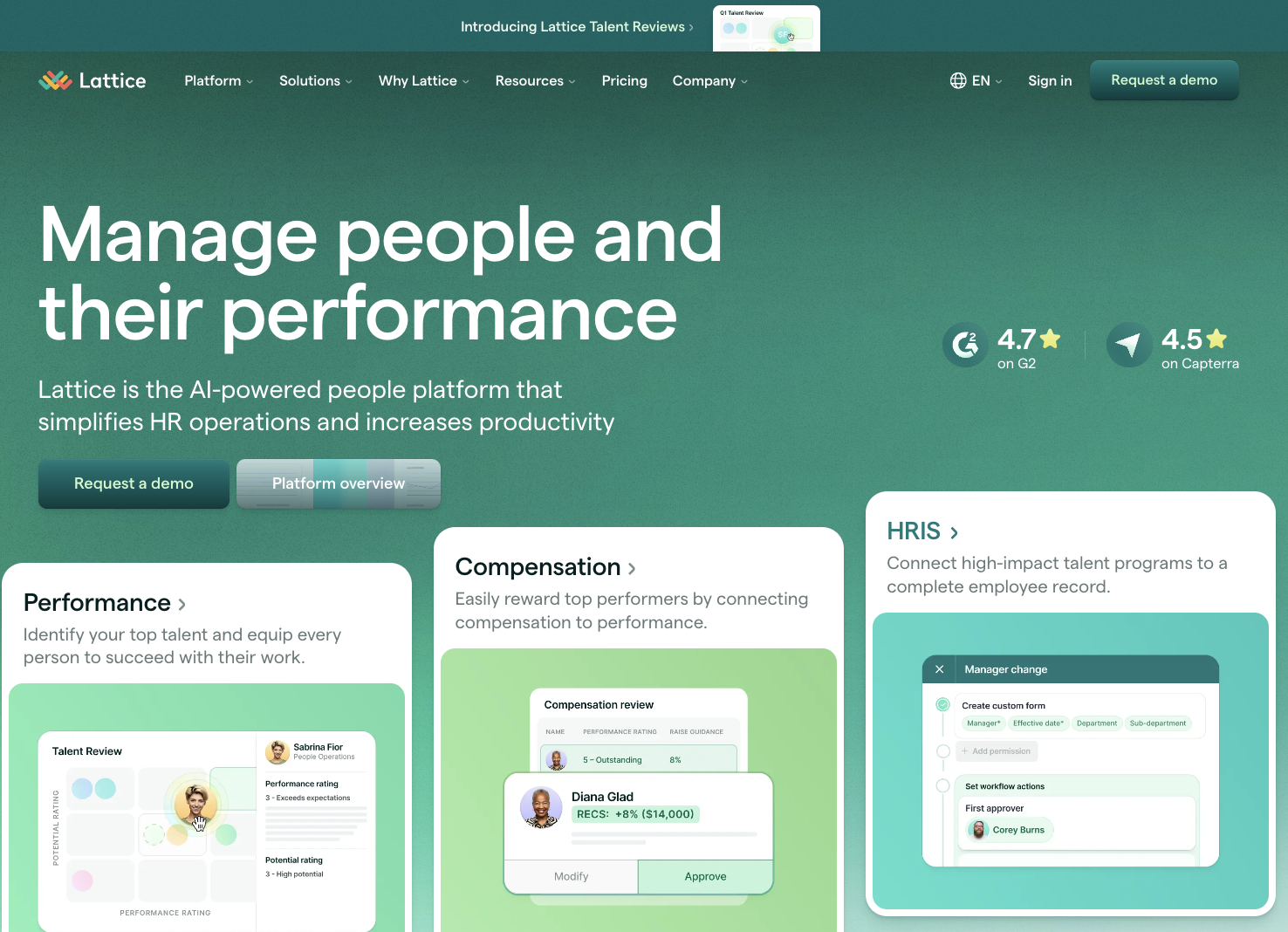
What we love about it:
- Strong social proof: displaying logos of reputable companies like Webflow, Robinhood, and Udacity builds trust and credibility.
- Resource accessibility: the resources section with customer support, Lattice University, and community links is prominently displayed, offering easy access to additional support and learning materials.
What could be improved:
- Improve color accessibility: enhancing color contrast for text and buttons would improve readability and accessibility, particularly for users with visual impairments.
- Simplify the footer: the footer contains many links, which can be overwhelming. Streamlining it to highlight the most important links would enhance usability.
- Break down dense content: presenting dense information in smaller chunks or bullet points can improve readability and engagement.
- Increase white space: reducing the amount of information in each section and incorporating more white space can make the content less overwhelming and easier to read.
- Emphasize key information: focusing on the most critical information and benefits can help users quickly grasp the main points without feeling overwhelmed.
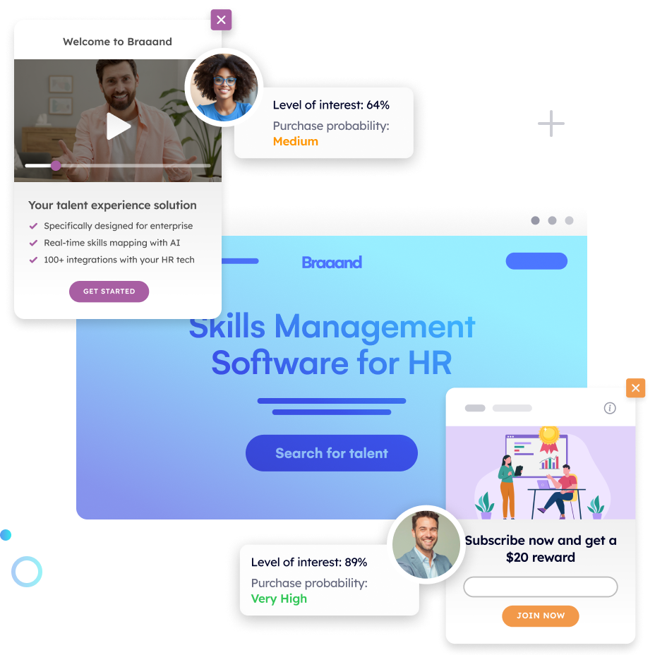
Optimizing Your SaaS Home Page with AI-Powered Personalization
Did you notice a common factor in these SaaS home pages?
3, 2, 1…
That’s right, they lack personalization. Except for a couple of pages that have clearly outlined their solutions and features for different segments, the rest have crowded home pages that put all the sales messages in front of every visitor, without understanding if they are a potential customer, someone interested in working there, a partner, etc.
To truly stand out, your SaaS home page needs to deliver a personalized experience for each visitor. Pathmonk Accelerate, an AI-powered CRO tool, can help achieve this by tailoring the visitor experience based on their behavior and profile.
With Pathmonk Accelerate, you can:
- Identify visitor intent: Detect what is your visitors’ intent in real time, and show them the most relevant content to guide their customer journey.
- Personalize on-page experience: Dynamically adjust the interactions displayed in the home page to align with the visitor’s needs and interests, improving engagement and conversion rates.
- Streamline user journeys: Reduce clutter by only presenting the most pertinent information, creating a smoother and more effective user journey.
- Increase conversions: By providing a tailored experience with Pathmonk Accelerate, you can increase your conversion rates and overall user satisfaction.