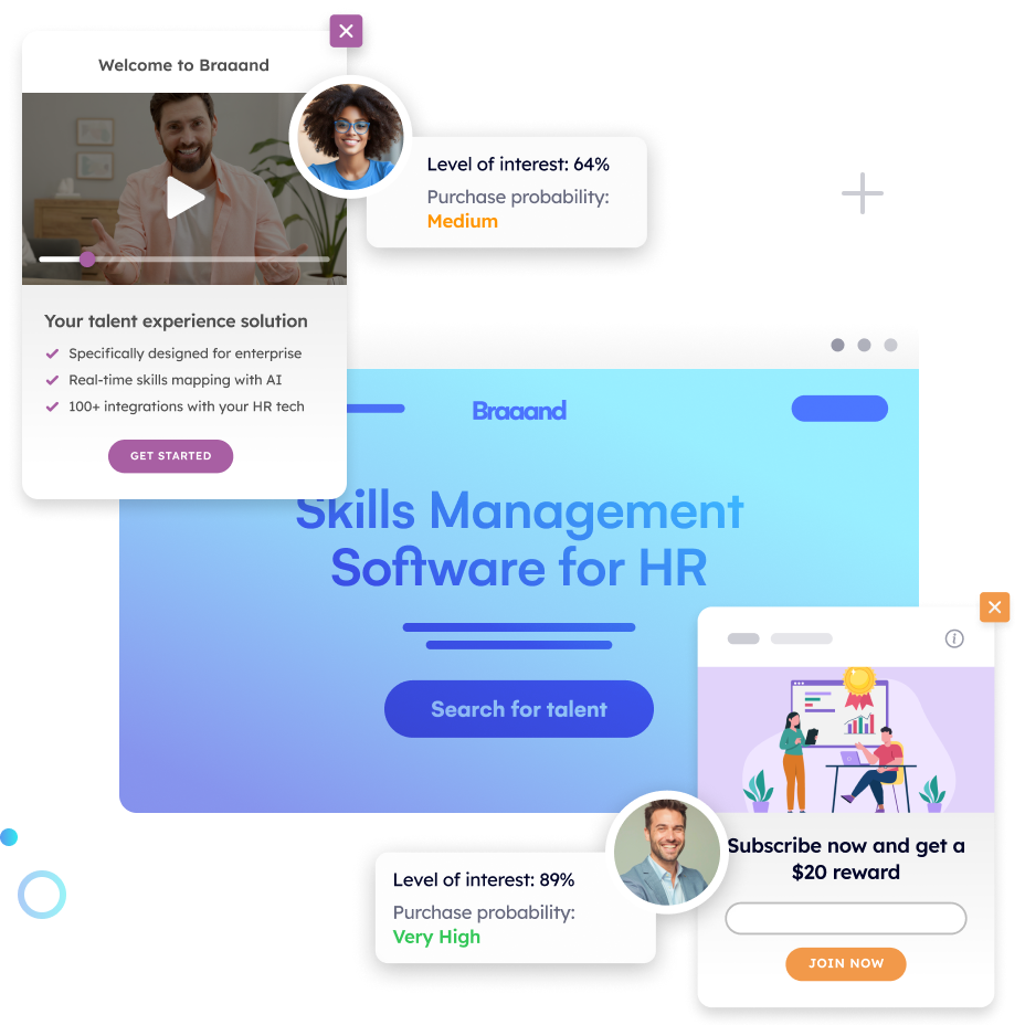
Welcome to the digital heart of your business, where first impressions are forged and the journey of your customer begins—the home page. In a world where every click can lead to a discovery, your initial website landing page stands as the beacon that draws visitors in, offering them a glimpse into what your brand stands for and what it can offer them. But how do you transform this digital threshold into a welcoming gateway that not only captures attention but also captivates?
Let’s elevate your home page to new heights!
Table of Contents
The Imperative of an Optimized Home Page for Online Success
A brand’s home page serves as the forefront of its online identity, setting the stage for customer interaction and engagement. For marketers, understanding and implementing an optimized home page is not merely a suggestion—it’s a critical strategy for ensuring online success. This optimization encompasses every aspect of the home page, from its design and content to its usability and search engine optimization.
Advantages of Focusing on a Single, Well-Optimized Home Page
Optimizing your website’s homepage is not just about aesthetics; it’s a strategic move that sets the tone for your entire online presence. A well-optimized homepage serves as the gateway to your brand, offering a first impression that can either captivate visitors or drive them away. It’s essential for establishing credibility and engaging users right from the start, encouraging them to explore further. This initial interaction is crucial, laying the groundwork for the user experience, and influencing their perception of your brand and their decision to engage with your content or offerings.
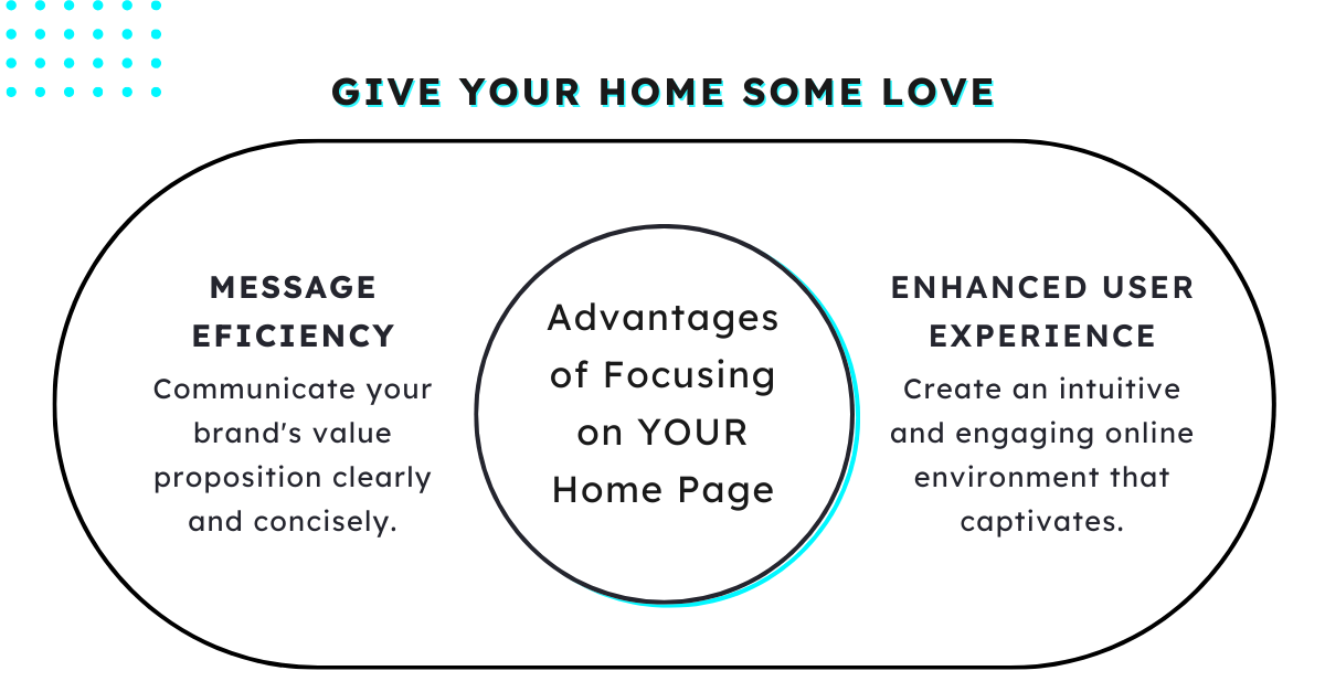
Furthermore, a streamlined, intuitive initial website landing page is key to effective navigation, guiding visitors through your site with ease. This optimization reduces bounce rates and facilitates a seamless journey from the homepage to conversion points, enhancing the overall user experience. By focusing on a clear, concise layout that highlights your brand’s value proposition, you’re more likely to convert casual visitors into engaged users and, ultimately, customers.
Optimizing your website’s homepage offers several advantages, as it is typically the first page visitors encounter and often serves as a gateway to the rest of your site. Here are some key advantages:
- First Impression: Your homepage is the first impression visitors have of your website. It sets the tone for your brand and helps establish credibility. A well-optimized initial website landing page can engage visitors immediately, encouraging them to explore further.
- Navigation: The initial website landing page often serves as the main navigation hub, providing links to key sections or categories of your site. Optimizing the homepage’s navigation ensures visitors can easily find what they’re looking for, reducing bounce rates and increasing time spent on your site.
- SEO Benefits: Search engines often prioritize the homepage when ranking websites. Optimizing your homepage with relevant keywords, meta tags, and rich content can improve your site’s visibility in search engine results pages, driving more organic traffic.
- Conversion Optimization: A well-optimized page can guide visitors toward desired actions, such as making a purchase, signing up for a newsletter, or contacting you. By strategically placing calls to action and highlighting key features or benefits, you can increase conversion rates.
- Branding and Messaging: The initial website landing page is an excellent place to showcase your brand’s unique value proposition and key messages. Optimizing the content and design can effectively communicate your brand’s identity, helping to differentiate you from competitors.
- Mobile Responsiveness: With the increasing use of mobile devices, it’s crucial to ensure your website is optimized for mobile users. A responsive design that adapts to different screen sizes and loads quickly on mobile devices can improve user experience and reduce bounce rates.
- Data Collection: The homepage can be a valuable place to collect user data through forms, surveys, or other interactive elements. Optimizing these features can help you gather insights about your audience and improve your marketing efforts.
Potential Drawbacks of a Single-Page Focus
Two significant challenges include limitations in SEO and content depth, as well as the difficulty in addressing diverse user needs through a singular page. Understanding these potential pitfalls can help marketers develop more comprehensive digital strategies that balance the benefits of a focused home page with the broader goals of the brand’s online presence.
Limitations in SEO and Content Depth
One of the primary challenges with a single-page focus is the inherent limitations it places on search engine optimization efforts. SEO is a critical component of digital marketing, driving organic traffic to your site through higher search engine rankings. A well-optimized home page can indeed rank for specific keywords, but its scope is naturally limited by the amount of content it can reasonably contain without compromising user experience.
The depth of content on a single page is significantly less than what can be achieved across multiple pages, each targeting different facets of your brand’s offerings and industry. This limitation can hinder a brand’s ability to rank for a wide variety of keywords, especially those related to specific products, services, or topics that require more detailed content. Furthermore, the evolving nature of SEO means that content needs to be updated or expanded regularly to maintain or improve rankings, a task that becomes more challenging when confined to a single page.
The Challenge of Addressing Diverse User Needs with One Page
Every visitor to your website comes with a unique set of needs, preferences, and stages in the customer journey. Catering to this diversity with a single home page is a considerable challenge. While a well-optimized home page can be designed to appeal to a broad audience, it may struggle to provide the tailored experience that different segments of your audience seek.
For instance, new visitors may need basic information about your brand and its value proposition, while returning customers might be looking for specific product updates or support resources. Trying to accommodate these varying needs on a single page can lead to a cluttered or unfocused user experience, potentially overwhelming visitors with too much information or, conversely, not providing enough detail to satisfy their queries.
Moreover, personalization, a cornerstone of effective digital marketing strategies, is difficult to implement on a single page. Personalized marketing efforts rely on delivering content that resonates with the individual user’s interests and behaviors, a task that becomes exponentially more complex when attempting to address a wide audience through a single touchpoint.
Crafting a User-Centric Home Page: A Strategic Approach
Crafting a user-centric initial website landing page is not just a best practice—it’s a necessity for brands looking to stand out and connect meaningfully with their audience. A strategic approach to designing a home page that prioritizes the needs, preferences, and behaviors of your core audience can transform your online presence, driving engagement, loyalty, and conversions. This process begins with a deep dive into identifying and understanding the people who are most likely to benefit from what your brand offers.
Identifying and Understanding Your Core Audience
The foundation of a user-centric home page is a thorough understanding of your core audience. This involves more than just demographics; it requires an insight into their behaviors, preferences, challenges, and motivations. Identifying your core audience is a multi-step process that leverages both qualitative and quantitative research methods to paint a comprehensive picture of who your users are and what they need from your brand.
- Market Research and Analysis: Begin by analyzing market trends, competitor strategies, and industry benchmarks. This will give you a baseline understanding of the broader market context and where your brand fits within it.
- Audience Segmentation: Break down your broader audience into smaller, more manageable segments based on shared characteristics. This could include demographic information like age and location, but also psychographic details such as interests, values, and lifestyle. The goal is to identify distinct groups within your audience who may have unique needs or preferences.
- User Personas Development: With your audience segments in hand, develop detailed user personas for each group. Personas are fictional representations of your ideal customers, crafted based on your research. They should include not only demographic information but also insights into their goals, challenges, online behavior, and how your brand can address their needs. Personas make the abstract concept of a “target audience” more tangible, enabling you to tailor your home page design and content more effectively.
- Engagement and Feedback Channels: Utilize direct engagement with your audience through surveys, interviews, and feedback mechanisms to gather insights into their preferences and pain points. Social media platforms, customer support interactions, and user testing sessions can be invaluable in this regard, providing real-time feedback from actual or potential users.
- Analytics and Data Analysis: Leverage data analytics tools to understand how users currently interact with your website. Look at metrics such as bounce rates, page views, session duration, and conversion rates to identify what works and what doesn’t. This data can reveal much about user preferences and behavior, guiding the optimization of your home page.
Key Features of a Conversion-Optimized Home Page
A conversion-optimized initial website landing page is pivotal in turning visitors into leads and customers. It acts as a digital handshake, offering a first impression that can either open the door to further engagement or close it firmly. To ensure the former, certain key features must be meticulously integrated into the home page design. These features are not just about aesthetics; they’re about creating a seamless, engaging, and effective user experience that guides visitors toward making a decision. Let’s explore these critical components.
Developing Headlines That Capture Attention and Interest
The headline is arguably the single most important piece of copy on your home page. It’s the first thing visitors read and plays a decisive role in their choice to stay and explore further or leave. A compelling headline must:
– Be Clear and Concise: Visitors should understand what your brand offers within seconds of landing on your page. Avoid jargon and keep it simple.
– Communicate Value: Highlight the unique value proposition of your brand. What makes you stand out from the competition? Why should the visitor care?
– Invoke Emotion or Curiosity: Use emotional triggers or questions that make visitors want to learn more. This could be the promise of solving a problem or the prospect of discovering something new and beneficial.
Integrating Engaging and Informative Content
Content on your home page needs to engage visitors immediately while providing them with the information they’re seeking. This includes:
– Benefit-driven Subheadings: Follow your headline with subheadings that delve deeper into the benefits of your offering. Each subheading should address a specific aspect of your UVP, guiding visitors through your key messages in a logical order.
– Visuals and Multimedia: Images, videos, and infographics can communicate your message more effectively than text alone. They also break up content, making it easier to digest. Ensure visuals are high-quality and relevant to your brand and message.
– Testimonials and Social Proof: Incorporate elements of social proof, such as customer testimonials, client logos, or trust badges. These build credibility and trust with prospective customers.
Incorporating Pathmonk Accelerate into your website’s optimization strategy brings a transformative advantage: the ability to dynamically tailor content based on individual user needs, significantly boosting conversion rates. By harnessing sophisticated AI algorithms, meticulously analyzes each visitor’s behavior, preferences, and interaction patterns in real-time. This deep understanding of the user journey allows for the automatic adjustment of the homepage content, ensuring that each visitor is presented with the most relevant and engaging information suited to their specific stage in the buying cycle or interests.
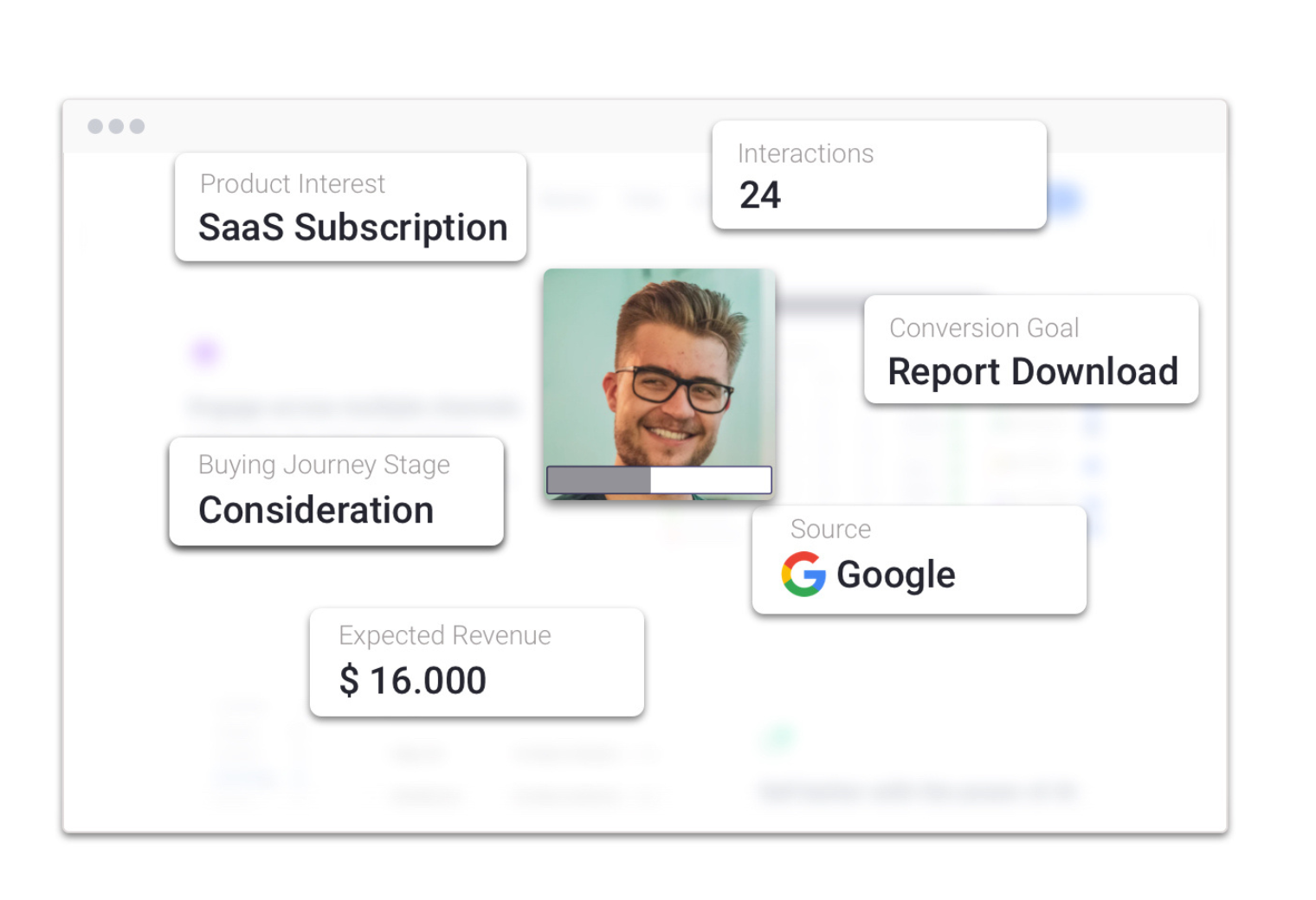
Accelerate stands out by its ability to predict visitors’ needs and potential friction within your website, presenting them with precisely what they require at the critical moment. This level of personalization is achieved through an intuitive understanding of user behavior, enabling a seamless alignment of content and user intent. Whether it’s a specific product, a helpful testimonial, or an actionable download, Accelerate ensures that each interaction is tailored to drive engagement and conversion.
This personalized approach to content delivery is a game-changer. Rather than offering a one-size-fits-all homepage, Pathmonk Accelerate enables a fluid, adaptive content strategy that speaks directly to the visitor’s unique needs and queries. This level of personalization dramatically enhances the user experience, making visitors feel understood and valued, which in turn, significantly increases the likelihood of conversion. From highlighting specific products to showcasing targeted calls-to-action, Pathmonk Accelerate ensures that your page is not just a static entry point but a dynamic, responsive hub that actively contributes to guiding visitors down the conversion funnel. The result is an initial website landing page that not only captures attention but also captivates, persuades, and converts with unparalleled efficiency.
Prioritizing Speed and Mobile Responsiveness
In today’s fast-paced digital environment, speed and mobile responsiveness are non-negotiable for a conversion-optimized initial website landing page. Visitors expect quick loading times and a seamless experience across all devices, especially on mobile.
Techniques for Enhancing Page Load Speed and Mobile Usability
- Optimize Images and Media: Use compression tools to reduce file sizes without sacrificing quality. Consider implementing lazy loading for images and videos, which delays the loading of these elements until they’re needed.
- Leverage Browser Caching: Store elements of your site in users’ browsers so that they don’t need to be reloaded with each visit. This can significantly reduce loading times for repeat visitors.
- Minimize HTTP Requests: Reduce the number of elements (scripts, images, stylesheets) that require an HTTP request to load. Consolidate files where possible and use CSS sprites to combine multiple images into one.
- Responsive Design: Ensure your website design adapts to any screen size and resolution. This not only improves user experience but also contributes to better SEO rankings, as mobile-friendliness is a ranking factor for Google.
- Test and Monitor Regularly: Use tools like Google’s PageSpeed Insights to test your site’s performance and identify areas for improvement. Regular monitoring allows you to catch and fix issues before they impact user experience.
Continuously Refining Your Home Page Through Testing
Continuous refinement and optimization are crucial to aligning with changing user expectations and technological advancements. This ongoing process of improvement is not just about tweaking; it’s about milking cutting-edge tools like Pathmonk Intelligence to delve deep into the analytics, understand user behavior in granular detail, and make data-driven decisions that enhance performance and conversion rates.
Analyzing Test Results for Improved Performance
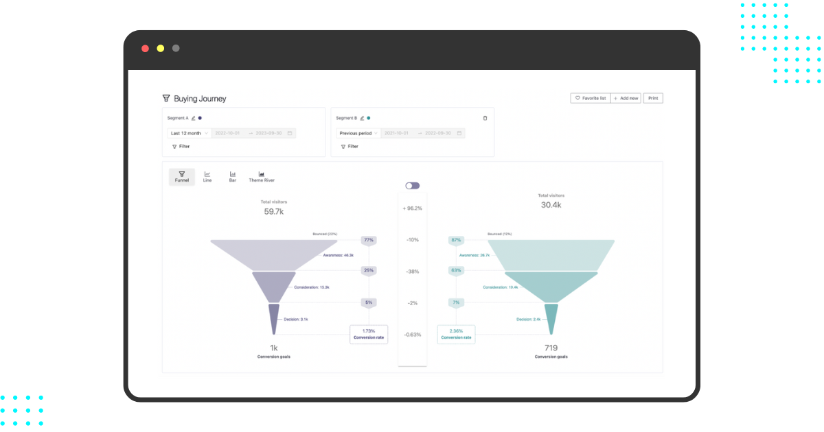
Pathmonk Intelligence stands out as a pivotal tool in the realm of website optimization. It goes beyond traditional analytics by employing artificial intelligence to provide a more nuanced understanding of how users interact with your home page. This advanced tool can dissect complex user journeys, identify conversion barriers, and spotlight the elements that truly resonate with your audience. Here’s how Pathmonk Intelligence can revolutionize the way you refine your home page:
Making Informed Adjustments Based on Data
- Deep Behavioral Insights: Pathmonk Intelligence offers a window into the users’ minds, tracking their interactions at each scroll, click, and hover. By analyzing these behaviors, you can uncover what captures attention and what causes hesitation or drop-offs. This level of insight is instrumental in crafting a home page that aligns perfectly with user preferences and behaviors.
- Predictive Analytics for Conversion Optimization: Leveraging AI, Pathmonk predicts which adjustments are likely to improve conversion rates. Whether it’s changing the placement of a call-to-action, tweaking headline text, or modifying the layout, Pathmonk’s predictive capabilities allow you to focus your efforts on changes that have the highest potential for impact.
- User Journey Mapping: Understanding the paths users take on your home page can reveal a lot about their needs and preferences. Pathmonk Intelligence maps out these journeys, providing clarity on how different segments navigate your site. This information is crucial for identifying friction points and opportunities to streamline the user experience.
- Integrating Qualitative Insights: While Pathmonk excels in quantitative analysis, it also facilitates the integration of qualitative feedback. By combining numerical data with actual user feedback, you gain a comprehensive view of your home page’s performance. This dual approach ensures that every optimization is grounded in both hard data and real user experiences.
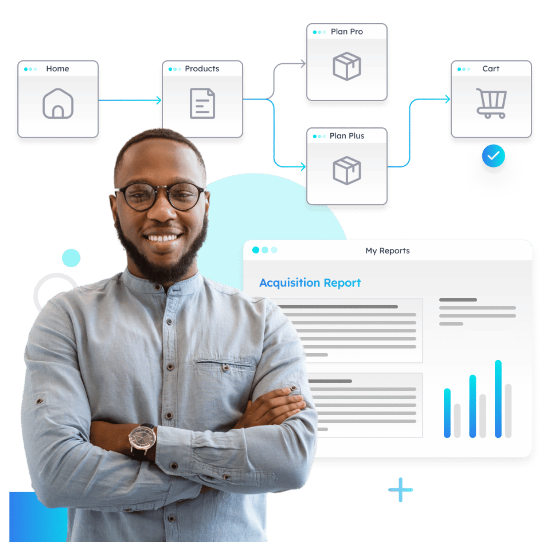
Understand how your prospects behave (in real time)
- Visualize how visitors move across your website
- Identify drop-offs and friction points instantly
- Turn journey data into actionable insights with AI
Conclusion
In the digital age, your website’s home page is more than just a landing page—it’s the heart of your online presence and a critical factor in your brand’s success. From capturing attention with compelling headlines to integrating engaging content, prioritizing speed and mobile responsiveness, and continuously refining through testing, every aspect of your home page requires meticulous attention and strategic planning.
Advanced tools like Pathmonk Intelligence enable a deeper understanding of user behavior, empowering you to make data-driven decisions that enhance user experience and conversion rates.
Remember, optimizing your home page is not a one-time task but a continuous journey of improvement and adaptation to meet the ever-evolving needs of your audience.
Additional Resources
Books and Websites for Further Learning
To further your knowledge and expertise in creating an optimized and user-centric home page, consider diving into the following resources:
Books
- Don’t Make Me Think, Revisited: A Common Sense Approach to Web Usability by Steve Krug – A must-read for anyone interested in web design and usability, offering timeless insights into creating user-friendly sites.
- Hooked: How to Build Habit-Forming Products by Nir Eyal – Provides valuable insights into user behavior and engagement, crucial for designing compelling home pages.
- Landing Page Optimization: The Definitive Guide to Testing and Tuning for Conversions by Tim Ash – Offers deep dives into strategies for optimizing landing pages, including home pages, for better conversions.
Websites
- Nielsen Norman Group – A leading resource in user experience research, offering in-depth articles, reports, and guidelines.
- Awwwards – Showcases innovative web design trends and inspires cutting-edge home page designs.
- Pathmonk – Offers insights into Pathmonk Intelligence and other tools that can aid in optimizing your website’s performance.
By leveraging these resources, you can deepen your understanding of effective home page design and optimization strategies, ensuring that your website not only attracts but also retains and converts visitors. The journey to a perfect home page is ongoing, but with the right knowledge and tools, it’s a path that can lead to significant rewards for your brand and business.
Increase +180% conversions from your website with AI
Get more conversions from your existing traffic by delivering personalized experiences in real time.
- Adapt your website to each visitor’s intent automatically
- Increase conversions without redesigns or dev work
- Turn anonymous traffic into revenue at scale
